5 design disasters (and what you can learn from them)
Leading designers tell us about times it all went very wrong.
No matter how successful you become, how much money you make, how many awards you win, you will still make mistakes. In the age of online perfection, it's easy to forget that even those with the most gorgeous design portfolios have at some point dropped a clanger. So we contacted some of our favourite designers and asked for their worst, most painful stories about design disasters.
Yarza Twin shared a chilling story about how a typo lead to a pop star's sister threatening to have them deported. Craig Black explained that just because someone says they know more than you, doesn't mean they actually do. Brand Brothers said they were once bullied into bad design by a tech giant. Raquel Quevedo did something you should never do when it comes to sending stuff to the printers. And Love told us why it’s a bad idea to shop for black snow in China. Read on for a selection of design disasters, and what you can learn from them.
Too good to be true

At the start of their career, Yarza Twins Marta and Eva received an offer from the sister of a "very famous and controversial singer (who we will keep anonymous)”. This client made various products and wanted a catalogue. The budget was next to nothing, but the Spaniards were new to London at that time and were trying to get their studio up and running.
It was a three-day deadline, but the job sounded easy enough. The client would send images and Yarza Twins would lay them out alongside text. "It was a big deal for us," Marta Yarza says, "so we felt very lucky and accepted it."
We cannot share pictures, because we don't want that woman back in our lives
Marta Yarza, Yarza Twins
The client sent the images she wanted to use – over 3,000 of them, including duck-face selfies and holiday snaps. None of them were named. Yarza Twins had to guess which picture went with which text. Then the client started adding to the brief. She wanted website banners, contact cards, posters …
"We were inexperienced and stupid," Marta says, "so we accepted to do all that work." They worked till four in the morning every day and got the work done. But the client spotted a word, in Arabic, that had been misspelled.
Yarza Twins don't speak Arabic, and the word was incorrectly spelled when they received it. But the client freaked out, refused to pay and began to make threats. She claimed she was hiring a famous lawyer to get the twins deported from the UK: "All because she spelled badly an Arabic word that could be super-easily replaced on the design," Marta says. "We cannot share pictures, because we don't want that woman back in our lives."
Get the Creative Bloq Newsletter
Daily design news, reviews, how-tos and more, as picked by the editors.
What can you learn from this? If you have a bad feeling about a client and a deadline, you should listen to your instincts, and don't let a client add more work to a brief without the promise of more pay.
To infinity and beyond… and back again


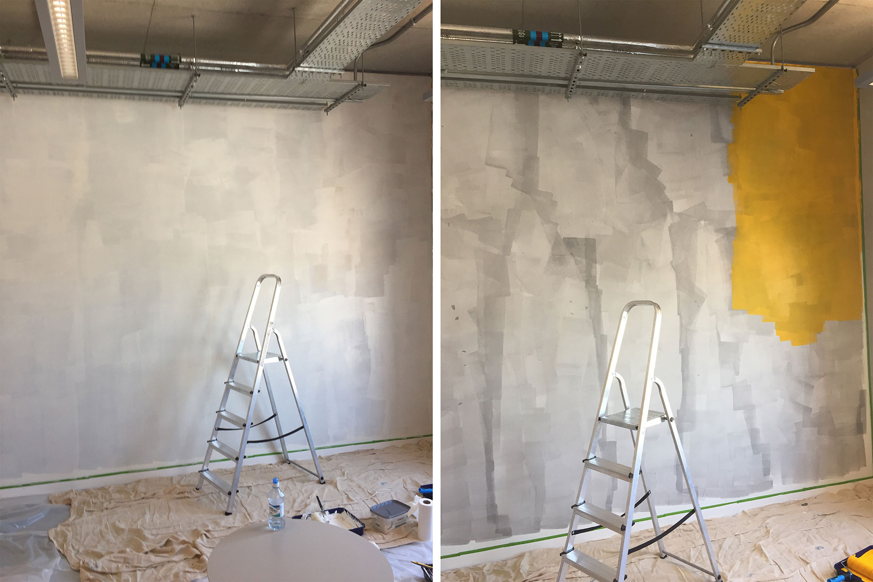
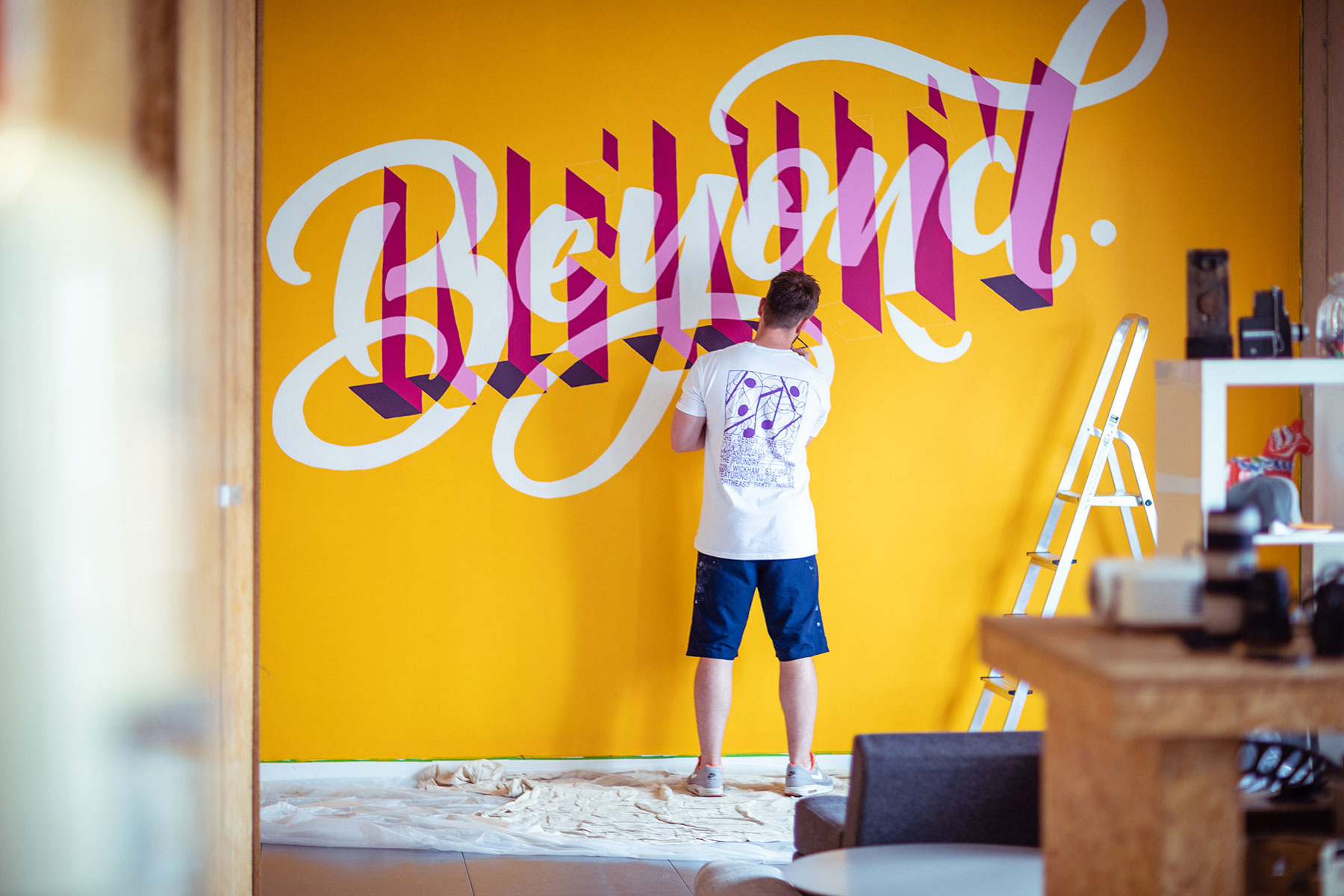
Craig Black is a lettering specialist. Branding agency MadeBrave approached him to paint a mural in their studio and it sounded like a simple enough job. The client knew exactly what they wanted: ‘To Infinity and Beyond’ – one of its brand values. Black came up with a concept that had the lettering set against a yellow background. The client signed it off. Time to get painting. The wall was already white – a blank canvas.
"However," the Scot says, "I was informed by a paint specialist that I should use a grey primer paint on top of the white wall to make the yellow background paint stand out. I was unsure about it. It's something I'd never previously done but I followed the paint specialist’s instructions." It didn't work.
The grey primer muddied the yellow, and Black had to cover the grey with two coats of white paint and three coats of yellow to get rid of it. "This had a knock-on effect, as there was a videographer booked in on those days to capture the making of the mural, which had to be delayed due to this mishap, inadvertently costing the client more than what was intended."
The lesson? Sometimes you really do know best.
A date with disaster

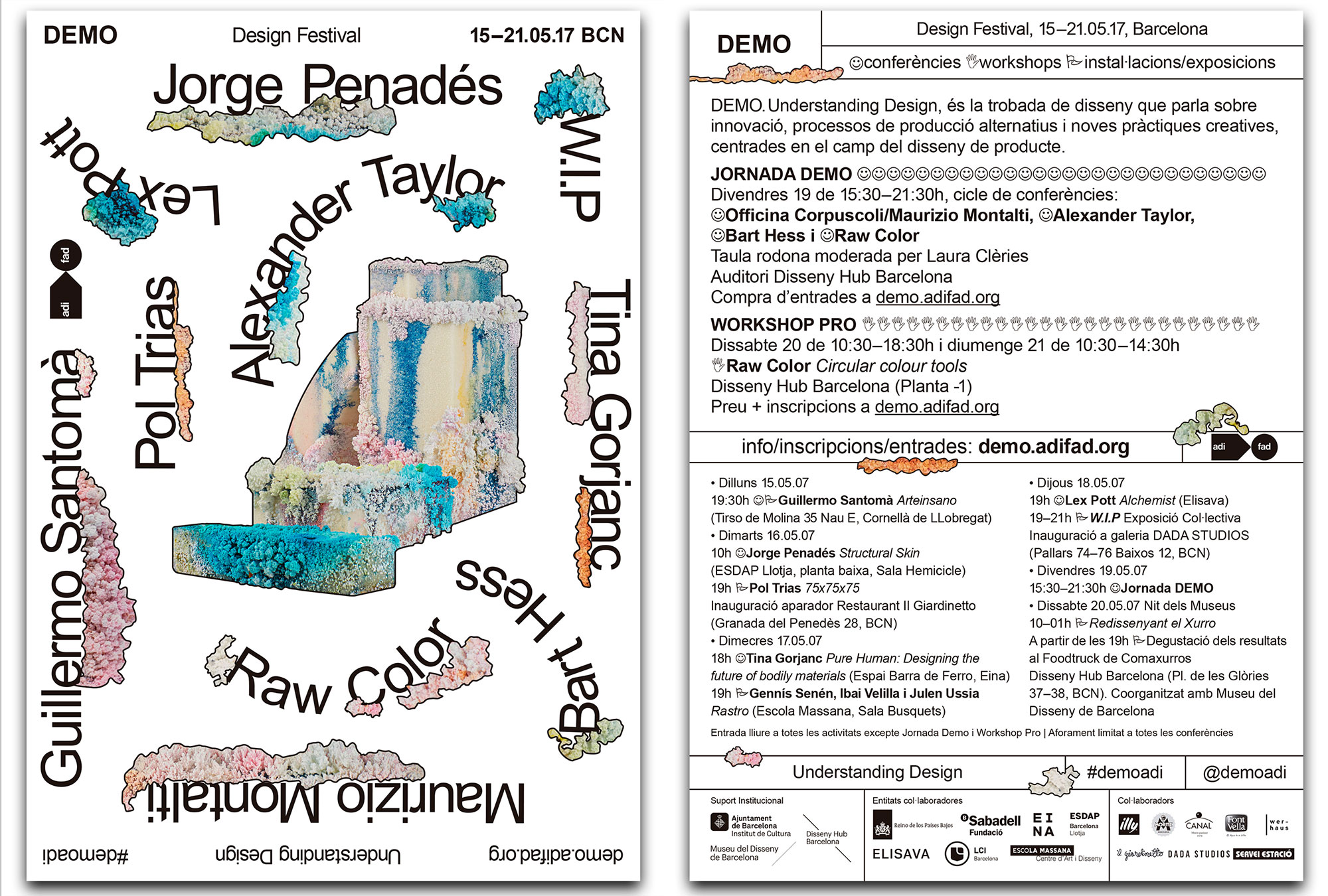
Can you spot what's wrong with the poster above? Raquel Quevedo made it for the Understanding Design festival. The Barcelona designer and art director says there's a ton of possible reasons why this mistake happened: the deadline was very tight, the brief repeatedly changed, she had to really beat the keys on her knackered old keyboard … But she isn't solely to blame. "Despite being seen by a thousand eyes," the Spaniard says, "no one noticed that the date was wrong."
Quevedo put the date of the festival not as 2017 but 2007. Thousands of flyers and posters were printed and distributed throughout Barcelona. "Not many people noticed the failure," she says. "The lesson? Do not send anything to print from one day to the next, even if the client demands it!"
Client control

In 2014, Brand Brothers – which has studios in Paris and Toulouse – got a job from one of France's leading tech companies. They had to design and make 100 metal boxes, which would be given out to the tech company's clients at an event, alongside various promotional materials. Johan Debit remembers being excited about the project because they had full creative control. The problem was the deadline – a month, by the time the contract was signed – and that the elements that made up the box were coming from five different suppliers.
The client, Debit says, was "impossible to talk to”. They kept asking for strange revisions. Brand Brother hit their deadline, but by then, there had almost no creative control. The finished pictures for the promotional materials, as requested by the client, showed business people (stock photos) using "futuristic" touchscreen holographic technology. It looked like something from a dodgy '90s sci-fi film.
We were ready to go to court if the client persisted in withholding the payment that was due
Johan Debit, Band Brothers
"We were getting to a point where we had been so excluded from the creative process that we just wanted to get this work over with," Debit says. Things got worse. The manufacturer delivered the parts: foam inlays didn't fit the boxes they were made for. Plus, some of the boxes had been damaged during delivery.
Brand Brothers paid for remanufacturing out of their own pocket, but the client became increasingly bad-tempered and refused to pay for anything. A shouty meeting followed. The tech company tried to use its size advantage to intimidate the small design studio.
"We reminded him that, even if he was a major client, we had honoured our commitments and he had not, and that we were ready to go to court if he persisted in withholding the payment that was due. Our determination paid off: the client eventually gave up his blackmail and we won. The full payment was received within only a few days."
The lesson? Listen to your instincts, and ensure you've always got a contract.
Lost in translation

In 2007, Sony marketed the PlayStation 2 console as gateway to a dark, sinister world called ‘The Third Place’. Sony asked Manchester studio Love to create something suitable to hold a USB that it would sent out to journalists. We wanted to impress," says Chris Myers, "and developed a dark, sinister snow globe – complete with black snow and a twisted Christmas scene within."
The client liked it, but Love's production team worried the deadline and budget were too tight. "Plus," the senior creative director says, "this was clearly not an off-the-shelf item."
We developed a dark, sinister snow globe... This was clearly not an off-the-shelf item
Chris Myers, Love
The production team eventually found a supplier in China. Contact was infrequent and only by email. Messages were vague and noncommittal. "After weeks of stress," Myers says, "the supplier sent us the picture of our prototype snow globe, adding we could have as many of these as we wanted: the image was of a tacky, regular, white snow globe – the kind you get from a Christmas store for a £1”.
Love had lost weeks waiting for this ‘prototype’. They had to admit they wouldn't be able to deliver the black snow globes, which Sony wasn't happy about. Love managed to keep PlayStation as a client, but an important lesson was learnt: "Never present an idea to a client if you don't know how you are going to make it a reality. At least have some idea of cost and production, or you could end up looking like creative fools."
Read more:

Thank you for reading 5 articles this month* Join now for unlimited access
Enjoy your first month for just £1 / $1 / €1
*Read 5 free articles per month without a subscription

Join now for unlimited access
Try first month for just £1 / $1 / €1
Gary Evans is a freelance journalist and travel writer. He is a former staff writer for Creative Bloq, ImagineFX, 3D World, and other Future Plc titles.
