In the graphic design world, the idea that something has become a trend is often perceived as a negative. But while blindly following trends for their own sake is of course to be avoided, it’s just as silly to try to shut yourself off from the world and ignore everything that’s going on.
In other words, you don’t have to follow trends, but it’s good to know what they are. In this post, we focus on five broad trends we’ve spotted in graphic design over the past 12 months. If there’s a trend you feel we’ve missed out on, though, please let us know in the comments below!
01. Typographic deconstruction
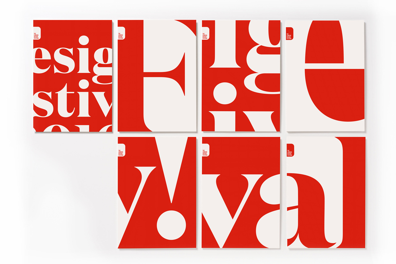
If the world of 2016 at times felt a little broken, then it’s perhaps unsurprising that broken letterforms were everywhere in branding this year. We saw them, for example, in The Neighbourhood’s branding for MCAU; Bond’s logo for Scala; Pentagram’s utilitarian identity for Openview; and NB Studio’s work for ClydeSpace, a CubeSat manufacturer.
The trend can also be seen in the overkerning-as-effect of Wolff Olins’ logo for The Met and the oversized letter fragments of Pentagram’s Design Festival identity (above). With seemingly endless permutations possible, we look forward to seeing further examples of typographic deconstruction in 2017.
02. Simplification
The KISS principle (Keep it Simple, Stupid) has always been an important rule in graphic design. But while simplification in design is nothing new, in 2016, it became more important and widespread than ever.
Why? Because as our lives get ever busier, and more and more content competes for our eyeballs, each piece of design work we create has to be visually simple and instantly understandable. Plus there’s a physical need for further simplification: the increasingly pressing need to make design assets work on phone screens, and even smaller devices such as smartwatches. It doesn’t matter how elegant your logo or icon is, if it doesn’t work when shrunk down to a few pixels, in 2016 it might as well not exist.
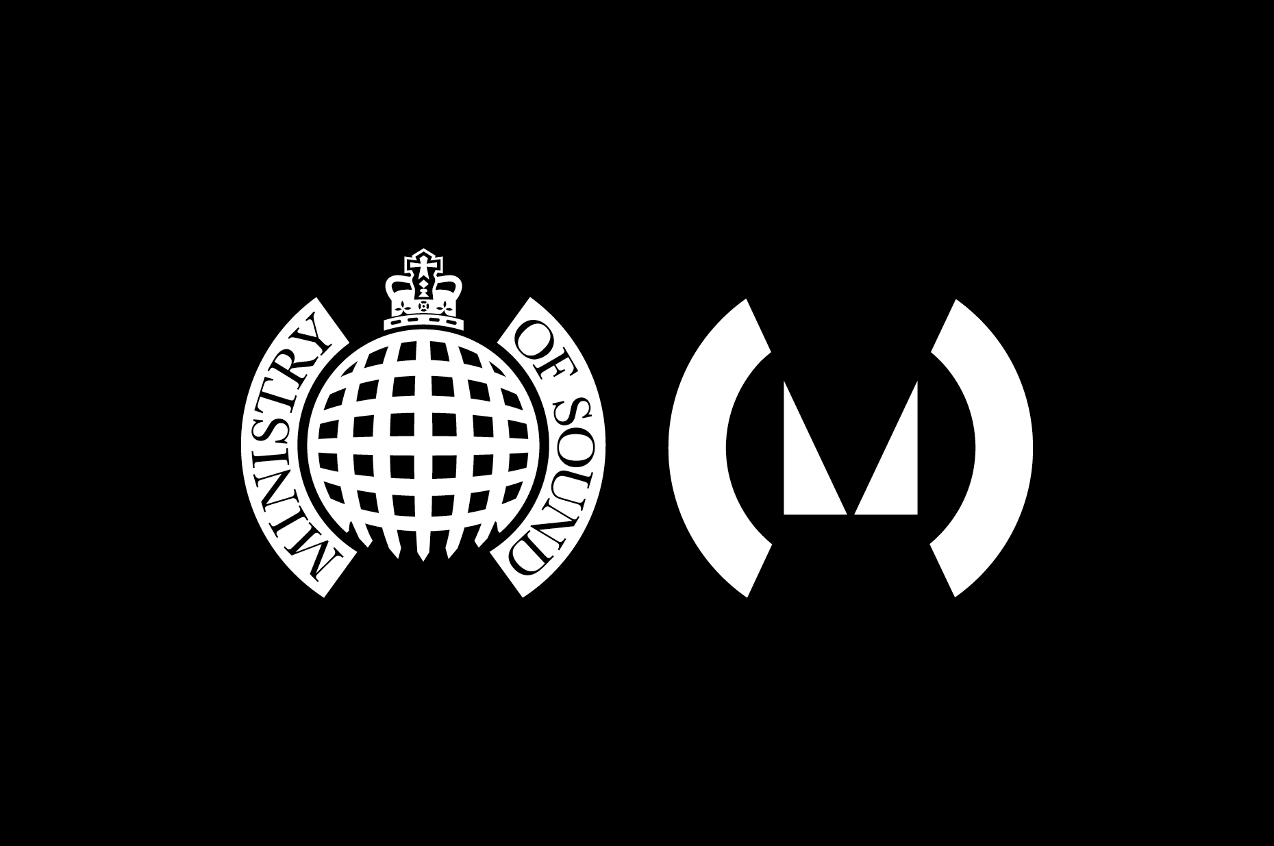
So it’s unsurprising that the trend for simplification can be seen in most of the big-name logo designs this year, including BT, BBC3, Subway, Mastercard, Instagram, HP, Bing, Pandora and Ministry of Sound. There was a marked move towards simplification in packaging too; seen, for example, in the "striking and in-your-face" McDonalds packaging designed by Boxer, the cleaned-up packaging for Grolsh, and the simplified packaging for Bare Snacks by Sterling Brands.
Get the Creative Bloq Newsletter
Daily design news, reviews, how-tos and more, as picked by the editors.
How far can this trend go? Could assets like the new Ministry of Sound logo (shown above) get even simpler in future? We can’t wait to find out...
03. Intense and heightened colours
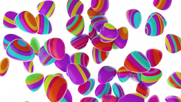
For many years, designers have groaned at the request, “Can you make the colours pop?” But this year, the globe needed cheering up a little more than usual - and a move away from subtle and muted tones towards childlike pastels, bright neons and primary colours has proved just the tonic.
In 2016, the use of punchy, eye-catching colour palettes was everywhere from Sagmeister & Walsh’s packaging for Appy Fizz to Pentagram’s branding for Film Independent. Practically every identity Hey Studio designed - from the OFFF design event to pop festival LiveOut - was a riot of colour, while Wolff Ollins imbued its identity for Nordic telco Telia with stunningly kaleidoscopic hues. More subtly, but just as effectively, bright reds and oranges were used to stunning effect in DIA’s new identity for Tomorrow International and GBH’s branding for Starck Paris.
04. The big brandmark revival
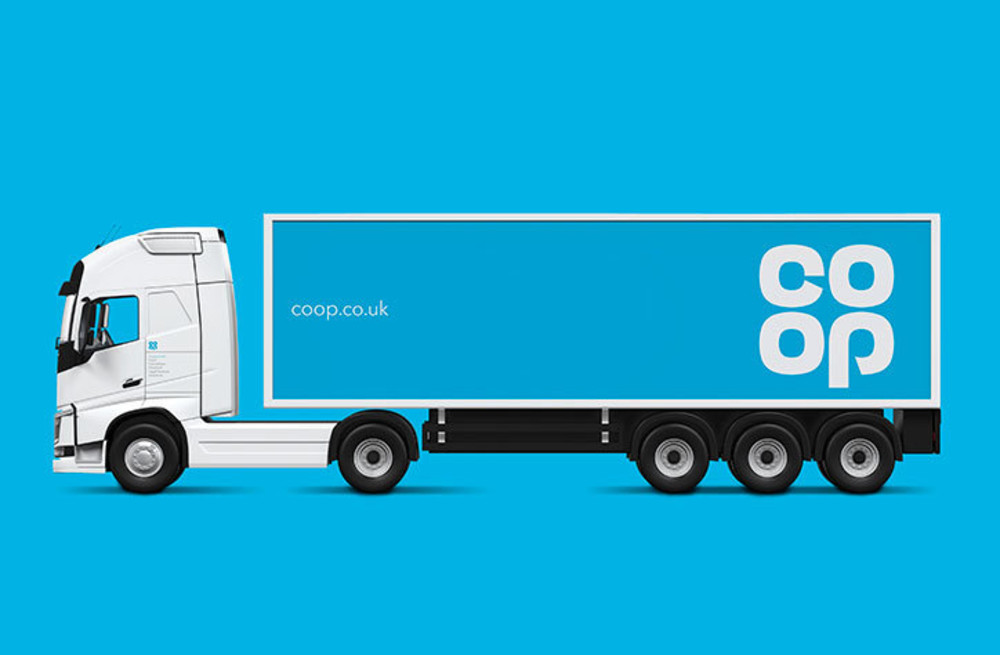
Nostalgia is ever-present in the world of design; as an influence, an inspiration, a tool to be drawn on. But 2016 saw designers take things to a whole new level, with some big brand identities simply pressing the reset button entirely.
To coincide with its return to the consumer products market, Kodak waved goodbye to the text based branding they’d introduced in 2006 and reclaimed their iconic red and black, camera-shutter logo of old. Similarly, North revived UK retailer Co-op’s classic 1968 clover-leaf logo, bringing a sense of reassurance back to the high street in turbulent times. Meanwhile, with the banking industry still widely untrusted, NatWest (under the guidance of Futurebrand) went back to a 1968 logo too, presumably in the hope people would forget 2008 had ever happened.
In all these cases, some tidying up and embellishing was done to fit modern sensibilities; it wasn’t a case of just cutting and pasting the old design as-was. But to all intents and purposes, a precedent has been set, and the iconic wordmarks of the past are fair game for a comeback. We can’t wait to see if any more are due for a revival in 2017.
05. Automation
![Adobe’s new AI platform promises that “tasks that take minutes [will be] done in seconds”](https://cdn.mos.cms.futurecdn.net/UACk7PvXXmCTHLZ97RJeaG.jpg)
Every year the makers of graphic design software aim to improve their products, to help us to work faster and with less boring repetition. This year, though, the rise of artificial intelligence seems to have ramped things up a notch.
For example, at Adobe’s annual conference in November it unveiled Sensei, a new platform that combines its Creative Cloud suite of design, photo and animation tools with an AI and machine learning framework.
In their own words: “In Creative Cloud, Adobe Sensei anticipates your next move. It recreates elements in photos where they didn’t exist, by studying nearby pixels. It sees type and recreates fonts for you. It identifies objects in your images and adds searchable words to your photo tags. And it recognizes faces, placing landmarks on eyebrows and lips so you can change expressions with click. Now tasks that take minutes are done in seconds.” Serious stuff.
Of course, the next big AI leaps in design software are just as likely to come from small, nimble startups as tech giants. So new tools are emerging in the arenas of interface design (with the likes of the Wix Design AI and The Grid), image retouching (with the Neural Photo Editor) and even in the logo design space. We’ve seen various attempts at logo creators already, of course, from the likes of Tailor Brands and Squarespace. But MarkMaker, a tool launched in 2016 in prototype, seems a little more sophisticated and potentially game-changing; using a ‘genetic algorithm’ that allows it to learn your preferences and automatically improve your designs over time.
With all of these new apps, it’s still very early days. But with Google recently open sourcing its AI engine Tensorflow, artificial intelligence is likely to explode in 2017, and could end up making the nature of graphic design work very different in the near future. Hold onto your hats…

Thank you for reading 5 articles this month* Join now for unlimited access
Enjoy your first month for just £1 / $1 / €1
*Read 5 free articles per month without a subscription

Join now for unlimited access
Try first month for just £1 / $1 / €1

Tom May is an award-winning journalist and author specialising in design, photography and technology. His latest book, The 50th Greatest Designers, was released in June 2025. He's also author of the Amazon #1 bestseller Great TED Talks: Creativity, published by Pavilion Books, Tom was previously editor of Professional Photography magazine, associate editor at Creative Bloq, and deputy editor at net magazine.
