5 amazing design concepts we wish were real
Sometimes the design concept is better than the real thing. We examine the best ideas that haven't been made (yet).
A design concept is arguably more important than the design or even the ultimate product. A good design concept contains the logic, reasoning and (you hope, at least) the research behind an idea. And, more than just a good idea, a good design concept doubles as a kind of visual elevator pitch. It should tell you all you need to know about how and why something does what it does.
We know there are graphic design portfolios out there simply bulging with bright ideas and in this post you’ll get to read about five design concepts we really wish had come to fruition. In fact, we’re hoping some of them still will.
01. Oceanix Floating City
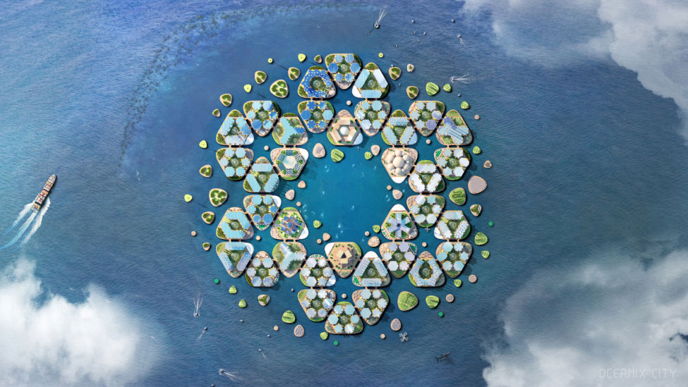
It’s a floating city! What’s not to love? Obvious excitement aside, this incredible concept from bjarke ingels group (BIG) is for a floating city situated offshore from major coastal cities that can be towed to other locations in the event of a disaster. The structures are designed to withstand floods, tsunamis, and cat-5 hurricanes and the islands are made from self-repairing biorock, which has a limestone coating formed by exposing underwater minerals to an electric current, becoming stronger over time. The imagined villages boast an environmentally friendly habitat with no high emissions and an efficient recycling system. Sounds like paradise.
02. Bookmarks rack
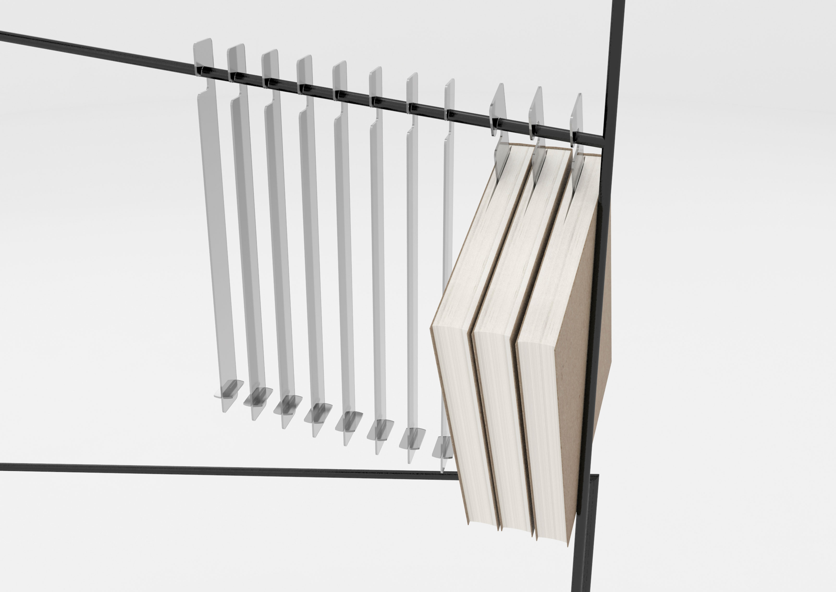
Books on hangers? It’s either genius or ludicrous. We’ve gone with genius on this occasion. Sometimes the best design ideas really are the simplest. Not only does this clever, mobile and space-saving invention by Qi Beichen keep your books tidy, it also marks where you stopped reading, perfect if you have a tendency to linger over seven books at once. This design won a Red Dot Award in 2018 and the moment this gets made, we’re buying it.
03. The New Public Convenience: Hull's Bath House and Lady Garden
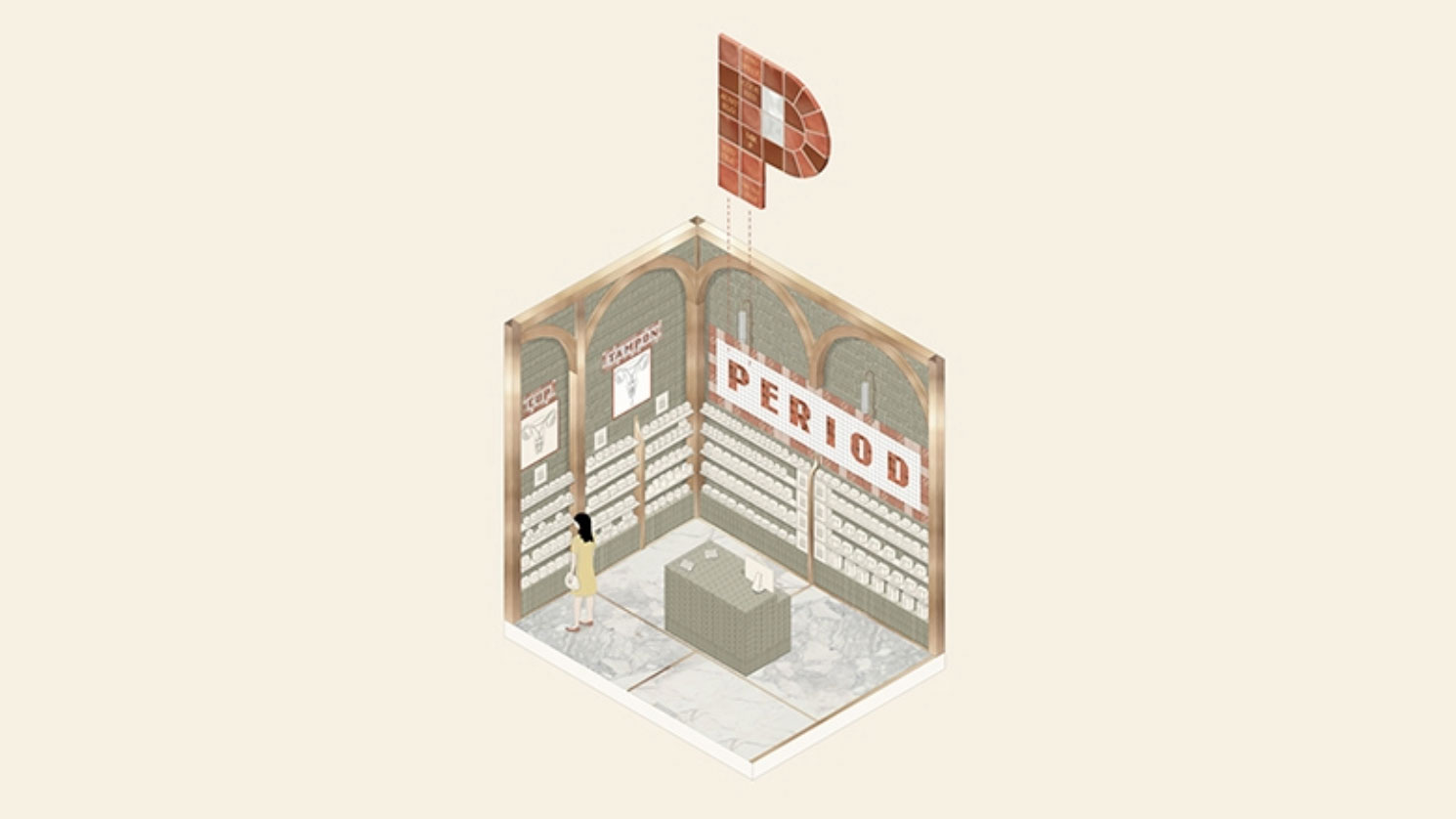
Designed by University of Westminster graduate, Ruth Pearn, The New Public Convenience: Hull’s Bath House and Lady Garden’ is a brilliant reimagining of Hull’s public toilets to benefit us all month-long. The building would include a launderette (praise be!), salon and clothes hire, as well as public toilets, baths and showers. The public convenience would be open and accessible to everyone to break down menstruation stigma.
In this dream public toilet, organic cotton tampons are recycled into compost to fertilise the plants. The composting process would also be used to heat up water for the building, with filters siphoning off wastewater for plants. These plants would be cultivated to produce essential oils for soap-making which can then be sold, with profits being reinvested into the building. Pearn’s design bagged her the AJ Student Prize in 2018 and the applause of plenty of women. We’re booking a one-way ticket to Hull with a pair of white trousers forthwith.
04. Circle Life
Devised by Taiwanese designers Chia-Yu Yeh and Yi-Xiang Lin, Circle Life is a sleek, wearable device for people with diabetes. The smart wristband integrates insulin patches with micro-needles and a non-invasive blood glucose sensor, allowing patients to monitor and manage their health on the go while reducing the need for (and pain from) injections.
Get the Creative Bloq Newsletter
Daily design news, reviews, how-tos and more, as picked by the editors.
The data gathered by the wristband is uploaded to the cloud, where it can be accessed by medical professionals or family members. Its charging stand also functions as a box to store insulin patches. The concept won the Red Dot Best of the Best award in 2016 and it’s not hard to see why. There are currently over 400 million diabetes sufferers worldwide, so we think this simple design deserves to be in on the world’s wrists pronto.
05. Campaign for Durex
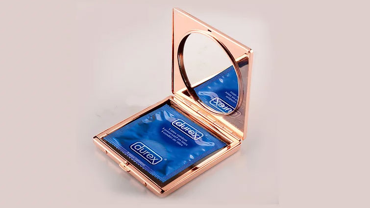
Estelle Carrington and Peter Heath, aka Estelle and Peter, responded to a 2019 D&D New Blood brief from Durex to encourage more young people to carry condoms. The pair came up with the idea of repositioning the contraceptive as part of health and beauty, not family planning – with the aim of making carrying a condom as normal as carrying makeup.
As only three per cent of women carry condoms, the campaign targeted women with the slogan: 'Find us in the makeup aisle'. The result is a fun, visually engaging campaign that sees condoms in powder compacts and johnnies as easy to come by as brow enhancer. You’re definitely worth it.
Read more:

Thank you for reading 5 articles this month* Join now for unlimited access
Enjoy your first month for just £1 / $1 / €1
*Read 5 free articles per month without a subscription

Join now for unlimited access
Try first month for just £1 / $1 / €1
