4 techniques to keep your tool at the top
Adobe reveals the secrets behind its ever-popular software.

Technology loves the new: the hot new app, the startup, the disruptor. But that obsession with what's fresh sometimes blinds us to the advantages of mature technology and companies: a user base that’s familiar with your product, a feature set honed by years of iterations, the resources that come from running at a profit. The trick is to maximise the advantages of mature technology while scraping off the barnacles that have accumulated on your hull over the years.
As chief product officer at Adobe, it's a challenge myself and the rest of the Creative Cloud team face every day. We have advantages that most startups would give up a major round of funding for: millions of customers worldwide; a feature set that includes virtually everything creative professionals need; plugins and partnerships that extend our apps' effectiveness.
But barnacles – we have a few of those, too. Some of our apps are complex and the learning curve can be steep. While more of our apps are going mobile, some are still desktop-only. And over many years of adapting code for different operating systems, hardware setups, and third-party plugins, bugs and performance issues crept into our products.
The Creative Cloud team is attacking those issues aggressively. I’d like to share some of the lessons we've learned along the way.
Not signed up for Creative Cloud? See our roundup on the best Adobe CC deals here.
Lesson #1: Empathy is everything
To improve your products, you have to listen closely to your customers, hear what frustrates them, what confuses them, what they wish they could do with your tools. And look closely at the data to get an overall view of users’ experiences.
Sometimes, that requires learning new skills. We’ve recently been training more members of our product team to engage directly with customers on social media so they can hear first-hand about both the pleasures and frustrations of using our tools. We also pay attention to media stories about our products and, especially, the reader comments attached to those stories. This feedback can sometimes be hard to read, but it’s all valuable.
Get the Creative Bloq Newsletter
Daily design news, reviews, how-tos and more, as picked by the editors.
If you don’t put in concentrated effort, you’ll hear only the loudest voices among your customers
Case in point: When we launched a new version of Photoshop on the iPad, some Photoshop veterans were disappointed that it didn’t include all their favorite tools and they let us know in online comments and reviews (read CB's Photoshop for iPad review and Photoshop 2020 review). We learned that we needed to be much more transparent about our intentions for Photoshop on iPad and we committed to a public roadmap for adding some of the most-requested additional features.
Effectively interpreting the data from your applications is an acquired skill, too. The problem today is never having too little data – it’s having too much. We’ve investigated and experimented to figure out which data points in the welter of information we have are most telling about our customers’ experiences.
The most important thing about empathy is remembering that it is work. If you don’t put in concentrated effort, you’ll hear only the loudest voices among your customers and that can lead you in the wrong direction.
Lesson #2: Pay attention to the First Mile
The First Mile of a product is everything that a new user relies on to get oriented: the welcome tour, the default choices, the explanatory copy, and more. Those elements are essential to newcomers' success and satisfaction with your product, so it’s bewildering that the First Mile is often given so little focus.
When we looked at the issue of our products' steep learning curves, we recognised two things. First, some of our tools are sophisticated, professional-grade products that will never be simple to pick up. But, second, we were inadvertently making things worse by not putting enough effort into the First Mile.

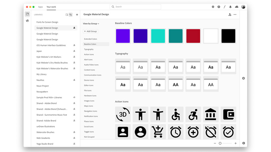
Over the past couple years, we’ve focused on the First Mile and we’re seeing some encouraging results. One great example is Creative Cloud Libraries. These collections of brushes, colour schemes, stock photos, and more are a great way to organise your own work and to create collaboratively with others. They weren’t used often enough, though, simply because they were hard to find and work in.
We rolled out a new version of our Creative Cloud Desktop application that brings Libraries front-and-centre and makes it easy to see their benefit. And we’ve seen a big spike in usage.
Examine all the things you take for granted and ask whether they'd be as obvious to someone who’s never seen it before
We've also recognised that sometimes a customer just needs to learn a new technique – they know that their photo is too flat, but they don’t know how to fix the problem. In Lightroom, we’ve introduced new interactive tutorials from master photographers that guide users step-by-step through common tasks, like balancing the light in a sunny portrait.
Want to work on your own First Mile? Start by examining all the things you take for granted about your product and ask whether those things would be as obvious to someone who’s never seen it before.
Lesson #3: Be prepared to rethink everything
When you first build a product, you build it based on the assumptions and technical limitations of the time. As time goes by, those baseline assumptions change, and you have to make sure your product changes along with them.
When we started building creative tools, only desktops were powerful enough to handle complex creative projects and local storage of files was the only option. Now, of course, mobile hardware has become so powerful that devices like the Apple iPad and Microsoft Surface are fully capable of running complex creative applications (see CB's pick of the best drawing apps for iPad).
Product leaders should think about expansion... as an opportunity for reinvention
The same is increasingly true for web browsers and the potential for web apps to generate industry-grade output. And network connections have become so fast that storing large files in the cloud is not a problem.
We’re working hard to take advantage of these developments with new products and features that expand Creative Cloud’s footprint, including Cloud Documents, creative files that live online to make it easy to collaborate and create anywhere; live co-editing of projects in Adobe XD, our interface design and prototyping tool; and Adobe Spark web apps that let you create social posts, videos, and webpages in a browser. And, of course, we launched the first version of Photoshop on iPad.

We’ve learned that large changes like that don’t just let you extend your product to a new platform. They give you an opportunity to engage new types of customers and completely rethink the way your product works. Building Photoshop for a mobile, touch-oriented device helped us completely reimagine the interface of this nearly 30-year-old application, making it more direct and intuitive.
And introducing Cloud Documents doesn’t just give people a new way to store their projects. It fundamentally changes the way people create and collaborate. Cloud Documents make it easy to start a project on one device, then finish it on another, or share projects with others to collaborate on or review.
We’re applying those lessons as we develop additional creative tools for mobile platforms. Last summer, Adobe Fresco, our new drawing and painting app, debuted on the iPad and we quickly brought it to the Microsoft Surface Pro X and Wacom MobileStudio Pro (read CB's Adobe Fresco review). Fresco is also fully compatible with Photoshop on both desktop and iPad. We’re currently developing an iPad version of Adobe Illustrator, a version that will also be interoperable with key Creative Cloud apps.
Product leaders often think about expansion to a new platform only as an opportunity to grow their markets. We should also think about it as an opportunity for reinvention.
Lesson #4: Don't lose sight of performance
All of your new features and other product improvements won’t mean much if your tools aren’t reliable and fast. No piece of software is perfect, but users have a baseline expectation for stability and performance and if you don’t meet it, they will look elsewhere.
Through listening to our customers, we realised we have more work to do to meet and exceed their expectations. To attack the problems, we’ve fundamentally changed how we build products. We’ve brought in new engineering leaders with fresh perspectives. We’ve set ambitious goals for reliability and performance. And we’ve significantly evolved our internal testing procedures and sped up our release schedules to rapidly squash bugs.
With mature technology platforms, you have a responsibility to ensure that your products remain accessible and high-performing
We’re starting to see real gains in both reliability and speed. In Photoshop, creating a new document, a process that used to take as much as six, finger-drumming seconds is now virtually instantaneous. Cloud Documents, after a rocky start, are now much more reliable. And you can work smoothly and fluidly with literally hundreds of assets in Adobe XD.
There are so many benefits to working on products like Creative Cloud with a legacy and a loyal base of users, and I know that’s true of many mature technology platforms. With those benefits, though, comes responsibility. A responsibility to ensure that your products remain accessible and high-performing. And a responsibility to never rest on your laurels and always look to the future.
Read more:

Thank you for reading 5 articles this month* Join now for unlimited access
Enjoy your first month for just £1 / $1 / €1
*Read 5 free articles per month without a subscription

Join now for unlimited access
Try first month for just £1 / $1 / €1
Scott is Chief Product Officer and Executive Vice President at Adobe.
