4 classic movie poster designs making a comeback
Including 80s neon and Saul Bass-style spirals.
Movie posters have come a long way over the years, with classic movie poster designs providing some of the most recognisable imagery of our popular culture. Think ET against the moon, Mrs. Robinson’s leg, Audrey Hepburn’s cigarette-slim black dress, Jaws spearing up through the water, an Alien egg glowing MacGuffin green.
Today, movie poster designs are more computer-enabled. The modern movie poster’s imagery is frequently the focus rather than the text, images are photographic more often than illustrated, and digital tools mean designers’ hands are untied from the restrictions of just the drawing board.
But some designers are looking back to styles popularised by classic film poster designs, and drawing from masters such as Saul Bass and Drew Struzan. Some are going even further back to the earliest movie poster looks, reinvigorating throwback styles by adding fresh elements.
Here are four classic design trends we’ve noticed are making a cool comeback in big screen posters.
01. Glossy composites
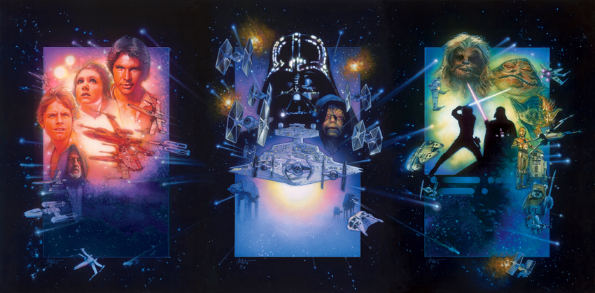
Drew Struzan's glossy composite style has returned. Even if you don't recognise the name, you'll have seen his work: Struzan was a hugely popular choice for film artwork in the 1980s. He designed over 150 movie posters, including all of the films in the Indiana Jones, Back to the Future, and Star Wars film series.
Struzan achieved his signature look by using a heavily gessoed illustration board, layering it over with airbrushed acrylic paint, touching up the details with coloured pencils on high- and low-lights, and then re-layering with the airbrush. (He used the gesso base layer to accommodate changes to the poster requested by the studio or client.)
It's easy to see why these glossy character composites have maintained their popularity. On its surface, it's a relatively easy strategy for movie poster designs: just make sure you have direct lines emanating from a centre point, and sock in as many important characters as you can around them.
Get the Creative Bloq Newsletter
Daily design news, reviews, how-tos and more, as picked by the editors.
Not much engagement with theme is needed when you can just print the well-known face of Harrison Ford front-and-centre.
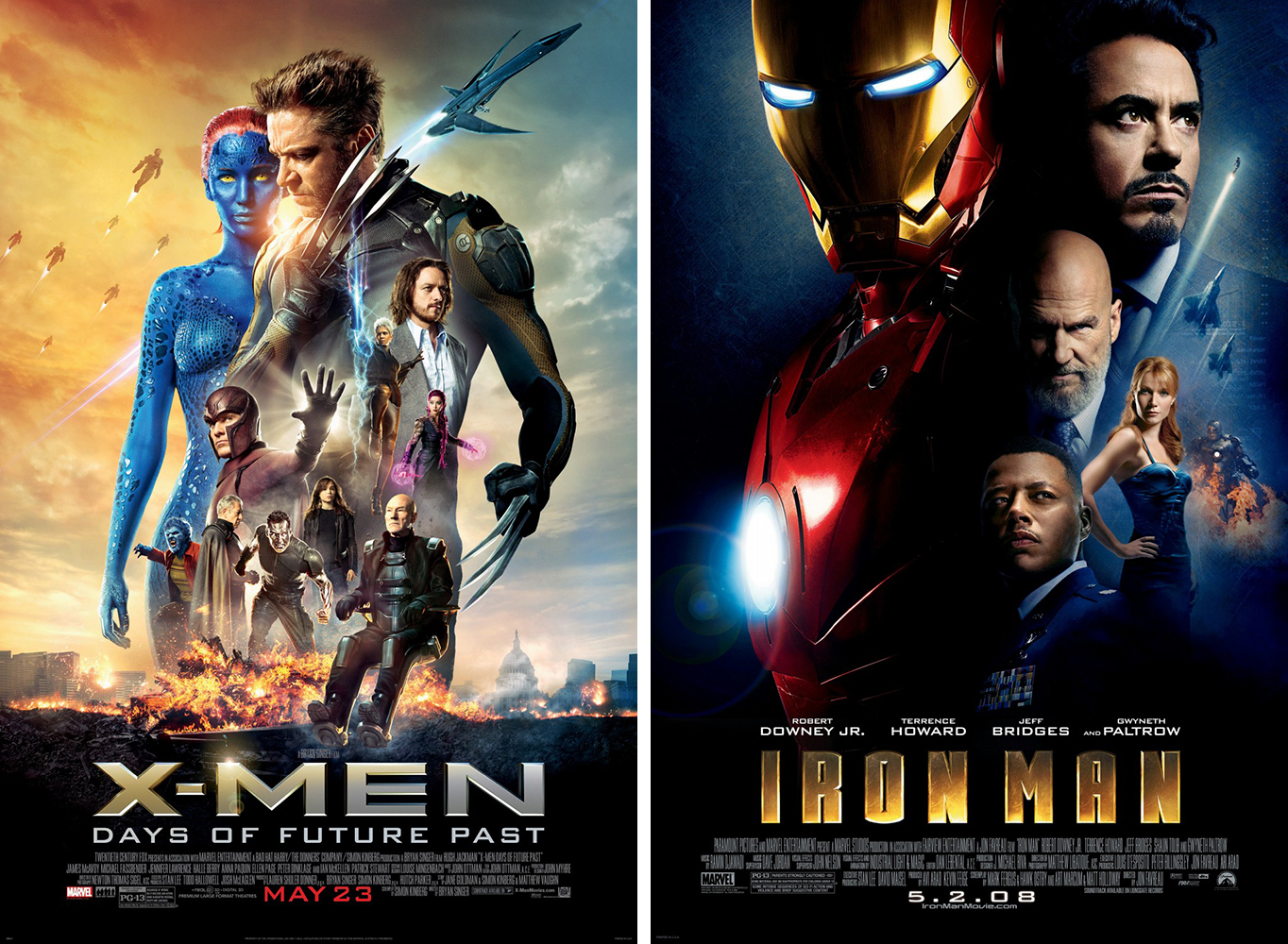
This might be why we’re seeing this mode used again lately, especially in star-studded movies whose main selling point is explosions plus cast list. Struzan's style seems to appear in every superhero movie, and is also still used within the Star Wars franchise.
Although when done without care, the composite look can appear lazy and confusing, there are those reviving it with grace. In other star-studded films, we’re seeing the character composite come back strong.
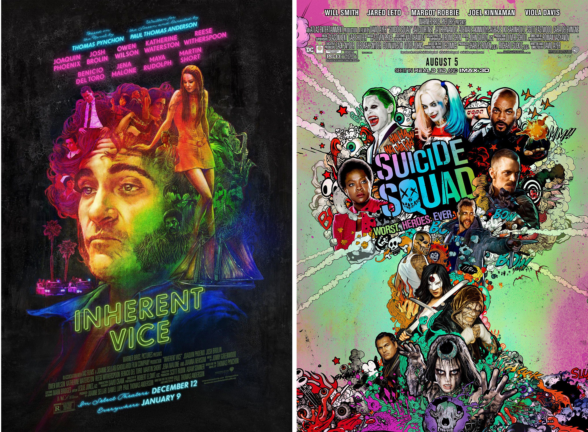
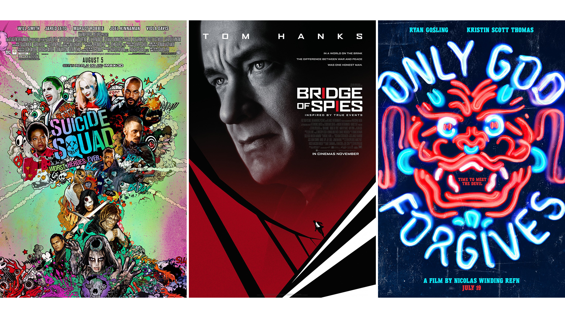
The poster for Inherent Vice mirrors the gessoed gauzy nature of Struzan , but adds a rainbow gradient as a nod to the psychedelic world that the film's characters inhabit. Suicide Squad also features a fun spin on the genre: the poster takes the character-composite-meets-explosion theme, and camps it up (if only the movie had been as inventive).
The poster for recent hit Baby Driver combines cast illustrations with a composite layout to create a fresh look. Finally, Thor: Ragnarok showed the other superheroes how posters should be done with its acid-toned, symmetrical design.
02. 80s pop neon

The wheel of design keeps on turning, and bringing back styles that we thought were long buried. Lately, the over-the-top colours and bright neon lights of the 80s are making a resurgence. It seem a lot of filmmakers must have been trendy preteens 30 years ago.
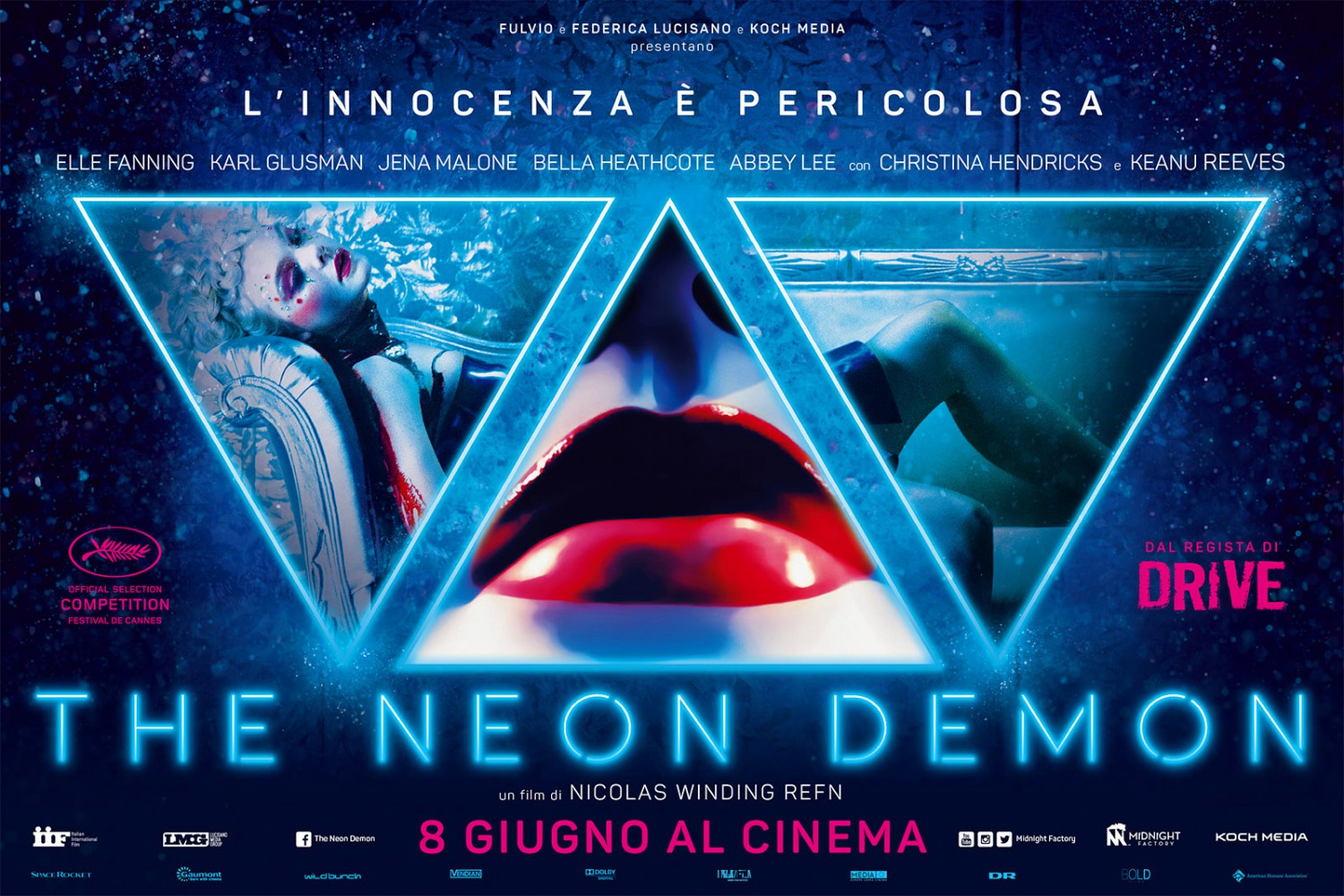
The movies of writer/director Nicolas Winding Refn are at the forefront of this trend, with movie posters that whole-heartedly embrace the 80s aesthetic. His brand is insistently rooted in the style.
He’s not the only one. Many recent movie poster designs have called back to the heyday of legwarmers and neon.
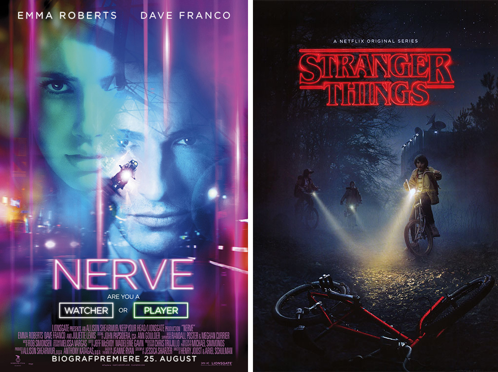
2016 techno-thriller Nerve was a blinding, flashing cacophony of neon, and the artwork for Stranger Things (not a movie, we know) is perhaps the ideal throwback, pitch perfect in its nostalgic tone, with just enough newness to bring the genre into the modern day.
03. Vertigo
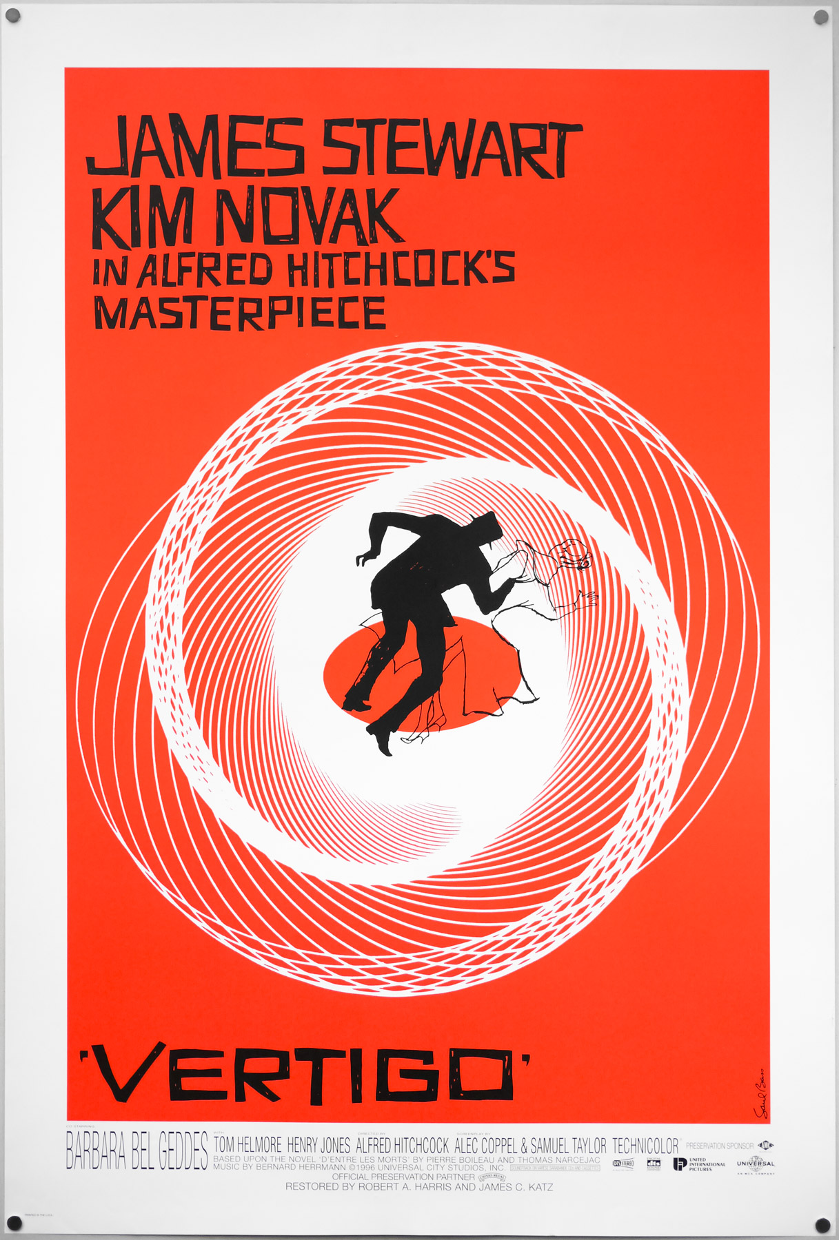
Saul Bass is a massive name in movie graphic design. Known for his blocky colours and silhouetted figures, he was a master of communicating theme through stark imagery.
One of his most iconic posters is for Hitchcock’s classic, Vertigo, wherein Jimmy Stewart begins to spin out of control, literally and figuratively.
This useful visual mechanism has been reemerging in recent years to represent central figures losing themselves. The style is characterised by that central figure struggling, running or seeking, surrounded by spinning or obscuring lines and blockages.
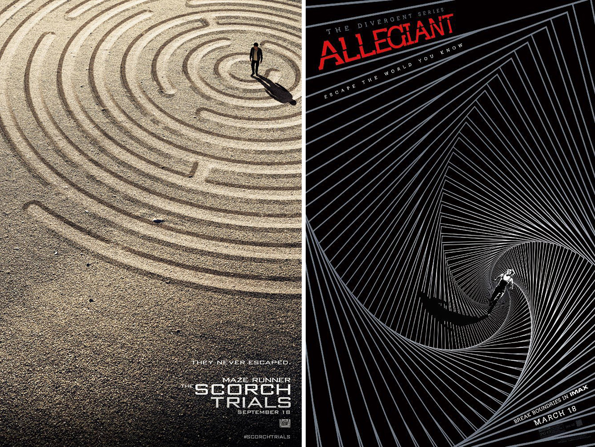
Designers everywhere are taking Bass’s trippy motif and adapting it to fit new genres. The poster for Maze Runner sequel The Scorch Trials features a literal maze trapping the main character, while Allegiant shows off a graphic, monochrome take.
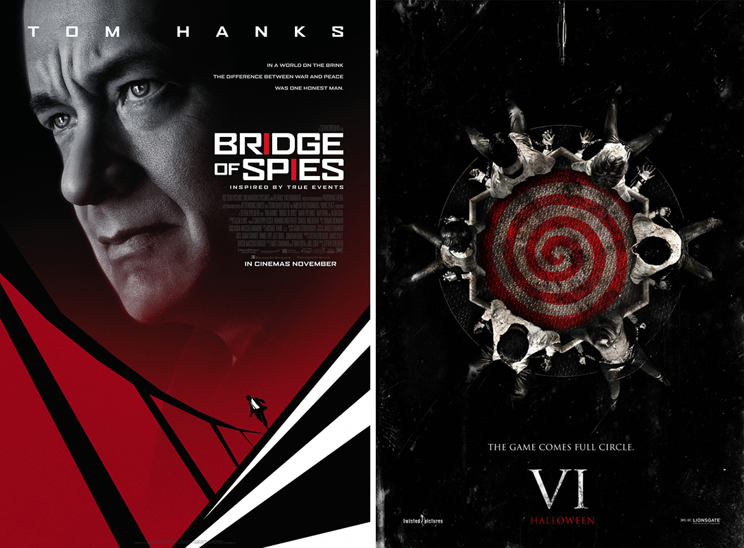
Tom Hanks sits atop the spiral as his silhouette runs for its life in the poster for Bridge or Spies, and the poster for Saw VI places the film's characters around the edge of a whirlpool-like spiral.
It’s a strong visual theme, and can be tweaked and adjusted to a film’s content with just a little creativity. No wonder we’re seeing designers pick the style back up and apply it with all sorts of fun twists and film-specific touches.
04. Big, blocky text
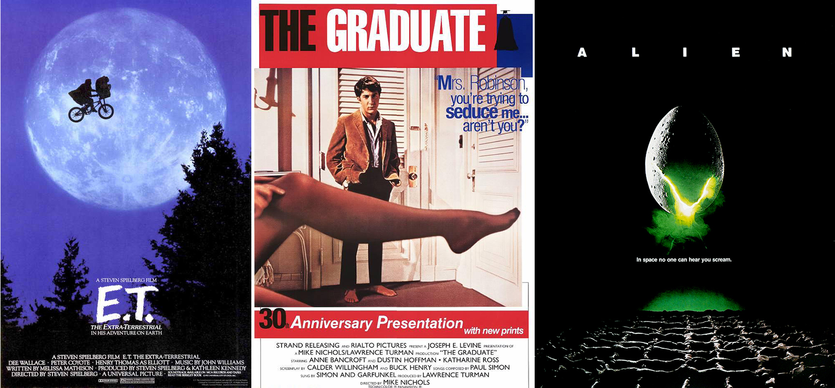
In classic movie posters, the name of the film typically took centre stage, often in the form of a blocky sans-serif title.
But in more modern times we saw a shift in approach, where designers started putting greater focus on the imagery, playing down, obscuring or even hiding the film name altogether.
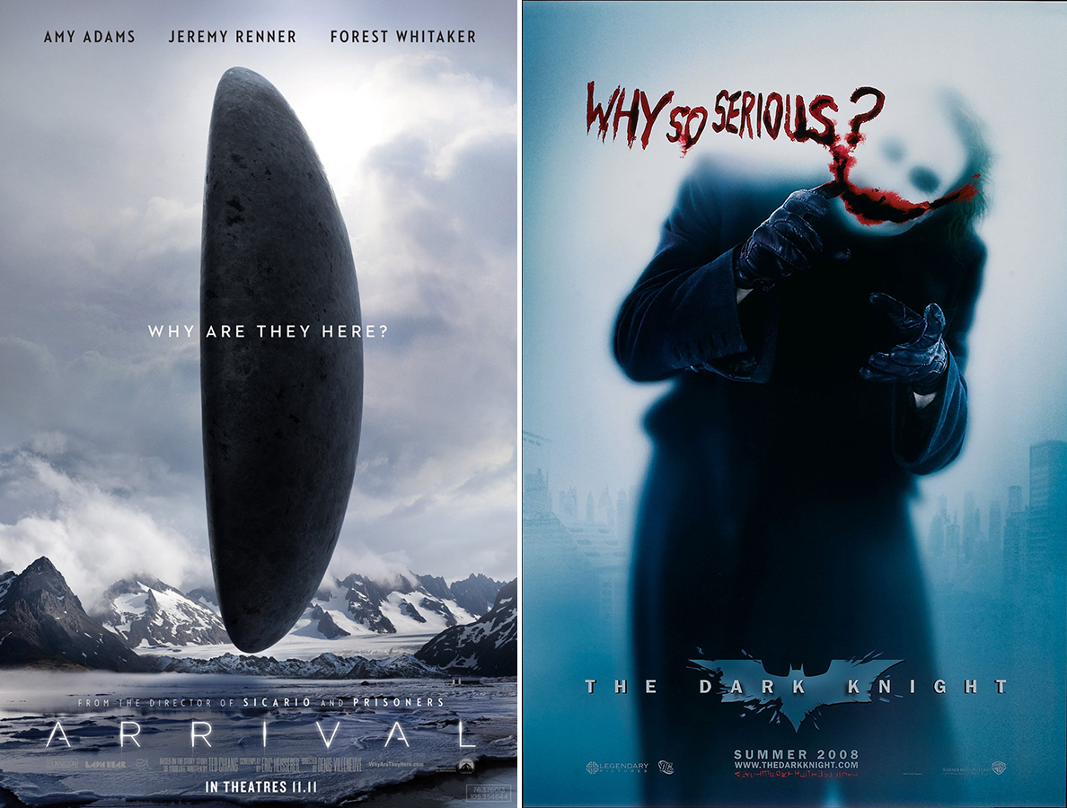
One of the reasons for this might be that with the advent of digital, designers can trust that the title will probably be included as a caption or linked to on a web page.
However, there's a new trend for harkening back to classic styles and putting the movie name front-and-centre again – more often than not in big, thick, sans-serif red text.
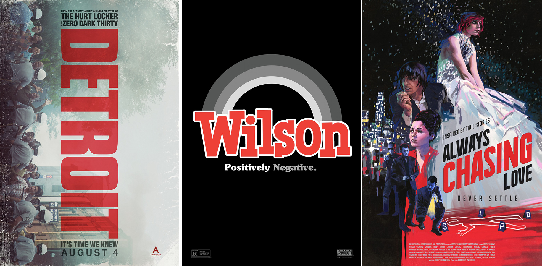
The poster for Always Chasing love looks like it came directly form the 1940s, for example, with illustration surrounding the chunky title. Detroit freshens things up by running the blocky title vertically down the design, and the poster for 2017 comedy Wilson is wilfully retro.
Coming back to big text-centric designs is interesting, since it’s more of a choice than a requirement, and designers are using these heavy, often red, slab texts very straightforwardly, as in the early movie announcement posters.
Focusing on text is an easy trend to follow, and a go-to when you don’t want to give too much of the film's plot away, or engage with the theme beyond announcing its existence.
Read more:

Thank you for reading 5 articles this month* Join now for unlimited access
Enjoy your first month for just £1 / $1 / €1
*Read 5 free articles per month without a subscription

Join now for unlimited access
Try first month for just £1 / $1 / €1
