3 top tools for testing web performance
2016 was the year of performance – here's how you can make your sites faster and leaner.
This year, as an industry we took big steps in dialing up the conversations about web page performance. A few focused changes can completely alter a site's performance, and every little bit – or rather, byte – is worth it. Performance matters because we're designing and developing for the user; so if it doesn't work for them, it doesn't work at all.
Site performance can be affected by a variety of elements, including network speeds, image sizes, non-minified resources, font file size, and the number of requests. Paravel developer Dave Rupert wrote not one, but two blog posts about how he tackled a lot of these issues on his own responsive site.
When it comes to JavaScript and CSS, including workflows with minifying and preprocessor options is a huge help. Even though line breaks and white spaces (tabs) aren't key culprits, if the project is large enough, they can be. If you're using external JavaScript libraries, opt for customised versions rather than a whole library for two functions.
Font hosting can also cause page bloat. One way to reduce this is by only including the type weights that have been used in your project. Keep to a few weights and consider other ways to push contrast and hierarchy.
Below, check out three tools that help you dissect your site and learn more about how long it takes to load.
01. Varvy's Page Speed Optimization
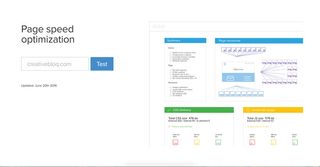
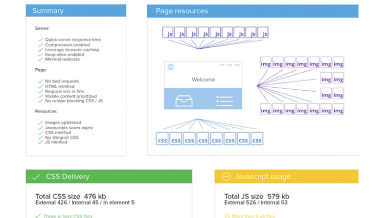
Varvy's Page Speed Optimization tool is well-organised, detailed and includes resources about the whys of performance to make it identifiable.
02. Pingdom
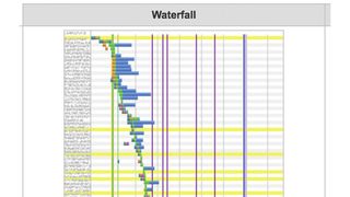
Pingdom's free option includes details on the waterfall load time of each element or request.
Get the Creative Bloq Newsletter
Daily design news, reviews, how-tos and more, as picked by the editors.
03. WebPageSpeed

WebPageSpeed is an extremely popular tool. It includes all those options listed so far, plus downloadable videos of how long a site and its elements took to download.
This article was originally published in issue 286 of net magazine, buy it here.
Related articles:

Thank you for reading 5 articles this month* Join now for unlimited access
Enjoy your first month for just £1 / $1 / €1
*Read 5 free articles per month without a subscription

Join now for unlimited access
Try first month for just £1 / $1 / €1
Sam is a designer living in Austin, Texas, who speaks and writes extensively about web and product design, diversity, inclusion, and equity. In 2011, she wrote the first university course on the topic of Responsive Web Design. She is currently Design Director at thoughtbot, and serves on several design advisory boards in Austin.
