20 ways to design better in Sketch
We reveal a selection of essential techniques, tips and shortcuts for the pro UI design tool.
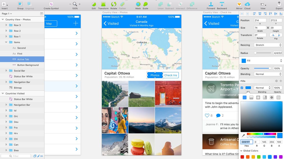
Sketch was first hailed as Adobe Photoshop's rival, then Adobe XD's rival, and now InVision Studio's rival as well. It's surprisingly resilient for an app that's never released a Windows version – although this might not seem so surprising when you learn both what it can do, but how it does it.
Sketch is an app for designing user interfaces, but its powerful, intuitive tools makes the design process so artfully smooth that you'll quickly understand why and how it paved the way for a new generation of design apps.
If you're creating a site, you'll need a website builder and our pick of the best web hosting service. Or, keep reading for 20 tips that will make you a power user in minutes.
01. Make your design collaborative with Libraries
Can other designers also use your symbols? Absolutely! Sketch Libraries are incredibly easy to use. All you need to do is to create the Symbols in a separate .sketch file, and then leave that .sketch file somewhere accessible, such as on Box, Dropbox or Google Drive (or check out our list of other cloud storage options).
Other designers can then import the Sketch Library into their Sketch documents by navigating to File > Add Library…. After that, symbols from that Sketch Library will be accessible via the usual Insert > Symbol method.
Sketch Libraries are a terrific way to enable design collaboration in teams. When the Sketch Library is updated, any .sketch file that's using that Library will receive a notification requesting if you'd like to update the document.
Pretty cool, right?
Get the Creative Bloq Newsletter
Daily design news, reviews, how-tos and more, as picked by the editors.
02. Test a responsive design using resizing
You have a container, which can be either a Group or an Artboard, and various layers inside that container. Let's say that this container is a website header with a floated logo and navigation – the logo floated on the left, and the navigation floated on the right.
When you resize the container, you want the logo to still be floated to the left, and the navigation to the right. Enter Resizing, where contained elements can be floated to a container edge, helping you to test responsive designs.
Once again, this all happens from the Inspector, under the Resizing tab. There are four possible locations that you can pin from:
- Left: object will be fixed to the left-hand side
- Right: object will be fixed to the right-hand side
- Right and top: object will be fixed the top and right sides
Pretty simple really, but there's a snag. When you resize containers ordinarily, the contained elements are resized accordingly. You can fix this by activating the Fix Width and Fix Height options, which will stop this from happening. Centralised objects will remain centralised as well. Magic.
03. Separate your projects by Page
After a while, your canvas will start to feel cluttered despite the fact that it's essentially unlimited. Large designs require organisation, which is why we can logically separate Artboards into different Pages.
The best way to organise Artboards into Pages is by platform. If you were designing, for example, an Android and iOS version of a mobile app, you could have a separate Page for each.
The reason for this, is that when you use prototyping and design handoff tools, you'd want to export the right Artboards to the right Project, so separating them in this way makes logical sense. With web designs, I typically create things like Symbols and logos on their own Page.
04. Automate your asset exports
Once you have defined your export options, you won't have to do that again. And this is true whether you're actually exporting image assets from Sketch or you're exporting to a design collaboration app, such as InVision, Marvel, Sympli or Zeplin.
Here's what you need to know: file format matters. SVG is better for the web because it's a vector format, which means that you can scale it up and down without losing quality. SVG formats are usually smaller in file size too, which makes webpages load faster.
We use PNG for mobile apps, although to cater for Retina/HDPI screens, we export images @2x and @3x, depending on the device that we're catering for. You can define as many options as needed, all at once.
Just click the Make Exportable button at the very bottom of the Inspector and list the different export options. And then, whenever you need to re-export, hit cmd + Shift + E. Your export settings will now be saved, but you will also be given the option to export only one, or some, or all of the layers you have chosen.
05. Organise image asset exports into folders
Developers don't want to sort through an entire folder of exported image assets, especially with large designs. Breaking them down into folders is more organised and we can do this from Sketch. Simply rename the layer using this format: 'subfolder/asset.png' to auto-create folders in your export.
Tip: did you know that you can drag a layer from the layer list onto your desktop to export it? It'll be a @1x PNG file by default.
06. Analyse colour contrast with the Stark plugin
Although it's not as trendy as concepts such as prototyping and animation, colour contrast is a big deal. Poor colour contrast results in limited accessibility, especially for users who have limited eyesight (something which affects 1.3 billion of us worldwide).
The WCAG (Web Content Accessibility Guidelines) sets worldwide standards for colour contrast, which can be somewhat difficult to understand for somebody that's never heard of them before.
The Stark plugin not only helps you to compare two colours against these WCAG 2.0 standards, to make sure that your contrast is sufficient enough, but also enables you to test your design against the eight different types of colour blindness.
The key things to check are when two backgrounds are adjacent to one another; buttons against backgrounds; and most importantly, text against backgrounds. Font size factors into this as well, as smaller text is harder to read, so considering that there's so much to think about here, Stark is handy to have in your toolbox.
Stark opens in a new window (Plugins > Stark > Show Stark). Press ↑ and ↓ to cycle through the types of colour blindness, ← and → to cycle through the Artboards in your document, or select two colours to analyse the colour contrast. Colour contrast is defined by two different levels/ratio (AA and AAA), and your colour contrast should be meeting at least the AA requirements.
07. Design handoff with the Zeplin or Sympli plugins
Design handoff is typically built into prototyping apps such as InVision and Marvel, but they are only available to teams with enterprise-level subscriptions. Smaller design teams (or solo designers) won't need design collaboration on that scale, so dedicated design handoff tools, such as Zeplin and Sympli, might be more suitable.
You'll have design hand-off and collaboration, but at the cost of prototyping features, which might be fine depending on the way you or your team does prototyping (because there are also paper prototyping and free tools, such as Craft).
Like most tools of this calibre, you can export screens from Sketch to Zeplin or Sympli using their Sketch Plugin. Both tools work largely the same way. With Zeplin, use cmd + ctrl+ E in Sketch to export screens; with Sympli, use cmd + Y.
Both apps let you tag screens for added searchability (useful for narrowing down screens in the handoff interface) and automatically collect image assets you've marked as exportable in Sketch, ready for the developer to implement them.
As with all competing tools, use the free trials and decide for yourself.
08. Combine shapes with boolean operations
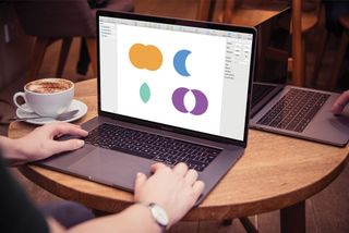
Boolean operations let us combine shapes to make new shapes.
Step 01: Creating two shapes
Let's use a circle as an example here. You can combine as many shapes as necessary with boolean operations, but for now we'll use only two. Create a circle, and then duplicate it (cmd+D) to create another circle. Make sure that they overlap, so that we can use one of them as a mask and see the effects.
Step 02: Select a boolean operation from the menu bar
As you can see from the Sketch menu bar, there are four boolean operations to choose from: Union, Subtract, Intersect and Difference. Union is the simplest of all the boolean operations, where the two shapes are combined to create a new shape.
With Subtract, one of the shapes eats into the other shape or shapes, subtracting from them. With Intersect, only the section where the shapes overlap will be visible. With Difference, it's the complete opposite, only the sections where the shapes don't overlap are shown. For simple shapes, this is often faster than creating them freehand using the vector tool.
Step 03: Make it clear which layer is the mask
As I said before, you can combine more than one shape with boolean operations. One of them has to be the mask, and this is the one that appears at the "bottom", as indicated in the Layer List. Combined shapes act like a Group once combined, so whichever one is lowest in the hierarchy is the mask. You can reorder these layers to change which one is the mask.
Note: boolean operations technically consist of paths and subpaths, but the concept of masking might make boolean operations feel more familiar.
Step 04: Learn the keyboard shortcuts for quick-access
Naturally, like everything else in Sketch, there are keyboard shortcuts that you can use to access these boolean operations faster:
- Union: cmd + ctrl + U
- Subtract: cmd + ctrl + S
- Intersect: cmd + ctrl+ I
- Difference: cmd + ctrl + X
If you have one of the latest MacBook Pros with a Touch Bar above the keyboard, these tools are also available for quick access via touch as well.
09. Create your own Sketch shortcuts
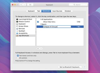
You can create your own Sketch shortcuts. To set your own Sketch shortcuts, head to macOS Preferences > Keyboard > Shortcuts > App Shortcuts > +, and then choose Sketch as the Application and type the menu command you want to define a shortcut for. For example, "Collapse All Groups" (cmd + ctrl + C) is a useful way to quickly clean up your Layer List! Add as many shortcuts as you need.
10. Define measurements with maths functions
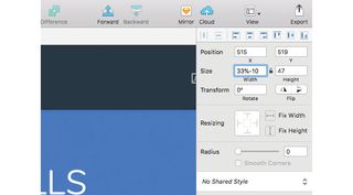
When specifying measurements with the Inspector, you can use maths functions to save you from having to do the calculations in your head. Say that you wanted a Rectangle to span the full width of an Artboard minus 20px on each side (i.e. a 20px margin), you could define the Width as "100%-40px". With a 320px Artboard, the Rectangle's width would then equal 280px.
11. Mimic CSS frameworks
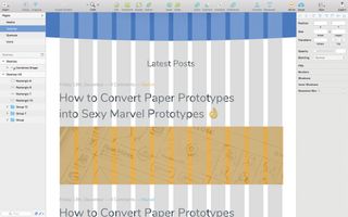
Web developers often use CSS frameworks such as Bootstrap and Foundation, which come with their own responsive grid systems. So to make designs more durable and flexible (and to protect development costs), designers using Sketch might want to replicate these grid systems using Layout Grids.
Navigate to View > Canvas > Layout Settings… to bring up the Layout Grid modal, then specify the numbers of rows and columns along with the overall width of the website container and any column/gutter widths. Layout Grids appear light grey on the canvas, although you can change this colour. Toggle them on and off with cmd + alt + L, your developer will thank you later!
12. Keep your common colours handy
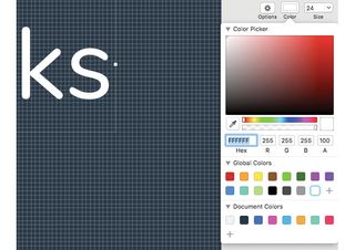
Colours are reused throughout a design for visual consistency. When used correctly, colours mean something to the user and so the UX is improved. It's typical to have a certain colour for the brand, the body text, the headings and so on, and we can save these colours in Sketch for quick-use, so that we don't have to recall hex/RGBA values from memory.
Whenever you're inside the colour chooser widget and you have the desired colour selected, click the "+" icon underneath "Document Colors" to save it to the document swatch. If you add colours to the "Global Colors" swatch, they'll appear in all Sketch documents. Drag the colours out of the colour chooser widget to remove.
For more on using colours effectively, see our post on colour theory.
13. Prototype like a pro
Prototyping and design collaboration is all the rage right now. The ability to see your designs come to life with interactive hotspots, dynamic components and animations before development has even begun, is not only fun to watch, but lets teams and stakeholders test user experiences and leave feedback early on.
Being able to iron out the majority of creases before the user even experiences the app or website ensures that your conversions are higher, your customer complaints are lower, and your product launches have more impact.
One of the best ways to prototype directly in Sketch is arguably the Craft plugin by InVision, which supercharges your design process in a number of ways. Here's the rundown:
- Provide your design with realistic dummy data.
- Source stock images for your content.
- Duplicate content vertically and horizontally.
- Create shared design libraries that are stored in the cloud.
- Enter Freehand mode for discussion and collaboration.
- Make your designs dynamic and interactive.
- Sync all of this into the core InVision App.
- Enable handoff, so developers can inspect design styles.
Craft exists as a vertical sidebar alongside the Inspector in Sketch. Despite its many features, the UI is fairly easy to use.
Marvel is another prototyping app that has a Sketch plugin. Although it only serves as a way of exporting designs into the core Marvel app, there are some benefits of using Marvel over InVision. Although it's not as flexible as InVision – which has more prototyping features, for example – the learning curve is smaller and the Marvel interface feels simpler than InVision's.
Give both a try, they're fantastic!
14. Use time-saving shortcuts

You might be surprised what you can do with Sketch using only the keyboard. Many of the tools are single-letter shortcuts, and repetitive, mundane tasks are something of an urban myth now. Once again, here are the shortcuts you'll love:
- Rectangle: R
- Oval: O
- Line: L
- Text: T
- Artboard: A
- Edit mode: Return
- Move up in hierarchy: esc
- Change opacity of object: 0-9
- Rename: cmd + R
- Export: cmd + Shift + E
- Zoom in/out: cmd and +/-
Cmd/Alt/Shift combos
- Group: cmd + G
- Ungroup: cmd + Shift + G
- Move object: ↑→↓←
- Resize object: cmd + ↑→↓←
- Move object by 10px: Shift +↑→↓←
- Resize object by 10px: cmd + Shift + ↑→↓←
- Click through to Object in Group: cmd+left-click
- Activate Smart Guides: alt
- Smart Guides with click-through: cmd + alt + left-click
- Move object up/down in hierarchy: cmd + alt+↑↓
- Increase/decrease font size: cmd + alt and +/-
- Align left: cmd + Shift+{
- Align centre: cmd + Shift+|
- Align right: cmd + Shift+}
Minimise your workspace
What always frustrated me about Adobe Photoshop was how bloated and cluttered it felt. It was a multidisciplinary tool, used for both design and art, so it's no wonder really.
Sketch, by contrast, is focused on UI design, so not only is it minimal by default, but you can toggle the toolbars on and off with a quick shortcut. This is useful for creating more space on the canvas when needed, or when you need to enter the "Just show me the design" mode.
These are the Sketch toolbar shortcuts that you need to know:
- Show/hide Toolbar (at the top): cmd + alt + T
- Show/hide Layer List (on the left): cmd + alt + 1
- Show/hide Inspector (on the right): cmd + alt + 2
- Presentation mode (hide everything): cmd +.
You shouldn’t forget about these shortcuts either:
Slice: S
Creates a rectangular selection that can then be exported, which is useful for highlighting or screenshotting key sections. Be sure to activate the Trim Transparent Pixels option in the Inspector to remove any whitespace from your Slices.
Vector: V
Vector tools are there to help you freehand draw totally unique shapes – icons or illustrations, for example. You can use 1, 2, 3 and 4 on the keyboard once focused on a vector point to change the point style from the default Straight style, to Mirrored, Asymmetric or Disconnected.
Mask: cmd + ctrl + M
When a shape is used as a mask, it redefines any content that overflows that shape. One example of this could be when you need a square image to fit inside a circle – the circular mask hides the 90-degree angles of the square image. Handy.
15. Reuse components with symbols
Colours aren't the only thing that we can reuse. In fact, we can reuse entire components. Take a main navigation, for example – you'll use that on most (if not all) screens, right? If you made a change to it, you'd want that change to be universal, right?
This is where symbols come in.
Select the component that you want to make reusable and then click Create Symbol from the toolbar at the top. After that, navigate to Insert → Symbol and then click anywhere on the canvas to insert it.
You can choose to store the master instance of the symbol on a separate page, away from the main design. This is the instance of the symbol that you edit when you want to make a universal change to it. Double-clicking on any other instance from the main design will redirect you to the master instance anyway.
16. Nested symbols and symbol overrides
You can also embed an SVG image into the page in CSS, using the same method as you would to attach any other kind of image to an element.
By using the SVG this way we can take advantage of the other CSS background properties allowing us to size, position and repeat our image as the background of an element.
To provide support we can use a trick in the way CSS is parsed by the browser and provide a fallback PNG right before we include our SVG.
17. Maintain design consistency with Shared Styles
And finally there are Shared Styles, which are like Symbols but for layers. Consider your heading styles, button text styles, body text styles and so on – the styles that you'll reuse time and time again. Shared Styles are created in the Inspector.
To create Shared Styles, select the layer in question and then click the 'No Shared Style' dropdown from the Inspector (or 'No Text Style' if it's a text layer). Then, choose 'Create new Text/Shared Style' from the list of dropdown options, then give it a meaningful name (such as 'Largest Heading', for example).
Flexibility comes more naturally with Shared Styles than it does with Symbols, where you can simply change what you need to change in one instance of a Shared Style and those changes won't sync with the other instances automatically. The change is a manual one, where you'll need to hit the sync icon in that same drop-down menu.
By not hitting the sync icon here, you are making a singular change to an otherwise visually consistent Shared Style.
18. Live preview your designs with Sketch Mirror
When mobile apps and websites are designed to be used by thumbs, it makes sense to test them with thumbs, which is exactly where Sketch Mirror comes in very handy. We need this to bring our designs off the big screen, and onto the little screen.
With Sketch Mirror for iOS, you can preview your Sketch artboards on your iOS device. Click 'Mirror' from the toolbar, then select your device from the list of options. If you can't see your device, make sure that you have Sketch Mirror open on your device and that they're both on the same wireless network.
Tip: swipe right on the iOS Control Centre and tap the Record icon to record a user test or create a video demonstration, which you can then send to your teammates – or anyone else – in a quick message!
19. Create that smokey iOS blur
When designing mobile apps for iOS, you'll often use a lot of their native UI elements and visual concepts, one of which is the smokey blur that appears as a backdrop to reduce visual distraction from any background elements. This effect blurs out the background when the Control Centre is open, for example.
You can create this effect by selecting the 'Background Blur' option from the Inspector. It should be noted that this doesn't work if the opacity of the Fill is 100%. The lower the opacity, the greater the blur effect.
Background Blur differs from Gaussian Blur in that with Gaussian Blur, the edges of the blurred background are blurred too.
20. Use Sketch Cache Cleaner

Sketch users often complain that .sketch files take up a lot of space on their computers. Here's what you can do to get around that problem.
Delete the Sketch cache to save space
When a .sketch file is automatically saved as a backup, the new cached version doesn't overwrite the old cached version. Each cached version is stored somewhere safe, which is what enables Sketch's native version control features. While this is useful for those needing to roll back to an earlier version of their design sometimes, those versions eventually end up stealing all of your megabytes (or gigabytes). Sketch Cache Cleaner is an independent app that deletes all of these versions when this cache becomes too large. Of course, you can turn off version control in Sketch's Preferences, but sometimes it's useful.
Instead, clean the cache only when you're sure there's nothing you'll need from it. If you're using a version control app such as Abstract or Plant, then in that case it would serve you well to turn off Sketch's native version control.
Reduce the size of sketch files
Even Sketch files themselves can become quite large, but Sketch now has a built-in feature that reduces their file size, which you can find at File > Reduce File Size. Some designers say that Reduce from the Flawless App team is a little more efficient at this though, since it retains the colour quality better. Reduce is free to download and sits in the macOS menu bar, making it quick and easy to access at any time.
Keep things organised
Generally speaking, getting in the habit of cleaning up your .sketch documents as you design (or at regular intervals), will reduce their file size. By that I mean removing any redundant layers, Ungrouping (cmd + Shift + G) any redundant Groups, and basically making your documents clean and easy to read.
This not only benefits your file sizes, but also makes your work readable for anybody that views it after you, which might include developers who are inspecting your work so that it can be converted to code, or even another designer that you might be collaborating with on a large design.
This article was originally published in a 2017 edition of creative web design magazine Web Designer, and has since been updated. Subscribe to Web Designer here.
Related articles:

Thank you for reading 5 articles this month* Join now for unlimited access
Enjoy your first month for just £1 / $1 / €1
*Read 5 free articles per month without a subscription

Join now for unlimited access
Try first month for just £1 / $1 / €1
Previously a design blog editor at Toptal and SitePoint, and before that a freelance product/UX designer and web developer for several years, Daniel Schwarz now advocates for better UX design alongside industry leaders such as InVision, Adobe, Net Magazine, and more. In his free time, Daniel loves gaming, café culture and Wikipedia, and also travels perpetually when there isn’t a pandemic.
