2019's illustration trends to know about
Whether you're creating or commissioning, discover this year's must-have looks.
Nothing ever stands still in the creative industries. Regardless of the field, the next big thing is destined, sooner or later, to become old hat, thanks to a mix of over-exposure and a never-ending influx of new ideas and styles ready to grab people's imaginations. If you want your work to feel fresh, you need to at least have an eye on the current illustration trends.
As one of the world's leading stock content marketplaces, iStock by Getty Images is perfectly placed to track the latest illustration trends, and have identified 10 key techniques employed by this year's hottest imagery. While nobody wants to blindly follow trends in their work, there are plenty of visual approaches here that you can incorporate into your illustrations – and even combine with one another – to give your portfolio a touch of the cutting-edge.
01. New retro wave colour palette
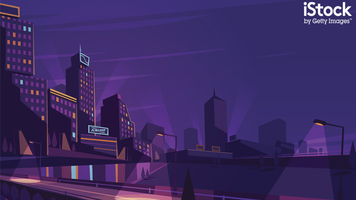
The visual style of the 1980s has never been more in demand. There's always a much-loved TV show or film from the decade being remade, loads of videogames are going for that irresistible retro look, and part of that is the new retro wave colour palette: dramatic and bold with the saturation levels turned way up. The key colour is a retina-searing ultraviolet, graduating to hot pinks, neon oranges and buttercup yellows; these palettes are everywhere right now, dominating abstract backgrounds and bringing futuristic landscapes to life.
View more of the trend here.
02. Flat and funky figures
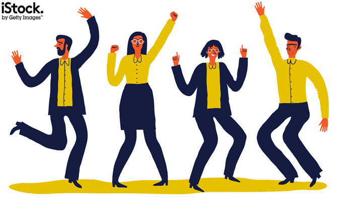
If you've looked at any startup's website lately, you can't have escaped the sight of cartoon figures drawn in an organic, naïve style to illustrate a company's services, products or values. iStock calls this style 'flat and funky' – chunky proportions, loose and rubbery limbs, and flat colours to create figure drawings that are fun, charming and whimsical. If drawing people is your thing, taking this approach is a great way to ensure demand for you work.
View more of the trend here.
03. Hyper-realistic shading

Thanks to advances in vector editing tools there are more options for shading than ever before, and clued-up illustrators are taking advantage of these improvements to create an amazing impression of depth in their work. By using complex shading techniques such as gradient meshes and blends, it's possible to give your vector illustrations a stunningly realistic illusion of depth that makes the viewer feel like they're looking at 3D renders. So step away from the drop shadow and basic gradient tools, and start being cleverer with your shading.
Get the Creative Bloq Newsletter
Daily design news, reviews, how-tos and more, as picked by the editors.
View more of the trend here.
04. Warm meets cool
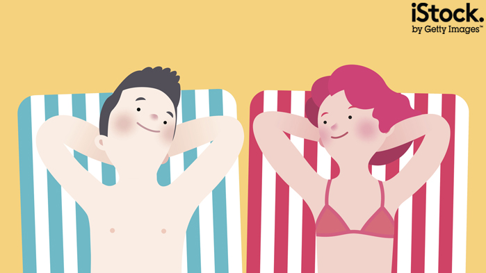
A little bit of contrast can do an amazing job of catching the viewer's eye, and a great way to achieve this effect is by combining warm and cool colours. By rendering the object of your illustration in warm tones and placing it against a cooler background you can instantly draw people's attention to what you want them to see. And right now there are plenty of illustrators using this technique, only with a subtle, modern palette that leans toward pastel hues rather than brighter, more saturated tones. The end results are just as impactful, but they're more sophisticate and modern-looking.
View more of the trend here.
05. Isometric perspectives

Often used in technical and engineering drawings, isometric perspective is also a look that was popular in the early days of 3D video games in the 1980s, so it's not entirely surprising that the isometric look is enjoying a revival, used in everything from cityscapes to interface icons. It's an appealing way of representing 3D because you don't need to worry about perspective and vanishing points, which makes it easier to adjust your composition without having to resize everything, and the end results are always striking.
View more of the trend here.
06. Fluidity
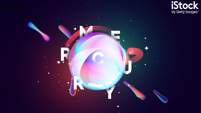
Those hyper-realistic shading effects we mentioned earlier? One place you can see them in action is in the preponderance of liquid effects in illustration right now, giving static imagery a glorious sense of movement. Rigid geometric shapes flow into each other and blobs of super-saturated plasma float in mid-air, sometimes combined with straight edges to provide an element of contrast. Perfect for icons and abstract backgrounds, it's also an excellent way of enlivening typographic compositions.
View more of the trend here.
07. Not-so-flat design
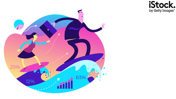
Everyone knows about flat design these days; you can't look at your phone without being confronted by an array of simple, flat icons lacking in shading, detail and perspective. And while flat design doesn't seem to be on the way out just yet, as screen resolutions have improved it's started to evolve. The new not-so-flat design makes the most of techniques such as gradient shading, texture and perspective – especially on-trend isometrics – and colour palettes have moved on too. It's less about vintage hues and more about in-your-face, saturated colour schemes: rich blues and violets and punchy neon shades, for a bold and cheery look.
View more of the trend here.
08. Metallic textures
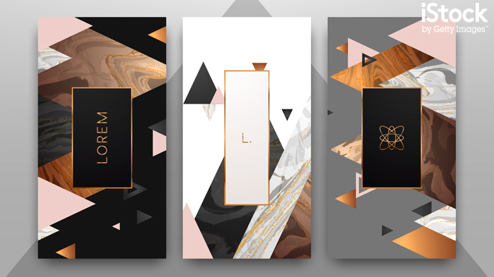
Another look that saw plenty of use in the materialistic 1980s, metallic effects are the ideal way to give illustrations a luxurious, glamorous feel, along with enough sparkle to grab people's attention. Modern use of metallics has evolved from cold but shiny gold, chrome and bronze; these days they're given an extra textural bite – think glitter, paint and foil – and unexpected colours are brought into play. We're all familiar with rose gold, but along with white gold and even green gold these are fabulous ways of giving metallics a fresh look.
View more of the trend here.
09. Pearlescence
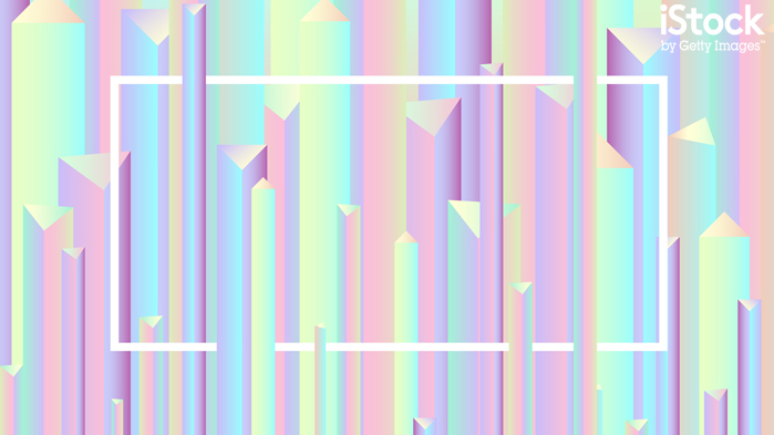
True pearlescence – a multi-dimensional effect that reveals different colours depending on the angle you're looking from – is only really an option if you're working in print and can call upon pearlescent inks. But a simulated pearlescent effect can be just as striking, and it's an easy one to achieve using gradients and pink, blue, yellow and green pastel shades, transforming flat colours into flowing fields of light that give any composition a mesmerising and dynamic edge.
View more of the trend here.
10. Glitch
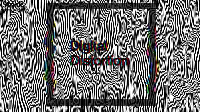
Finally, an ever-popular look that keeps on evolving as technology progresses. Glitch effects used to be inspired by analogue technology – the snowy white noise on a badly tuned TV set or the visual distortion caused by bad video tracking or a broken vertical hold. And while these are still great effects, today there are some equally lovely digital glitches to be used as well, such as corrupted JPG data, overdriven chromatic aberration and datamoshed video distortion. While you don't want to overdo these effects, a little bit of glitch dirtying up a clean vector image can add heaps of visual interest and give your work a touch of retro cool.
View more of the trend here.
Now that you know the latest trends to follow, you can create content that customers want. Visit iStock by Getty Images and explore millions of illustrations and vectors that always reflect the current trends. In addition, you can save 10% off any credit pack with code ISTOCK10 or 15% off any annual subscription with code ANNUAL15. Simply add the code at checkout before 30 September 2019.

Thank you for reading 5 articles this month* Join now for unlimited access
Enjoy your first month for just £1 / $1 / €1
*Read 5 free articles per month without a subscription

Join now for unlimited access
Try first month for just £1 / $1 / €1
Jim McCauley is a writer, performer and cat-wrangler who started writing professionally way back in 1995 on PC Format magazine, and has been covering technology-related subjects ever since, whether it's hardware, software or videogames. A chance call in 2005 led to Jim taking charge of Computer Arts' website and developing an interest in the world of graphic design, and eventually led to a move over to the freshly-launched Creative Bloq in 2012. Jim now works as a freelance writer for sites including Creative Bloq, T3 and PetsRadar, specialising in design, technology, wellness and cats, while doing the occasional pantomime and street performance in Bath and designing posters for a local drama group on the side.
