11. Understanding typographic hierarchy
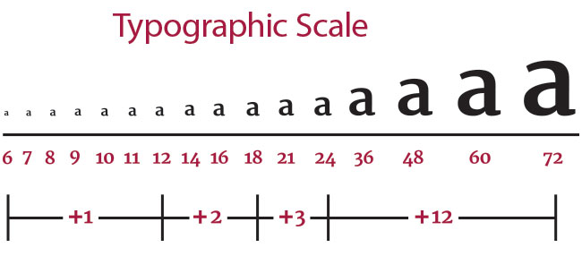
Typographic hierarchy is a system for organising type that establishes an order of importance within the data, allowing the reader to easily find what they are looking for and to navigate the content. This article offers a simple example and explains how you can achieve typographic hierarchy in your own designs.
12. How to achieve better typographic hierarchy in web design
If you can’t put your finger on why a web design isn’t working, the odds are good that it’s an issue with your visual or typographic hierarchy. This article offers six tips for designing online content that people will actually want to read.
13. The rules of responsive web typography

Responsive web typography is tough – you need to have both design chops and technical know-how. This article explains all the principles and systems you need to know to take the mystery out of responsive web typography.
14. Control web typography with CSS font
The way a browser loads your fonts has a big impact on the performance of your website. This article explains the different ways to tell the browser do it, and which to use when.
15. Master accessible web typography
Readability of content is probably the main goal for almost every website. To this end, Fontsmith has worked with Mencap to research, test and design accessible typefaces for those with disabilities. In this article, we present some of their findings.
16. How accessible is your typeface?

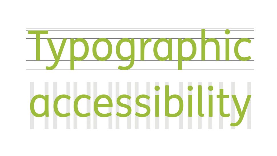
Accessible typography gets your message across smoothly, and makes it more legible for people with learning difficulties. This infographic from Fontsmith explains how designers can gauge the accessibility of their typefaces.
17. Font design: Top tips
Where exactly do you begin if you want to make your own font? If you're a designer or illustrator new to this discipline, this article explains the first practical steps, the common software you can use and the early considerations to get you going.
Get the Creative Bloq Newsletter
Daily design news, reviews, how-tos and more, as picked by the editors.
18. The 10 commandments of typography
Learning typography is as much about what you shouldn’t do as what you should. This article looks at common type mistakes, how you can avoid them and some suggestions for further reading along the way.
19. Typography tricks every designer should know

Want to push your typography skills further? This article shares 10 typography tips and tricks from professional designers that you can use to boost your design skills and impress friends and colleagues.
20. Top-quality typography tutorials
This post brings together the web's best typography tutorials, all in one place. You'll find typography tutorials on adding colour to your type, designing text effects, making a typography poster, illustrative typography, and more.

Thank you for reading 5 articles this month* Join now for unlimited access
Enjoy your first month for just £1 / $1 / €1
*Read 5 free articles per month without a subscription

Join now for unlimited access
Try first month for just £1 / $1 / €1

Tom May is an award-winning journalist and editor specialising in design, photography and technology. Author of the Amazon #1 bestseller Great TED Talks: Creativity, published by Pavilion Books, Tom was previously editor of Professional Photography magazine, associate editor at Creative Bloq, and deputy editor at net magazine. Today, he is a regular contributor to Creative Bloq and its sister sites Digital Camera World, T3.com and Tech Radar. He also writes for Creative Boom and works on content marketing projects.
