The ideation and wireframing stage of any design enables you to consider the layout and user experience from the very start of your project. By only using the core components for your web design — header, footer, navigation, buttons — to begin with, you can always ensure your focus is on the user, without getting distracted by which colour palette to use.
There are plenty of wireframing tools out there, but today many web teams use Sketch. Its usability and unrivalled speed make it the obvious choice.
Starting with the header, what do we need if we are approaching this project mobile first? Is the logo the main focus? Should we consider using a ‘burger’ navigation to ensure best practice? These are the questions any designer should keep asking themselves throughout the process when building their wireframe components and creating a page design, and here's how to address these questions, and more, using Sketch. Want different site build tools? Consider using a website builder or weigh up your web hosting options.
Click the icon in the top right of each image to enlarge it

Wireframing in Sketch
01. Build the components in Sketch
The first steps should be to create an artboard for mobile or desktop, and begin to build the components on the page with simple shapes, in order to define the outline of the components, like the header.
Too many colours can be distracting, so minimise your colour palette to clearly define important elements in your wireframes. Highlighting the important stuff (call-to-action buttons, header text) with bolder colours is a subtle yet effective way of creating a visual hierarchy when sharing the designs with colleagues and clients (share easily with decent cloud storage).
For example, within the header, inserting a logo and navigation in a bold blue colour, on a pastel blue background, will present them as the important elements in your component.
Get the Creative Bloq Newsletter
Daily design news, reviews, how-tos and more, as picked by the editors.
It’s also worth noting that it’s possible to update the link colours in your Sketch preferences, just in case there is a colour clash in a design with the default orange.
02. Use a grid and guides
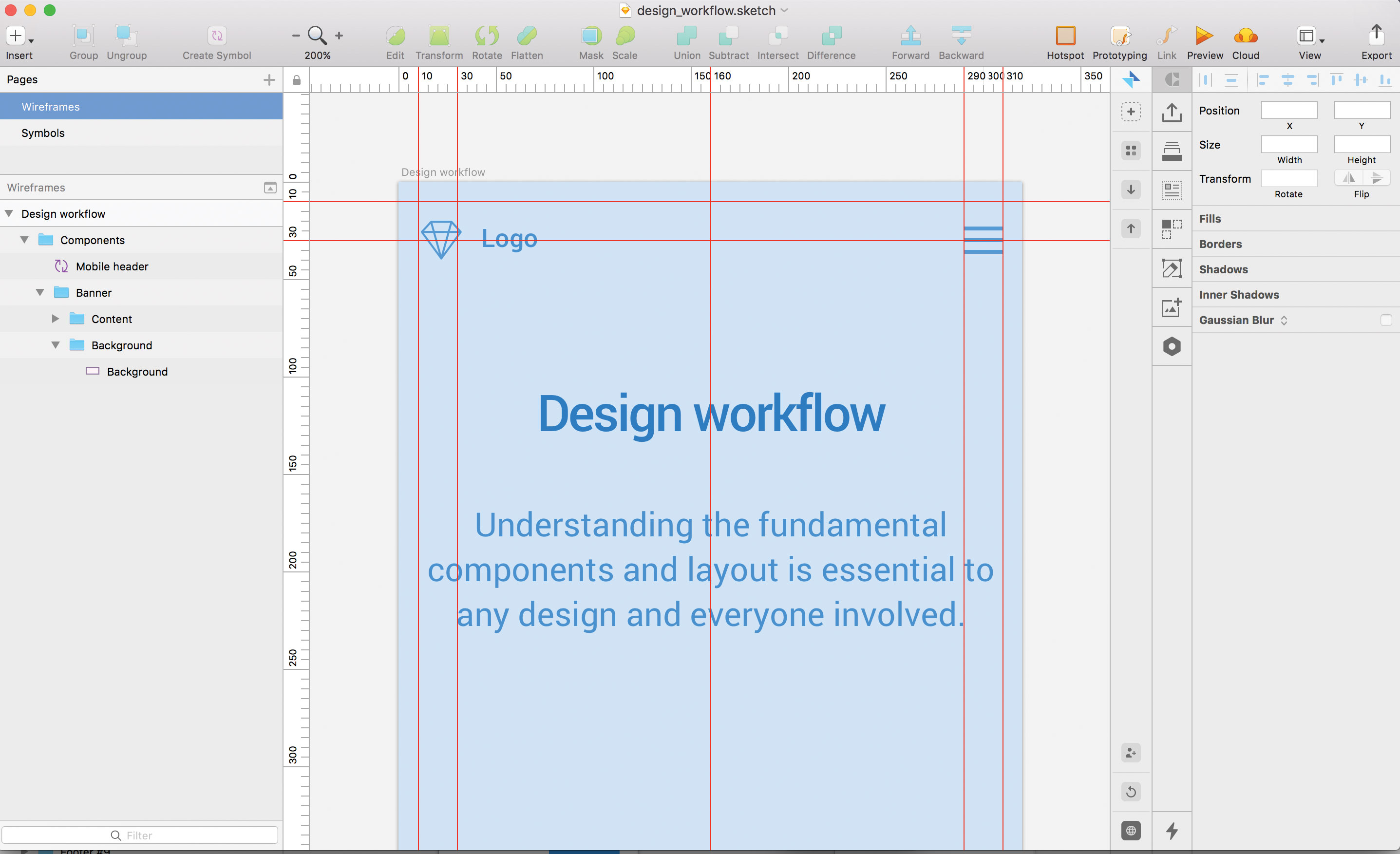
It’s also important to consider a grid system, padding and margins as soon as possible when defining the wireframes. Show rulers in a Sketch file by going to View > Canvas > Show Rulers (or ctrl+R). Clicking on these rulers (down the left and above your artboard) will create guides, which in turn saves a lot of stress when sharing designs, as consistency is key when defining a design system.
03. Create symbols in Sketch
Planning to use these components in more than one artboard? Why not create a symbol? Symbols are the best feature in Sketch by far, they act as super-components that update all the artboards they currently sit in. To create a component, right-click an element, and choose Create symbol. This will be saved into one packaged item manageable from the symbols page.

Improve your Sketch prototypes
04. Add animations in Sketch
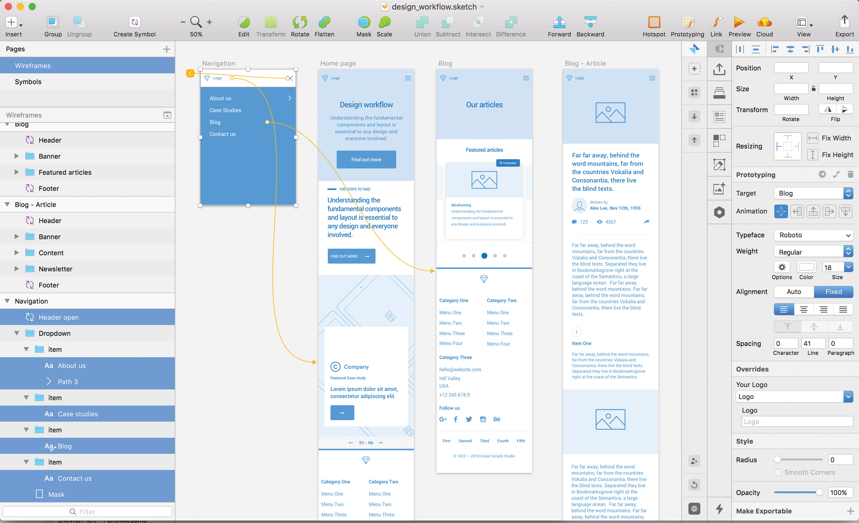
Underneath the target area on the right-hand panel there is the option to add animations between your artboards. Using animations is a great way to add more life to your prototype. However, the current options are more tailored towards app prototypes, and don’t offer much flexibility if demonstrating a website design. That said, it’s expected the list will grow in future updates of Sketch with options like fading transitions, for example.
05. Flag your starter page
When previewing a prototype, the flag icon that sits in the header of the popup next to the select dropdown is a great way to indicate which of the artboards is the home page. Once selected, every time the prototype is opened, this artboard will be the first page. This will also set the homepage when sharing the prototype in the cloud.

Collaborate in Sketch
06. Use Sketch Cloud

Sketch’s latest cloud feature is an online showcase of all pages and artboards in one place. Anyone can sign up to use Sketch Cloud to view, download, and comment on Sketch files, which have been shared publicly or privately straight from Sketch.
Pages act as sections on your Sketch Cloud link and are displayed in order of their structure in Sketch (from top to bottom). Artboards within these pages do the same, so make sure the structure is correct (for artboards, order from left to right) to show designs in a specific order. This is also a great platform to perform some user testing once you’ve shared your cloud link.
When the prototype is complete, click on the Cloud icon, sign up with an account, and upload the designs to the cloud. From this point onwards, the link will remain the same, so any future amends added to the project will be uploaded when clicking on the cloud icon and selecting Update in the share popup.The dashboard on the cloud is self-explanatory with prototypes, artboards and symbols available to view in order.
07. Prototypes in Sketch Cloud
If you viewed your prototype in your Sketch file earlier, and flagged one of your pages as the starting page, Sketch Cloud will create a new section with this prototype ready to go.
Can’t see a prototype? Simply go back to your Sketch file, highlight the artboard you want to be the starting page, click Preview so you see the popup, and finally click the flag icon. On your next push to the cloud, this prototype will be waiting for you.
08. Enable comments in Sketch Cloud
All users with access can leave comments on each artboard, enabling all feedback to be kept in one place, so there's no need for that long-winded email anymore.If you are looking to get feedback on your prototype or designs, or want to share the prototype on a public link, click on the cog icon in the top-right corner of your cloud dashboard. Here, you can enable comments (which will appear once viewing a design by clicking the bottom-right icon), and create a public link for your designs for sharing.
You can keep the designs private, and give access via email to a lucky few. To share a direct link to your prototype without the user having to navigate in Sketch cloud, adding ‘play’ or grabbing the URL in prototype mode and enabling a public share link will do this. For example: sketch.cloud/s/1abc2/all/website/home/
09. Essential shortcuts in Sketch Cloud
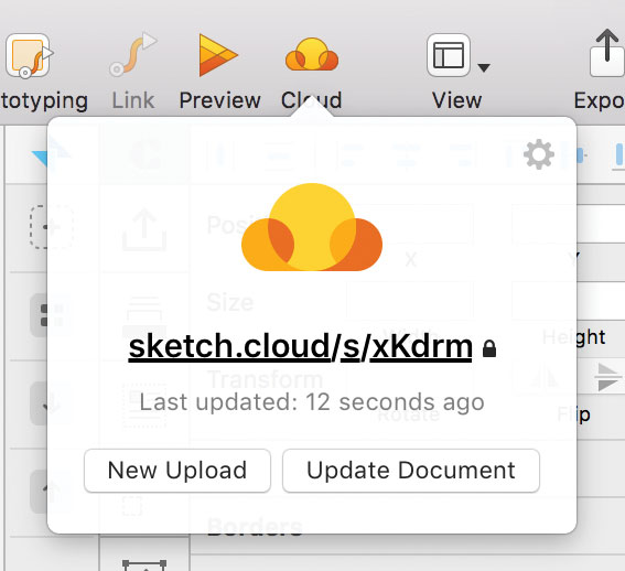
Push your latest changes to cloud by selecting this icon – your browser will open the link once completed.
Declutter your Sketch cloud link by selecting only the page you want to show in the top left dropdown, and share the URL from here instead.
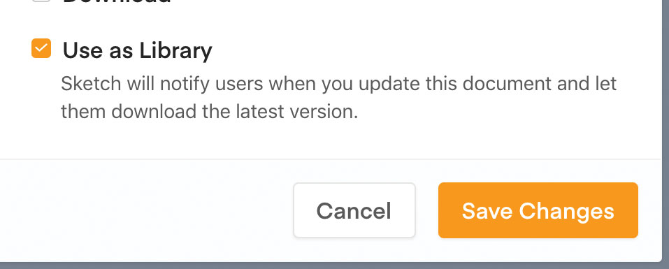
In the settings panel popup, tick ‘Use as library’ to automatically let your team know there’s been a change.
Flag your opening artboard in preview mode before pushing to cloud to make it appear first on your Sketch cloud link.

Build a design system in Sketch
10. Stay organised
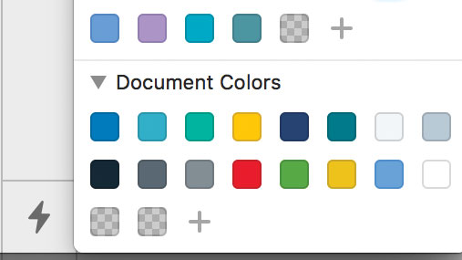
Keep your brand colours organised in your document palette by choosing the said colour and clicking the ‘+’ icon.
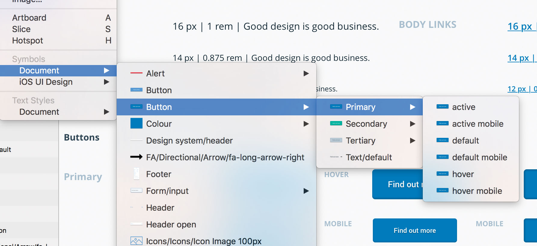
Keep your favourite symbols organised in their multiple states by using slashes when naming your symbols, for example naming your symbols ‘Button / Active’ and ‘Button / Disabled’ will group your symbols together under the same category.
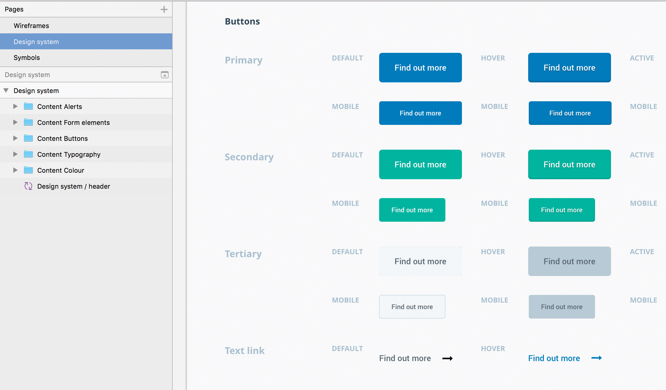
Create a design system page by separating all your elements that define your brand into its own page in Sketch. This is a simple way to show everyone where they can grab the assets.
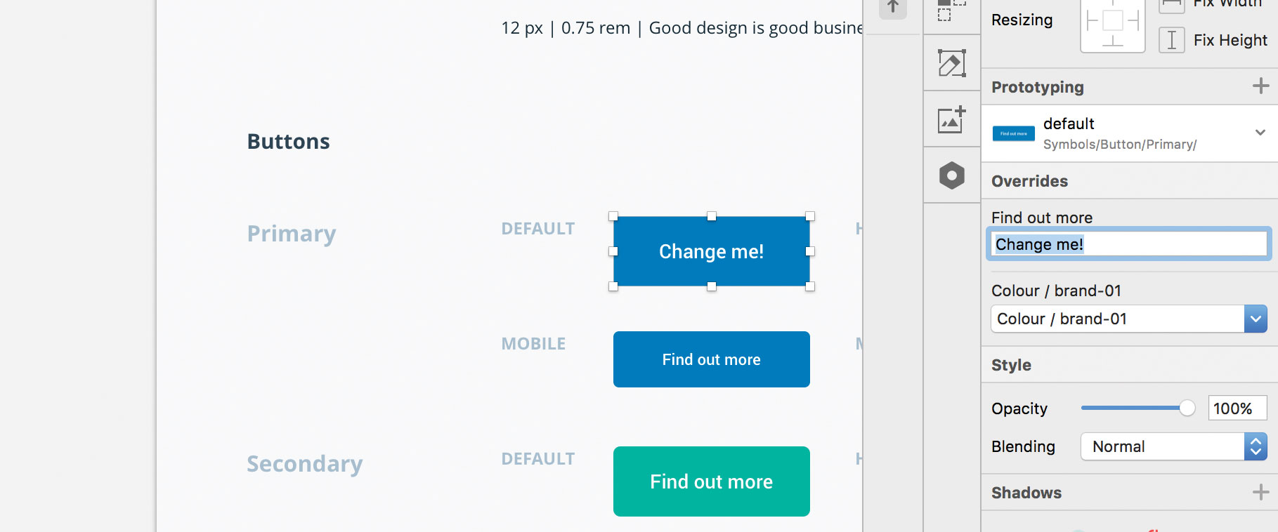
You can overwrite the content in your symbols, such as text in your button (see above), so you don’t need to worry about making new elements if it’s only a small change.

Create a page design
12. Create a strong visual hierarchy
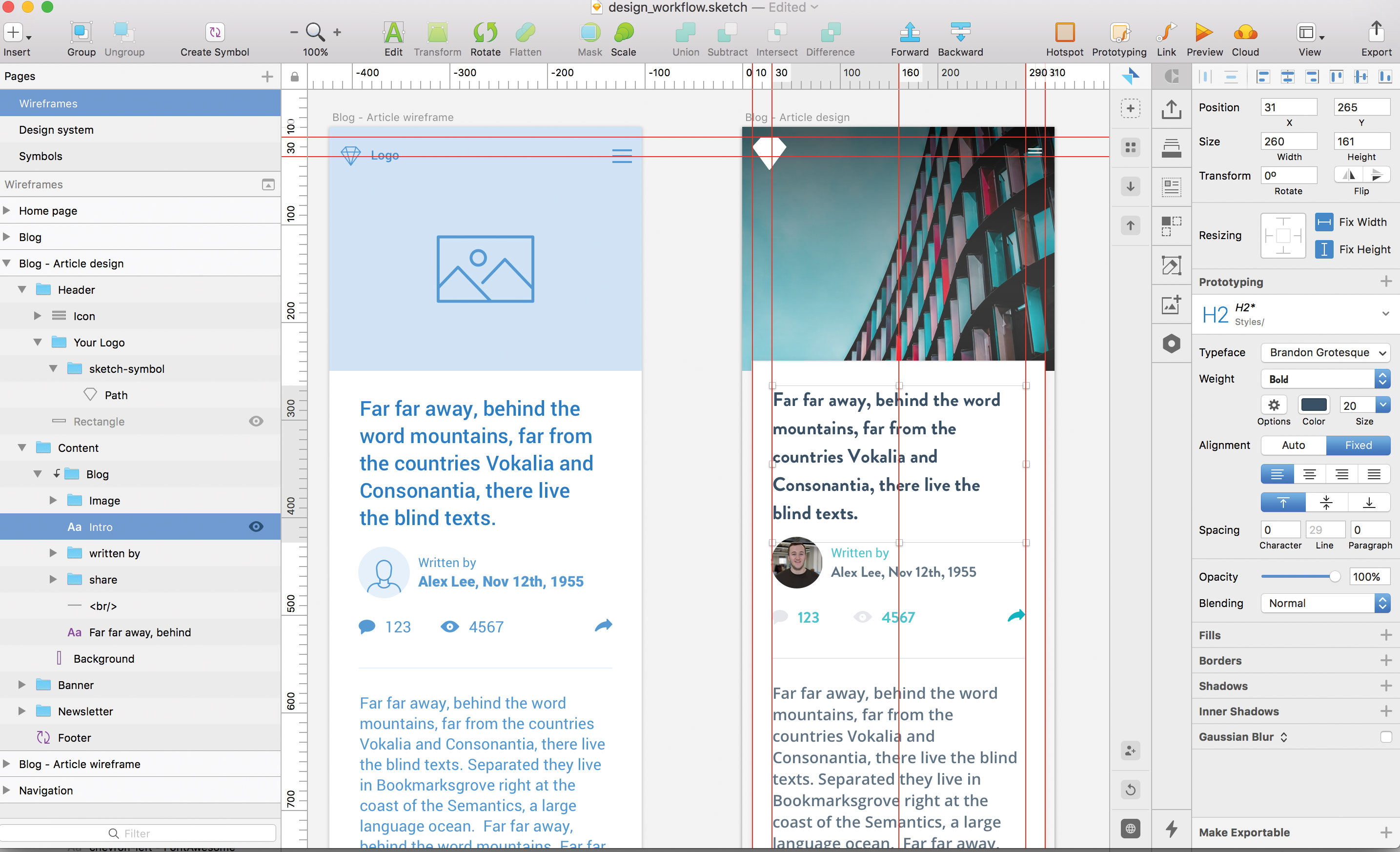
A strong visual hierarchy ensures clarity in any user-centric design. To get started, design the most universal components – such as colour and typography – first, and then work down to smaller ones such as buttons and input components.
To insert just about anything into your design, hover over to Insert tab at the top of the Sketch UI, click, and then start importing elements onto your artboards. Keep in mind your wireframe and design system to ensure consistency in your work.
13. Use colours sensibly
Colour is arguably the most important element in any design workflow. With colour, we can set the overall look, feel and tone of a design, so always ensure you use it in correlation to the importance of the elements that they are assigned to.
Try grouping your colours like so:
- Primary colours: the main brand colours, used to create the basic colour scheme of a project and crucial elements like buttons.
- Secondary colours: these accompany the primary colours, and compromise different shades, gradients and tints from the primary colours.
- Tertiary colours: an important group, which display system messages, such as alerts, warnings, and notifications.
To make your colours as efficient as possible, create each colour as a symbol in your Sketch file to ensure any changes update the elements across your design.
14. Use typography effectively
It’s important to design the style and size of all the headings (H1, H2, H3, and so on) and paragraphs to create a visual hierarchy. Usually, typography doesn’t have many stylistic variations, such as colour or weight, so consider using your colours effectively to present the brand personality.
Once your happy, define your text styles in the right-hand panel, by clicking on the ‘no text style’ dropdown and selecting ‘new text style’, once saved, you can use this typographic style throughout your design, like symbols.
15. Use icons to add context
When used effectively, icons add context to more complex components such as buttons, labels, or tables. Icons in your design can be functional by encouraging users to interact — using an ‘X’ in a button to signify a Remove action, for example.
Consider creating a set of UI icons as nested Sketch symbols to help complement other UI elements in the design framework, – arrows, for example – that can be used in sliders, previous and next buttons and pagination.
16. Design buttons and inputs
When designing buttons and inputs, make sure to design their individual ‘states’. Each have multiple states and provide visual feedback to users to indicate the current state (for example, hover, clicked). It’s good practice to create each state as a separate symbol, since this adds flexibility.
17. Complex components and sections
At this stage, the design could be considered complete since it has everything needed to create a functioning product. However, it’s worthwhile spending more time creating components for the UI framework, such as cards, tables and forms. These can then be combined to develop sections, shaping the blocks to which our websites and applications rely on such as headers, navigations and banners.
This article originally appeared in issue 277 of Web Designer. Buy issue 277 here or subscribe.
Read more:

Thank you for reading 5 articles this month* Join now for unlimited access
Enjoy your first month for just £1 / $1 / €1
*Read 5 free articles per month without a subscription

Join now for unlimited access
Try first month for just £1 / $1 / €1
