14 quick ways to improve your art in 2019
Paying attention to details could make a big difference to your work.
There are many aspects to consider when tackling a painting, both technical and fundamental. What I don’t often hear about are the minor tactics that help elevate the art-making. In this workshop I’ll focus on techniques that aren’t emphasised, particularly ones pertaining to works made with acrylics and coloured pencil. Having an understanding of the basics is important, but it’s the tiny nuances that will distinguish your work.
I’ve been working professionally as a freelance artist for about a decade now, and I’d like to share with you the essential tidbits I’ve learned along the way, including how I capture the natural glow of skin with acrylic glazing and wax-based pencils.
In addition to sharing my painting techniques, I’ll explain what to do once a painting has been completed. Finding suitable frames and scanners are key components in preserving your art for the years to come. Every artist has their personal art-making tactics that they develop over their years of experience, so keep making art, learn, grow, grow some more, share what you’ve learned, and keep the inspiration cycle going for others.
01. Focus on the outline
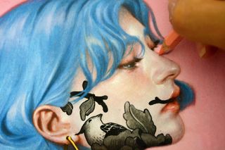
A common mistake that people learning how to draw make is paying too much attention to the form within the lines of an object, rather than looking at the line itself. Edges are made of coloured lines and tend to be high in chroma. Instead of contouring objects with black lines, try using something with medium to high chroma.
For skin, outline the figure with Terracotta and this will give it that natural shimmer. To give objects that are catching light – for example, a blue rooftop on a sunny day – trace its rim with a True blue coloured pencil. This is also a great way to establish your focal points. The vibrant outer edges help to advance the element to the foreground and draw the viewer’s eye.
02. Create colour harmony

When working with an extensive colour palette, it’s easy to let it get out of hand, resulting in a gaudy painting full of dissonant colours. A great solution for this is to harmonise your palette by toning the paper with light washes of paint.
After I’ve transferred my drawing on to hot press watercolour paper, I make a mixture of Brilliant blue and Cadmium red paint, and apply a few thin washes of it. The paper is now a few shades darker with a purple tint to it. Subsequent layers of colour will react to these initial washes, and by sharing this commonality, will yield a more cohesive palette.
Get the Creative Bloq Newsletter
Daily design news, reviews, how-tos and more, as picked by the editors.
03. Capture organic shapes
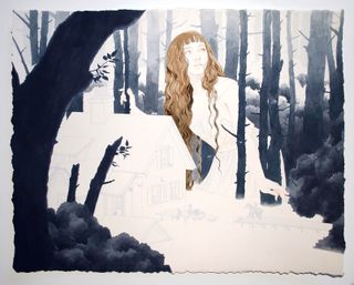
Water-based paint such as acrylics are ideal for capturing organic shapes, including clouds, foliage and fabric. Objects that tend to have a lot of billowing texture can be intimidating, but you’ll come to learn that the water does most of the work for you. You just have to be fearless and let go of that innate control that lives in all of us.
When rendering these shapes, allow the paint washes to find the forms for you. Be loose with the control of your brush and make strokes that are haphazard and unplanned. Let edges bleed into one another. The less control you have, the more organic the outcome will be.
04. Don't treat your brush like a pencil
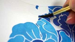
An old bad habit of mine was treating the brush like a .05 mechanical pencil. I would execute each paint stroke with precision and end up with static movement in my figures and their attire.
To achieve fluid, organic shapes and gradients, hold your brush loosely and use the full motion of your wrist. Execute your paint strokes by turning the belly of the brush at extreme angles. Don’t dab unless necessary. You can also vary the softness of the paint stroke’s edge by doing this.
05. Use white paint sparingly

Most of the whites in my paintings are made of the natural white of the paper. On occasions, I’ll use Titanium white to highlight, but it’s used sparingly. I find that white paint comes across dull: although it’s light on the value scale, it’s low in vibrancy.
I recommend that you plan your painting ahead of time, determining the placement of the highlights. For example, the shine on the female’s cheekbone is kept untouched, along with the highlights on her nose and chin.
06. Get the right pencil for the job
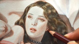
I use two different types of coloured pencils, both wax-based. The Prismacolor Premier pencils are opaque in colour and possess a creamy texture. They have a soft core and will repel water, so are only used at the end of the painting process to fix mistakes and finalise solid shapes.
The Prismacolor Verithins are made of a thinner, harder wax lead that are most suitable for clean lines and fine details. They tend to be water-soluble, and thus work well with acrylic washes. The Verithins are great for pushing dark values that
I find difficult to achieve with acrylic washes and sharpening lines, like the edge of an ear lobe.
For more advice on different types of pencil, see our post on the best pencils for colouring, drawing and sketching.
07. Transfer your sketches
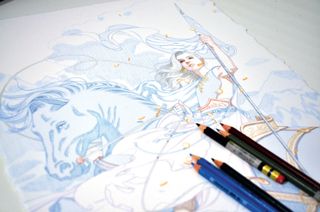
There are different options available when transferring a sketch, either with a projector, light box or my personal favourite, a large-format printer. When transferring via projector and light box, I lose the dynamism that lives in the original sketch.
By printing the sketch directly on to the watercolour paper with archival pigments, you can preserve the spirit of the lines as well as saving yourself hours of work. To prep your sketch for transfer, make sure you lighten it so that it’s only barely visible – it’s meant to serve as a blueprint, after all. Afterwards, you can redefine the lines by tracing it with coloured pencil.
If you're not sure which printer to go for, see this post on the best printers.
08. Use iridescent embellishment
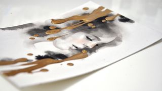
To add an extra layer of dimension to your work, embellish it with an iridescent quality. Gold leaf and Pebeo Paints are a few ways to give it distinction, and collectors tend to gravitate towards these. Having that extra touch of authenticity is highly sought after.
Before applying the embellishments, prep your painting by adding a layer of matte medium. This acts as an isolation layer and protects the painting. It also gives the surface a bit of tooth. For Pebeo Paints, which is an oil-based iridescent medium with an enamel texture, use a pipette to leave drops of shimmery gold to your finished painting. Make sure to let it dry for at least 48 hours, especially if the application is thick.
09. Add glazes
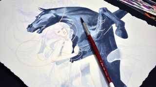
Rendering with acrylics is a slow process for me. I work from light to dark with diluted washes of paint, a technique called glazing. By overlaying layers on top of each other, value is darkened and form is created. A painting usually consists of 50-80 glazes, applied with different watercolour techniques. For broad areas where a soft edge is needed, like a horse’s muscular texture, use the wet-on-wet method. For finer details that need crisp edges, like a ribbon, use wet-on-dry.
10. Blend paint strokes

Paint strokes can generate a painting wonderful texture, but there are times when you might prefer to develop a smooth gradient in your artwork. To blend paint strokes, I recommend heavily diluting your paint with water and executing with a light touch. Don’t go heavy with the application and be patient as you build value on the paper. Overlaying glazes upon glazes of paint on top of each other will slowly smooth out the strokes, much like an iron set on a low heat. If the paint strokes are still unyielding, use a pencil in a neutralising colour to gradually blend them away.
11. Treat acrylics like watercolour
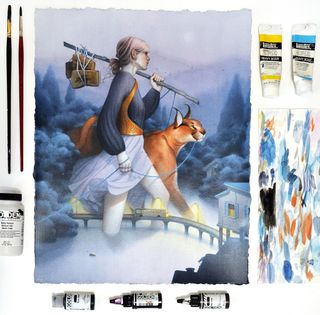
Acrylics are one of the most versatile water-based mediums. Because of this, I can treat them like watercolour, diluting and blending strokes. Unlike watercolour, there’s a higher level of permanence in the pigment so it doesn’t enable you to lift colour. I prefer this since I’m able to achieve a wide range of value changes. Like watercolour, you can tint certain areas to add slight colour changes. By mixing a few drops of Golden High-Flow acrylics with water, you can bring subtle hints of warmth to a figure’s cheeks.
12. Digitise your painting
A lot of young artists don’t prioritise the importance of digitising the finished painting for future usage. It’s key to have a high-resolution digital scan of the final so it can be used for promotional purposes, Giclée prints, licencing rights and more.
For works in watercolour, I recommend using a Cruse scanner. Access to one can be difficult, but try calling your local fine art or large-scale printing company and you may be in luck. It scans the painting without touching the art and is able to capture the nuances of the paint strokes without grainy reflections. If you don’t have access to one, an Epson 11000XL is a great second option.
13. Add a natural edge

A great way to apply more authenticity to your original piece of work is giving it rough-cut, deckle edges. An easy way to do this is by using a straight-edge ruler to tear your watercolour paper edge as oppose to cutting it with an X-acto knife. It distinguishes the painting as an original piece of artwork and makes it available for unique framing options.
14. Frame the finished piece
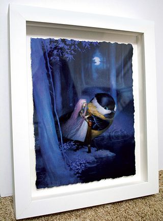
Painting on watercolour paper has perks. Because it’s paper, you can frame it so that it’ll showcase its natural deckle edges. A wonderful way to frame artworks on paper is by top float-mounting it in a shadow box-like frame. The painting is adhered on top of archival foam board to make it appear as if it’s suspended in air, with space between all sides of the paper. In my example, I chose a white wooden frame with two-inch rabbet height. To have the painting float-mount like this, you’ll need ample depth for all of the different framing components including the glass, mat boards and backing.
This article originally appeared in issue 166 of ImagineFX, the world's leading magazine for digital artists. Buy issue 166 or subscribe.
Read more:

Thank you for reading 5 articles this month* Join now for unlimited access
Enjoy your first month for just £1 / $1 / €1
*Read 5 free articles per month without a subscription

Join now for unlimited access
Try first month for just £1 / $1 / €1
