12 dazzling examples of direct mail design
Top tips for designing direct mail that's impossible to ignore.
Direct mail is one of the most challenging types of marketing collateral to design. The temptation is strong to simply try to replicate past successes and stick with what you know works, but if you want to truly succeed, you have to be willing to try something new.
Not every direct mail has to completely reinvent the wheel. The important thing is to find some way to set yourself apart from your competition – whether that’s a creative new type of packaging or simply an attractive logo. Here are some top tips for creating an innovative direct mail piece, along with cool designs that demonstrate those principles.
- Exclusive offer: Save 15% on Adobe Creative Cloud now
01. Create a mascot or character
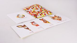
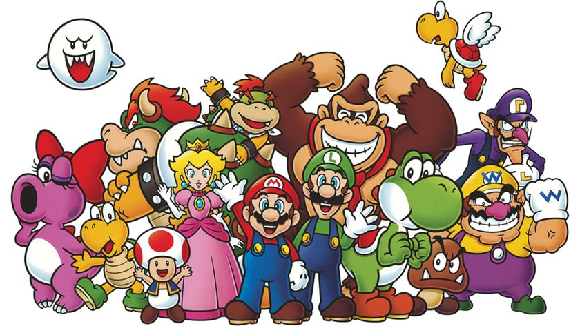
A fun character can help to humanise your client’s company and encourage people to identify with your message. This Society of Design Etiquette campaign pictured above uses four colourful mascot characters to promote good design principles.
02. Explore subtle textures

It often helps to engage potential customers on multiple sensory levels. The use of foil stamping in Erre’s direct mail design pictured here is visually subtle, but gives the black envelope a luxurious texture to the stripes that recipients can feel as they handle and open it.
03. Use die cut windows creatively
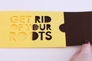
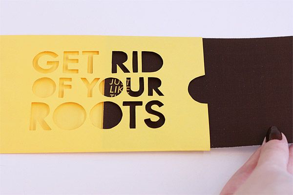
A die cut window can express the company’s purpose or values in unexpected ways. This high-concept promotional piece for a hairdresser by Caroline Henson, 'Get rid of your roots', urges the user to visually 'drain' a yellow design of its darker elements. It's an effective visual representation of dyeing brown roots out of somebody’s blonde hair.
04. Get confrontational
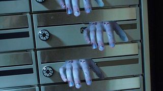
Kengo Maeda's Night of the Living Dead direct mail design features an extra flap styled to look like a zombie’s hand. When inserted into a person’s mailbox, the hand can be left dangling out, creating the appearance of a fearsome monster creeping out from inside. It’s a confrontational image that immediately draws the recipient’s eye.
05. Tell recipients what's inside
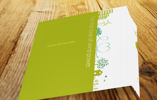
A solid call to action is an essential part of any direct mail campaign. Most people tend to look at the address area of an envelope first, so that’s one of the best places to put your call to action (as Tartan Marketing has done here by writing 'For the love of wind power: Member perk pack inside' on the front of the envelope). Make sure it’s clear, concise and gives recipients a reason to look inside.
Get the Creative Bloq Newsletter
Daily design news, reviews, how-tos and more, as picked by the editors.
06. Find engaging ways for recipients to open

Another great way to encourage recipients to open your direct mail piece is to make it open in an unconventional way. Warren Hardy for BMW added a perforated pull-tab to this piece that mimics the path of a vehicle cutting through a field of snow. It’s the sort of element that begs the recipient to interact with it.
07. Try special finishes
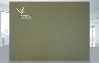
Foil stamping is a creative and versatile imprint method that gives direct mail pieces a little something extra. Bamboo Living’s portfolio design features a white, non-metallic foil to make the logo stand out while also maintaining a natural, organic look. For other brands, a shiny metallic or coloured foil might better complement the design.
08. Show off your product
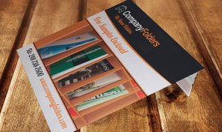
Seeing is believing, so showing off images of a client’s products or services is often much more effective than simply talking about them. Company Folders uses images of its products to engage recipients of this sample packet envelope.
09. Seal your envelope in a unique way
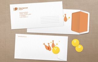
Sometimes the smallest touches make all the difference. For instance, instead of just sealing your envelope in the usual way, consider using a colourful sticker such as the bowling balls used for this festive envelope from Masterskaya Vkusa.
10. Think outside the box
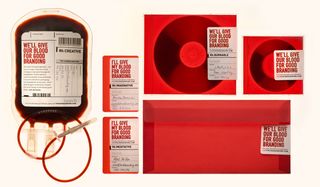
Direct mail marketing doesn’t always need to be in a conventional envelope. Plenty of unusual 3D objects can be sent through the mail. This hand-delivered fake blood bag from Touch is a controversial piece designed to get people talking.
11. Include a free gift
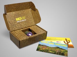
Offering recipients a free gift (such as a promotional product or other small item) gives them an excellent reason to look inside; it contains something they may actually want. For instance, this unique desert-themed direct mail campaign by MDG Advertising for MDVIP includes a miniature cactus.
12. Provide something useful
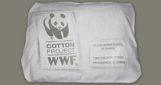
Consider going one step further; instead of including a gift inside your direct mail piece, make the entire direct mail piece a gift. Here’s a cool example: the World Wildlife Fund mailed T-shirts to various schools with the terms of its design contest printed on them.
Related articles:

Thank you for reading 5 articles this month* Join now for unlimited access
Enjoy your first month for just £1 / $1 / €1
*Read 5 free articles per month without a subscription

Join now for unlimited access
Try first month for just £1 / $1 / €1
The Creative Bloq team is made up of a group of design fans, and has changed and evolved since Creative Bloq began back in 2012. The current website team consists of eight full-time members of staff: Editor Georgia Coggan, Deputy Editor Rosie Hilder, Ecommerce Editor Beren Neale, Senior News Editor Daniel Piper, Editor, Digital Art and 3D Ian Dean, Tech Reviews Editor Erlingur Einarsson and Ecommerce Writer Beth Nicholls and Staff Writer Natalie Fear, as well as a roster of freelancers from around the world. The 3D World and ImagineFX magazine teams also pitch in, ensuring that content from 3D World and ImagineFX is represented on Creative Bloq.

