11 steps to better logos
Explore the characteristics that tie together the world's biggest logos – plus tips for designing your own.
Getting your logo just right is one of the most important aspects in creating an effective brand identity. Designing a logo should be a process of reduction (but not always simplicity), underpinned by a clarity of purpose and a conviction in execution.
The LogoArchive project explores how designers have produced new and original logos over half a century, and conveyed an abundance of ideas through an economy of form. Read on for a closer look at the common themes that appear in the world's best logos, plus advice for how to harness these concepts in your own logo design work.
01. Combine ideas
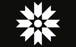
When working two ideas together, look for commonalities of form. Although the awkward and the ugly do have their place in logo design, correlation, rather than dissonance, often delivers a more universally satisfactory outcome.
02. Make static forms dynamic
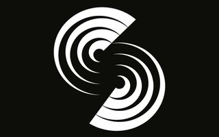
Use direction, pattern and repetition to give static forms a sense of motion and visual interest. This could be in the use of diagonal cuts or arrows, in the radial arrangement of objects, in the changing weight of lines, an increase in size, or a transition from one form to another.
03. Add layers
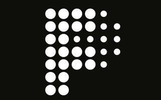
Use line weight and negative space or the density of local objects to reveal secondary images. You can use this to build layers within a logo to create a visual hierarchy. This element of discovery and surprise has value for the audience, and the difficulty of its execution will help to differentiate it and secure memorability.
04. Study visual language
Consider your demographic. Are they specialists or the wider consumer market? Look for connections between brand activities and form. Take the time to understand your audience’s perceptions and associations.
The Idiosyncratic
Get the Creative Bloq Newsletter
Daily design news, reviews, how-tos and more, as picked by the editors.
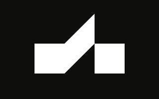
Study the visual language of the industry you’re working in. Does it have consistent and specific principles or symbols you can draw upon? Architecture, for example, has a quite a few that lend themselves well to the graphic.
Space, structure, light, shade, flow and tension provide great points from which to begin constructing a logo that can engage a specific group. Many of these are recurring concepts, yet designers still manage to construct something new, distinctive and interesting from these elements.
The Universal
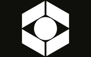
Arrows to imply speed and directness, globes to suggest the international, eyes to convey the observational. These are viable tools to communicate universal ideas. Although communicatively blunt, they can be an inclusive foundation from which to build on.
Distinction can come in the way you render these, or pair them with an image, letter or form. The best examples of this type are often the product of good observational skills and an ability to recognise commonalities. This can be acquired by taking the time to really look at, rather than just browsing, tools like LogoArchive.
05. Use negative space
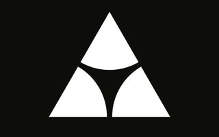
Consider negative space as a valuable object within your logo. Focus on the space you’ve created in and around your forms. Does it provide balance or an interesting contrast to the fill? Is it being used to add an additional image? Consider how negative space may become more prominent on screen or diminished across different substrates. Recognise and leverage this changing state.
06. Embrace the abstract
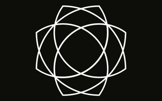
Logos do not need to be explicit in the ideas they convey. Abstraction frequently crops up on LogoArchive. This type of logo can be used to set a tone and convey a feeling. Look for imagery related to the business and industry, crop it down, make a pattern, reinterpret it. It doesn’t matter what people see within it. Leaving room for interpretation has value.
People love puzzles, and having opportunities to make connections and draw their own conclusions. This is particularly useful in the art space. The visceral rather than the intellectual, and the subjective over the objective are also useful considerations, and are effective within the right context.
07. Find relevant symbols
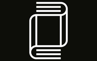
When it comes to representational forms, look to the brief. What are you being asked to articulate? How are these elements best expressed? Finding the right tool to communicate a particular idea is paramount. Logo is perhaps the most limited medium in today’s multimedia world, but still has the capacity to convey something of a brand.
Is there a story to tell? Are there historical symbols or imagery associated with the brand? Are there values, history or processes unique to the brand? For broader brand identity programmes, consider how a logo can add to, complement or reinforce other ideas and assets.
08. Include contrast
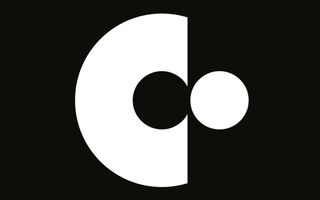
Consider combining opposing elements: the smooth and the sharp; the thick and the thin; the static and the dynamic; the positive and the negative; the abrupt and the transitional; the reductive and the ornate. The right contrast can be very striking, and draw impact and memorability from the simplest forms.
09. Multiply elements
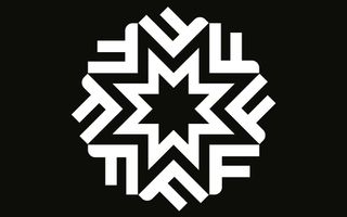
Use forms to build other forms. Duality and multiplicity – the creation of one image through the repetition or union of others – are good ways to draw distinction and interest from simple forms. Work together image and type or draw image from type. Use negative space and a commonality of form to work ideas together in a natural and distinctive way. Keep to just two ideas and look for a comfortable visual balance and a communicative clarity.
10. Make the most of sparse forms
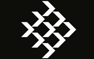
Use line weight and the density and grouping of objects to create a sense of light and shade, depth and structure. Cut out shadows and draw highlights to create a partial form but a complete image. Use illusory contours to imply rather than explicitly define shapes. Get more from less wherever possible.
11. Use fine details
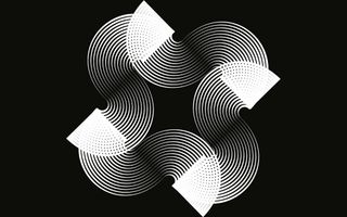
Modern reproduction techniques and high-definition screens mean that designers can now have finer lines, closer shapes and more complex interwoven forms. Be open to using these. Although worth considering, scalability is a bit of a lingering and antiquated concept.
Many of LogoArchive’s posts have very fine lines. Within the right context, they can convey detail, or deliver contrast to and emphasise heavier forms. Consider how you might scale up a logo while retaining its fine lines.
This article was originally published in Computer Arts magazine. Subscribe now.
Related articles:

Thank you for reading 5 articles this month* Join now for unlimited access
Enjoy your first month for just £1 / $1 / €1
*Read 5 free articles per month without a subscription

Join now for unlimited access
Try first month for just £1 / $1 / €1

