11 uber-cool branding schemes for very boring industries
Metal cutting, IT security, cement: eight cool branding projects for not-so-cool companies.
In the world of branding, some companies' are so strong they don't even need a logo, while others need, let's say, a little imaginative thinking. But why should all the cool branding work go to the coffee shops, clothing lines and craft beer companies? Who says the lawyer can't have the best business cards? And what's wrong with referencing a rebel Dutch designer when rebranding a company that cuts metal?
We spoke to studios around the world to find out how they created cool branding schemes for industries that don't naturally set people's pulses a-racing: from cement and flooring to a mortgages and an organisation specialising in perioperative medicine (nope, we didn't know what that was either).
01. EJET: Cutting specialist
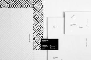
EJET is a company that "specialises in cutting". It cuts metal. It cuts plastic. You live in Greece? You want something cut? Go to EJET. But how do you create a brand for a cutting specialist that isn't obvious or, well, dull? Luminous Design Group managed it by drawing inspiration from rebel Dutch designer Jurriaan Schrofer.
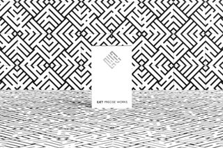
Themistocles Tsiamis is art director at the Luminous Design Group Athens studio: "The symbol we designed, encapsulates in its aesthetic the company's main activities – industrial design and cutting process of metallic surfaces. Taking cues from the company's specialty, decorative design, we created an interlocking pattern that was used throughout the identity system. Additionally, we applied some printing techniques that added to the overall feeling of metallic texture."
02. Rezult: MDF flooring
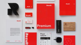
When Ukraine-based MDF flooring manufacturer Rezult needed a new identity, it turned to Kiev-based agency Fedoriv. Challenged to help the plant shift from Russian to European and Asian markets, Fedoriv focused on elevating the quality of the product in the new branding.
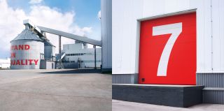
“Our research made it clear that some people treat renovation very seriously, regardless of what part of the world they live in,” explain the team. “These people do a thorough remodelling job, applying effort to extend the lifetime of their house. They aren’t against paying more, as they believe that cheap cannot be good.”
Fedoriv intended the company’s new name, Rezult, to have a Germanic twang of efficiency, a theme emphasised by the red-and-black colour scheme. A witty tagline – ‘Stand On Quality’ – completes the package.
Get the Creative Bloq Newsletter
Daily design news, reviews, how-tos and more, as picked by the editors.
03. Osteo Poly Clinc: Medical massage
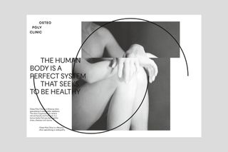
This outstanding piece of design looks like a Vaughan Oliver 4AD album cover. It's actually for a clinic specialising in osteopathy (the manipulation and massage of bones, joints, muscles), a meticulous project in which everything means something.
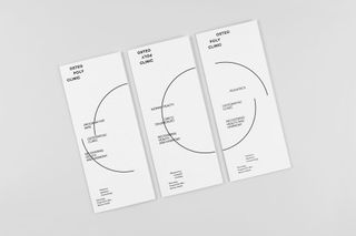
"It was important to explain what is osteopathy and how it works," say Victoria Ermolaeva, from branding specialist Ermolaev Bureau. "Doctors use their five fingers to treat people – five main points in the name of the company form the perfect circle. The circle is a symbol of a human being in perfect condition. A broken circle shows that there are some problems with health, its compositions stand for different problems with human body. The most distorted circles define the worst diseases. When the elements get back to the perfect circle, it means recovery."
04. Habito: Mortgages
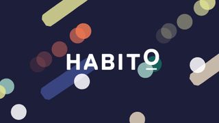
While the big banks are becoming increasingly savvy to the power of good design, it takes real skill to make the prospect of borrowing vast sums of money to buy a house look carefree and cool. Driven by an ambition to become a household name in mortgages, new service Habito asked London-based agency MultiAdaptor to create a brand that would appeal to a mainstream audience and take the company to the next level.
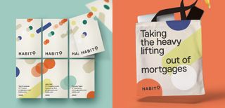
With consumer trust in financial services at an all-time low, Habito needed a fresh, authentic, empathetic brand to cut through and connect with people. “We created a distinctive anti-gravity graphic language and calming visual world for Habito,” explains MultiAdaptor co-founder Andy West. “Seemingly heavy forms are lifted up to give them an unexpected floating feeling, reflecting the big idea at the heart of the brand: lift away your mortgage worries.”
05. Telma Gonçalves: Law
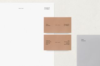
Law is another industry not known for its love of aesthetics. Humana Studio took on the challenge to brand Telma Gonçalves, "a young, open-minded lawyer". The Lisbon studio wanted its work to differ from typical lawyer identities. It had to find a way to represent justice and balance without relying on traditional symbols likes gavels and scales.
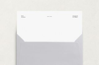
Ana Abreu is an illustrator and creative director. "Our solution," she says, "was to make every element balanced, by being horizontally aligned. This way it represents justice and impartiality. The two horizontal lines form the symbol, a minimal reference to the balance."
06. Mark Spencer: Forensic botany
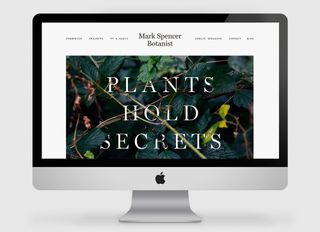
Mark Spencer is a forensic botanist: he consults with police departments and forensic services on cases where plant-based evidence can unlock crimes. OK, so that's quite cool when you know what it is – but conveying that in a branding scheme is not so simple.
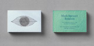
Fieldwork Facility was asked to create an identity for Spencer that was intelligent, simple and memorably executed. The logo – a skeletonised leaf that resembles an eye – represents Spencer’s observational skills and vast botanical knowledge. The tagline ‘Plants Hold Secrets’ tells the story of his forensic work, while ‘Plants Tell Stories’ is used for his public-facing work, such as TV.
“We created imagery for these two worlds by commissioning Robin Friend, a British landscape photographer, to join us on a simulation of a forensics investigation with Mark,” explains Fieldwork Facility creative director Robin Howie.
07. Dansk Erhverv: Chamber of Commerce
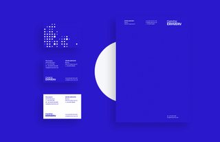
Dansk Erhverv is the Danish chamber of commerce network for the service industry in Denmark. Charlie Tango took on the job of rebranding the organisation because "their visual identity no longer suited the work they perform or the perception they had of themselves."
The Copenhagen studio held workshops with employees to find out more about their culture and values. They came up with eight words. Charlie Tango picked two of those words to guide the design process: modern and innovative. From those two words they ended up with a "sharp, professional and Nordic minimalist design."
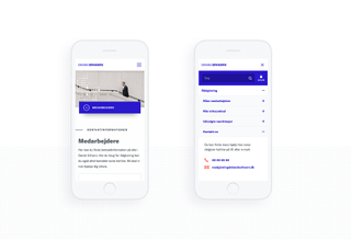
Managing director Andreas B. Iversen says: "We started to make the logo sharper, so today it appears more significant, modern and robust. In addition, we defined new brand colours: the clear blue and deep orange provides a clean and easy-to-understand hierarchy in both printed matter and digital elements. We also defined a new, tighter image style that appears more professional and reflects the Nordic countries and Nordic values. Finally, we introduced a 5th element in the form of a dotted grid that creates recognition across the Dansk Erhverv."
08. LafargeHolcim: Cement
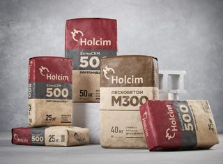
LafargeHolcim is Swiss-based construction materials and solutions company. So how did it end up with a Russian constructivism vibe on the packaging for its cement?
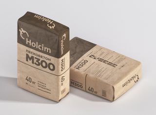
Nadie Parshina is creative director at Ohmybrand, the Moscow-based studio challenged with the rebrand in Russia, where the company was competing with similar packaging and even fakes.
"The biggest challenge when working with international companies," Parshina says, "is they don't understand often the specifics of local markets – in particular, the Russian market. But the Russian office of LafargeHolcim gave us serious support, and we managed to comply with corporate standards and solve important the tasks: visibility and recognisability of the brand."
09. Securrent: Internet security
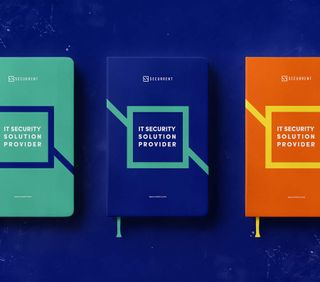
Securrent is a Turkish IT security provider. Seçkin Uysal is founder and managing director of Studio Recode in Istanbul. Uysal says companies wanting a rebrand generally prefer something conservative, something pretty close to what they already have. With Securrent, he held workshops to find out what was the "brand essence." The finding from these workshops helped him sell the final rebrand.
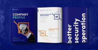
"The brand identity," Uysal says, "which comes after brand essence, was almost easy. However, there was the challenge of creating symbols and metaphors for the brand. Our solution was presenting a base moodboard based on the workshop we had and then could go on with ease."
10. UK Scouts
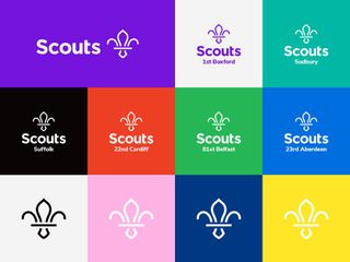
The Scouts may have undergone a modern revamp in recent years, but here in the UK the organisation traditionally isn't the coolest. But London agency NotOnSunday approached the rebranding job the same way it would any brand. It picked out the organisation's key strengths, its sense of belonging, its focus of skills for life, and built up the project from there.
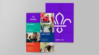
"The biggest challenge," co-founder Trev Townsend says, "was creating something that had to be used by 7,000 different Scout groups throughout the UK. We didn’t want to overcomplicate the layouts. The creative fun will flow out over the next couple of years. We had to create something that could be used by all, including non-designers."
11. TRIPOM: Perioperative medicine
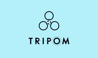
Perioperative medicine is the "medical care of patients from the time of contemplation of surgery through the operative period to full recovery." Not an easy job when it comes branding.
Mark Richardson – aka Superfried – took on a "challenging project, requiring design discipline" for an organisation called TRIPOM (Trainees with an Interest in PeriOperative Medicine). Richardson wanted his work to stand apart from medical design cliches. Check out the organisations website – before and after – to see to his outstanding work in action.
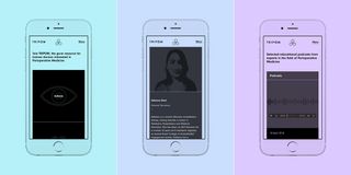
"They required a new brand identity," Richardson says, "and the development of a complex web-based platform that was fun and vibrant to connect with their target student demographic.
The company's previous logo consisted of three apples, playing on the pun – 'tri' (three) and 'pom' (Apple in French). Avoiding medical cliches helped it stand out in the marketplace. Numerous arrangements and styles were explored, but a triangular-rotational form was selected – having an apt chemical-medical diagrammatic feel. For the logotype bespoke uppercase lettering was developed with the subtle addition of dots to convey it's acronym nature."
Read more:

Thank you for reading 5 articles this month* Join now for unlimited access
Enjoy your first month for just £1 / $1 / €1
*Read 5 free articles per month without a subscription

Join now for unlimited access
Try first month for just £1 / $1 / €1
Gary Evans is a journalist with a passion for creative writing. He's recently finished his Masters in creative writing, but when he's not hitting the books, he loves to explore the world of digital art and graphic design. He was previously staff writer on ImagineFX magazine in Bath, but now resides in Sunderland, where he muses on the latest tech and writes poetry.
