Like it or not, we’re all influenced by trends. That doesn’t mean you have to unthinkingly follow them, but it’s important to know what they are.
iStock by Getty Images aren’t just world leaders in stock photography, they’re a major provider of stock illustrations too. So they’re in the perfect position to identify new and emerging trends in the world of illustration.
In this post, we round up 11 illustration trends they’ve identified for 2017, examples of each, and suggestions about how you might use them in your own designs.
01. Stippling
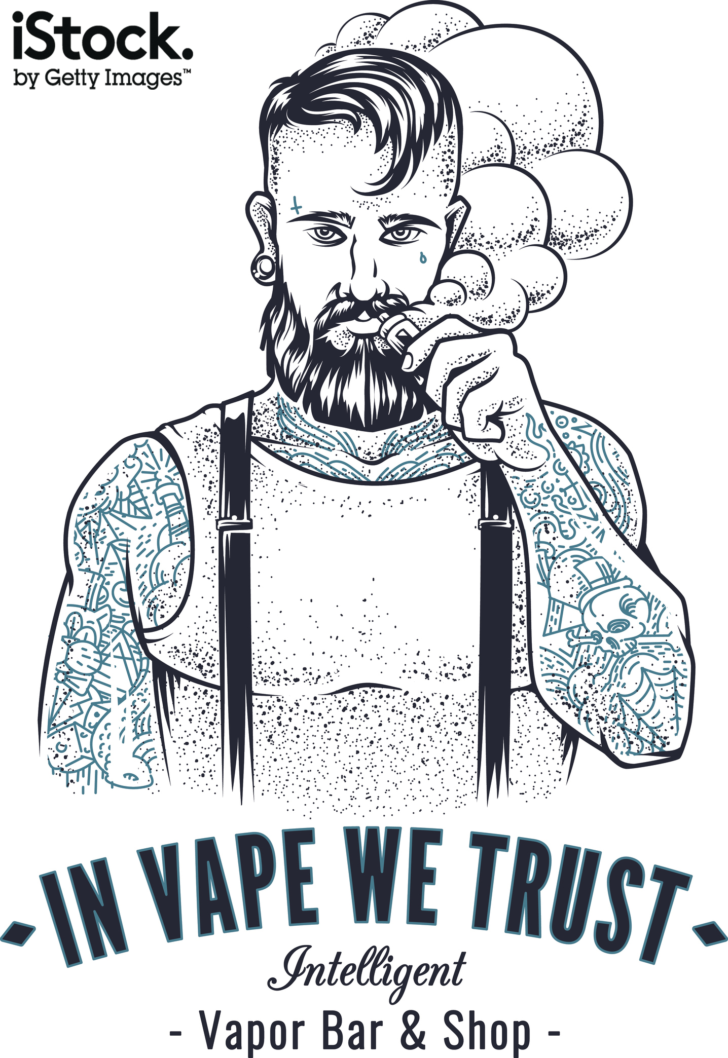
In the last few years there’s been a resurgence of traditional illustration techniques, including engravings, etchings, screenprints, lithography and woodcuts. And now stippling is back in a big way. It’s a shading technique where you build up a drawing by laying down a multitude of small dots. The darker the shading, the more dots you need.
To get this painstaking technique right, you need to be disciplined and meticulous. But in return you’ll get a unique, handcrafted texture to your shading that pairs beautifully with a variety of outline styles. And if you want to cheat a little, you can harness the power of filters, brushes and swatches in modern drawing software.
02. Hand doodled geometric patterns
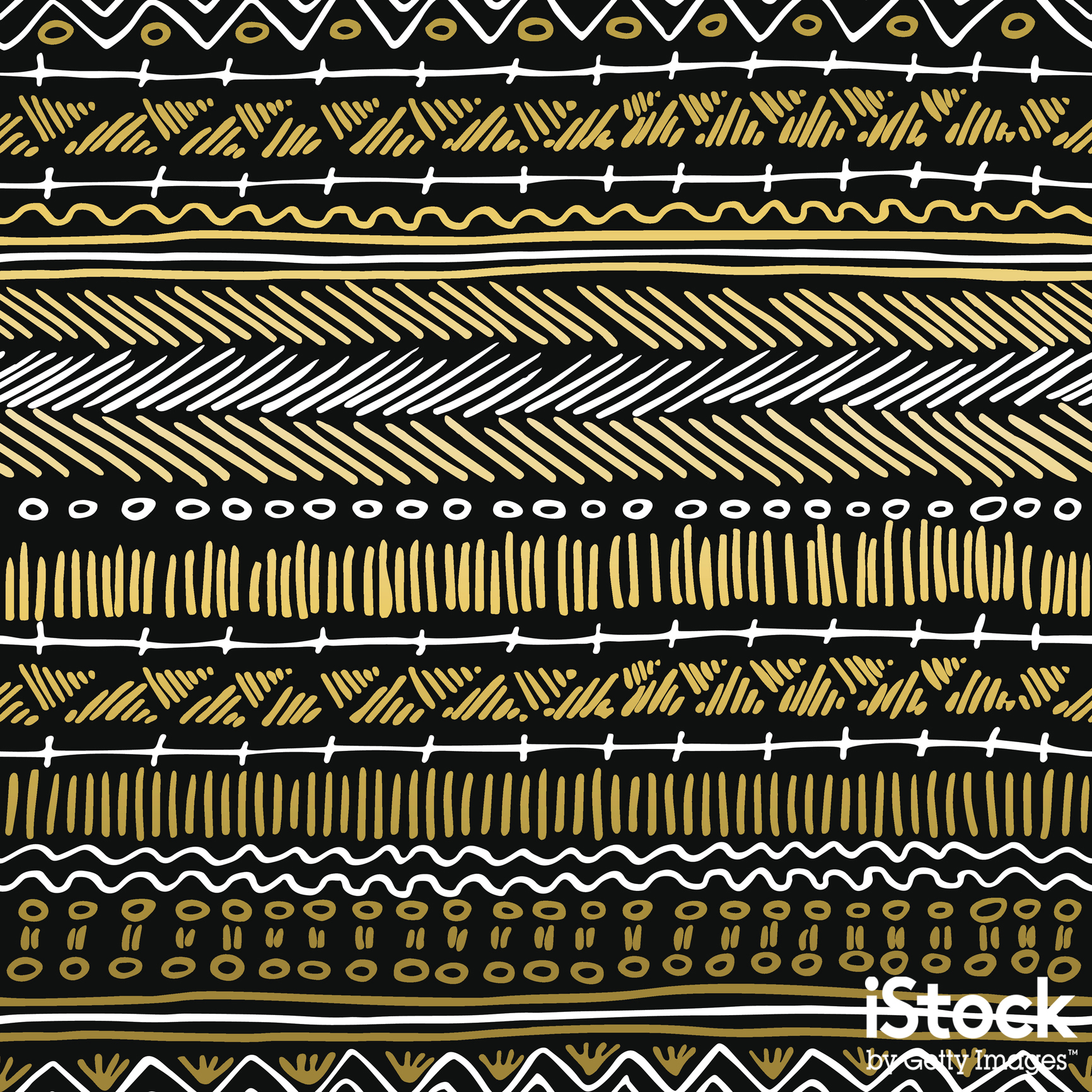
Geometric patterns have always been popular in design. But right now we’re seeing a softening of the style, as illustrators move away from clinically mathematical patterns and towards a more quirky, hand-drawn approach. The lines are a little wobblier and the colour fills a little uneven, but that’s just part of the appeal of this charming, characterful style.
03. Surrealism
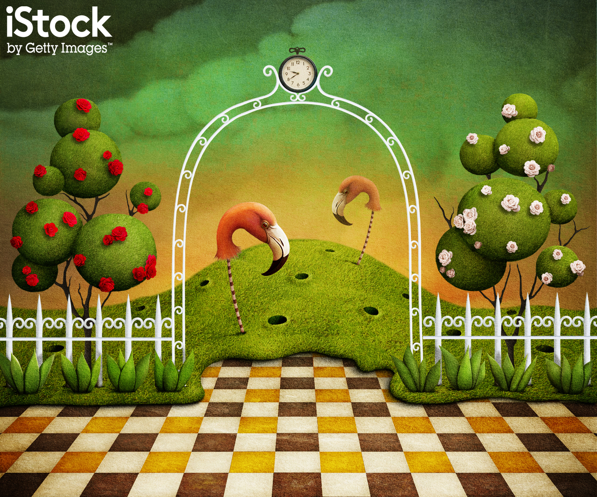
Surrealism is all about unexpected juxtapositions, surprises and non-sequiturs. And it’s a style that’s increasingly becoming popular amongst illustrators. We’re seeing more and more strange creatures and unnerving landscapes, mashed together with the mundane and day-to-day... confusing and delighting the viewer.
04. Handmade script fonts
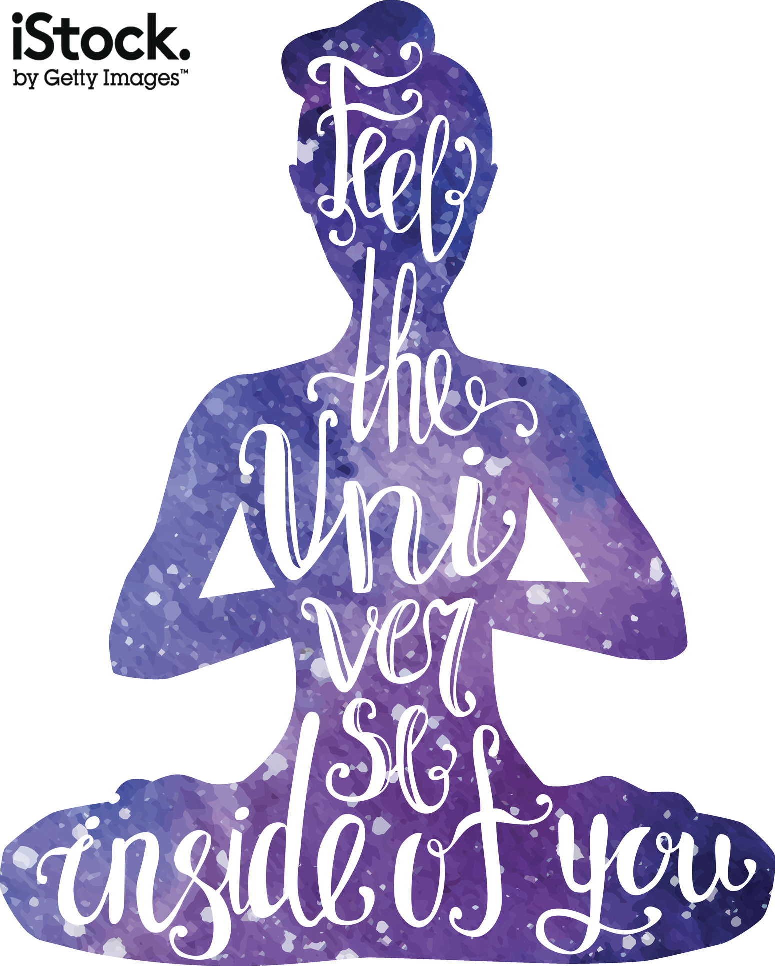
As our lives become more and more digitised and impersonal, creatives are seeking ways to add charm and character to their designs. Hand-drawn fonts work particularly well for brands that want to emphasise their localness, uniqueness and originality.
To inject a playful human element into computer-generated typography, illustrators are harnessing the textures of chalks, paints, inks, markers and pencils on materials like paper, chalkboards, wooden and cardboard backgrounds.
05. Multiple exposures
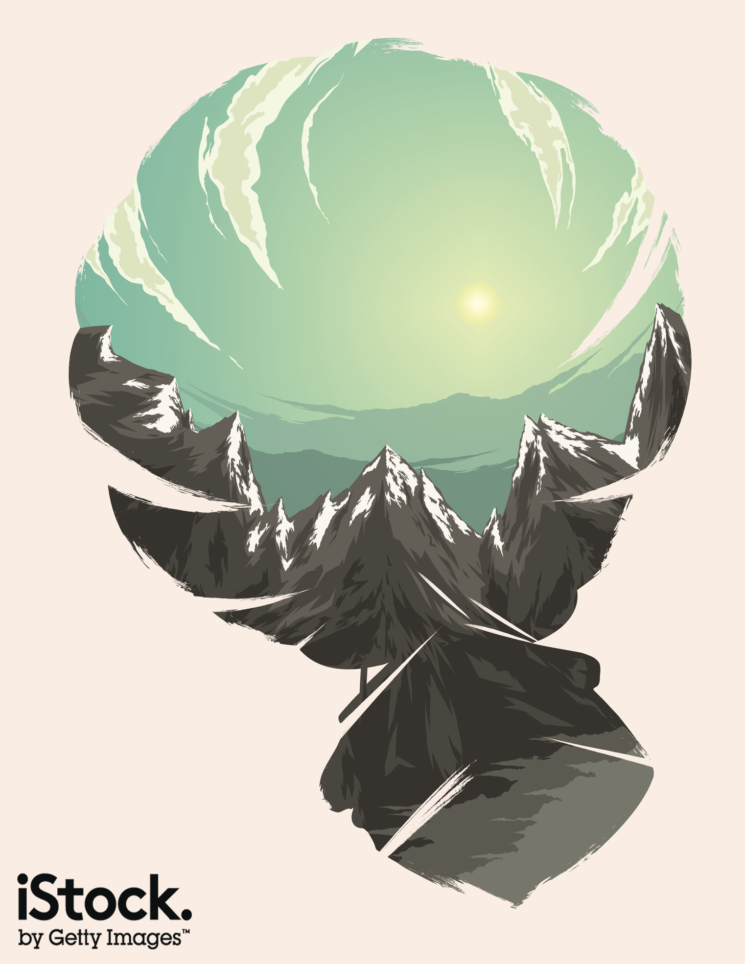
In photography, a multiple exposure is created when two or more exposures are superimposed to create a final image. Use of multiple exposures has been a big trend for a couple of years, and it’s now influencing the world of illustration too. For illustrators, there’s no need for technical knowhow, just a good eye and a little creativity to replicate the effect.
06. Unique perspectives
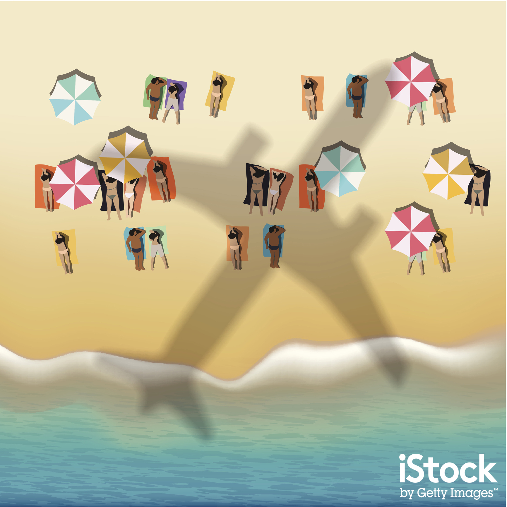
With eye-catching imagery becoming more and more important to online success, designers are looking for new viewpoints on well-worn subjects. And illustrators are increasingly taking their cue from selfie-culture, GoPros, drones and wearable tech to incorporate the idea of personalised perspectives and ‘point of view’ (POV) imagery into their art.
Drawing things from unique perspectives (such as first-person, overhead, or worm’s eye views) offers a new angle on life we don’t typically see. From wide-angle landscapes to close-ups of objects, it’s all about bringing a fresh new look to common subjects.
07. 1980s
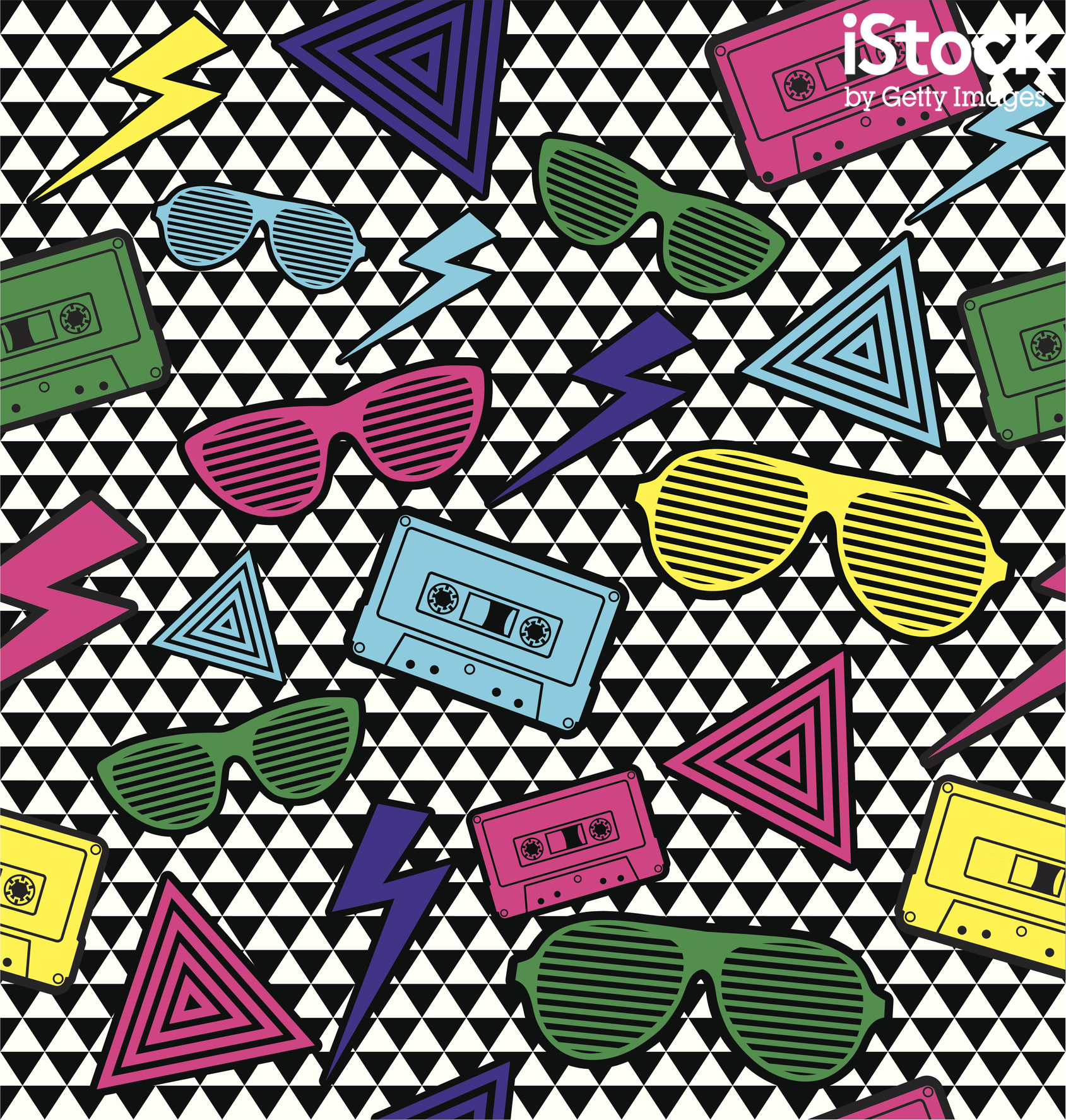
The distinctive styles of the 1980s, revived in recent hit shows like Stranger Things, are returning to the world of illustration with a vengeance. From bright and punchy colour palettes (including characteristically eye-watering neons) to anachronistic objects (such as ghetto blasters and early arcade machines), artists are adding a slice of fun nostalgia to their creations.
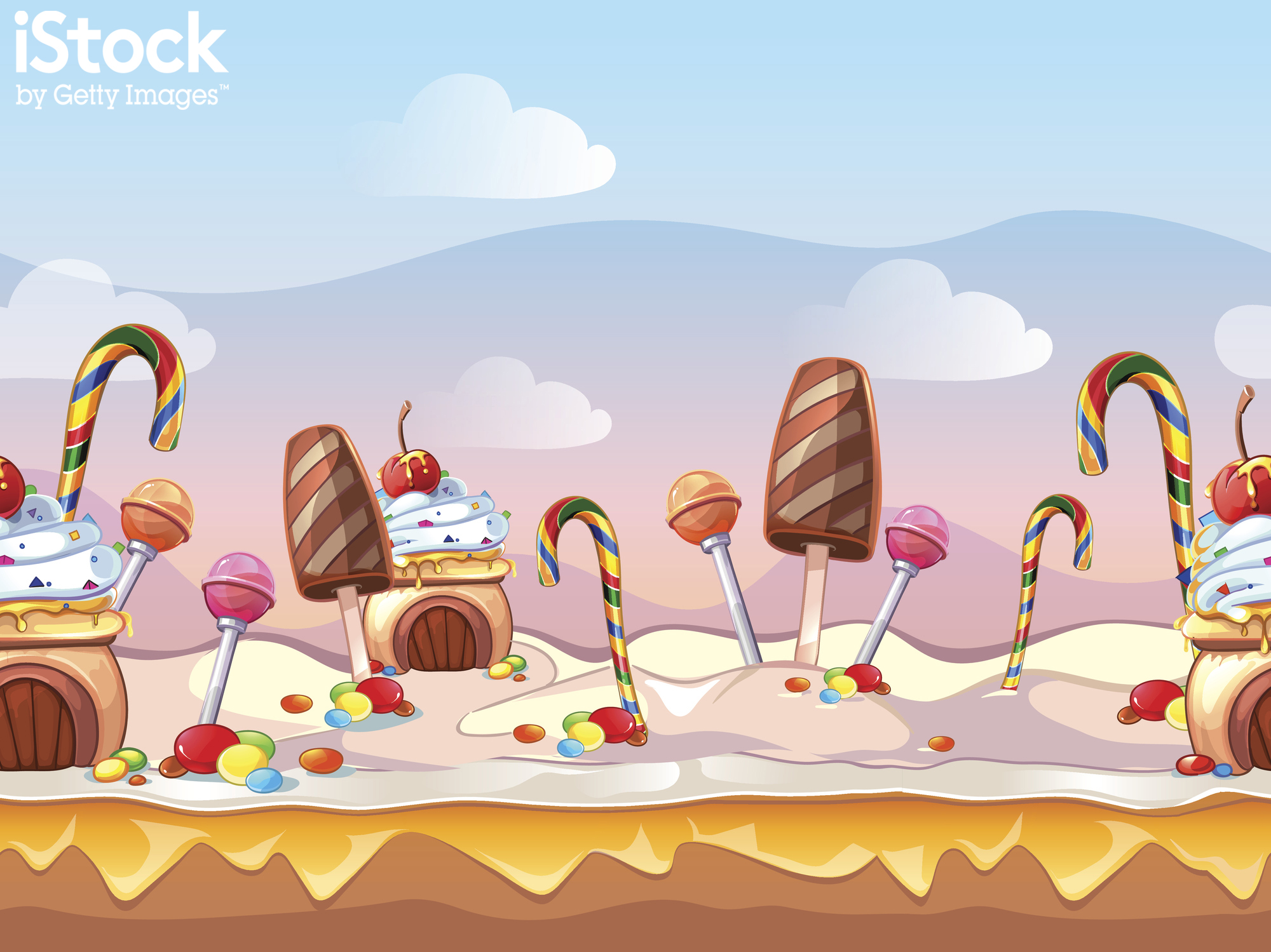
08. Gaming inspired styles
09. Instagram-inspired palettes
It’s the norm for Instagram and other social media photos to be spiced up with filters inspired by traditional film processing techniques, such as cross processing, vignettes and Lomography. And these Insta-styles are influencing the work of illustrators too, bringing looks such as unnatural colours and high contrast to their artworks.
10. Gold

Gold is the colour most associated with opulence, wealth and luxury. We’ve seen more and more use of gold lately to add depth, glamour and sparkle to illustrations, and fully expect this trend to continue into 2017.
11. Flat Design 2.0

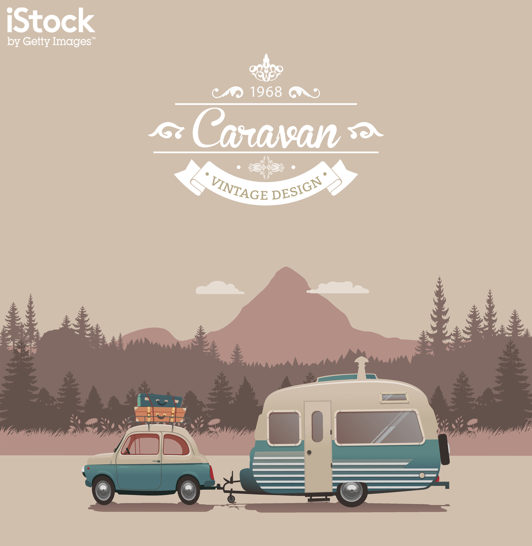
Flat Design’s been around for a while now, but rather than dying off, it’s continued to develop and evolve. Now vector illustration is moving away from super-simplified, flat shapes to more complex and detailed compositions.
Illustrators are utilising subtle shading to add depth, incorporating more rounded and curved elements and adding a handful of extra colours. It all adds up to what’s being called Flat Design 2.0, and it’s perfectly aligned with the trend towards bigger and wider screen sizes.
To see more of these trends in action, check out the wide range of stock illustrations at iStock by Getty Images.

Thank you for reading 5 articles this month* Join now for unlimited access
Enjoy your first month for just £1 / $1 / €1
*Read 5 free articles per month without a subscription

Join now for unlimited access
Try first month for just £1 / $1 / €1
Get the Creative Bloq Newsletter
Daily design news, reviews, how-tos and more, as picked by the editors.

Tom May is an award-winning journalist and editor specialising in design, photography and technology. Author of the Amazon #1 bestseller Great TED Talks: Creativity, published by Pavilion Books, Tom was previously editor of Professional Photography magazine, associate editor at Creative Bloq, and deputy editor at net magazine. Today, he is a regular contributor to Creative Bloq and its sister sites Digital Camera World, T3.com and Tech Radar. He also writes for Creative Boom and works on content marketing projects.
