As we all know, website design isn’t about making things look pretty. It’s about usability. It’s about functionality. It’s about getting the user the information they need, quickly and easily. Right?
Well, of course. But as long as your site does all that already, there’s no harm in making it aesthetically pleasing as well, surely?
Here we present 10 websites that make great use of colour to stand out from the crowd, align with their brand values, and visually entice the user. If you’ve seen others that does it just as well, or better, please share the URLs in the comments below!
01. Mailchimp 2015 minisite
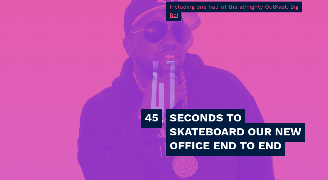
Email newsletter brand Mailchimp has always been at the hipper end of the design spectrum, and this minisite summing up their year in 2015 fits right into that tradition. The site harnesses the duotone colourwash trend popularised by Spotify and extends it, by transitioning from shade to shade as you scroll through the year’s events. The effect is simple, but quite striking, and gives a whole new perspective to what would otherwise be fairly unremarkable images. (You can read more about the duotone trend in design here.)
02. Anton & Irene
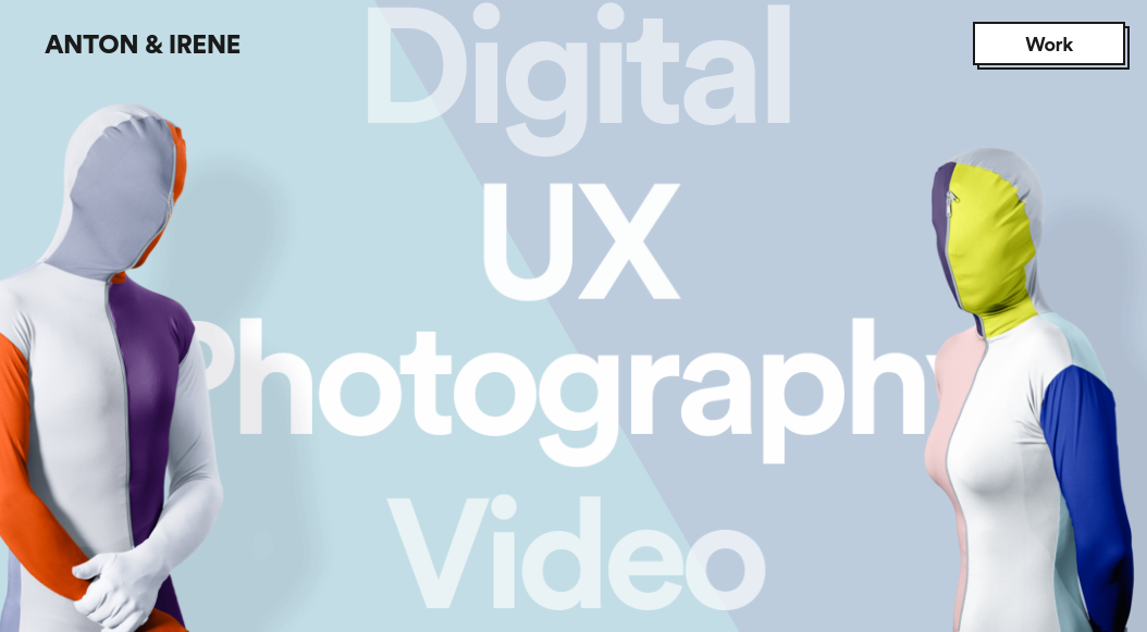
Anton & Irene are former Manhattan agency directors Irene who’ve pivoted to become hands-on designers at their own studio in Brooklyn. The site, which they designed themselves, and was developed by Oleg Chulakov Studio, oozes confidence with its use of bold typography and bold colours. The chosen palette is beautifully precise, featuring colours that are vibrant without being overwhelming, and combinations that are original without being offputting.
03. Créations Namale
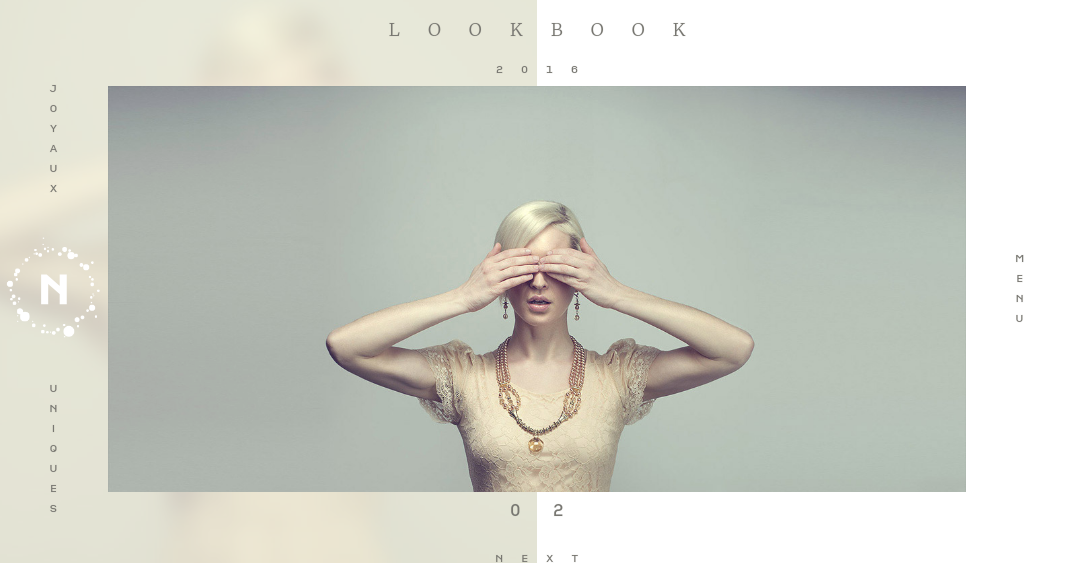
Colour schemes don’t have to be garish to draw people in. This site for Créations Namale, a hand-crafted jewellery company, uses pale and muted hues to evoke a sense of calm and elegance that suits the high-end brand perfectly. It was created by Canadian studio Phoenix.
04. Cantina dei Colli Ripani
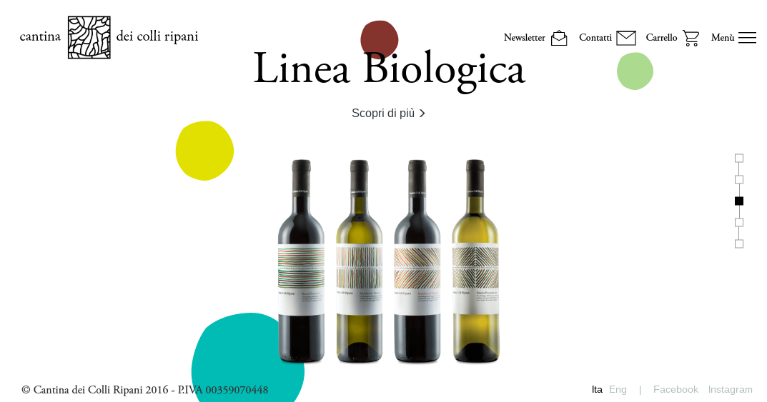
This visually inventive website for Italian winery Cantina dei Colli Ripani brings staid product shots to life with splashes of animated colour. There’s a contemporary, arty look to the site as a whole that matches the brand and its audience perfectly, and the monochrome background elements are a perfect foil for these bright and punchy blobs. The site was designed by Milanese studio Moze, with art direction by Andrea Castelletti and Camilla Gatti.
Get the Creative Bloq Newsletter
Daily design news, reviews, how-tos and more, as picked by the editors.
05. Bastille: Eye of the Stormers by Spotify
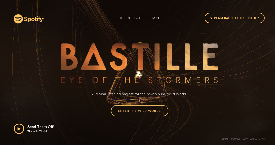
‘Eye of the Stormers’ is a companion piece to indie pop band Bastille’s latest album, Wild World. Co-created with Spotify and Active Theory, it offers a multimedia experience in which the more times a city streams Bastille’s music on Spotify, the bigger the storm it created on screen. The beautiful gold and silver scheme brings it all together nicely, and instantly conveys that this is a listening experience suitable for sophisticates.
07. You Waste a Lot of Time at Work
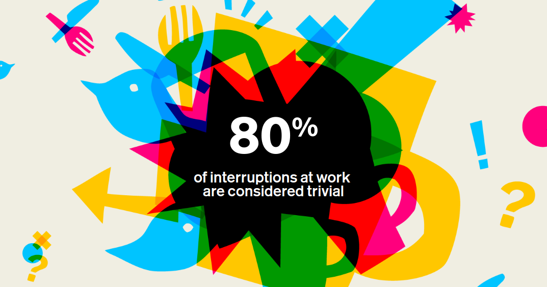
The days when creating an infographic alone was enough to get people’s attention are long gone. So software company Atlassian’s interactive infographic site pops with colour like no site has popped before. It overlays bold, high saturation colours in an arresting way that’s just - but not quite - on the verge of disorienting, and balances out the craziness nicely with a subdued, off-white background. The site was created by Hyperakt.
08. El Burro
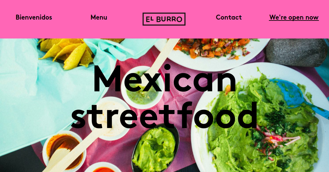
One way to attract attention to your site is to use colours people wouldn’t expect. Hot pink isn’t a shade you traditionally associate with Mexican food, but Olso eatery El Burro’s website uses it to great effect in this clean, one-page site, which was created in-house. With the background gradually changing colour as you scroll, the overall effect is one of fun and youthful vigour.
09. Multiways E-Strategies
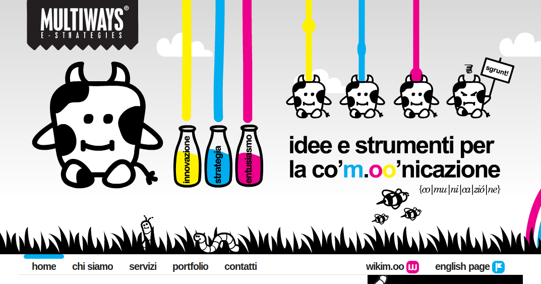
This site for Italian communications and marketing agency Multiways shows that vibrant colours can use sparingly and still draw attention. Setting these friendly splashes of pink, blue and yellow against a black and white background is a masterstroke, making them pop in a truly dramatic fashion.
10. Ohlin D
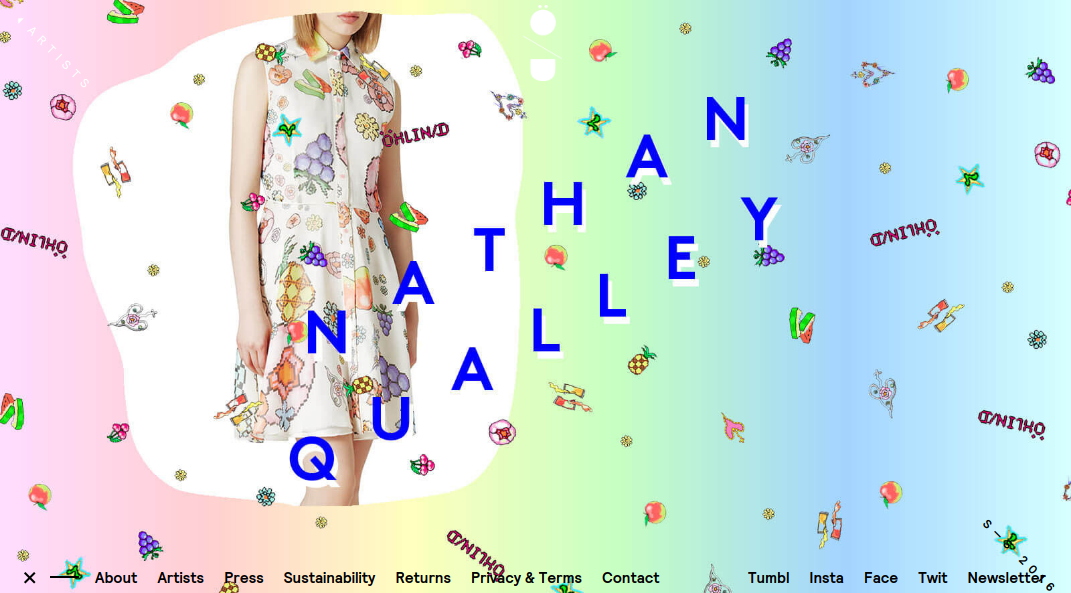
Ethical New York-based clothing brand Ohlin-D teams up with artists on a regular basis to create new designs. So it’s appropriate that its website pages are art-directed to match each design in turn. Perfectly blended background hues draw out the colours of each product image in a way that’s calming and reassuring, whilst also being upbeat and enticing.

Thank you for reading 5 articles this month* Join now for unlimited access
Enjoy your first month for just £1 / $1 / €1
*Read 5 free articles per month without a subscription

Join now for unlimited access
Try first month for just £1 / $1 / €1

Tom May is an award-winning journalist and editor specialising in design, photography and technology. Author of the Amazon #1 bestseller Great TED Talks: Creativity, published by Pavilion Books, Tom was previously editor of Professional Photography magazine, associate editor at Creative Bloq, and deputy editor at net magazine. Today, he is a regular contributor to Creative Bloq and its sister sites Digital Camera World, T3.com and Tech Radar. He also writes for Creative Boom and works on content marketing projects.
