Top web navigation trends
We take a look at the navigation approaches making interfaces more usable.
Over the past year we’ve seen a lot of growth and new trends in the world of web design. In this article, I'll be focusing on website navigation, and the patterns web designers have been adopting to help people find their way around their sites. These nav trends all work well for a variety of types of sites, and responsive web design across different screen shapes and sizes, so there’s a lot of variety here to pull ideas for your next design project.
01. Sticky navbars
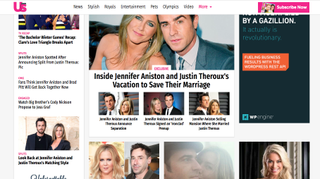
Navigation is designed to help users get from point A to all other points on a site. And keeping the nav menu in a fixed place enables users to navigate the site from anywhere on the page. Many websites 'stick' their main navigation to the top of the screen as the user scrolls down to explore content.
This has become easier thanks to CSS and jQuery plugins and many website themes now come with a sticky navbar as the default, and this trend is showing no signs on going anywhere. Consistent navigation and usability are both important, but the fixed navbar is also handy for mobile users, where the site is naturally longer and thinner.
How should you use it?
If you have a site with lots of navigation items then it’s a good idea to keep it fixed. It’s a surefire way to keep visitors on the site for longer and increase total pageviews.
However, make sure the navbar doesn’t take up too much space. It shouldn’t be so large that it blocks major portions of the page content. The site for US Magazine gets around this issue by resizing having its navigation bar shrink in size as the user scrolls down, making it less intrusive. As long as the user can still consume the page content they’ll probably benefit from a universally accessible fixed navigation.
02. Mega menus
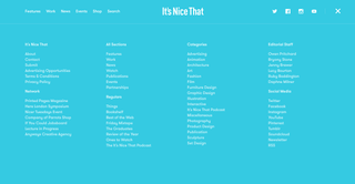
The mega menu has been popularised with the increase of magazine-style blogs. They differ from normal drop-downs because instead of just flowing down vertically these mega menus expand wider, usually containing multiple columns of content. This technique works well if used judiciously but it’s not great for every site. In fact it’s really only useful if you have enough content to justify a mega menu.
Get the Creative Bloq Newsletter
Daily design news, reviews, how-tos and more, as picked by the editors.
Why use them?
Visitors can get a sense of your blog or website by skimming through related content. If you can provide more content in a mega menu then why not?
This trend does not work on mobile, since there’s no room on the screen. But plenty of people still browse the web on desktops and laptops so there’s a wide audience out there in support of the mega menu.
03. Universal navigation
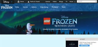
Some companies work with or own multiple brands, and include a universal navigation across an entire website. Disney for example owns theme parks, creates games, and produces movies along with TV shows. It makes sense to keep this universal navigation on every page, regardless of brand, to draw attention to other Disney products.
And this trend isn’t exclusive to conglomerates or holding companies. It is sometimes used on networks of websites, such as those owned by New York Media. Another good example is in the header of Mashable, which links out to all the brand's international sites.
Why use this?
If you’re working with a larger network of products or brands then it can be helpful to link them all together in order to create a coherent brand identity. A universal navigation can drive visitors across the whole network to help cross-pollinate different audiences.
04. Vertical sliding navigation
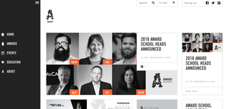
Increasing numbers of websites are adopting the vertical navigation trend, and when it works it really works well. It's particularly popular on portfolios or creative agencies that push the boundaries of traditional web design.
The example above from AWARD is a fantastic case of using the vertical navigation while keeping it visible at all times. Icons link from the side so you can click an icon instead of the hamburger icon. It’s an experimental approach to navigation design but it can work on creative-oriented websites.
Why use this?
Only try this technique if you’re going for a fullscreen layout that moves away from a traditional grid design.
A working vertical navigation isn’t easy to create from scratch, and it's tricky to get it working in responsive designs. However if you’re curious to experiment and willing to try new ideas then vertical navs can be a refreshing twist.
05. Globally hidden menus
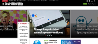
Every web designer should know about hamburger icons and their use in responsive design. But as people become more familiar with the hamburger icon and what it means, more and more sites are keeping the navigation hidden from view at all times.
This may seem strange because it doesn’t help the visitor find links quickly. However it does clear up space on the screen by removing the navigation from sight. There have been various studies that indicate most users struggle with hidden menus. But this trend may be changing with more people using smartphones and growing familiar with the hamburger icon’s significance.
Why use them?
The best case scenario for a globally hidden menu is with a tech-savvy audience. These visitors recognise the hamburger icon and they know it means 'click here for menu'. So if you’re designing a tech blog or creating a B2B digital agency then this can work. But if not, think long and hard before you take this approach, and make sure you're not sacrificing usability in favour of style.
06. Responsive subnav menus
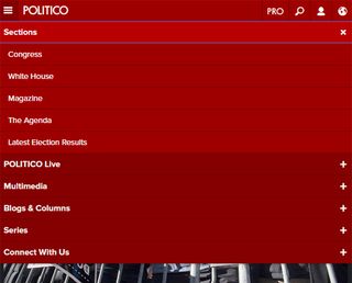
When designing a website, there’s no way to avoid dealing with mobile navigation. It’s popular and it’s here to stay. Designers will often hide some navigation links on mobile to help the menu fit better on small screens.
But many sites are following a new trend of keeping all navigation items by using drop-down menus. This usually requires a hamburger nav with toggle icons for link drop-downs.
You’ll only see this technique on mobile screens or in small browser windows. For example, Politico's mobile site uses small plus signs (+) to indicate a sub-menu beside each link.
Why use them?
Visitors should have access to browse your entire website regardless of what device they’re using. By keeping the sub-menus in place you can offer better opportunities for visitors to browse around.
Just make sure that each sub-menu is clearly denoted with an icon, colour change, or something visual. Visitors should know if clicking/tapping a link opens a menu or brings them to a new page.
07. Top story carousels
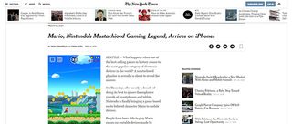
This trend is becoming more popular on blogs and high-volume news sites. Many of these larger sites can publish dozens – if not hundreds – of new articles every day.
Adding a simple carousel to the top of the page offers visitors a chance to check out the latest articles. These stories can be curated or updated dynamically, and they can be styled with thumbnails or whatever you like. You can see another example on basically any Vogue article.
Why use them?
If you’re designing a blog with high volume content then this trend can do wonders for the user experience. Visitors can find out about recent stories and it’ll increase the average total time on site by encouraging visitors to explore more than one story per visit. Most blogs that publish lots of content want to increase visitor retention and the article carousel is a great way to do this.
08. Table of contents

Google seems to love longform content and it’s driving writers to publish lengthier guides on practically everything. This works great for web content but it can muddy the reading experience. To simplify things, I’ve noticed more table of contents boxes being added into longer articles with defined sections. The most notable example is Wikipedia, which has been using a ToC since its inception.
Why use them?
The biggest reason to use a table of contents is to improve the user experience. Longer articles are becoming the norm and it can be intimidating to land on a 5,000+ word article. A ToC reduces that intimidation factor. They’re also useful in SERP rankings, since Google can offer jump links based on a table of contents. This is a win-win approach.
09. All-caps corner links
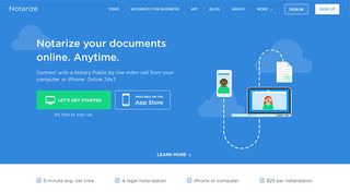
This is a subtle navigation trend but it’s been spreading rapidly over the past few years. It seems like every startup and professional business uses the all-caps text style to create a navigation that feels intuitive and symmetrical.
These navs usually follow very similar styles:
- All caps
- Small lettering
- Sans-serif fonts
- Extra horizontal spacing
- White or very light hue
Whenever I see a navigation like this it’s almost a welcoming occurrence. This design trend has become the signature style for a clean, crisp, and professional-looking navigation.
Why use them?
An all-caps navigation menu just looks professional; it’s subtle yet noticeable and it gives off a sense of trust to the user. If you’re designing a startup or corporate website then this trend is probably the best design style to follow for your navigation. Be wary though: you don't want to end up with a site that's soulless or looks identical to everyone else's.
10. Single page dot navigation
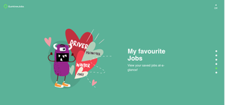
The rise of single-page websites has driven many new trends into the limelight. One of these is dot navigation: a series of circular icons located on the left or right side of the screen. Each of these dots represents a different section of the site. And since the layout is one long page, these links are highlighted to indicate the user’s current position. I really like the ingenuity of this trend, but there is a question mark over if people understand what these dots stand for or how to use them.
Why use this?
If you’re designing a single page layout then I’d recommend using a sticky navbar at the top of the page. This makes it easier to see what each slide represents and what sort of information is on the page.
But if you can’t (or don’t want to) use a top navigation then these dot features are the next best thing. Or even better: combine both! It’s possible to have a top nav with text links and include dot navigation icons too. Or even include text beside the dots. There are lots of options to choose from, and they can all work well.
Related articles:

Thank you for reading 5 articles this month* Join now for unlimited access
Enjoy your first month for just £1 / $1 / €1
*Read 5 free articles per month without a subscription

Join now for unlimited access
Try first month for just £1 / $1 / €1

