10 ways to texture like a pro
Make better 3D textures with these easy-to-follow tips from texturing experts.

Creating textures for your 3D artwork is a vital part of creating realistic 3D models. Of course, there are plenty of textures already out there – see our list of free textures – but sometimes you need to create your own to get the results you want.
With this in mind, we spoke to texture experts Myriam Catrin of Weta Digital and Quixel’s Wiktor Öhman to discover their best advice for producing stellar texture work.
If you're after more 3D tips and tricks, then don't miss our Maya tutorials, or list of the best 3D modelling software.
01. Plan properly
"Always start with a clear idea," says Catrin. "Take the time to gather your references to know exactly where you want to get to. When you know the look you want to achieve, even if you don’t have all the details, you’ve done half the work. I consider this the most important tip for any texture artist."
02. Use mood boards
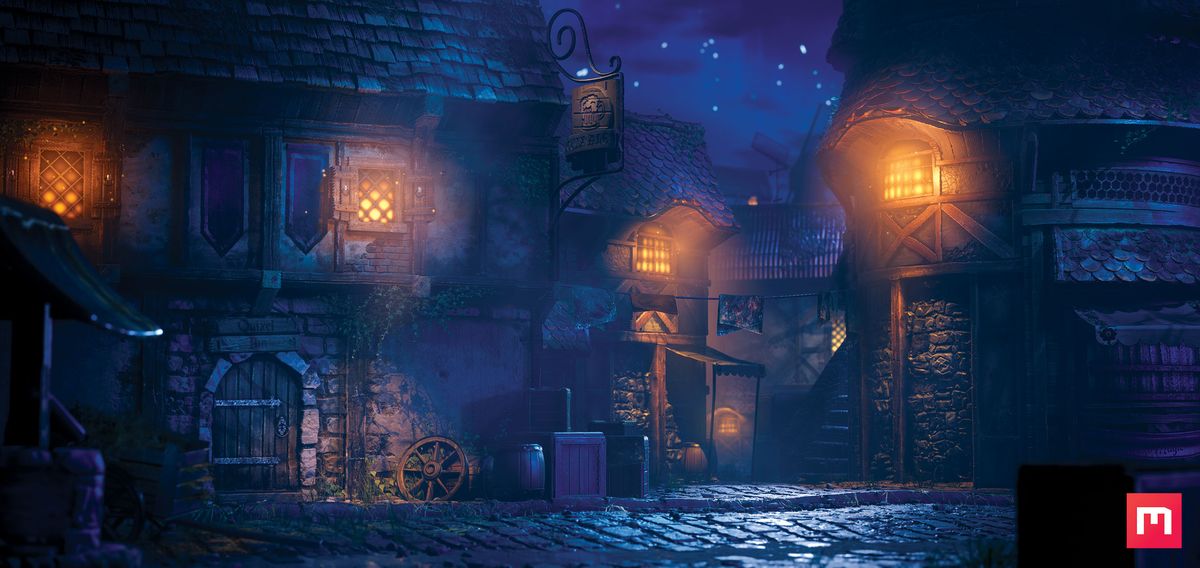
Part of that planning stage can also include mood boards, says Öhman (see our mood board tips on creating effective boards). "Have a number of references or mood boards ready for the detailing and colouring of the textures. The base textures in my scene (above) are quite saturated, which helps them stand out in the night-time colour scheme: bright reds, vibrant oranges and crispy blues."
03. Build a texture library
As well as planning, being organised is also important, according to Catrin. "Organise your tools: take the time to create your own tileable pictures (mask and colour, displacement) and stencils to paint through or triplanar projection. Take photos, scan materials.
Choose with purpose; it takes time to build a texture library, but it will ease your workflow and help you to make something special."
Get the Creative Bloq Newsletter
Daily design news, reviews, how-tos and more, as picked by the editors.
04. Add details last
"Work from broad features and finish with fine features at the end," says Catrin. "Start on your textures from mid-distance (large) then get closer and add details (close-ups). Render your textured asset regularly from far away to very close to assess correction priorities. A lot of details with no features will look busy. It has to look good at every distance."
05. Build primitives
"Start off by placing the building planes and other primitives in a way that draws the eye of the viewer to where you want and creates a noticeable parallax effect," says says Öhman. "Feel free to place light sources as well. I use lights as a way to guide the eye – in the image above from the top-right to the bottom-middle of the scene."
06. Non-destructive organisation
"Organise your work in a non-destructive manner," says Catrin. "Think about compositing. Work with the colour revealed or hidden by a dependant mask (Alpha) and keep filters live to tweak independently. You can re-use Alphas or share them in channels like displacements, speculars, or separated additions like dirt, dust or oil traces.
07. Impose limits
"Keep your organisation and your thinking simple," continues Catrin. "Choose one reference or art concept and run with it. Have a limited set of references so you don’t try to mix too many of them. That doesn’t mean your textures won’t be complex or rich. Simplicity is the key to being able to tackle visual complexity in your work."
08. Use displaced primitives
"The environment shown above was a very impractical but incredibly fun and educational project," says Öhman. "It consists mainly of real-time displaced primitives in Unreal Engine 4. I can recommend this type of environment to anyone who wishes to work on their composition and colour skills, as it’s rather quick and easy to do."
If you're torn between Unity and Unreal Engine, see our handy guide to the differences between the two.
09. Make props
"As well as the facades that I made for the project, I also created a number of props, for example, I made the barrels, crates, wheels and so on," recalls Öhman. "These are also tiling textures applied to primitives, such as planes, cubes and cylinders. The crate, in particular, was a rather fun prop to create."
10. Use Quixel Mixer
"The facades and all the other textures were created in Quixel Mixer, using a combination of hand-painting and material blending," says Öhman. "I started the textures by creating Base, Height and Normal maps, which I then detailed and coloured. Working with only Height and Normal made it easier to block out the scene."
This article originally appeared in issue 130 of 3D Artist. Buy issue 130 or subscribe to 3D Artist here.
Read more:

Thank you for reading 5 articles this month* Join now for unlimited access
Enjoy your first month for just £1 / $1 / €1
*Read 5 free articles per month without a subscription

Join now for unlimited access
Try first month for just £1 / $1 / €1
