10 tips to create a stunning portfolio website
Our top 10 tips to help you create a portfolio website that stands out from the pack.

A portfolio website offers a way to show off your work, connect with clients and bring in new business. However, many creators don’t have a background in website design or website optimisation.
Using a website builder can help you create a portfolio website that stands out. But even then, it’s important to know which elements will display your work at its best. If you want to use a template, check out our guides to the best portfolio templates and the best alternative portfolio sites. In this guide, we’ll cover 10 tips you can use to build a stunning portfolio website.
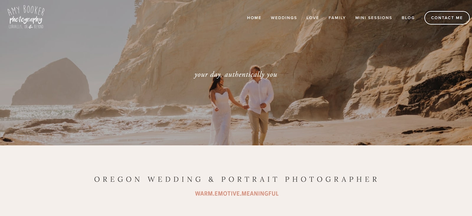
01. Make your homepage shine

While your entire portfolio website needs to be top quality, the truth is that most visitors will never make it past your homepage. So, this is your single best chance to make a good first impression.
To make a homepage that captures visitors’ attention, it’s important to show off your best work. You can put together a collection of images in a collage, create a portfolio of around a dozen images, or use a slideshow to share several pieces of your work. If you’re a videographer, it’s a good idea to create a highlight reel that blends your most captivating clips.
Whatever you decide to display on your homepage, make sure it represents the full range of your creative business. That way, visitors can instantly see what you do and whether you might be a fit for their needs.
02. Explain yourself up front

While it’s tempting to let your work speak for itself on your homepage, you can gain a lot of ground by adding engaging writing to the first page of your website. Take this opportunity to explain what you do and what makes your work unique. That way, potential clients know right away what you can offer without having to click through your site.
Another reason to add text to your homepage is that it’s good for SEO (search engine optimization). When you use relevant keywords like “photographer” or “graphic designer” on your homepage, your website is more likely to rank in search results for these terms on Google and other search engines. That makes your portfolio website easier to find – and better for reeling in new business.
Get the Creative Bloq Newsletter
Daily design news, reviews, how-tos and more, as picked by the editors.
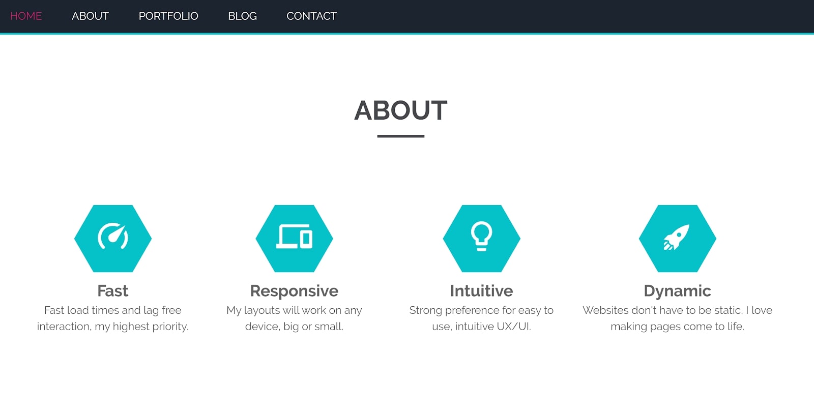
03. Create a unique About page

Your About page is likely to be your website’s second-most visited page after your homepage. So, it needs to be engaging enough to make potential clients feel like they have a connection with you.
Creating a strong About page can be difficult. You need to show off your personality and your creativity, but also maintain professionalism. Ultimately, the goal should be to explain what you do and why someone should hire you or invest in your work. That might mean adding a photo and a few lines, or it might mean telling a whole story. You can also use a video to connect with visitors or even just to list fun facts about yourself.
Whatever you decide, make sure your About page includes basic details like your name and location.
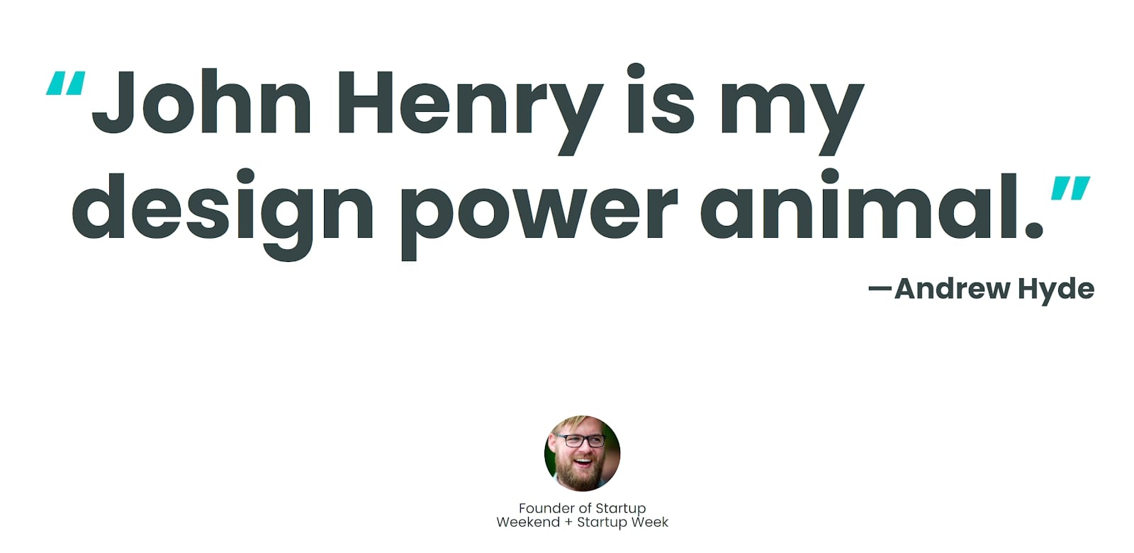
04. Add testimonials

Testimonials and reviews from former clients offer social proof of just how good you are at your work. They add legitimacy to your portfolio website and reinforce your worth in the eyes of visitors. Recommendations from real people can offer an important nudge for potential clients to get in touch.
On top of that, testimonials are a chance to talk about your past clients and projects. This is especially useful if you’ve worked with widely recognised or particularly demanding companies. If visitors can see that you’ve got experience with big projects, that’s more reason for them to want to hire you.
05. Slim down your portfolio

It’s easy to believe that visitors to your website will look at your work with the same hard eye for detail that you do. But the reality is that most people will spend 30 seconds or less looking at your portfolio.
With that in mind, it’s a good idea to present your best work and leave the rest out. Having around 20 images per portfolio gallery is about right. It’s okay to have multiple galleries if you work across different niches.
06. Make your navigation seamless

There’s nothing more off-putting to website visitors than a navigation menu that’s hard to use. If you have too many pages on your site or a layout that’s confusing for first-time visitors, people will be focused on that, when you want them to be focused on the quality of your creative work.
Most website builders offer standardised navigation layouts, which makes it easier to get this aspect of your site right. Never use drop-down menus that are more than one level deep, and avoid drop-down menu items entirely if you can. Also, make sure the page names that appear in your menu are self-explanatory to visitors. Keep it simple and call your portfolio page 'Portfolio' and your About page 'About'.
07. Use your design skills

If you have design skills outside your main creative discipline, don’t be afraid to put them to use on your website. If you’re a graphic designer, for example, you could use animations to bring your work to life in a unique way. Or if you’re a photographer, you could design a graphic that illustrates the types of work you do or create a promo video that shows off your best work in an engaging way.
These types of designs should be simple enough that they don’t steal the thunder from your main portfolio. But using something other than text to explain yourself or your work to potential clients can help demonstrate your flair for creativity.
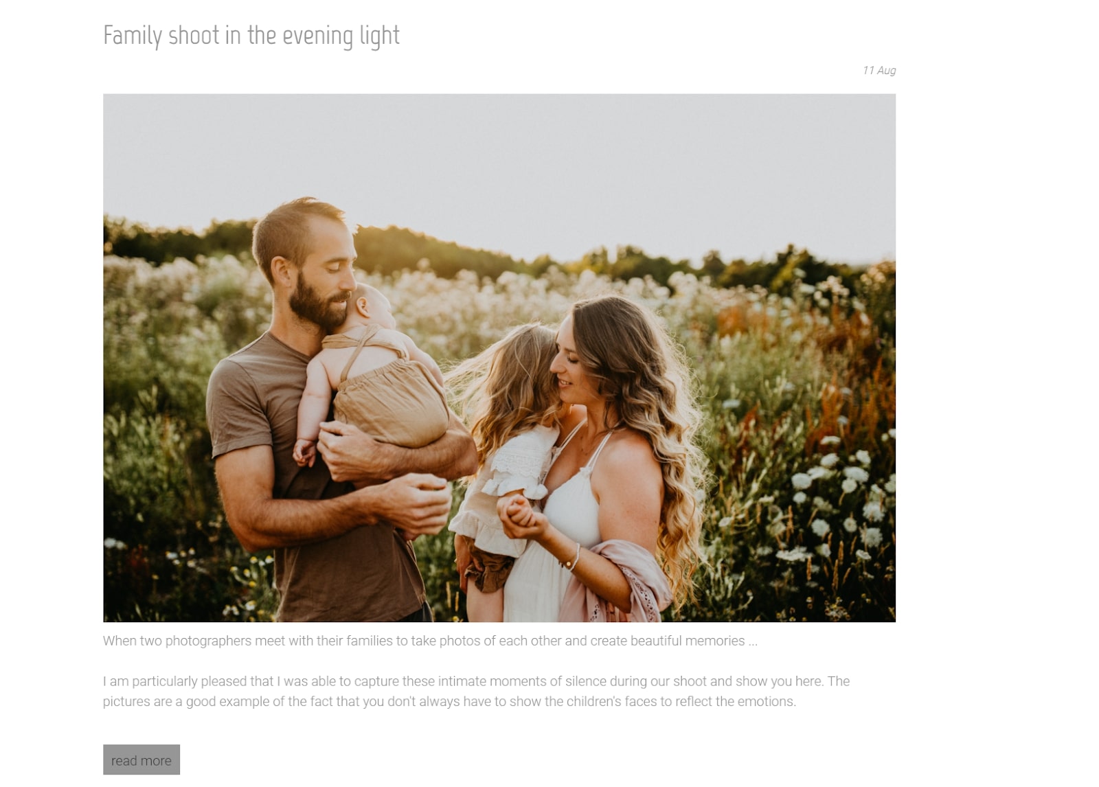
08. Add a blog

Adding a blog to your portfolio website is one of the best things you can do to grow your business in the long run. Blogging about your work gives you a chance to connect with visitors to your site and create a loyal following over time. It’s also great for SEO, since your blog articles can show up in search results and direct people who may not otherwise have known about your work towards your portfolio website.
Another benefit to starting a blog is that it serves as a place for all the work that doesn’t make it into your portfolio galleries. You can brag about recent projects, show off work that’s currently underway, and offer insights into the work that went into a particular design, image, or video.
09. Keep it clean

While we’ve offered a lot of thoughts on elements you should include on your portfolio website, it’s also important to think about what shouldn’t be on your site. In many cases, a minimalist design is the best since it keeps the spotlight on you and your work. Get rid of unnecessary pages and images, and cut down text to just the essential information that you want potential clients to know.
It’s also important to tidy up your website from time to time. Go through your pages and blog posts to remove links that no longer work, for example. Make sure that all of your page elements are working on both desktop and mobile, and fix or remove any that aren’t.
10. Make a call to action

Once you’ve got visitors excited about your portfolio, make sure that they have a clear path for acting on that excitement. Create a call-to-action button that links to your contact page or an order form and place it in key locations across your website. The call-to-action button can be preceded by a display of your work or copy telling potential clients what you can offer them.
While you want your call-to-action button to be easily discovered by visitors, make sure it doesn’t appear spammy. The best approach for most portfolio websites is to place no more than one button per page.
Read more:

Thank you for reading 5 articles this month* Join now for unlimited access
Enjoy your first month for just £1 / $1 / €1
*Read 5 free articles per month without a subscription

Join now for unlimited access
Try first month for just £1 / $1 / €1

Michael is a freelance journalist and photographer based in Bellingham, Washington. His interests span a wide range from business technology to finance to creative media, with a focus on new technology and emerging trends. Michael's work has been published in TechRadar, Tom's Guide, Business Insider, Fast Company, Salon, and Harvard Business Review.
