10 tips for better mobile UX design
These are the key things to keep in mind when developing mobile UX design.

Mobile UX design poses its own challenges for UX designers. Layouts, menus, forms, web fonts and gestures are all things you need to consider when designing a website. But all of these elements raise particular considerations when it comes to mobile UX design.
With mobile now estimated to account for just over half of all website visits, it's more important than ever to make sure that you think carefully about how a site is going to be viewed by visitors using their smartphones and other mobile devices. We've drawn up our own list of 10 top tips for better mobile UX design that can help you give users a smooth experience. Not sure where to start? A website builder might be the perfect tool for you, as well as a decent web hosting provider if you're just starting out.
Take a look at our essential tips for UX design, and make sure you avoid these common UX mistakes. To learn everything you need to know about UX, and not only for web design, consider signing up for our online UX design course. You could even win a place on the course if you complete our two-minute online survey.
01. Include feedback in your mobile UX design
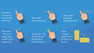
One big difference with mobile UX is that nowadays the vast majority of people are using touchscreens. That allows you to give users tactile feedback that can really enhance their experience of your site.
A static webpage won’t be as engaging as something that’s a bit more dynamic, and rollovers, hover states and animations can all bring a website to life. So add support for touch gestures, and also subtle movements of iconography to draw the user’s eye.
02. Forget the carousel in mobile
Carousels remain a pretty popular feature in web design, but the statistics suggest they shouldn't – at least not for mobile. In fact, Google data suggests less than one per cent of mobile users actually engage with carousels.
The problem is that every time a carousel changes, the impact of the previous slide is immediately lost. Therefore, it's not a good idea to hide key content behind a slider. Instead, stack it vertically down the page and the user will do a more natural vertical scroll.
Get the Creative Bloq Newsletter
Daily design news, reviews, how-tos and more, as picked by the editors.
03. Build in scope for the future in your UX mobile design
If the approach is to get a release as early as possible, it’s easy to end up focusing on only the most vital features of a site. The problem with this approach is that it could make it impossible for developers to truly build scope in the future. Always try to design for the most complex first.
04. Remember that less is more in UX mobile design
It's always worth remembering that mobile UX design doesn’t have to be a replication of the desktop experience. In fact, often it shouldn't be. Smaller screens mean can make desktop UX uncomfortably cluttered. By reducing certain features and content to accommodate the user’s device and screen size, we can make the experience a lot more pleasant for the user. For example, a long-winded product configurator to shopping basket journey could be cut down to a simple ‘quick add’ process.
05. Design for the fickle

There’s always a risk of mobile users losing engagement and being distracted by external variables. This is more the case than with desktop because of the situations in which users tend to be using their devices. To account for this, try to make the interface easy to pick up from where they left off. Break big tasks and forms down, and make everything as simple as possible.
06. Reuse mobile UX design assets where possible
One of the key pillars of user experience best practice is consistency. It is always a good idea to keep a consistent library of already designed UX assets for all screens, devices and resolutions (if you've got a lot of design files to store, you'll need roomy cloud storage). With a mobile-first approach to UX, it’s harder to ignore this rule.
07. Listen to the best
There are several unchallenged leaders in consumer mobiles, and there's a reason for that. Both Google and Apple have regularly maintained documentation for UX best practice, and this is hands-down the best starting point for any designer. Although guidelines could be seen to stifle creativity, it’s always a good place to start and to ensure a happy medium.
See Google's Principles of mobile site design and Apple's UI design do’s and don’ts.
08. Focus on real user preferences

It’s beneficial to use real users to test whether a mobile UX design actually works. This allows you to make design decisions based on fact rather than preference and thus reduce the chance of confusion when articulating features to developers. Real user data is also more powerful when challenged by the subjective taste of a client. See our tips for successful UX research and testing for some pointers.
09. Keep text alignment readable
Centred text content isn’t always bad, but the key is to know when not to implement it. Full-page article content is almost always best being ‘left to the left’ since this makes it easier for the user to scan. So if readability is a key goal of the website (and we can't think of many cases when it wouldn't be!) then keep text to the left when you have a lot of content and centre-align small text blocks only.
10. Remember the basics
Sometimes it can be easy to dedicate so much time to details like interactions, gestures and the like, that we forget the basics. But ensuring that a website has the essentials like an up-to-date SSL certificate, fast loading speeds and a lightweight SVG sprite sheet guarantees a better user experience. Security warnings and unnecessarily large then scaled down imagery will put up barriers, stopping users getting to the key content.

Want to learn more about UX and UI? Don't miss our UX design foundations course.
Related articles:

Thank you for reading 5 articles this month* Join now for unlimited access
Enjoy your first month for just £1 / $1 / €1
*Read 5 free articles per month without a subscription

Join now for unlimited access
Try first month for just £1 / $1 / €1


