10 things designers say that normal people don’t
Designers have their own special lingo, which can cause confusion when uttered in the presence of normal folk. Here are some of the worst offenders.
We designers are a special breed. We understand the world in a different, arguably better, way to ‘normal’ people. Whilst we blend into society with aplomb, we’re obviously a superior species – sent from a distant universe to make things look better. And our nation has certain distinct phrases that you won’t hear a normal puny human utter.
So if you hear any of the following in passing, you know you’ve been in the company of a higher being…
01. 'It’s not a font, it’s a typeface'
When chatting to non-designer friends, they may casually mention that they used new fonts in their latest work project. But what they really mean is a typeface. They used more than one weight. If there’s anything more infuriating to a designer it’s the mixing up of these two terms. Font = one weight, typeface = the whole set.
02. 'The kerning is so off'

Most regular Joes won’t even know what kerning is – more fool them we say. But when we see any kind of kerning or leading errors we just can’t let it go. Whether on a menu, sign or... well, anything. Most think ‘ah, so what?’ but for us designers it’s a huge bugbear. It’s the difference between flick and... well, we’ll let you work that one out.
03. 'Black is not a colour!'
"And I just love wearing black, it’s such a great colour on me,” you overhear on the tube. You have to bite your tongue almost to the point of dismemberment. Black, as we all know, is not a colour – it’s the absence of colour. AND THEREFORE NOT A COLOUR. Just try not to scream it too loud for fear of ousting our higher intelligence.
04. 'You’re using Windows?'

It’s a fact that most of the world uses Windows. And whilst you may dabble, you’re still a bit shocked when any of your friends pull out their laptop and it’s not a MacBook Pro. And if it’s anything below Windows 10 – gasp – then they pretty much won’t be considered your friend any more.
05. 'You call that a brief?'
We like to have a certain amount of freedom, but a one-sentence brief is the most frustrating thing on the planet, especially when followed up with a raft of changes that weren’t set out originally. Picture it now, holding up a printout and saying to yourself ‘You call that a brief?’ Yeah, we’ve all done it.
Get the Creative Bloq Newsletter
Daily design news, reviews, how-tos and more, as picked by the editors.
06. 'It’s not empty… it’s negative space'
There’s a temptation for clients to want to fill up every part of a page or design. But we all know the correct use of negative space is as important as the imagery and typography itself. So next time a client says ‘so what’s with all the white space?’ respond ‘it’s negative space and it’s important to the balance of the design’ 15 times, or until they hang up or leave.
07. 'Has anyone seen my stylus?'

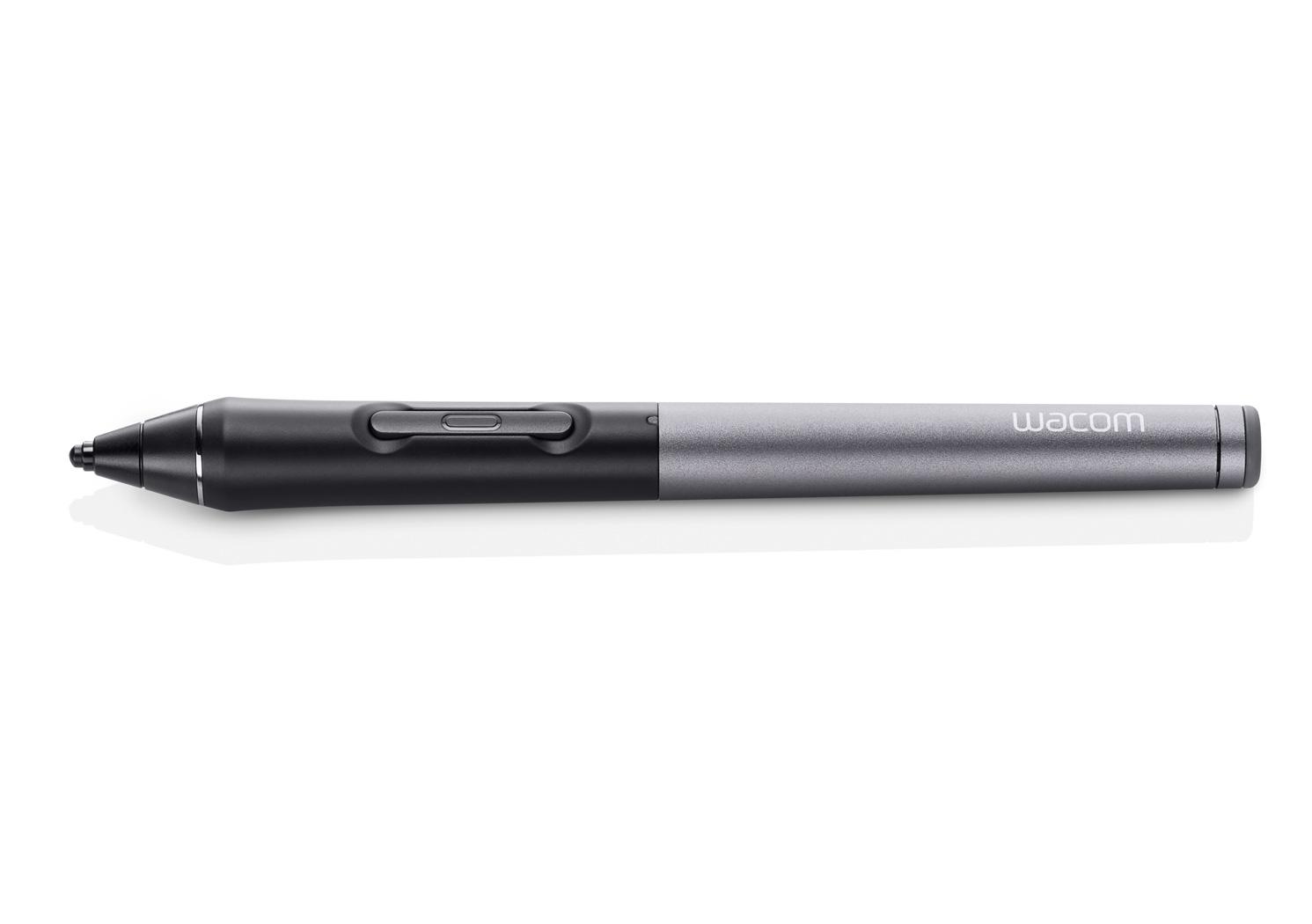
Ah, the Wacom pen, the TV remote of the design world. Why is it these things always go missing? Even though there’s a little stand for it on your desk. After asking everyone in the office (John in accounts thought you’d lost your ‘style’) you find it by the kettle in the next kitchen – and you can’t even remember making tea that morning.
08. 'There’s too much copy!'
Who in everyday life looks at something and says ‘there’s too much copy on this page’? No one, that’s who. Apart from the designer. We know exactly how much text should be on a page or spread. Eager clients want to cram all the words they can onto their one-pager, but the designer revolts, making them cut it back until it’s more aesthetically pleasing than the golden ratio itself.
09. 'I bought a typeface yesterday'

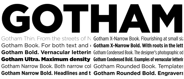
Normal people don’t buy typefaces, it’s a fact. When was the last time you heard of someone in the world outside of design bragging that they just picked up Gotham? Yes, most people just search through reams and reams of free fonts (yes, fonts!) before finding something relatively suitable.
Us designers however, have to have the perfect typeface – even if that means shelling out. So we will pore over all our options before reaching for the credit card. And then explain why we purchased it whilst experiencing blank stares from our non-designer buddies.
10. 'Are you sure that’s CMYK/RGB/[insert colour mode here]?'

This is why clients employ designers and don’t do things themselves. We know about colour modes and formats. And when something isn’t supplied in the right way, we like to tell people about it. We’d also like to give an honourable mention to resolution, which is one of life’s greatest mysteries to those not in the design world.
Anything else you say that other people just don’t? Is our satire bang off target? Tell us in the comments below…
Related articles:

Thank you for reading 5 articles this month* Join now for unlimited access
Enjoy your first month for just £1 / $1 / €1
*Read 5 free articles per month without a subscription

Join now for unlimited access
Try first month for just £1 / $1 / €1

Rob is editorial, graphic design and publishing lead at Transport for London. He previously worked at Future Publishing over the course of several years, where he launched digital art magazine, ImagineFX; and edited graphic design magazine Computer Arts, as well as the Computer Arts Projects series, and was also editor of technology magazine, T3.
