10 life lessons for designers
These insights from experienced designers will help you on the path to creative success.
The design industry is more vibrant and exciting than ever, but it is a competitive and demanding environment that can be daunting for people at the beginning of their career. Some rookie mistakes are an inevitable (and valuable) rite of passage, but sometimes a few words of wisdom from a more experienced figure can help beginners avoid needless conflicts, better expend their resources or just have the confidence to stick to their guns when deadlines and clients seem unmanageable.
There are no shortcuts to gaining experience – although reading the 30 books every graphic designer should read may help – but there are insights from experienced creatives that we can all benefit from, even if you've already got a stellar design portfolio under your belt.
The path to creative success is unique for all of us, and the following life lessons are by no means a definitive list, with no absolutes (except for the rule that there are no absolutes). But these strategies have proved successful for many experienced designers, and will hopefully provide inspiration and insight to younger talent.
01. Know current trends (so you can avoid them)

Now that every other creative in the world is available to you via the phone in your pocket, originality is the most powerful currency.
Sawdust has established a world-wide reputation with their unique typography, and when Computer Arts spoke to co-founder Jonathan Quainton, he was unequivocal about how new talent should make their mark: "Don’t follow trends... find your own source of inspiration. The more obscure the better."
Design legend Milton Glaser – perhaps most famous for his ‘I heart NY’ design – has also encouraged creatives to aim higher than simply following contemporary styles. "I think the best designers have a kind of broader look and don’t change with the prevailing wind," he told us when we interviewed him back in 2010. "If you’re serious about design, you have to be more concerned about durability and ideas that go beyond the moment."
Make no mistake: knowing what is and isn’t fashionable is still crucial. But whether it’s lurid gradients, brutalist typography or '90s retro-chic, design against trends to stand out against the crowd.
Get the Creative Bloq Newsletter
Daily design news, reviews, how-tos and more, as picked by the editors.
02. Take risks with your career

Radical shifts in career or projects that initially seem too challenging can be terrifying, but the stock cliche – we regret what we didn’t do in life, not what we did – holds pretty true for creatives looking back on their careers.
Despite having single-handedly reinvigorated magazine design through his innovative work at Bloomberg Businessweek, designer Richard Turley abandoned print (and his native UK) at the very peak of his success to take a job in America making TV indents and campaigns for MTV.
His self-proclaimed "clusterfuck of visual content" re-energised him, exposed his talent to an enormous new audience and showed his understanding of the importance to grow and develop as a creative.
Designers who stand still stagnate. Forward progression is everything if you are to develop a long-lasting career.
03. Understand your influences
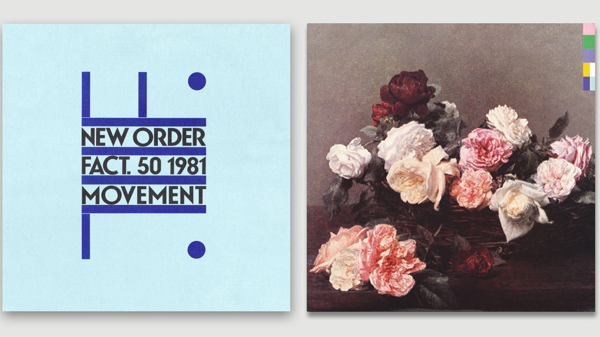
Whatever your chosen area of interest, you need to know and understand it better than anyone else. Radical experiments in typography are unlikely to yield rewards if you don’t know which rules you’re breaking. Colour theory cannot be challenged without a basic comprehension of the common principles. More than ever, we exist and create in a richly connected world. The DNA and heritage of your ascendents need to be absorbed.
Peter Saville did not just stumble on his radical design aesthetic for Factory Records. The deliberately provocative borrowing of high art aesthetics and subtle identity building were triggered by the realisation, when he was due to leave Manchester Polytechnic in 1977, that he didn’t know enough about the history that underpinned graphic design. His rigorous research allowed him to explore a much richer visual history, and bring these influences back to his own work with startling results.
04. Deliver a solution, not options
If your work is in any way client-based, there will inevitably come a point where you are required to communicate what you aim to deliver. Whether this is a campaign, illustration or logo, young creatives will be tempted to show a range of options that the client can choose from, a nervous symptom of wanting to ‘show your workings’.
Don’t. Remember that you are being hired to offer a solution, not to engage in debate. Choose a direction and execute it with maximum confidence. Don’t make the mistake of using client meetings to help search for direction. Your indecision will be noted.
The unspoken law of all client-based design is that if offered a choice, your client will pick wrong. Don’t give them the chance. You should have been living a breathing this project know what the best solution is. Sell with confidence and listen with humility.
(And keep those alternative ideas in reserve, just in case...)
05. Ignore disciplines
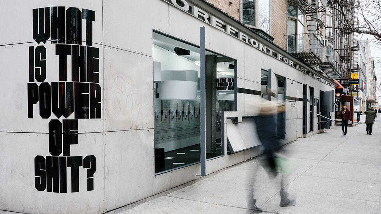
Specialist disciplines are fading fast. When Computer Arts interviewed design icon Mario Hugo, no single title could encompass his diverse range of work (designer, art director and illustrator had to do) and he was dismissive of any notion of specialism in contemporary design. “It feels very limiting to call yourself one thing or another,” he told CA. “Those in the emerging world of design would prefer to broaden their horizons.”
Graphic designer and Pentagram partner Natasha Jen raised some eyebrows at this year’s Design Indaba with her provocatively entitled talk: Design Thinking is Bullshit. But throughout her career of innovative, multi-discipline client work, she has always spoken her mind, championing the polymathic nature of design and encouraging each new designer "to think and operate like a renaissance man".
The narrower your area of expertise, the less flexible (and attractive) you are to new clients.
06. Mentoring talent can be rewarding
Young creatives are often ruthlessly (and rightly) self-focused, but when opportunities arise to develop and nurture younger talent, altruism has its own rewards. To guide a younger talent past pitfalls, help nurture their skills or simply offer practical support is fulfilling in its own right, especially if we see new talent benefit from our mentoring.
As creatives we tend to live in our own heads, following processes that are often intuitive. Dragging our ideas and theories to the surface to share with others often leads to a sharper self-awareness, and a better understanding of our own methods. Experience cannot be taught via a YouTube tutorial or faked with youthful exuberance, but it can be shared.
07. Stay playful
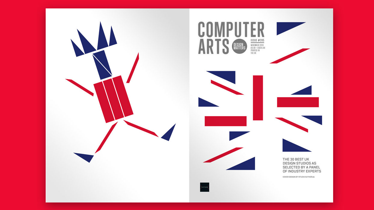
A desire to be taken seriously early in our career can often inhibit us, but experienced designers remember how important it is to play, as well. However much we rationalise our work, the reality is that many of our critical justifications are written in hindsight. The actual unlocking of the imaginative processes is usually mysterious and instinctive.
This can be a source of anxiety for young designers, especially when the creative well runs dry, but however many design books promise formulae for success, the only shared characteristic of successful creatives is a passion for playfulness.
Studio Sutherl& has topped the Computer Arts UK Studio Rankings list for two years running now, and its sublime output is driven by exuberant, child-like play harnessed by a formidable mastery of craft. “The more joy you put into a project, the more joy comes out,” founder Jim Sutherland told us, his work demonstrating how experience earns the right to be young again.
08. Keep your portfolio up to date
Keeping your graphic design portfolio (or website or showreel) up to date is a discipline few creatives can manage. There is always the next brief on the horizon, and updating our informal portfolios – Instagram, Behance etc. – can often feel more fun. But the less frequently you update your portfolio, the more unwieldy a task it becomes. Tedious though it may seem, experience will teach you that your portfolio is your single most important piece of work.
Whatever your current role, having your portfolio at hand to email at a moment’s notice is essential. Unexpected opportunities may arise that need to be acted on swiftly, and hastily refreshing your portfolio is never a good idea. It is a window onto your talent, professionalism and self-awareness – bloated portfolios dilute your best work; hasty portfolios with spelling errors will be ignored – and the standard for self-presentation has never been higher.
As your career progresses, have the discipline to edit your own work down. Remember, much of this work will be flipped by in seconds, so variety and pace are essential. It is a visual narrative of your creative life. Show it to friends and peers and ask for constructive feedback. It doesn’t matter how important or interesting a project was for you, only what impact it will have on the viewer.
Read more about how to craft a standout portfolio here.
09. Trust your instincts
This is perhaps the most difficult life lesson to acquire. Most creatives spend their whole lives questioning themselves and weighing up their relative successes. It is an inevitable component of the designer’s DNA to suffer creative anxiety. What we now term Imposter Syndrome is usually just good old-fashioned self-doubt, and there are few creatives who would deny ever feeling anxious or stressed about a project.
But the better we get at listening to our inner voice – however irrational, contradictory or seemingly arbitrary – the better we can harness the power of our instincts. Education, training and logic are vital essential skills but our instincts often provide the magic.
And if you suspect something’s wrong with your design but don’t know what it is, take it apart and start again. It doesn't matter if you can’t rationalise the flaw, if your instincts tell you something’s not working, believe them.
10. Learn from your mistakes
Analysing what went wrong with a project is often more instructive than trying to explain why something works, and experienced creatives learn from their mistakes and apply these lessons to subsequent work, rather than erase it from their memory (and Instagram).
Recognising the value of our mistakes is difficult to accept early on in our careers, but it’s a fact that is better embraced than agonised over. “There’s a tremendous advantage to make a terrible blunder,” design legend Paula Scher reminded us when we interviewed her back in 2009, “because you learn that way… To get good, you have to get really bad.”
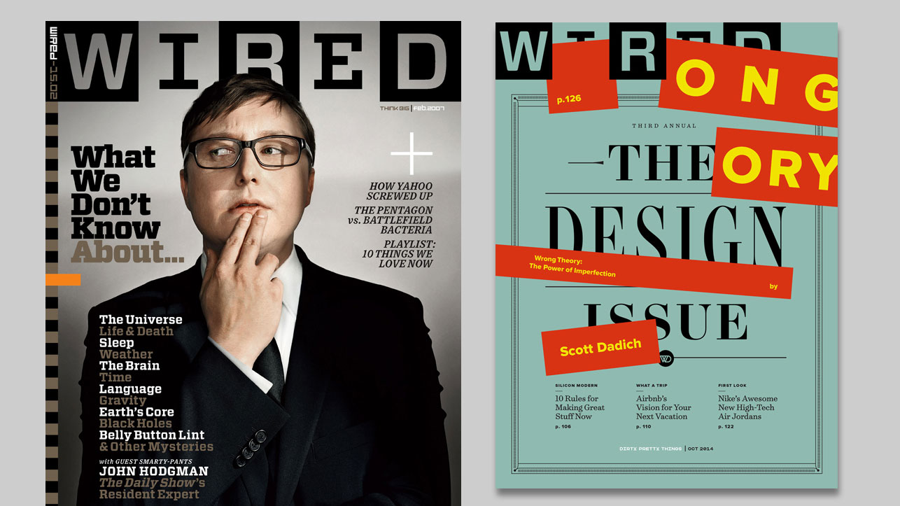
When Scott Dadich was creative director at WIRED in 2006, he found himself challenged by a colleague to ‘improve’ what he felt to be an already perfect cover. In a fit of “designerly fuck you", he sabotaged his own design with a random, lurid stripe. With hindsight, he came to appreciate this ‘mistake’ as a vital ingredient of an otherwise adequate design, and his subsequent exploration of Wrong Theory heralded a new era of innovative editorial design both at WIRED and the design world beyond.
Related articles:

Thank you for reading 5 articles this month* Join now for unlimited access
Enjoy your first month for just £1 / $1 / €1
*Read 5 free articles per month without a subscription

Join now for unlimited access
Try first month for just £1 / $1 / €1

Mark Wynne is an art director and designer with more than 20 years' experience in the publishing industry. He's been responsible for art directing and rebranding several popular magazine titles, including Official PlayStation Magazine and cult videogame title EDGE, and he was also Art Editor for Computer Arts magazine. Mark is one of Creative Bloq's go-to experts for all things related to design and branding.
