10 instantly recognisable American brands
What better way to celebrate the 4 July than with some great branding from the USA?
It's 4 July, and in celebration, we're taking a look at some of the great brands the USA has given to us over the years.
We're all familiar with the really big American brands that you'll find in all the lists - McDonald's, Apple, Coca-Cola and the rest. But there are plenty more that are just as ingrained in our minds and culture, and just as worthy of recognition; read on for some star-spangled, all-American logo design inspiration.
01. Colgate

The founder of Colgate, William Colgate, was actually English, but his family emigrated to Baltimore when he was 15 years old. In 1806, at the age of 23, he established his own starch, soap and candle business in Manhattan. It wasn't until 1896, though, that the Colgate company introduced the product that would become synonymous with its name: toothpaste in a collapsible tube, kicking off a brand identity that's still going strong today.
02. Atari
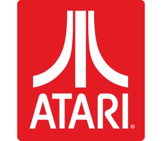
It's a name that can be traced back to the very dawn of the videogames business, and while the name Atari is Japanese and comes from the board game, Go, the company itself is all-American. Or at least it was until it was bought by the French games company, Infogrames.
Its iconic logo was created in-house by graphic artist George Opperman; sometimes described as 'Fuji' because of its resemblance to the Japanese mountain, it was designed to look like a letter A while being a representation of Atari's original hit game, Pong. The two side pieces represent the players, while the middle stroke is the centre line of the Pong court.
03. Holiday Inn
Originating as US motel chain, but now British-owned with over 1,000 hotels worldwide, Holiday Inn is one of the world's largest hotel chains, and while it might not be your first choice when it comes to holiday destinations, it's definitely recognisable. In its early heyday, it was notable for its big and friendly Holiday Inn logo, in a peculiar reverse-italic script font; a relaunch in 2007 saw it ditch both the logo and the last of its motels, and a new Interbrand-designed logo came to the fore.
04. Dell
While Apple and Microsoft are the two big names in computing, Dell has been doing its thing for 35 years, growing from a dorm-room operation in Austin, Texas into a multi-billion dollar corporation with over 145,000 employees worldwide. Since 1989, its logo has featured a canted letter 'E' – supposedly to reflect Michael Dell's ambition to turn the world on its ear – and this easily identifiable piece of visual shorthand was retained in its most recent rebrand, courtesy of Brand Union.
Get the Creative Bloq Newsletter
Daily design news, reviews, how-tos and more, as picked by the editors.
05. Ben & Jerry's
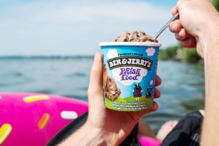
Ben & Jerry's has been in the ice cream business for over 40 years, starting out as an ice cream shop in Burlington, Vermont in 1978, growing steadily through the 1980s and going worldwide from the 1990s onwards. Since the beginning, it's retained its charming hand-drawn Ben & Jerry's logo, designed by creative director Lyn Severance; a 2014 global redesign by Pearlfisher revamped its branding but left the logo intact.
06. Old Spice
Until fairly recently Old Spice was a bit of a has-been brand, most notable for its UK TV adverts from the 1970s featuring surfers and the dramatic tones of Carl Orff's O Fortuna. And while its branding is largely unchanged these days – that combination of script font and boat logo is far too recognisable to throw away – it's done a great job of repositioning itself for a younger demographic thanks to inspired branding and marketing work from Landor, along with Wieden+Kennedy and Citizen Relations, celebrating the art of manliness in fun and unexpected ways.
07. Spam
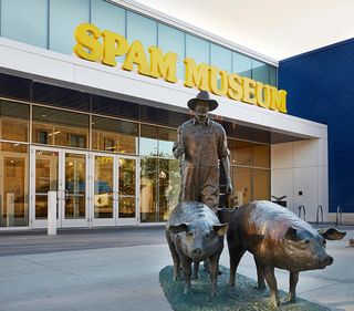
We know; you don't like Spam. Nobody does. But 82 years after it was originally launched, Spam – a mouth-watering blend of pork, water, salt, potato starch, sugar, and sodium nitrate – is still going strong.
The reason it still does well? It's cheap – when the global economy tanked in 2008, Spam sales went up. And while the name has become synonymous with junk email, that hasn't hurt the Spam brand, and just look at that logo: it's unabashedly retro and utilitarian, with the name picked out in bright yellow ITC Souvenir Bold. You may hate the product, but you have to love the branding; you may even want to visit the Spam museum in Austin, Minnesota.
08. WD-40
A similarly no-nonsense piece of all-American branding comes from that essential unjammer of everything, WD-40. Everyone has a can of WD-40 around the house, either under the kitchen sink or in the garage, ready to be whipped out whenever a lock gets stuck or a hinge becomes a bit too squeaky.
WD-40 is one of those items that doesn't need a clever brand identity; the name derives from what it does – water displacement – and the fact that it was invented on the 40th attempt at getting the formula right. It does the job and that stark blue-on-yellow logo makes it easy to find when you need it.
09. Gillette

It used to be 'the best a man can get', but as of this year Gillette is 'the best men can be'; a subtle development, but an important one in these #MeToo-flavoured times. Founded in 1901 as the American Safety Razor Compan, Gillette pioneered disposable safety razors and became one of the world's biggest names in shaving, and the brand name continued after the company merged with Procter & Gamble in 2005.
The familiar bold italic Gillette logo has been in use since 1989, but it was revamped in 2009 with a neat hidden feature: the circular tittle on the 'i' was replaced by a quadrilateral, and now the negative space within the 'G' and the 'i' creates the effect of a pair of razor blades.
10. Harley-Davidson
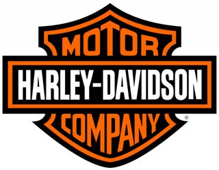
You can't have an article on American brands without featuring Harley-Davidson; big, brash, loud and occasionally dangerous, it's pretty much the embodiment of the American dream. Founded in 1901, it didn't even have a logo until 1910, and the distinctive 'bar and shield' design has formed the basis of Harley-Davidson logos ever since.
Today the logo isn't just available on motorbikes; Harley-Davidson-branded merchandise is available in all shapes and forms, including clothing, toys and home décor.
Related articles:

Thank you for reading 5 articles this month* Join now for unlimited access
Enjoy your first month for just £1 / $1 / €1
*Read 5 free articles per month without a subscription

Join now for unlimited access
Try first month for just £1 / $1 / €1
Jim McCauley is a writer, performer and cat-wrangler who started writing professionally way back in 1995 on PC Format magazine, and has been covering technology-related subjects ever since, whether it's hardware, software or videogames. A chance call in 2005 led to Jim taking charge of Computer Arts' website and developing an interest in the world of graphic design, and eventually led to a move over to the freshly-launched Creative Bloq in 2012. Jim now works as a freelance writer for sites including Creative Bloq, T3 and PetsRadar, specialising in design, technology, wellness and cats, while doing the occasional pantomime and street performance in Bath and designing posters for a local drama group on the side.
