There's little that gives us more joy than logos with hidden meanings – the pinnacle of clever design work. It goes without saying that creative professionals are adept at spotting the intricacies of design and details other people often don't notice. A weird choice of font on a shop sign. An expert use of motion graphics on an app loading screen. The list goes on.
But there are plenty of iconic logos you've probably seen a zillion times and never spotted the genius hidden meanings contained within them. Of course, you all know about the FedEx arrow, and the Amazon smile. But there are a plethora of examples besides those.
In this post, we pick 10 of our favourites. How many of these logos' hidden secrets had you already spotted? If this isn't enough, check out these logo easter eggs. Feeling inspired? Here's our how to design a logo guide.
10 logos with hidden meanings
01. Beats by Dr Dre
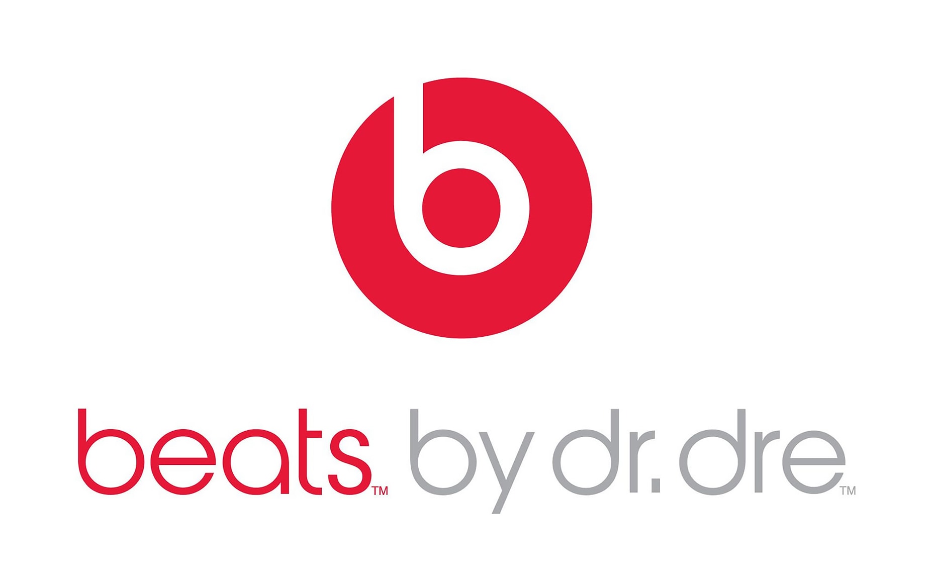
Launched in 2006 by rapper and music producer Dr Dre – the founding member of N.W.A. and the Svengali behind stars like 2Pac, Eminem and Snoop Dogg – Beats by Dr Dre remains the world’s hippest headphone brand.
The company’s logo was produced in collaboration with Californian creative studio Ammunition, and on the face of it, its design is pretty straightforward: a simple white ‘b’ in a red circle. Look at it another way, though, and it also represents the head of a person (the red circle) wearing one of the headphones (the white ‘b’).
This is an excellent use of minimalist abstraction that provides a nice little Easter egg for those who spot it, while the logo still works perfectly for those who don’t.
02. Goodwill

Founded in 1902, Goodwill Industries International Inc is an American non-profit providing employment, training and other community programs for people finding it difficult to get a job, such as veterans or those without an education. It’s best known for its massive network of thrift stores, as well as operating sister organisations across Canada, South America and Asia.
Get the Creative Bloq Newsletter
Daily design news, reviews, how-tos and more, as picked by the editors.
Goodwill is upbeat, positive and optimistic, and its logo fits right into that category. Legendary graphic designer Joseph Selame produced it in 1968, and you can learn more about its creation in this video.
What many don’t notice, though, is that this logo cleverly incorporates a smile in two places: both the main icon above the wordmark, and one within the wordmark itself. (Still can’t see it? Take a closer look at that first ‘g’.)
03. Tour de France
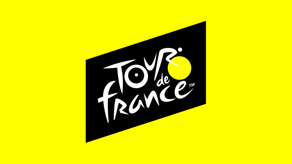
First held in 1903, the Tour de France is the most prestigious cycle race in the world. Consisting of multiple stages, it mainly takes place in France, but since the 1950s it has held sections in nearby European nations too.
The Tour’s modern logo was created by French designer Joel Guenoun in 2002, with its symbolic yellow-and-black palette and frenetic, cartoonish lettering. The latest iteration of the design (shown above) was released in summer 2019, simplifying the wording and making subtle changes to improve legibility.
Our favourite element of this iconic logo is easy to miss: a neat little typographic sketch of a cyclist. If you still can’t spot it, take a look again at the ‘r’, the adjacent black dot and the bright yellow sun, and all will become clear.
04. Continental

Founded in 1871 as a rubber manufacturer, German company Continental is today one of the world’s biggest manufacturers of automative parts. It operates in more than 60 countries and produces a wide range of components, but it’s probably still best known for its tyres.
The current Continental logo – an update of a wordmark dating back to the 1920s – was created in 2013 by Peter Schmidt Group. It’s a very smart, quite formal wordmark, but what you might not have noticed is how the ‘C’ and ‘O’ form the shape of a tyre. This is easy to initially miss, but difficult to ignore once you’ve spotted it.
05. BMW
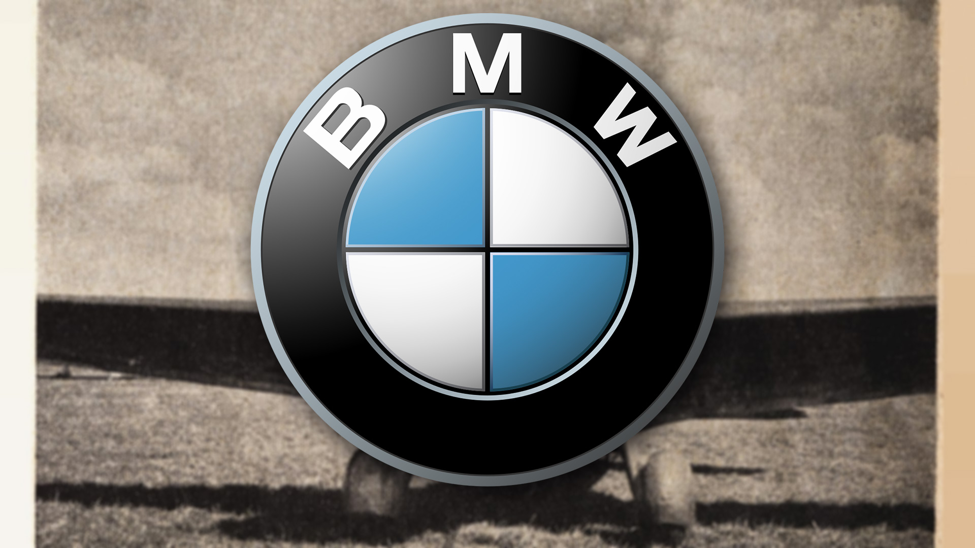
Another German multinational, BMW stands for 'Bayerische Motoren Werke', or 'Bavarian Motor Works'. Founded in 1916 to manufacture aircraft engines, the company now produces cars and motorcycles, and is a byword for class and quality around the world.
There’s a longstanding myth that BMW’s logo, originally designed in-house in 1927, represents a spinning aircraft propeller. But as we discovered, it’s in fact a mix of the logo of the Rapp Motorenwerke, from which the company grew, and the colours of the Bavarian flag.
That’s significant, because at the time of BMW's formation there was a popular movement for Bavarian independence from Germany, which was much like the Scottish and Catalonian nationalist movements in the UK and Spain today. This phenomenon hasn’t gone away, either: in a 2017 YouGov poll, more than 32 percent of Bavarians supported independence. So now you know.
06. Cisco
Founded in 1984, Cisco Systems is a US technology conglomerate based in Silicon Valley. Most famously pioneering the idea of a local area network (LAN), it has recently started to focus on the Internet of Things and artificial intelligence, and currently has a $221.3 billion market cap.
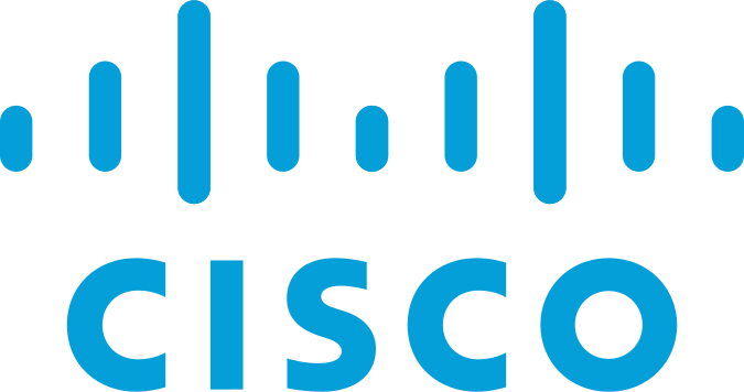
The name ‘Cisco’ is taken from the firm’s home city of San Francisco, and its original logo was a fairly literal depiction of the famous Golden Gate bridge. In contrast, the current logo, designed in 2013 by local creative agency Tolleson, features short lines that appear to represent digital signals, similar to the ubiquitous WiFi icon.
However, if you examine the steady evolution of the original logo across the decades, you can see these contemporary blue lines still actually represent the Golden Gate bridge, albeit in a much more minimal and subtle way.
07. Baskin Robbins
Founded in 1945, Baskin-Robbins is an American chain of ice cream and cake specialty restaurants with around 7,500 locations in nearly 50 countries. The company is best known for its slogan '31 flavors', the idea being that you can have a different flavour of ice cream for every day of any month.
The slogan originated from the ad agency Carson-Roberts, which later became part of Ogilvy & Mather (now Ogilvy), and remains in place today, even though the company has now introduced more than 1,000 flavours to its range.
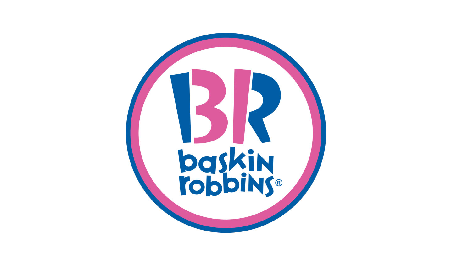
If you look closely, you’ll see that the brand’s classic slogan has even been subtly included in the logo design, which was last updated in 2007 by Cliff Freeman & Partners. In case, you’re drawing a blank, the pink parts of the ‘B’ and the ‘R’ form the number ‘31’.
08. Subway
Known for its made-to-measure, salad-packed sandwiches, Subway has more than 41,500 locations in more than 100 countries. Founded way back in 1965 as Pete’s Super Submarines, the American restaurant franchise has recently capitalised on a consumer trend towards healthier fast-food options, and has expanded rapidly around the globe as a result.
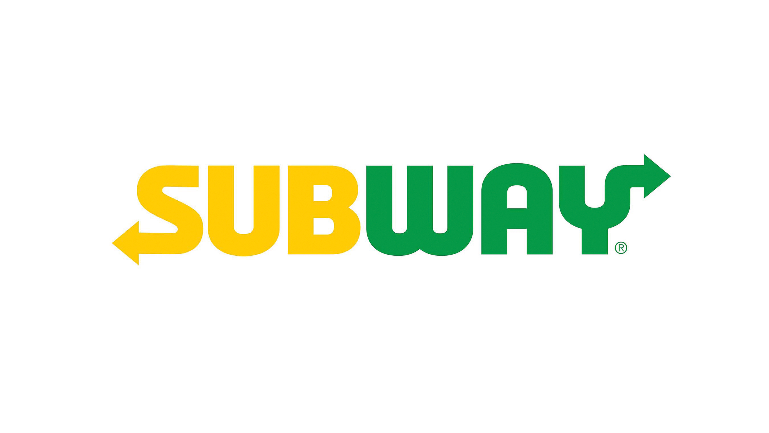
Subway’s current logo was designed in-house in 2016, and a spokeswoman explained that the yellow and green colours are "a reflection of the colourful array of fresh vegetables and other ingredients," found at its restaurants.
More subtly, meanwhile, the arrows appearing out of the first and last letters of the wordmark (which also appeared in the previous logo) apparently represent the entrances and exits of a Subway. The underlying message here is that you don’t have to sit down at eat your sandwich at the restaurant; you can just grab it and eat on the go.
09. Unilever
One of the oldest and biggest multinational companies, consumer products giant Unilever owns over 400 brands, ranging from Dove to Hellman’s. Founded in 1929 by the merger of a Dutch margarine producer and British soapmaker Lever Brothers, Unilever did little to promote its own corporate identity to the public for many years, and its own logo was a fairly uninspiring text-based wordmark.
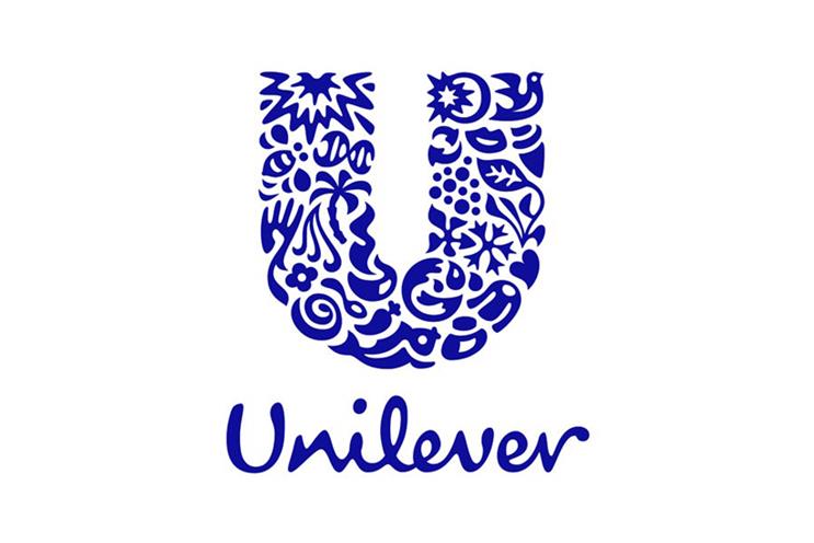
That all changed, though in 2004, when Wolff Olins created the beautiful Unilever logo shown above. And while the pictogram it contains may look random, each one of them actually represents one of the company's sub-brands (such as a lock of hair symbolising Unilever’s shampoo brands) or its corporate values (such as a bird representing freedom).
10. Vaio

Launched in 1996 as part of Sony, Vaoi is now an independent Japanese manufacturer of PCs and smartphones. Originally standing for ‘Video Audio Integrated Operation’, the acronym was updated to represent ‘Visual Audio Intelligent Organizer’ in 2008.
To the untrained eye, its logo, designed by Timothy Hanley, looks simply like a stylised representation of the company name. In fact, it quite cleverly represents a fusion of analogue and digital technologies.
The left half of the icon is a wave signal, representing analogue tech, while the right half is a ‘1’ and a '0', representing the binary basis for digital tech. It’s all a bit of a geek fest, admittedly. But hey, if you can’t geek out with a logo for a high-tech company, when can you?
Read more:
- Best logo designer: These tools have their place
- How to craft a powerful logo shape
- The YouTube logo: a history

Thank you for reading 5 articles this month* Join now for unlimited access
Enjoy your first month for just £1 / $1 / €1
*Read 5 free articles per month without a subscription

Join now for unlimited access
Try first month for just £1 / $1 / €1

Tom May is an award-winning journalist and editor specialising in design, photography and technology. Author of the Amazon #1 bestseller Great TED Talks: Creativity, published by Pavilion Books, Tom was previously editor of Professional Photography magazine, associate editor at Creative Bloq, and deputy editor at net magazine. Today, he is a regular contributor to Creative Bloq and its sister sites Digital Camera World, T3.com and Tech Radar. He also writes for Creative Boom and works on content marketing projects.
