When it comes to putting together a portfolio site, the main thing you need to worry about is selecting your best work, because ultimately that’s what people are coming for.
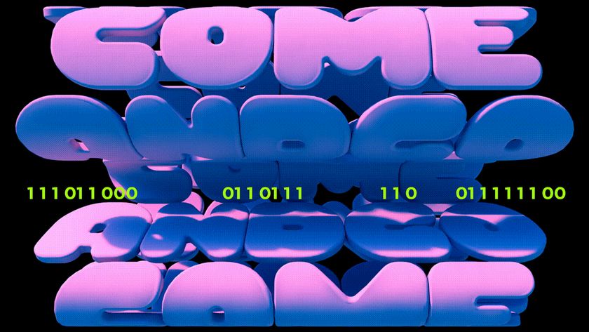
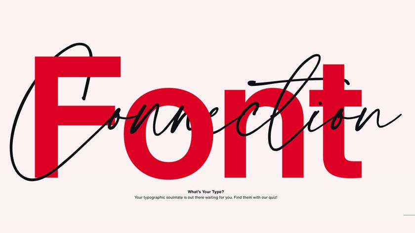
But as a designer, it’s also good to present that work in a way that shows off your design smarts. So attractive use of typography on your site can really help you to sell yourself and your skills. These font pairings will help get you started.
In this post, we look at some great examples of typography on portfolio sites, and learn from the designers how they made their choices.
01. Sebastiano Garilli
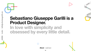
Sebastiano Giuseppe Garilli is a product designer who’s “in love with simplicity and obsessed by every little detail”. And he certainly believes in keeping things simple when it comes to the typography on his portfolio site.
“As Massimo Vignelli said, I believe that type should not be expressive,” he explains. “I chose Helvetica for my site because it was designed specifically not to give an impression or have any inherent meaning. I think Helvetica is the ultimate expression of neutrality and I love its clarity.”
The other font used on the site is Baskerville. “I chose it out of a long list of serif fonts that I tried to pair with Helvetica,” Garilli says. “It was the best choice in term of type combination, contrast, clarity and it gave me the chance to have a good hierarchy.”
02. Andrea Pedrina
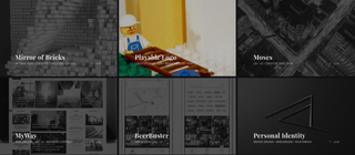
Andrea Pedrina is an Italian multi-disciplinary designer who’s mostly focused on interaction design. His portfolio site has a distinctive style that immediately grabs the attention, with a retro sci-fi video background and a monochrome, brooding aesthetic that continues until you’ve hovered over or clicked through to an individual case study.
Get the Creative Bloq Newsletter
Daily design news, reviews, how-tos and more, as picked by the editors.
Part of the reason it all works is the evocative typography, based on combination of serif (Playfair) and sans-serif (Raleway) fonts. “I picked Playfair because I'm a big fan of serif, vintage like fonts,” Pedrina explains. “And I chose Raleway because it's brutally precise and well shaped. I simply love it, especially the light version.”
These were not just snap picks, he stresses: “I did a lot of research and tests to evaluate the best font combinations. The goal was to find fonts that would fit nicely with my colour scheme, design approach and taste.”
03. Benjamin Guedj
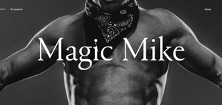
Benjamin Guedj is a French designer who currently works freelance in Paris and specialises in web design, identity, and interface design. His award-winning website uses huge, imposing letters to give maximum impact to his work, which includes the movie websites for Amy and Magic Mike.
Guedj always starts his designs by focusing on the typography, and draws on the heritage of print design. “You can make a website only with fonts, and it could still be really cool,” he reasons. “I’m always looking for some graphic shapes, some rhythm.”
In this case, he used Apercu for the main text and Portrait Ultra Light for his titles. “I wanted to find the perfect mix between elegance with the serif Portrait and readability with the Apercu,” he explains.
04. Ruslan Siiz
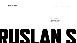
Born in Ukraine and now living in Poland, Ruslan Siiz is a 22-year old designer specialising in UI, UX and interaction design. His strong focus on typography is evident from his portfolio’s homepage, which is purely text-based and dominated by a big, bold and confident title that then artfully deconstructs on scrolling.
“I love typography!” Siiz concurs. “I spent a lot of time selecting the right typeface. I wanted something blocky, strong and bold. Something that would complement my designs and would make a project title feel like a statement. For my primary typeface, I chose the ultra-strong Refrigerator Deluxe Bold. For the secondary typeface, I went with Nimbus Sans, which is classy and simple.”
When choosing fonts for any website, he says, “you need to brainstorm some of the qualities or characteristics that you want your design to communicate. This is important because every typeface has its own mood or personality. If you're not sure, just ask yourself this question: ‘Does this font support the qualities of the client brand or complement the purpose of your design?’”
05. Alexandre Pidault
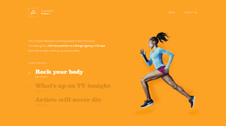
Born in France and living in San Francisco, Alexandre Pidault is a young designer focusing on visual, interactive and conceptual design. On his portfolio site, there’s a fun and friendly feel to the colours, layout and typography that really draws you in.
Pidault has used Superclarendon for the title of each project page and the section titles within. “This font is impactful when it’s used in bold /black and with high font-size,” he explains. “It’s timeless and can be easily used in addition to a sans-serif.”
And that’s exactly what he’s done here, using the sans-serif Conduit for body text, as well as the vertical text and numbers. “Conduit is a font I really love because it’s modern and really readable in uppercase,” says Pidault. “It’s still readable when used vertically, and can be used to improve the global structure of pages.”
06. Colm McCarthy
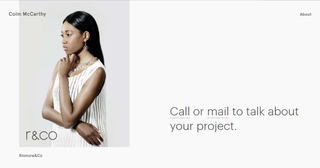
Colm McCarthy is an Irish freelance graphic and web designer who aims to create functional identities that work in harmony, both in print and online. He’s adopted a minimalist approach to the design of his portfolio site, which balances enticing images with carefully chosen typography.
“For the most part I've used Graphik Light: a beautiful, modern and super legible font,” McCarthy explains. “There is a lovely flow to this sans-serif that makes any sentence look great. The tall x-height is a really recognisable feature. This font oozes character and helped me to create the modern aesthetic that I was going for.”
For titles and small body text, meanwhile, he’s used Aperçu Regular. “For me this font is the Swiss army knife of fonts! It looks great on screen and in print at any weight or size. Again, it’s very legible but features nice subtle details and every time I look at it in play, I fall in love with that letter S.
McCarthy’s design aesthetic is very minimal so he places a high emphasis on clean, sharp and functional typography, he adds. “These fonts balance really well and, in my opinion, won't date easily. For fast loading times I didn't want to use more than two fonts, so the ones I chose had to be versatile enough. I tried a few other font pairings and experimented with the CSS properties as I went, but I kept coming back to these two.”
07. Kai Brueckers
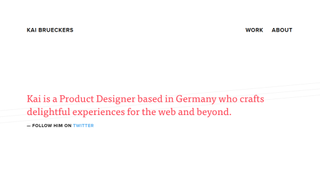
Kai Brueckers is a German-Swiss product designer who loves to craft delightful and engaging experiences for the web and beyond. And he uses clean, clear and confident typography throughout his site to showcase his no-nonsense approach.
But while Brueckers makes design look easy, it’s anything but. “Typography is hard,” he admits, “and it can easily break your whole design when you do it wrong. So for my portfolio redesign I looked through over 80 different typefaces until I settled on 12 different pairings I wanted to experiment with.”
After he settled on a pool of possible candidates, he played with each combination inside the actual design to get a better feel for how they would blend in. “Doing that, I narrowed my findings down to the two typefaces I end up using on the final site: FF Tisa Pro for major headings and paragraphs and Proxima Nova for second-level headings and navigation elements.”
08. Xavier Bourdil
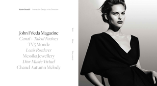
Based in Nouméa, New Caledonia, Xavier Bourdil is a 31-year-old graphic designer, art director and illustrator. His portfolio site is based around beautiful images and stylish typography.
“As a designer, I mostly work in fashion, luxury, culture and craftsmanship, so I needed a typeface that would fit those areas,” he explains. “However, I wanted to avoid the cold and classical feel that we can have while seeing communication from those industries. I knew that I wanted a serif in major, for a luxury look and feel, and a sans-serif to contrast with it.”
Ultimately, Bourdil opted for Freight Display (book and italic) for the titles and large text, Scala Sans for small text, and Cabin for the all-caps text, such as the case study categories and on the About page.
“To me, Freight offers the perfect compromise between something elegant, stylish and a more modern/deconstructed approach,” he explains. “Book is pretty straight and Italic is just as rock n' roll as I needed. Scala is perfect for text because it contrasts a lot with what Freight is giving; it "calms down" everything, and I found it very legible in small size, which was mandatory for the project descriptions. I didn’t like the Scala Sans in caps, though: it was a bit too high for what I wanted, and I found Cabin was perfect for that job.”
09. Giovanni Xu
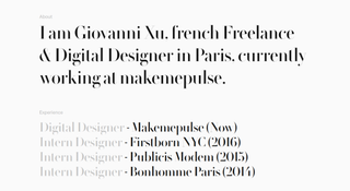
Giovanni Xu is a French digital designer, currently working at Make Me Pulse, a digital agency in Paris. He’s made the brave choice of a monochrome, type-only homepage for his website, which simply links through to the websites he worked on. This simple, classic presentation uses the font Le Jeune, which Xu “chose for its elegance and finesse,” he says: “I just made it very big so that people can admire the beauty of the font.”
10. Du Haihang China
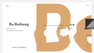
Du Haihang is a multidisciplinary designer and developer from Shanghai, China, with a decade of experience. His portfolio website makes impressive use of dynamic typography, using a range of cool WebGL typeface animations to intrigue and excite the viewer. The shaded lettering, simulating the viscosity effect of water, is particularly mesmerising. Drag, swipe and scroll and you’ll soon see what we mean.

Thank you for reading 5 articles this month* Join now for unlimited access
Enjoy your first month for just £1 / $1 / €1
*Read 5 free articles per month without a subscription

Join now for unlimited access
Try first month for just £1 / $1 / €1
Tom May is an award-winning journalist and editor specialising in design, photography and technology. Author of the Amazon #1 bestseller Great TED Talks: Creativity, published by Pavilion Books, Tom was previously editor of Professional Photography magazine, associate editor at Creative Bloq, and deputy editor at net magazine. Today, he is a regular contributor to Creative Bloq and its sister sites Digital Camera World, T3.com and Tech Radar. He also writes for Creative Boom and works on content marketing projects.
