Becoming a better designer is not just about having the right graphic design tools or mastering grid theory. You need to open your eyes to the designs that play a part in your everyday life. Ask yourself: what’s good about them, why do they work so well? Or alternatively: what could be improved about them, how could they work better?
Sometimes, however, the results can be a little unexpected. When you stop and think about it, so many of the things we use every day just plain suck. Here we list 10 of the biggest offenders. [Warning, this subject gets people pretty riled up, so some images and videos contain expletives].
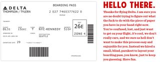
01. Airline boarding passes

Maybe we’re biased, but as journalists we put a painstaking amount of effort into presenting information in a clear and accessible way, making it quick and easy for readers to digest.
The makers of airline boarding passes seem to spend an equal amount of effort into sowing confusion and chaos in the minds of passengers.
Examples such as this one, posted by Stripe designer Tyler Thompson, would be difficult to decipher at the best of times. When you’re suffering heinous jet lag, after 10 hours of zero sleep punctuated by vomit-inducing turbulence and screaming babies, you can only assume that its creator is sitting watching you on CCTV, laughing the laugh of the truly demonic.
If you’re any doubt that this is a problem that could be easily fixed, check out the simple to follow alternative designs sketched out by Thompson.
02. Aeroplane seating

Even when you finally manage to board a passenger flight, the design madness doesn’t stop. Count the number of armrests on a typical aircraft seating plan. Then count the number of seats, or the number of arms of the passengers in them. Notice how this makes no sense at all? As comedian Eugene Kelly points out below, three seats with only four armrests just doesn’t go.
Get the Creative Bloq Newsletter
Daily design news, reviews, how-tos and more, as picked by the editors.
And it doesn’t stop there. There’s also the recline function: great news for anyone wishing to spend 12 hours inside in a small, triangular sweatbox with a stranger’s scalp millimetres from your face. As Hugh Morris of The Telegraph puts it, reclining a plane seat is rude and anyone who does it is selfish. So why make it integral to the design of a service?
03. America’s identical currency notes

Disclaimer: if you were born in the United States, then you should probably sit one this out. Because you have spent a lifetime subconsciously perfecting the minute mental calculations that allow you to distinguish between currency denominations that are the exact same size and the exact same colour.
Yes, we know this was originally an anti-counterfeiting move, and probably has cost-saving benefits. But those of us from nations where it’s nigh on impossible to mix up a one and a fifty are just plain baffled by it. (US citizens: next time you’re short of cash, ask a foreigner to lend you a dollar. You never know your luck.)
04. Computer keyboards

From laptops to desktop PCs, phones to tablets, there are many different variations of the computer keyboard. So why is it that they all suck?
Any serious PC gamer knows that your biggest foe will be never Necrogiant, Iustitia or Deathwing. No, the most heinous enemy you will ever face will be the Windows key inexplicably located between the Ctrl and Alt keys, which shuts the game down and returns you to the home screen at the slightest accidental brush.
Apple users fare no better. Although the company is famed for claiming its products ‘just work’, iOS11 arrived riddled with bugs, such as the glitch that meant pressing the letter ‘l’ might at times produce an ‘A’ plus a strange character. As Adam Clarke Estes wrote for Gizmodo: “The new operating system has turned my phone into a bug-infested carcass of its former self, and the frustration of trying to use it sometimes makes me want to die.”
As on mobile, so on the desktop. Last week Apple itself fessed up to multiple problems on MacBook keyboards including in its own words: “letters or characters that repeat unexpectedly or don’t appear when pressed or keys that feel ‘sticky’ or aren’t responding in a consistent manner”.
The more sophisticated our devices get, it seems, the more flawed they become. Comedian Orny Adams presents his own [less sophisticated and more expletive-laden] issues with computer keyboard design below.
05. USB slots

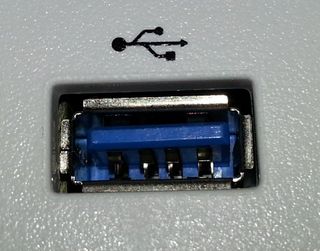
While we’re on the subject of computer design, we can’t let this one go either. Yes, manufacturers, we’d like as many USB slots as possible so we can connect the maximum number of devices to our computers. But no, we don’t want them all so close together that we can’t actually fit the leads for said devices into the space provided.
It’s like increasing the number of spaces in a car park by making each the width of a child’s bicycle. Not helpful. Think it through.
06. Public toilets

Almost everything about the design of public toilets is wrong. Let’s start with the fact that almost all of them have hand flushes.
What’s the most effective way to spread an infectious disease? How about installing something that’s going to be touched by thousands of people a day, all after doing their business and all before washing their hands? A problem that, say, a foot-operated or automatic flush would entirely avoid.
Then there’s the toilet paper dispenser. This constantly challenges you to a game of nerves as you struggle to tease out a sliver of dangling tissue with enough gentle persuasion that it will bring forth a whole sheet. Normally, though, it will rip entirely and leave you with the choice of trying to dismantle the entire metal cabinet or pleading with the occupant of the next cubicle to part with some of their precious stash.
Even washing your hands is a modern-day nightmare. As you approach an unfamiliar device that reveals nothing about how to operate it, you wave your hands like a lunatic, this way and that, or push, pull, press and prod everything and anything in the hope that it will somehow produce water. As comedian Michael McIntyre points out: what exactly was wrong with turning a tap on and off in the first place?
07. Stickers on fruit

This one we just don’t get at all. Barcode stickers on individual pieces of fruit, or sometimes just stickers informing you of the type of apple you're about to eat. Presumably the idea with the barcodes was to save you a few seconds inside the supermarket weighing your fruit. Unfortunately, you then waste several minutes at home trying in vain to prise the highly adhesive sticker off, before eventually giving up and either slicing out the offending part of the flesh, or just swallowing the remaining fragments of paper and gum whole because you’re so hungry (just us?).
You may be encouraged to do the latter by internet reports that fruit stickers are actually edible and FDA-approved. Please don’t. This is fake news, as documented in this Snopes article.
08. Hotel room lighting

If you’ve stayed in more than a couple of hotel rooms, particularly in North America, then you’re sure to have endured this: levels of low-light that seem specifically designed to make you feel weak and disoriented, Guantanamo Bay-style.
You walk into a darkened room and turn on all the heavily lampshaded, energy-saving lamps only to find yourself… still in a darkened room.
There must be a central light you’re missing, you think, and spend the next feverish hour trying to locate something, anything, that will give off greater luminosity than the dying embers of a discarded cigarette.
What’s worse, this is not a mistake: it’s been done on purpose and is called ‘mood lighting’. Never mind, at least they made your towel into a swan sculpture. Which you can just about make out by the light of your smartphone torch.
Occasionally, of course, hotels suffer from the opposite problem, providing you with just one horribly fluorescent overhead bulb, and not even a bedside lamp to read by. But perhaps that's just the hotels we've stayed in lately...
Of course, these are not the only design mistakes hotels make. Comedian Erik Griffin has a few more, expletive-filled complaints of his own…
09. Cereal boxes

Cereal boxes, on the face of it, seem pretty easy to open. But we just can’t seem to avoid making a hash of it.
Maybe it’s the time of the morning, when most of us are not at our best selves. Maybe it’s the fact that we’re overly excited to get to all that (sugary) goodness. Or maybe it’s that the amount of glue used to seal the top of the box and interior bag varies so wildly that the amount of pressure you need to exert is utterly unpredictable.
Consequently, everyone has at least once endured an explosion of corn flakes, rice crispies or cocoa pops all over the kitchen floor. And the tattered evidence is left for all to see, as Lori Voornas of Portland’s number one pop radio station Q97.9 highlights in this short video:
This is all something that an alternative cereal box design, such as a zip-lock bag, would help to avoid. But hey, where would be the fun in that?
10. Revolving doors

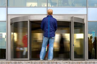
When you think about it, the door is a pretty incredible invention. And it’s not something that really needed redesigning. Not unless you were looking for something that would unnecessary raise people’s stress levels, potentially cause injuries, and just fundamentally baffle people. Especially when they're carrying luggage.
The answer to that question, a little boringly, is that revolving doors are more energy efficient, as they prevent drafts (via acting as an airlock), thus preventing increases in the heating or cooling required for the building.
They’re also apparently very efficient at letting large numbers of people in and out. And of course, they’re a gift to comedy screenwriters and stand-up comics everywhere. We’ll leave you with the thoughts of comedian Michael McIntryre once more...
Read more:

Thank you for reading 5 articles this month* Join now for unlimited access
Enjoy your first month for just £1 / $1 / €1
*Read 5 free articles per month without a subscription

Join now for unlimited access
Try first month for just £1 / $1 / €1
Tom May is an award-winning journalist and editor specialising in design, photography and technology. Author of the Amazon #1 bestseller Great TED Talks: Creativity, published by Pavilion Books, Tom was previously editor of Professional Photography magazine, associate editor at Creative Bloq, and deputy editor at net magazine. Today, he is a regular contributor to Creative Bloq and its sister sites Digital Camera World, T3.com and Tech Radar. He also writes for Creative Boom and works on content marketing projects.
