10 business card fails
From illegible fonts to inappropriate jokes, we explore the worst business cards around.
Sign up to Creative Bloq's daily newsletter, which brings you the latest news and inspiration from the worlds of art, design and technology.
You are now subscribed
Your newsletter sign-up was successful
Want to add more newsletters?
Five times a week
CreativeBloq
Sign up to Creative Bloq's daily newsletter, which brings you the latest news and inspiration from the worlds of art, design and technology.

Once a week
By Design
Sign up to Creative Bloq's daily newsletter, which brings you the latest news and inspiration from the worlds of art, design and technology.
Once a week
State of the Art
Sign up to Creative Bloq's daily newsletter, which brings you the latest news and inspiration from the worlds of art, design and technology.
Seasonal (around events)
Brand Impact Awards
Sign up to Creative Bloq's daily newsletter, which brings you the latest news and inspiration from the worlds of art, design and technology.
A business card can be the catalyst that leads to future clients picking up your design portfolio and giving you the job, or the scrubby paper that ends up in the bin or being used as a toothpick. Make yours the former by learning from these cautionary tales...
01. Out of shape
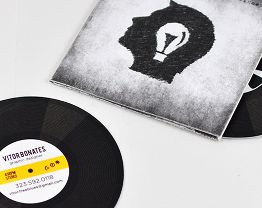
In our 10 commandments of business card design feature, we preached some vital rules: Don’t use a gimmick unless it’s a (really) good one. And don’t vary from common shapes. Now, while the design and imagery on this card is perfectly okay, the fact you have to take the card out of the sleeve to get contact details; and the fact that the contact card itself is round, is a mistake in our eyes. The record design is inventive, but it’s crying out to get lost. Which is a shame, because Vitor Bonates’ work is actually pretty good.
02. QR nightmare
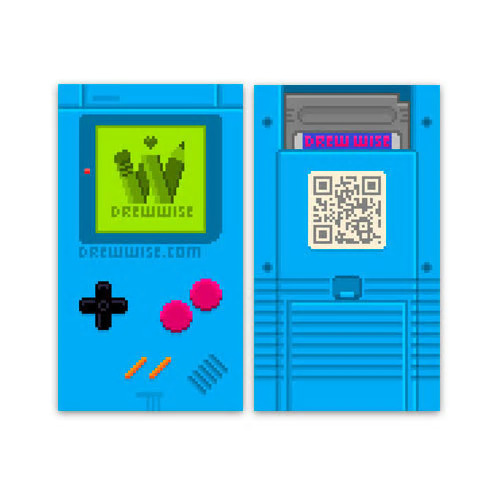
This would be a lot of fun if it weren’t for the fact THERE’S NO CONTACT DETAILS ON THE CARD. Just a website. And a QR code. YES! A QR CODE! If there’s one thing you definitely shouldn’t do it’s use a QR code. No one cares about them. No one ever uses them. If the space was used for an email and phone number it would be perfectly acceptable. But a QR code? Come on!
03. A bit of a stretch
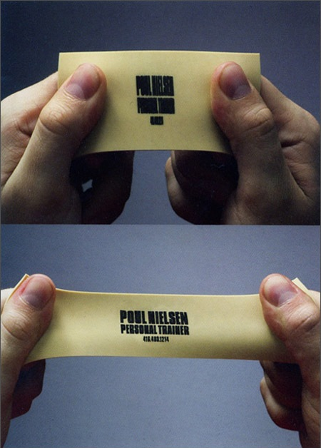
Legibility is key on your business card – it’s hugely important that clients can see your details at a glance. Yes, this is a fun gimmick for a personal trainer – when you stretch it it reveals the logo and name. But you have to work for it to get the contact (we get it, but we still don’t like it). Say you want to call on your mobile? How do you stretch it with one hand? This feels like design for design’s sake.
04. Tools down
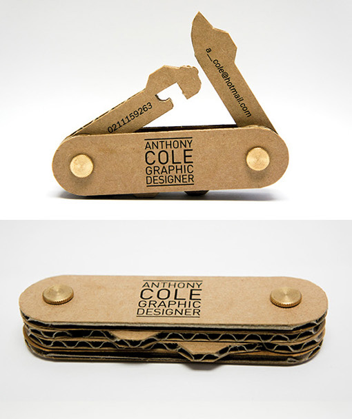
Yes, we know you’re like a Swiss army knife – you’re obviously very creative and have a lot of different ‘tools’ in your armoury. But, whilst impressively made, this is another example of a gimmick taken a bit too far. As a concept it’s great, and is admittedly a talking point, but in reality it’ll probably sit on a clients’ desk for a while before being lost or binned.
05. Blown away
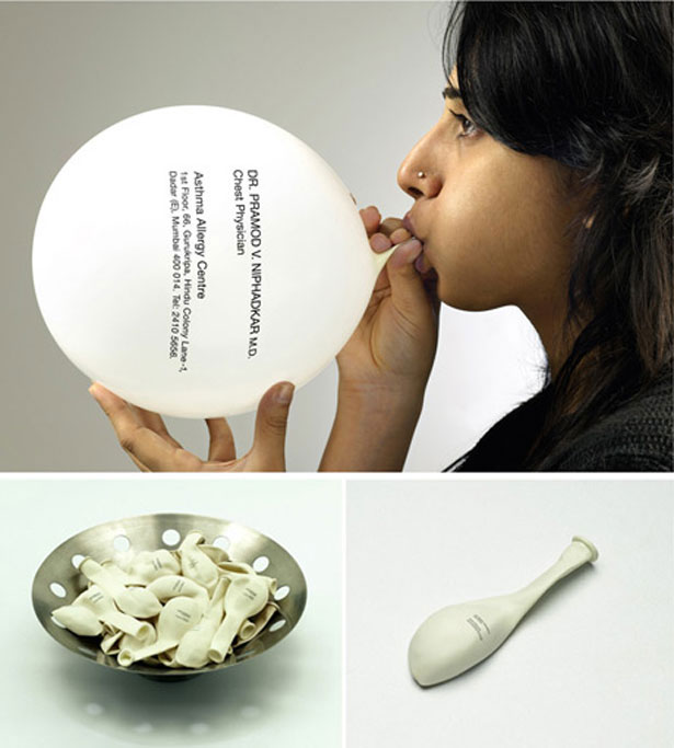
This is in the same realm as #3 on our list. And we can’t quite see the point of it. We get it’s for a chest doctor. But, do you blow up the balloon and tie it, only for it to get in the way and deflate before throwing it away? Or you blow it up and then get someone else to write the contact down and then throw the balloon away?
06. Just bad

Okay, look up ‘bad business card’ on Google (that’s what we did) and this is pretty much the top result. It’s also the ultimate in rubbish design. For one, there’s a wolf. Why is there a wolf? Secondly, the jumble of typefaces is just wrong. And ‘when good is not good enough, call BAD’? WOW.
Sign up to Creative Bloq's daily newsletter, which brings you the latest news and inspiration from the worlds of art, design and technology.
07. Meaty problem
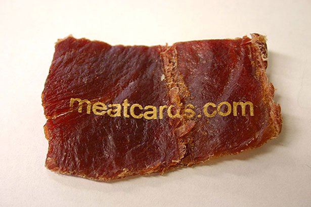
These are business cards. Made out of meat. Only a jerky would want that, surely? I guess if you were really hungry you could eat the card at your desk. And then you’d have lost the contact. Oh well.
08. Booby prize
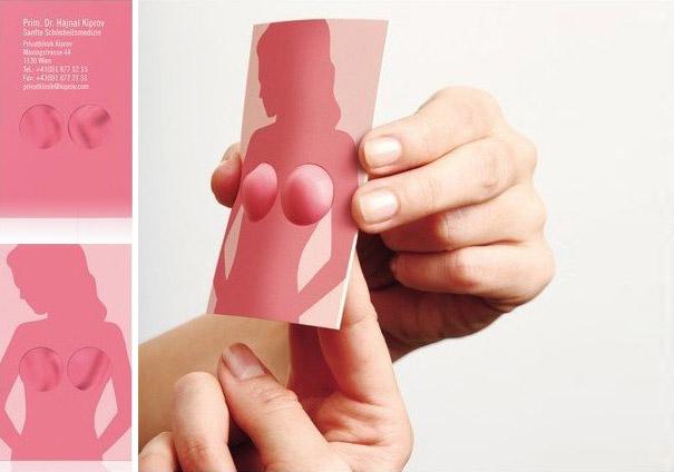
A prize goes to this one for trying to be funny. A BOOBY prize! But seriously, the designer behind this must have thought this was a good idea. Think about that for a second. The designer thought this was a good idea – and that clients of this plastic surgeon would genuinely stick their fingers through these holes. We bet this card lost more potential clients than it gained. It's not big or clever.
09. A simple approach

Nothing says cutting-edge prototyping than an illegible mess of fonts and colour. It looks like a clown’s been sick. And then a bad typographer’s been sick.
10. Cookie cutter
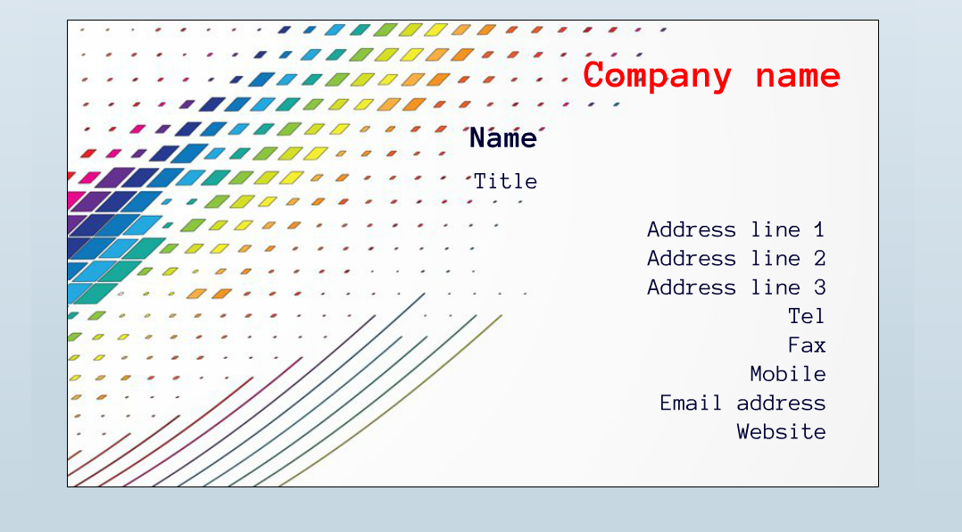
We’re not talking about this particular card here (although it’s awful), more about the reams of services out there that offer businesses templated cards. There’s nothing us designers hate more, right? If you’re running a business and have any respect for it, employ someone who knows what they’re doing when creating a card. It's a shame it’s so hard to convince some clients, who instead go for what they think is the easy route.
Like this? Read these...

The Creative Bloq team is made up of a group of art and design enthusiasts, and has changed and evolved since Creative Bloq began back in 2012. The current website team consists of eight full-time members of staff: Editor Georgia Coggan, Deputy Editor Rosie Hilder, Ecommerce Editor Beren Neale, Senior News Editor Daniel Piper, Editor, Digital Art and 3D Ian Dean, Tech Reviews Editor Erlingur Einarsson, Ecommerce Writer Beth Nicholls and Staff Writer Natalie Fear, as well as a roster of freelancers from around the world. The ImagineFX magazine team also pitch in, ensuring that content from leading digital art publication ImagineFX is represented on Creative Bloq.
