Think of graphic design and you think of 2D imagery. But moving into the third dimension can really help your designs to stand out.
These 10 examples show just what amazing results can be achieved with thoughtful and inventive of 3D. Meanwhile, if you’ve seen a great example of 3D in graphic design, please let us know in the comments at the bottom of the page!
01. Victor’s Drinks

The point of rendering a photo-realistic scene in 3D is not to replicate reality, but to enhance it in ways that catch the eye and spark the imagination. That’s exactly what Together Design did here, following a brief from Victor’s Drinks to create a trophy shape made of cider.
“The trophy should feel as it was formed from a splash coming out of the surface of still liquid,” the agency was told. You can see more on how the team made this striking image, created to promote a ‘make your own cider’ brand, in this blog post.
02. Lovebox

Lovebox is a two-day music festival held in Victoria Park, east London, that’s been running since 2002. Designed by the in-house creative team and Kevin Summers of Almost Interesting, This poster for last year’s event was created using a selection of 3D printed shapes. You can see how the team put it together here.
03. Axe
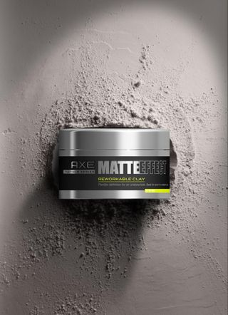
Male grooming brand Axe (known in some countries as Lynx) asked PB Creative to design its new hair styling range aimed at older males: The Matte Effect. The team combined 3D CAD visuals, created using Cinema 4D, with photographic background imagery to bring the range to life for promotional purposes. The combination of the two delivered a super-realistic, edgy and masculine look and feel to the visuals that also leveraged the formulation benefit of each product.
04. Durex
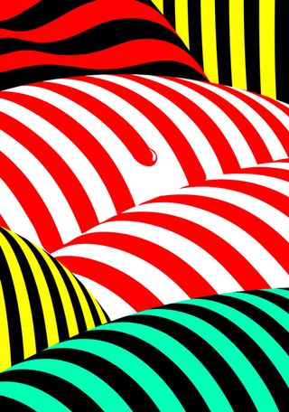
German graphic designer Timo Lenzen is known for his bold and eye-catching 3D poster designs, which combine vivid colours with architecture-inspired forms. Typical of his work is this poster design for Durex China, which promotes the company's pleasure gel product in a subtle, abstract manner.
Get the Creative Bloq Newsletter
Daily design news, reviews, how-tos and more, as picked by the editors.
05. All you need is Ecuador

Brazilian agency Studio Manipula created this stunning and inventive campaign to promote tourism in Ecuador. Each of the CG images combines the country’s big selling points (its environments and its animals) in inventive ways that make the viewer look twice. You can see more of the campaign images here.
06. Habib’s Milkshakes
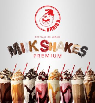
Andre Caputo is a CGI artist and graphic designer based in Brazil. He's known for his hyper-realistic 3D depictions of food items, and here’s a great example. Promoting Habib’s, a Brazilian fast food company that specialises in Middle Eastern cuisine, this poster takes the idea of snack-based typography to its mouth-watering limits. You can see more images from the campaign here.
07. NatWest

For the most part, the story of logo design in the 2010s has been one of flattening and simplifying. So it was a breath of fresh air when Futurebrand designed this 3D cube logo for NatWest, taking the British bank back to its original brand guidelines. Read more about this radical redesign here.
08. Scripts with Depth
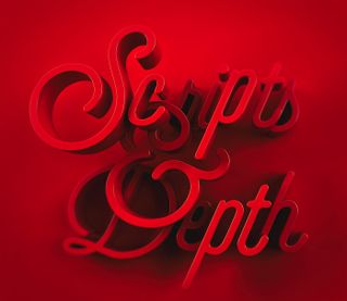
We’ve seen a lot of big, bold script lettering used in graphic design over the last few years, and to be honest, it can get a little repetitive. But South African designer Karl Phatt has reinvigorated the style in his experimental typography project ‘Scripts with Depth’. By playing around with the Z-axis, Phatt has really succeeded in breathing new life into an ageing form; you can see more of his images here.
09. Curriculum 3D
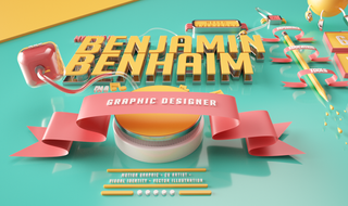
Most employers aren’t keen on people getting ‘imaginative’ with their portfolios, so you have to be really clever to pull it off. Benjamin Benhaim, a Paris-based art director, has done just that with his Curriculum 3D, created using After Effects, Cinema 4D and Octane Render. You can see more images of this imaginative portfolio here.
10. Visa Olympics 2016
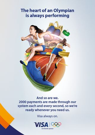
London-based art director Gordon Reid couldn’t have been more excited to work on Visa’s brand campaign for the Rio Olympics at Saatchi & Saatchi. “This idea came to us of using a heart, representing the beating heart of the Olympics,” he recalls. “So the tagline was: ‘The heart of the Olympics is always on, and so are we’, tying it in with Visa, which never stops.”
Reid worked with Bruno di Lucca, the head of design at Saatchi, to develop the concept using a mixture of 3D-rendered illustrations and photography to create a series of collages. “We designed a series of artworks, each of which developed the metaphor in a different way: the heart of the athlete, the heart of Rio, the heart of a fan and the key visual, the heart of the Olympics,” he explains. The images were rendered by Smoke and Mirrors, and you can see more of them here.

Thank you for reading 5 articles this month* Join now for unlimited access
Enjoy your first month for just £1 / $1 / €1
*Read 5 free articles per month without a subscription

Join now for unlimited access
Try first month for just £1 / $1 / €1
Tom May is an award-winning journalist and editor specialising in design, photography and technology. Author of the Amazon #1 bestseller Great TED Talks: Creativity, published by Pavilion Books, Tom was previously editor of Professional Photography magazine, associate editor at Creative Bloq, and deputy editor at net magazine. Today, he is a regular contributor to Creative Bloq and its sister sites Digital Camera World, T3.com and Tech Radar. He also writes for Creative Boom and works on content marketing projects.
