There’s no point in making a website pretty if it’s difficult to use. And particularly when it comes to making money online, your first, second and third priorities always have to offering a great user experience, with intuitive navigation and reliable functionality, not to mention clearly labelled calls to action.
Once you’ve achieved that, though, there’s certainly no harm in making your designs look beautiful as well. And that’s exactly what these 10 sites, all new for 2017, have achieved.
Each offering the complete package, both in terms of aesthetics and functionality, we hope they inspire you to go the extra mile with your own ecommerce designs.
01. Adidas Climachil 2017
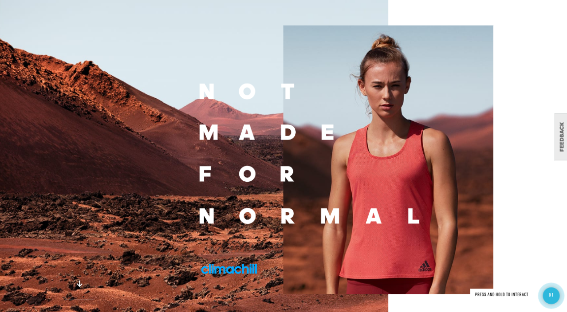
Adidas’ Climachil range of sportswear utilises groundbreaking cooling technology (fabric woven with titanium and 3D aluminium cooling spheres) to help athletes' performance in warm conditions. This innovative approach demands an innovative site, and Netherlands agency Resn were just the people to supply it.
Making good use of evocative photography that engages the emotions, this dual-layered experience is enriched with story content just below the surface (click-and-hold to experience it). The sales functionality is handled via a click-through to the main Adidas site.
02. B&O PLAY Spring/Summer 2017
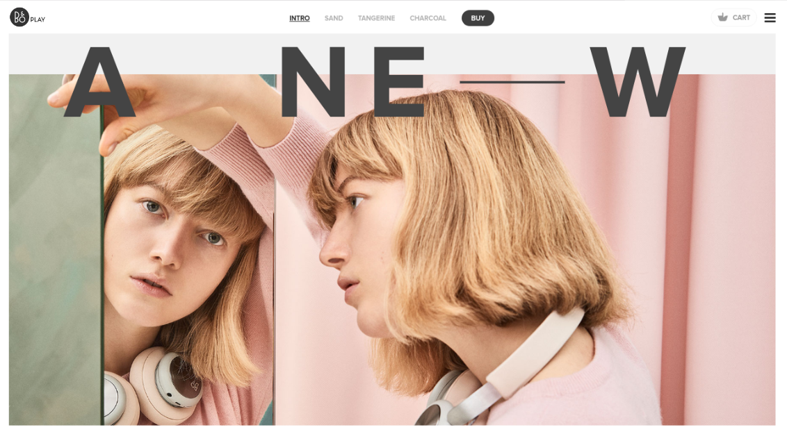
An offshoot of consumer electronics company Bang & Olufsen, B&O Play sells a range of high-end audio products including headphones, speakers and music systems. On this site created by Danish agency Trouble, bold and elegant type combines with sumptuous fullscreen model shots and enticing scrolling effects to evoke the feel of a high-end lifestyle magazine.
Given the premium nature of the brand, this approach helps reassure consumers that they’re in the right place and making the right choice.
Get the Creative Bloq Newsletter
Daily design news, reviews, how-tos and more, as picked by the editors.
03. Carbon Beauty
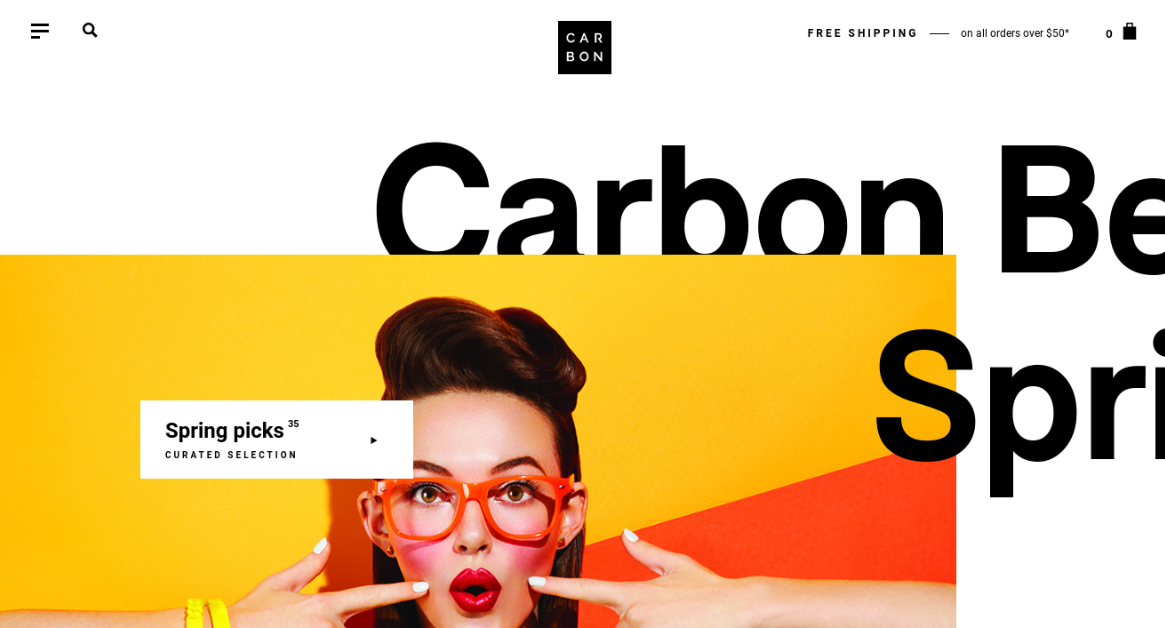
Carbon Beauty was founded upon the idea that customers deserve a better platform to explore and purchase beauty products. Built by Canadian agency Locomotive, it certainly looks different, with an achingly hip and youthful design based on eye-popping colours and collage-influenced layout. There are some cool scrolling effects too and – most importantly of course, it’s also very easy to find what you’re looking for and buy it.
04. Wed’ze
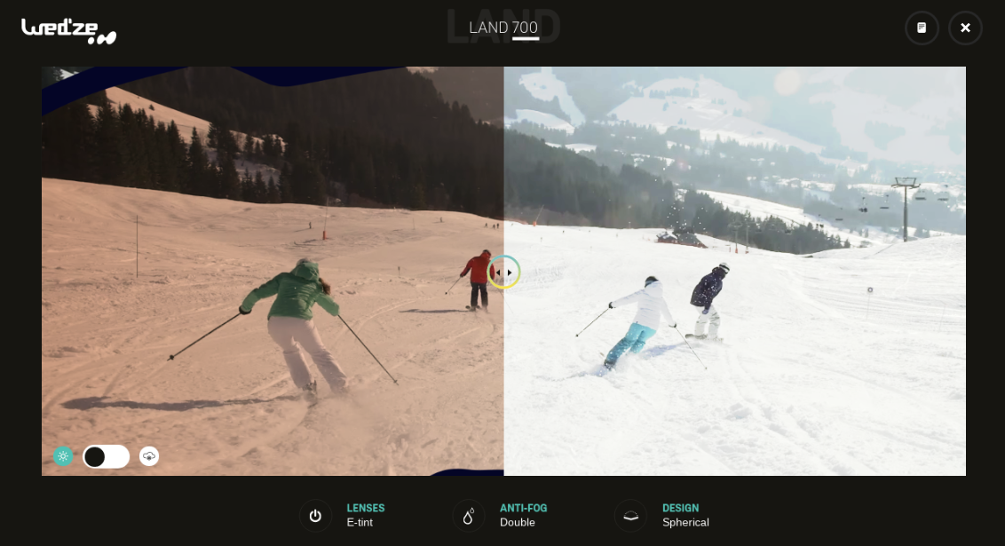
Wed'ze is an affordable brand of ski goggles, but it's not just keen to compete on price. This website for its 2016-2017 collection has been gorgeously designed by French studio Akaru and offers a clever simulator that shows what your view will look like through Wed'ze's goggles as you descend the slopes. It’s a simple but clever feature that helps engage visitors: a superb example of the 'show, don't tell' principle in action.
05. More by Bourn
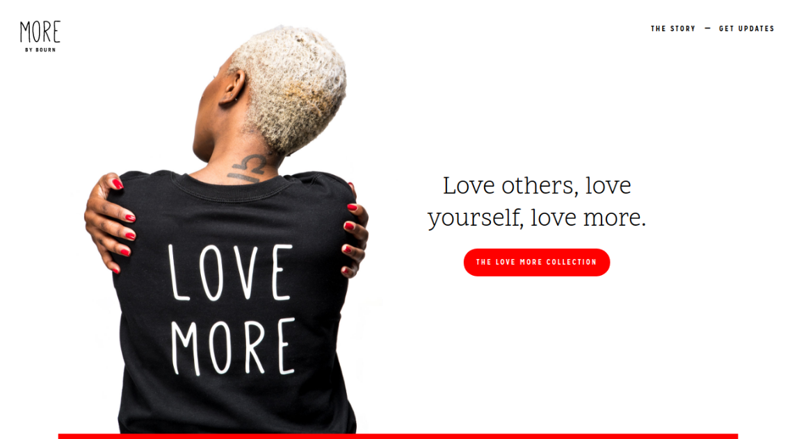
If the ultimate goal of any brand is to make an emotional connection with its audience, the Love More collection by US fashion label Bourn goes straight for the jugular. Such a nakedly sentimental approach could easily attract derision, but in this case both the clothing designs and their online presentation hit the right notes.
This one-page website harnesses simplicity as a feature, with an effective black and red colour palette and bucketloads of white space. Then, if you’re tempted to buy, a slick custom Shopify integration with Ajax in-page checkout functionality makes it happen effortlessly.
06. Lensabl
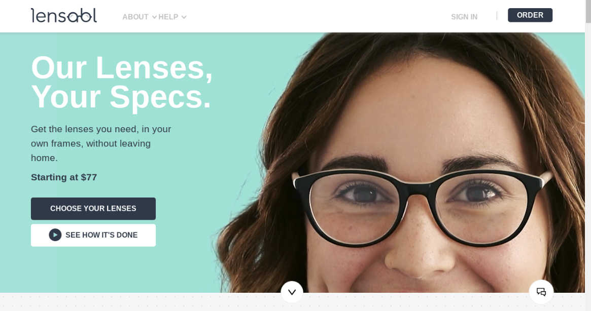
American retailer Lensabl has a simple proposition: prescription lenses, in your existing frames, at a fraction of the normal price. Designed by Santa Monica agency Herman Scheer, its website distills things down to the bare essentials, giving you all the information you need in digestible, bite-sized pieces... or just letting you go ahead and order.
Most of all, we love the confident and inspired use of video on the homepage. Eye contact is a powerful tool, and by 'greeting you' in such a personal fashion, this brand engages you right from the start.
07. Velaska
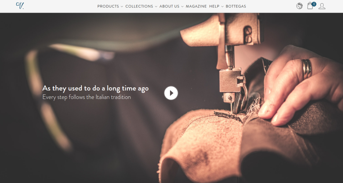
Shoe retailer Velasca aims to offer high quality Italian craftsmanship at fair prices, by dealing directly with traditional workshops and cutting out middlemen. Its website is suitably stylish and elegant, combining model photography, shots of workplaces, an explainer video and some beautiful illustrations.
On the downside, we’re not totally sold on the typography, which looks a little tacky in places. But on the whole this is a great example of how to tell a brand story without detracting from your main ecommerce goals.
08. Papiroga
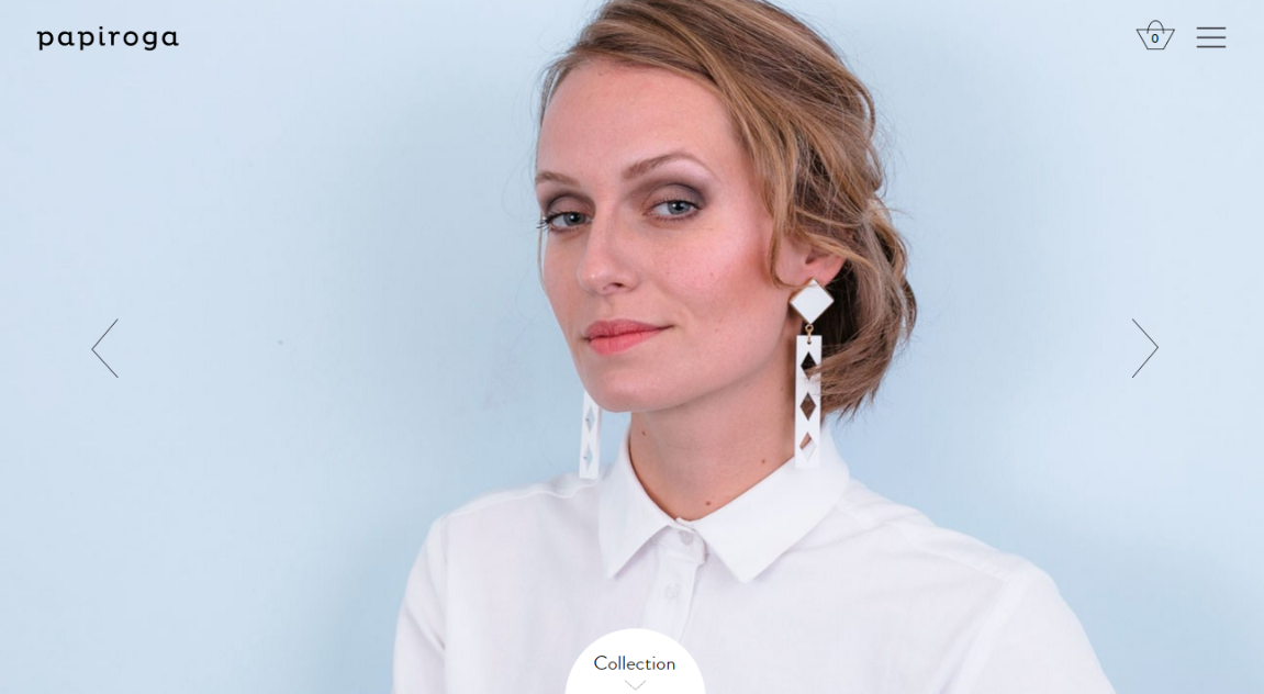
Founded in Madrid in 2011, Papiroga sells handmade maxi necklaces with exclusive designs and limited editions. This new site for 2017 was created by Spanish studio Miscellaneous. Taking the idea that “a picture tells a thousand words”, its elegant design elevates simplicity to an artform and just lets the gorgeous pieces speak for themselves.
09. Hashtag Bay
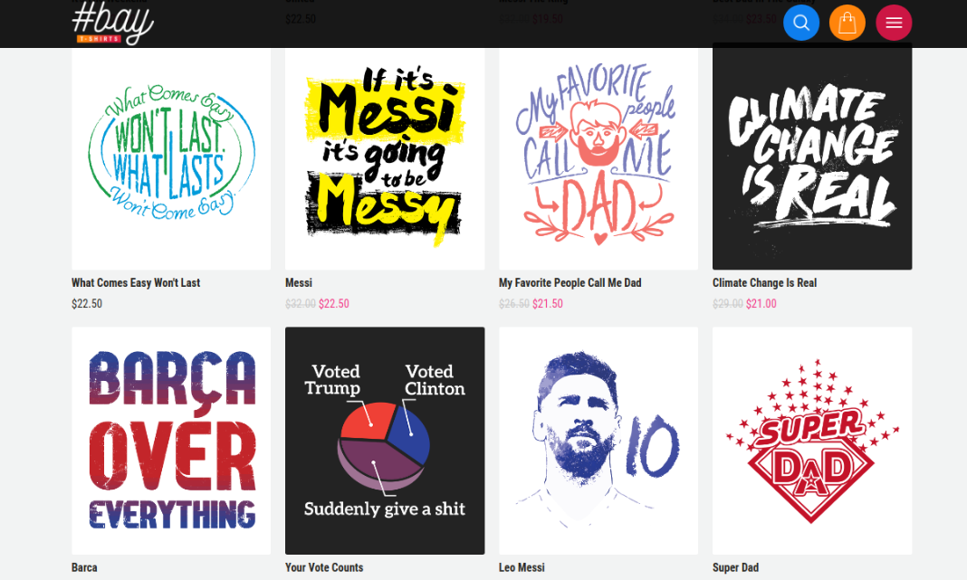
Want a T-shirt that’s as up to date as your Instagram stream? American site Hashtag Bay offers nicely designed “trending T-shirts” on various topics like music, politics or entertainment. There are also more broadly “motivational” and “funny designs”.
With so many different categories and sub-categories to deal with, the website designers have done a great job in creating clean, easy to follow navigation here. Thoughtful use of colour coding, a well-constructed grid system and precisely worded microcopy all combine to make buying T-shirts here a pleasure, not a chore.
10. Keen
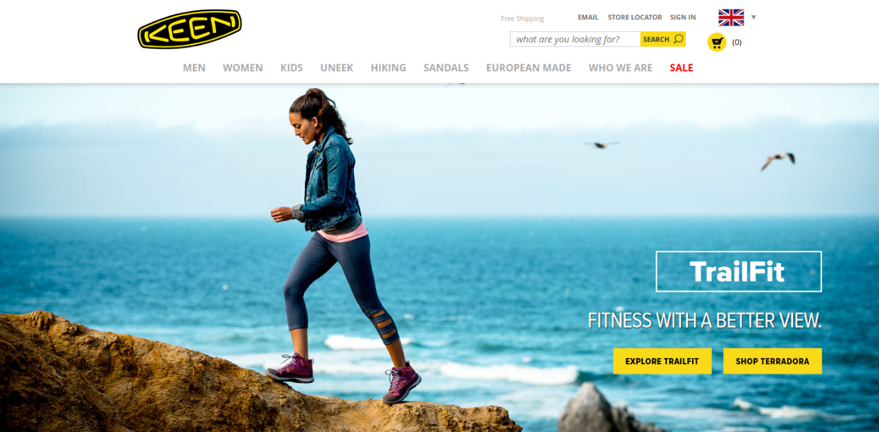
In the modern world, the lines between work and play are becoming more and more blurred. To help us meet the demands of what it calls 'Hybridlife', Keen is devoted to designing footwear, bags and socks you can wear and use in any place, at any time.
Its homepage features lots of sumptuous, travel-related photography to draw you into the concept, and there’s a suitably relaxed design that uses lots of white space to let the content and navigation breathe. A premium experience for an affordable brand.

Thank you for reading 5 articles this month* Join now for unlimited access
Enjoy your first month for just £1 / $1 / €1
*Read 5 free articles per month without a subscription

Join now for unlimited access
Try first month for just £1 / $1 / €1

Tom May is an award-winning journalist and editor specialising in design, photography and technology. Author of the Amazon #1 bestseller Great TED Talks: Creativity, published by Pavilion Books, Tom was previously editor of Professional Photography magazine, associate editor at Creative Bloq, and deputy editor at net magazine. Today, he is a regular contributor to Creative Bloq and its sister sites Digital Camera World, T3.com and Tech Radar. He also writes for Creative Boom and works on content marketing projects.
