10 alternatives to Gotham
Beautifully designed it may be, but Gotham has become so overused that designers are crying out for similar alternatives. Here are 10 of them.
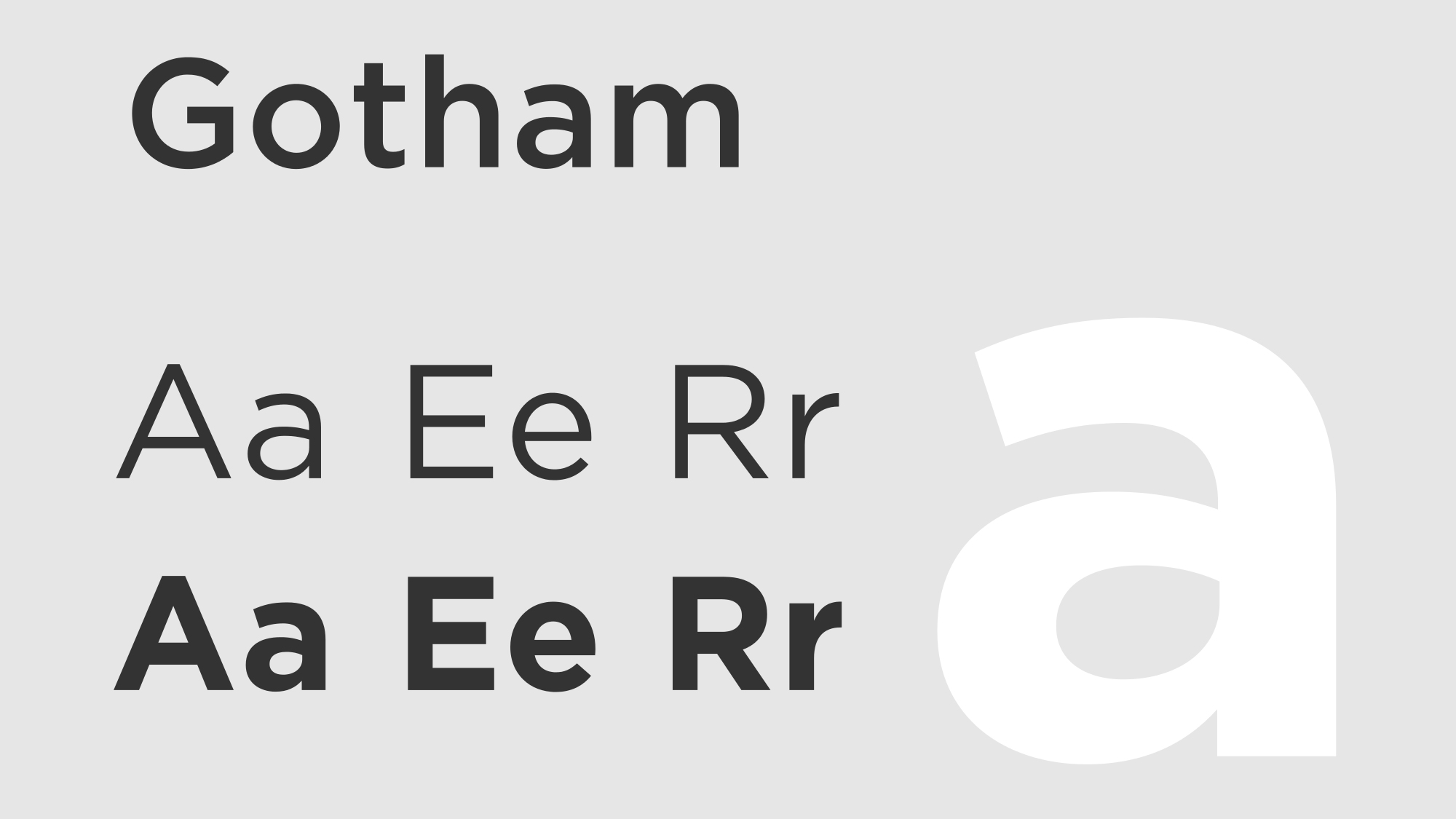
Originally a commission for GQ magazine, Tobias Frere-Jones' Gotham has become one of the biggest typographical success stories of the past decade. Released through H&FJ (now Hoefler & Co.) in 2000, it got a particular boost as the typeface of choice for Obama’s 2008 presidential campaign, not to mention gracing countless movie posters, corporate identities and more.
Inspired by architectural lettering from mid-20th century New York, Gotham has a uniquely American edge that sets it apart from its more European-flavoured counterparts.
It's also enormously versatile as a typeface, when taking into account its nine weights (thin, extra light, light, regular, book, medium, bold, black and ultra), each of which comes in italics, as well as narrow, extra-narrow and condensed widths.
Of course, because Gotham is so good, it's everywhere – but don’t despair, there are plenty of credible alternatives when it comes to geometric sans serifs, whatever your budget.
Proxima Nova
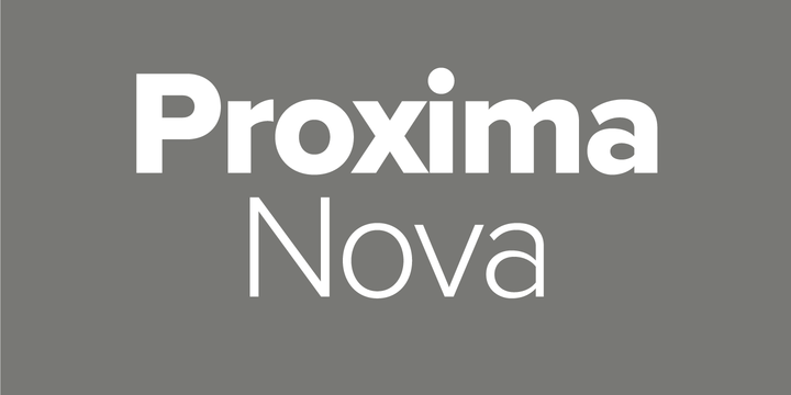
Perhaps the neatest substitution for Gotham is Mark Simonson’s Proxima Nova, released five years after the H&FJ classic in 2005.
While not quite as extensive a family as Gotham, Proxima Nova is nonetheless available in seven weights (thin, light, regular, semi-bold, bold, extra-bold and black), with matching italics, small caps and condensed and extra-condensed widths.
If originality is your reason for cheating on Gotham however, this may not be the best choice – the web design community in particular has already embraced Proxima Nova. In fact it’s becoming almost as ubiquitous as Gotham, and is used by over 25,000 websites including Buzzfeed, Mashable and Wired.
Montserrat
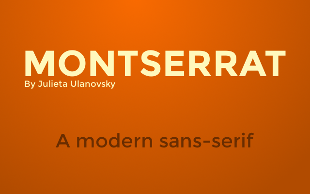
For a totally free Gotham alternative, Julieta Ulanovsky’s Montserrat is available on Google Fonts. Like Gotham, it is inspired by urban signage: in this case Buenos Aires rather than New York.
Of course, being free you have to sacrifice the considerable versatility. Its regular and bold weights roughly equate to Gotham’s medium and bold, but there are no italic or narrow versions so applications are pretty limited.
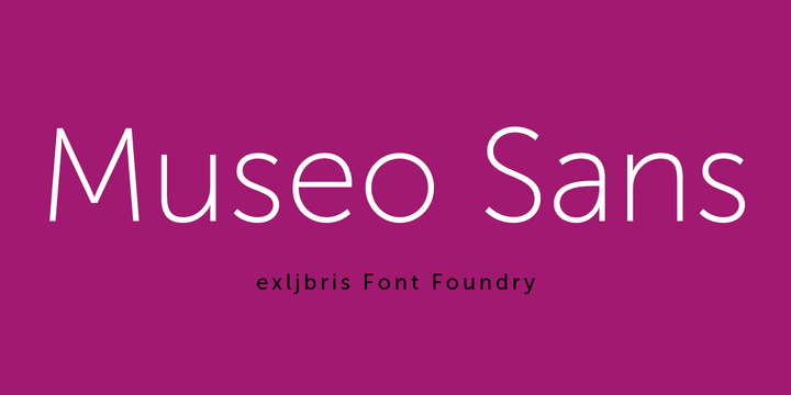
Museo Sans
Well known for his creative marketing strategies, Arnhem-based type designer Jos Buivenga has made two fonts in the Museo Sans typeface available for free through his exljbris foundry, while the remaining eight are paid-for.
As a highly legible geometric sans serif, Museo Sans makes a credible, and affordable, alternative to Gotham for display and text use, with each weight coming in an italic variant.

Lato
Created by Warsaw-based designer Łukasz Dziedzic in 2010, Lato (which means 'summer' in Polish) is a semi-rounded sans serif that, like Gotham, strikes a compelling balance between friendly and serious.
Also like Gotham, Lato started life as a corporate commission. Dziedzic's client later decided to follow a different direction, and Lato is now available through Google Fonts.
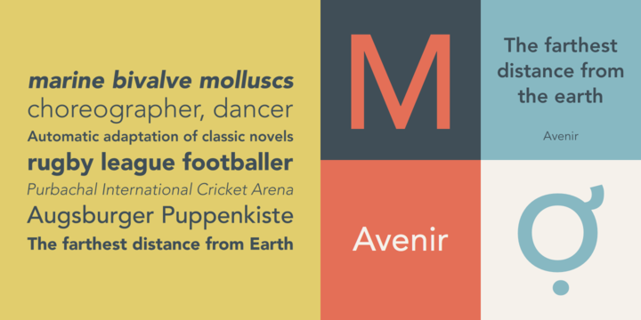
Avenir
Pre-dating Gotham by over a decade, Adrian Frutiger's Avenir ('future' in French) was released in 1988 as a modern twist on sans serifs such as Futura.
Unlike Futura, Avenir is not purely geometric: its vertical strokes are thicker than its horizontals, the ascenders are shortened and the 'o' is not perfectly round, tweaks that aid legibility and give the typeface a harmonious appearance.
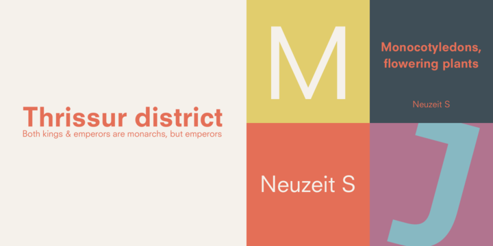
Neuzeit S
If you want to dig even deeper into typographical history, Neuzeit ('new time' in German) was created by Arthur Ritzel in 1959, and updated in 1966 as a corporate typeface for Siemens.
With both geometric and realist sans serif characteristics, Neuzeit S is based on Neuzeit Grotesk, a more purely geometric sans serif designed by Wilhelm Pischner in 1928 – and has been used by Fox News for some of its on-screen graphics.
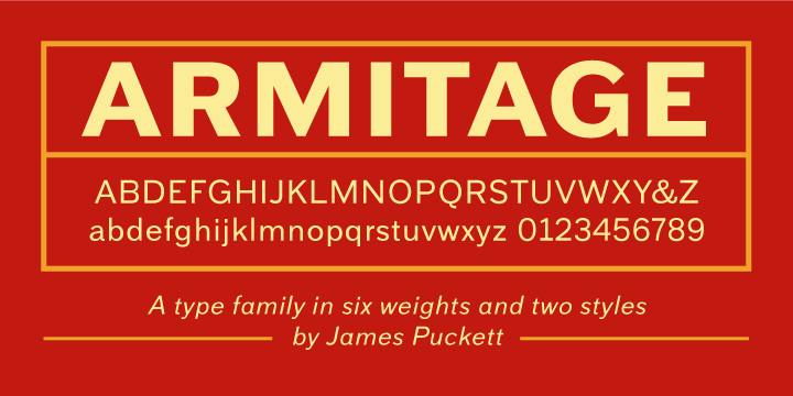
Armitage
If that vintage American feel is what attracted you to Gotham in the first place, Armitage could be a great alternative if you’re looking to add a late-19th century vibe to your design work.
Designer James Puckett drew on a wide range of source material, including sign manuals, inscriptions, period posters and architecture.
Armitage also benefits from six different weights, each with italics, making it a pretty hardworking typeface for a range of creative applications.
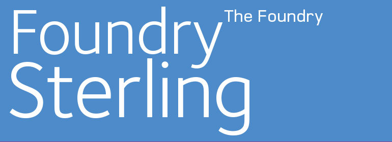
Foundry Sterling
Conversely, if Gotham’s roots are too American for your needs, Foundry Sterling brings a more quintessentially English flavour to the table, and manages to be both functional and graceful.
Like Gotham, Foundry Sterling has a broad range of weights that make it versatile in application, whether for identity, editorial or signage.
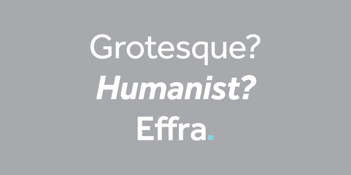
Effra
Named after the river running through Brixton, the area of London where its creator Dalton Maag is based, Effra draws inspiration from one of the earliest commercial sans-serif typefaces, Caslon Junior.
Its clean lines and humanist forms make Effra a highly flexible alternative to Gotham for all manner of design solutions, landing it a Red Dot Award in 2013.
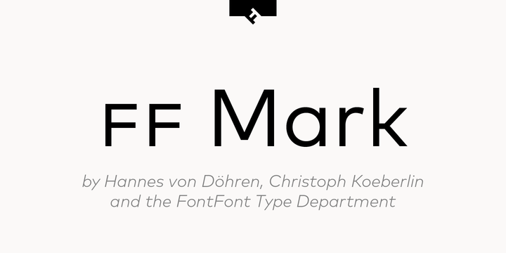
FF Mark
Created by German type designers Hannes von Döhren and Christoph Koeberlin from FontFont in 2013, FF Mark is the freshest Gotham alternative on this list.
It's also the most versatile, boasting an incredible 10 different weights – from hairline to black – as well as advanced support for ligatures, alternate characters, case-sensitive forms and more.
According to FontFont, it is ideally suited for everything from film and TV to advertising and packaging, editorial and publishing, logos and branding as well as web and screen design.
Of course, if you want the full extent of the 41-style FF Mark family at your fingertips you'll need to pay handsomely for the privilege.
Get the Creative Bloq Newsletter
Daily design news, reviews, how-tos and more, as picked by the editors.

Thank you for reading 5 articles this month* Join now for unlimited access
Enjoy your first month for just £1 / $1 / €1
*Read 5 free articles per month without a subscription

Join now for unlimited access
Try first month for just £1 / $1 / €1

Nick has worked with world-class agencies including Wolff Olins, Taxi Studio and Vault49 on brand storytelling, tone of voice and verbal strategy for global brands such as Virgin, TikTok, and Bite Back 2030. Nick launched the Brand Impact Awards in 2013 while editor of Computer Arts, and remains chair of judges. He's written for Creative Bloq on design and branding matters since the site's launch.
