12 tips for creating truly terrifying art
Anthony Scott Waters explains how to examine the darkest aspects of human nature.
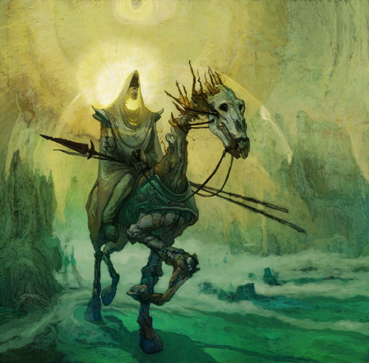
What do you mean by horror? You've got to know that before you get rolling. Are we talking HP Lovecraft? Scooby-Doo? Twenty-five years in art has taught me that it's the thinking that counts the most. Iteration without knowing where you’re coming from first is just spitballing – you’re just wasting time.
I've had the pleasure of creating some scary critters for a variety of projects and I’m deeply curious about what scares us and why.
Humans are wired to recognise bilateral symmetry. Deviate from the standard human form in any way and it makes us feel uncomfortable, even scared. As a person with a deformity, I know the truth of this first hand. Everybody has an in-built desire for security. Take that safety blanket away and you’ll have one terrified body on your hands.
Keep in mind there's some subjectivity here. Our perception of what's scary changes as we grow up. We're given concrete reasons for some of our fears (divorce, injury, violence). These can become transcendent (child abuse, rape, murder) in the way they alter our view of the world.
Horror's a kaleidoscope. In one setting it might mean a monster erupting from a coffin, but for a parent whose child has been abducted, to look upon the body of that child would be more horrific still. Context gives us the measure of a concept and helps us figure out where to go next.
01. The shape: who's your audience?
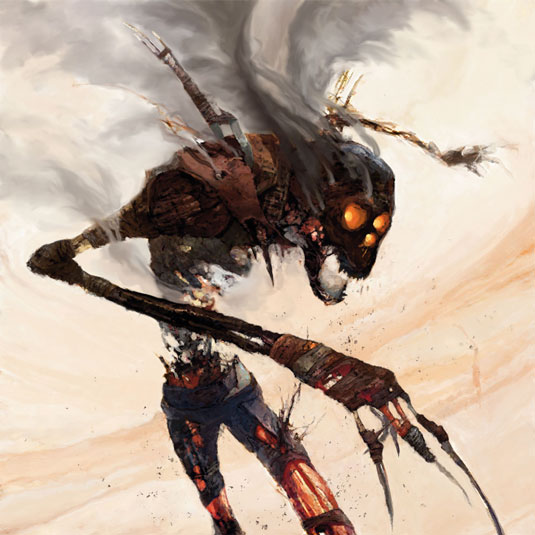
Ask yourself: who am I trying to scare? Your answer defines your audience, which helps set your imagination boundaries. This is primarily about age. As we age thresholds are raised. For teenagers, knowing the witch plans to cook Hansel and Gretel isn’t enough. We've got to see a chopping block and bloody cleaver.
02 .The shiver: who is vulnerable?
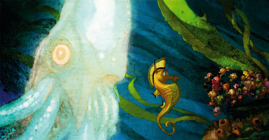
On stage, the Shiver comes before the Scare and the body floods with adrenaline. Kids are most susceptible, but we stay open to it as adults. Only the context changes. Kids can see what might be, at the same time they see what is – for example, a dangerous dog blocking the sidewalk, a block away.
03. The scare: how are they vulnerable?
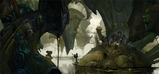
You know the Sesame Street song, One of These Things... (is Not Like the Other)? This is the opposite. The thing that's different leaps out at us. Our eyes are drawn to things that frighten us – it's programming from our biological past. "That's not a hummock of grass, it's the mane of a lion, you idiot! RUN!" The Scare establishes a baseline for the menace. The Shiver is a shark's fin in the distance. The Scare is seeing the shark from underwater 30 yards away.
04. The shocker: what's the true nature of the threat?
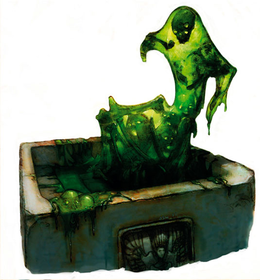
The Shocker clarifies how great the threat is. The head popping out of the hole in the boat in Jaws. It drops hints of how severe the gross-out will be, or defines the high water mark where there's no gross-out (see the final scenes in Robert Wise's classic film The Haunting).
05. The gross-out: what's the worst possible outcome?
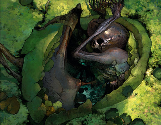
Here's the touchiest (pun intended) subject matter of the horrific. I say touchiest not for the gut-churning qualities of the gross-out, but for the dangers of using the gross-out in the first place. Gross-outs take us straight to the bottom level of shocking.
Our fears of blood, of pain, disfigurement and dehumanisation are brought right into our face when you roll out the entrails. The more we get to see, the faster the shock wears off. Without a good, solid context for the viewers to care about it, the gross-out becomes bowel theatre.
Cabin Fever's a good example, or the reboot of the Evil Dead. (That does suggest a whole subcategory of horror – the horror of being jaded to suffering – but there's only so much we can discuss here.)
06. Getting to the heart of it
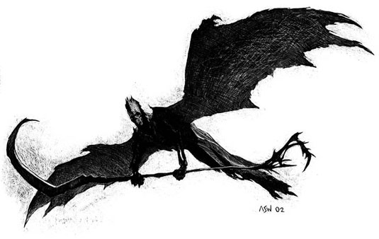
The next logical question is what's at the heart of the choice you've made? Are you going for the Gross-out? What's the context for Gross-out? How about the Scare? These states of fright are all related. What differs is the degree to which you emphasise one element over the others (deciding this will be a scary image, a disturbing one and so on).
07. Distortion of form
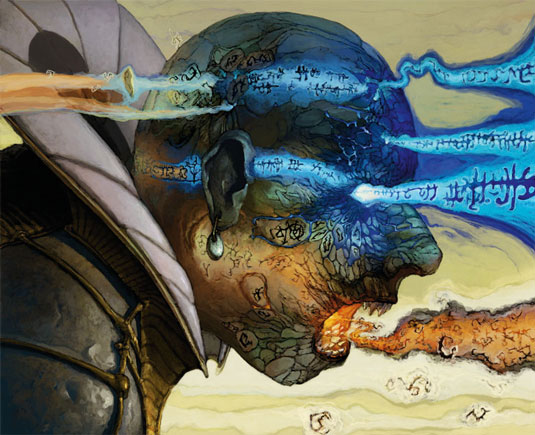
This is the easiest way to generate goosebumps. The Pale Man from Pan's Labyrinth had eyes in his palms. Genius. We leave our comfort zone when we alter the mathematical relationships of the human form. Consider what your monster is meant to do and exaggerate the appropriate parts of the human form, like the Martense clan in HP Lovecraft's The Lurking Fear, with arms and shoulders grotesquely overdeveloped to serve their subterranean needs.
08. Mixing and matching
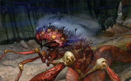
Another method for bringing horror to the ordinary is to blend elements that don't normally belong together. Pyramid Head from Silent Hill is a great example. The Borg from Star Trek are another.
Don't limit yourself. Dig on the internet for good reference, then put everything up in front of you and draw some striking visual connections. Note how HR Giger's Alien design references modern industrial design in the details of torso, arms and legs.
09. Think outside the box
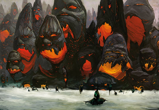
Can objects be made horrific? What about machines or buildings? Anything can be made to appear scary. Don't believe me? Google the Paris Catacombs, Beelitz-Heilstätten Hospital, or Pripyat. Decay and defacement help to make a place creepy, but with places such as Pripyat you're aware something terrible must have happened there even if you don’t know anything about the Chernobyl disaster.
It's all in how you choose to depict the subject. Zdzisaw Beksiński's cathedrals are terrifying. I wouldn't touch the puzzle-box from Hellraiser if you paid me a billion dollars. It’s not just the story behind these two examples that frightens. The intended fear was consciously used to sculpt the design.
10. Deciding on a theme
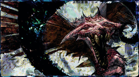
How wild should your designs be? It depends on the vibe the client wants. Subtle forms of horror call for careful blending of visual elements. Contrast the revenant from The Woman in Black (which fitted with the understated atmosphere of Edwardian England) with Frankenstein's Army, which had some of the most bizarre monster designs seen in years. A theme is a spine for a project in the same way a value structure is the spine for a good work of art.
11. Expose thyself
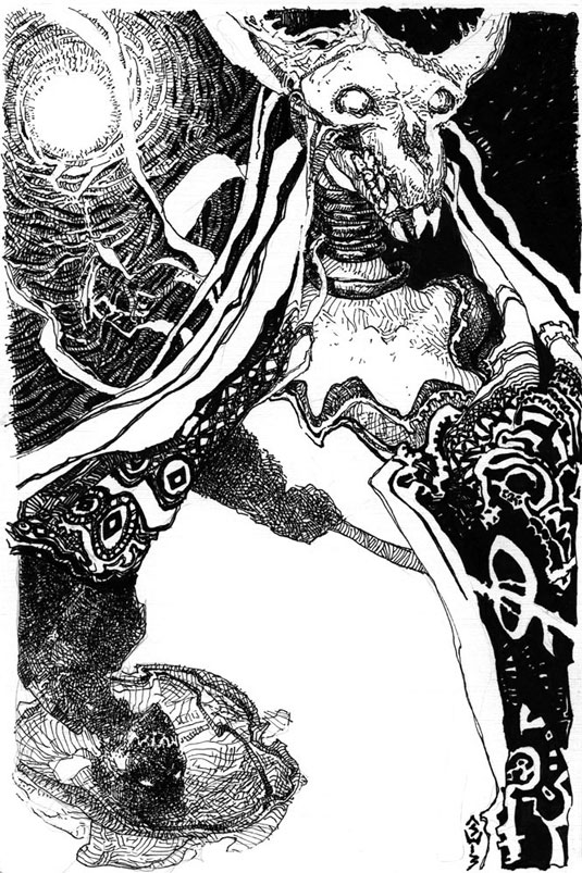
Films are like veins of minerals. Tap them for ideas and inspiration, especially ones with rich visuals, such as Stalker, Aliens or anything by the Brothers Quay. Read authors known for imaginative worlds. China Miéville, Michael Moorcock and HP Lovecraft come to mind. Look for artists who explore the uncanny and horrific.
12. Improve your posture
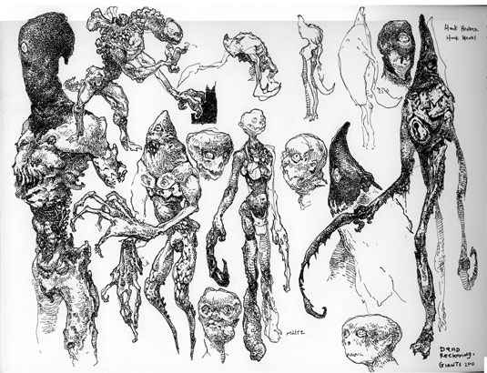
We create so many figures and forms at a high velocity that if we're not careful, shorthand for poses and composition becomes limited. The solution is to go back to the beginning. Resume drawing figures if you've let that go (or animals, perspective, architecture). Given a chance to design a character, try creating a pose that speaks for the character. Tough guys don't stand like slackers, or professors like zombies. Make the pose match the man, or monster!
This article originally appeared in ImagineFX magazine issue 111.
Like this? Read these!
- Horror artist takes on zombie flesh eaters
- 3 top tips for depicting the death of a vampire
- Free Photoshop brushes every creative must have

Thank you for reading 5 articles this month* Join now for unlimited access
Enjoy your first month for just £1 / $1 / €1
*Read 5 free articles per month without a subscription

Join now for unlimited access
Try first month for just £1 / $1 / €1
Get the Creative Bloq Newsletter
Daily design news, reviews, how-tos and more, as picked by the editors.
