The secrets of creating epic Warhammer artwork
We walk you through the creation of a dynamic piece of artwork for Total War: Warhammer.

This workshop will show the process I and my colleagues at Creative Assembly use to create dynamic and thrilling fantasy illustrations, while staying true to an established intellectual property. Rather than providing a comprehensive Photoshop tutorial, the aim is to show you how to draw for a large and established franchise.
When working with such a renowned universe, such as the Total War series, you have to be mindful of how characters, creatures, items and locations should be portrayed. Exercise your creativity while staying true to the spirit of the original. And that's in addition to the classic artistic struggles of composition, sense of movement, anatomy, values, colour and polish.
Exercise your creativity while staying true to the spirit of the original
Fortunately, we have a wealth of source material to draw upon, and some incredibly well-defined miniatures and concept art to work with. At Creative Assembly we're doing our best to bring this fantasy world to life, and the bedrock of this process is research. Understanding the lore and embracing the source material is one of the most important things we do.
I hope that this artwork demonstrates our love for our job, and displays not only the special care we take to depict Warhammer's fantasy-themed content, but also what a rich palette it gives us to work with. Having such a deep well to draw upon really gives you a lot of diverse options and directions to go in.
This composition has also been created with a destination in mind – that it will appear on the cover of ImagineFX – and as such it has to work with an extra level of editorial requirements. This naturally brings another layer of depth and intrigue to the task. This workshop showcases the approach I take and how the piece reaches its final destination.
01. References and preparation
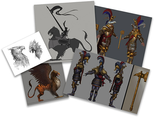
This is the research phase, when I gather references and materials to ensure the final piece represents the original model design and the in-game assets as closely as possible. Fortunately, in this instance most of the game's characters are already complete, so I can use them as reference alongside the original concept art. Research is always important. I find it keeps the work on track and saves me time in the process.
02. Sketching and dramatic values
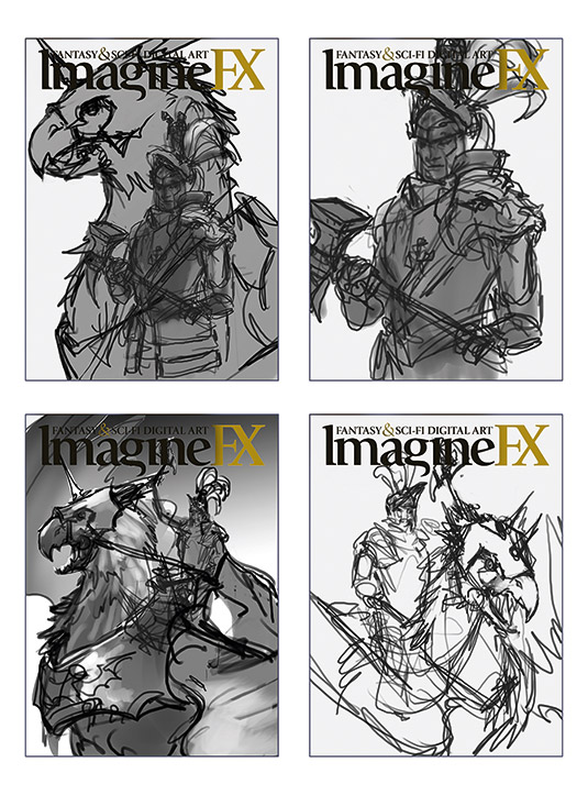
Next I explore different subjects. Battle scenes need dynamic movement to be successful, and for each of my ideas I try to convey a sense of action and motion. I also work out ideas for the lighting scheme and test out the overall composition, with other graphic elements in mind, such as the magazine's logo and any cover text.
03. Setting on an idea
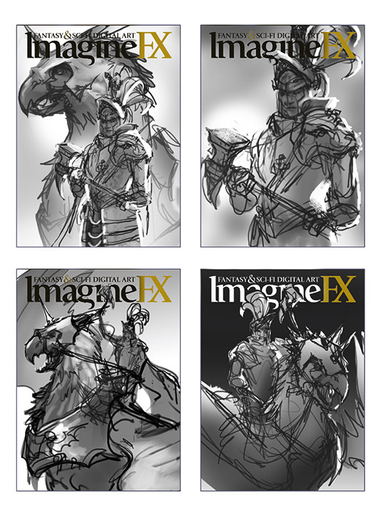
After some initial exploration and ideas from the ImagineFX team, we decide to feature a key character from the game. These characters are the cornerstones of Warhammer, famous heroes with distinctive, archetypal looks and they ride into battle on exotic creatures. It's between the Orc, Azhag the Slaughterer, and his wyvern Skullmuncha; and Karl Franz on his griffon, Deathclaw. After some consideration the forces of Order win, and I go with Karl Franz and Deathclaw.
04. Refining the composition

I take the general idea of Karl Franz atop his trusty griffon steed and work through more variations of the composition. In this stage, the changes are smaller yet just as important. I focus on how the image works with the cover layout and logo, where the focus of the composition is, and make positioning decisions to create the best visual flow. I chose a right-facing Karl Franz and Deathclaw, with both characters' faces in clear view for stronger impact.
05. Jumping into colour
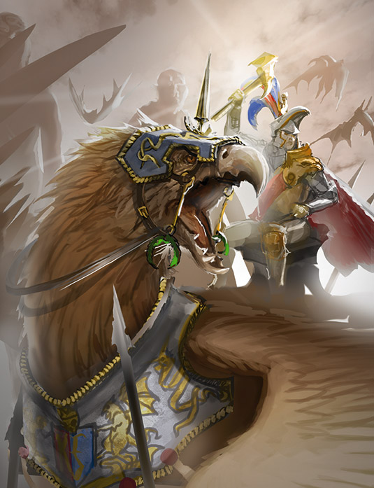
Once the figures are spatially arranged, I add colour. An overall neutral warm palette and bright value gives a generally optimistic tone to the image, and details of the characters' armour and weapons add different colour hits to create points of interest. While adding colour, I maintain some value structure and keep the focal points around Deathclaw and Karl Franz.
06. Acknowledging a milestone
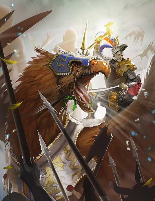
I've set up the composition, values and colours, but the hard work has only just begun. The core image is basically done, yet the final is really only halfway finished. This is the moment where most beginners like to stop painting. It's easy to lose focus and interest in the image, because what's left is a lot of monotonous and systematic hard work.
07. Going with the flow
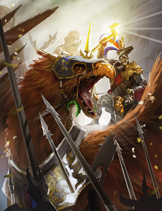
I move over the image, refining areas, cleaning up edges, adding depth and interest by adjusting values and hues. It turns out to be quite freeform and I experiment with some lighting effects. This can be a useful stage because, with the base composition fixed, you're free to experiment in a number of small ways that can make a big impact on the final image. It also gives you a clearer idea of where you're heading.
08. Layer count explosion
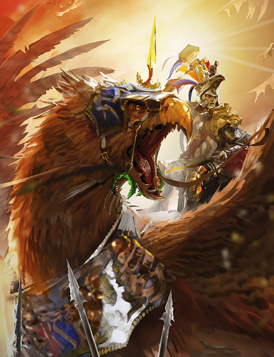
With a big painting like this, especially with some flow and experimentation in the process, it's easy to build a huge number of layers in your document. Working with layers is personal preference. They definitely offer benefits when used correctly, but can also become a nuisance if they get out of hand. So I find it's a good idea to exercise a little discipline and try to keep the numbers down.
09. Organising the chaos
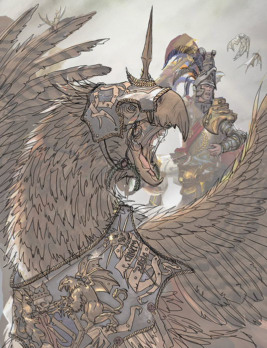
I organise the document and group related layers together. This ensures I get the best performance out of Photoshop, but maintain some flexibility. Layer groups in Photoshop are especially handy. Once organised, I do a pass of line art on the painting. This helps me to clarify and refine the image later, and tightens up the detail level consistently across the whole picture.
10. Paint, flatten, repeat

Next, I sequentially refine and overpaint the picture. I flatten the updated parts as I go, to keep the layers in check and gradually improve the image. Now is a great time to do a sanity check and refer back to the guiding light of your source material, so you know you're not going too far off-piste regarding minor but important details.
11. Adding background and foreground
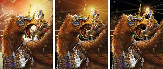
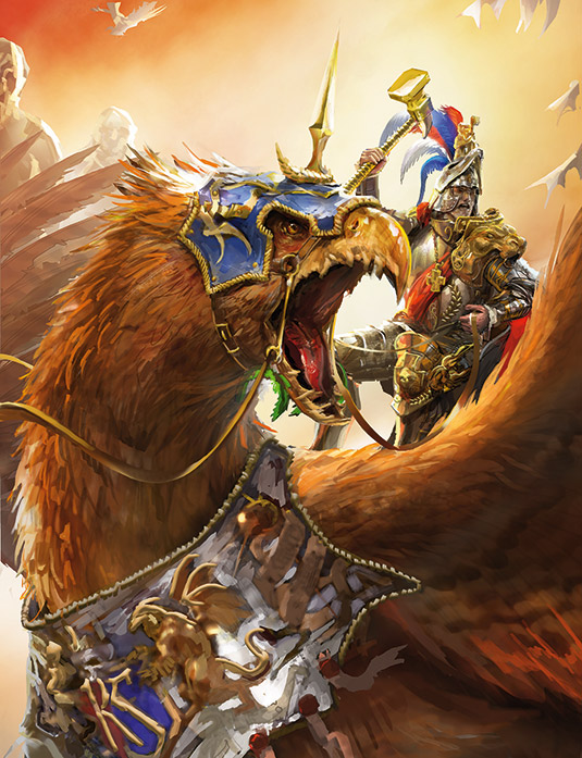
To create depth, I place something both in front and behind the main characters. Overlaps help as well. In the background I add a dramatic sky, clouds and light shafts. To suggest a battle, I add giants and wyverns in the air, goblin and orc spears in the foreground. These details can come and go depending on how focused or busy I want the final image to be.
12. Adding visual effects
I attempt to add more drama, by using particle effects, dust, sun beams, flares, motion blur and the additional shadows cast by the strong light originating from the Warhammer itself, Ghal Maraz. Even if I place some visual effects at the beginning of the process, I always take extra time to try and fit some more of them in at the end. It helps create the impression that the image is richer in detail and more dynamic. Believe me, there's always space for some additional effects, and in most cases they make the image stronger.
13. Adjusting colour and contrast
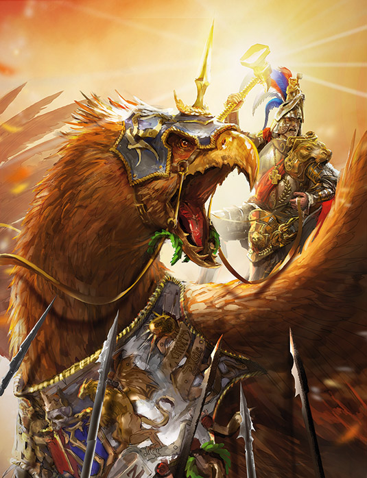
Now I begin applying the final touches. I adjust the colours, make sure the balance of the palette is both pleasing and fitting for the subject, and ensure the entire image hangs together in a coherent way. I find that during the rendering process you can lose a bit of contrast, so it's good to check that the value structure is intact and the contrast is as intended.
14. Calling it done
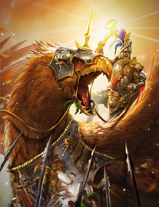
The secret to a successful image is knowing when to stop. Look at your picture. Does something annoy you? Correct it. Look again. Is there something you think isn't right, but no one will probably notice? Correct it. Something else that you can't quite put your finger on? That's the artist's curse. You'll never be 100 per cent happy. Believe me, 99 per cent is enough.
This article was originally published in ImagineFX magazine issue 133. Buy it here.

Thank you for reading 5 articles this month* Join now for unlimited access
Enjoy your first month for just £1 / $1 / €1
*Read 5 free articles per month without a subscription

Join now for unlimited access
Try first month for just £1 / $1 / €1
Get the Creative Bloq Newsletter
Daily design news, reviews, how-tos and more, as picked by the editors.
