Use sculpting to get inspiration for your illustrations
See how 3D sculpts can be used to help artists relax and generate ideas for an illustration.
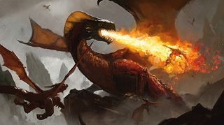
Every artist has experienced art block. Stress is a major factor that contributes to this condition: being unable to think of anything to draw, struggling with an existing painting or feeling inadequate when you compare your work to others leads to frustration and can ultimately stop you wanting to create at all. This is bad. Developing a process that would remove the stress of painting illustrations became a major goal of mine when I was struggling with how to draw a dragon.
Pareidolia is a fancy word to describe the phenomenon whereby we see shapes such as human faces or animals in clouds or other places you wouldn't expect them. This has been used by artists for years, doodling in sketchbooks until an idea pops out, but for my art block-beating process I wanted to remove myself from drawing in the early stages altogether.
Sculpting, whether using traditional materials like clay or with 3D software was the answer: it's tactile, relaxing – and fun! Spending an hour or so playing around in 3D led to interesting shapes and compositions every time and consistently gave me ideas for new illustrations.
I'll be using 3D-Coat for the sculpting phase (alternatives include ZBrush and Sculptris), OctaneRender for rendering (lots of options here including Blender, MODO or KeyShot), DAZ 3D and Photoshop. No real 3D knowledge is required for this workshop – experimentation is the key here!
01. Start playing in 3D
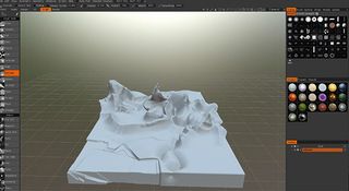
I load up 3D-Coat and create a cube. This is what I'll be sculpting, grabbing different tools and pushing or pulling shapes out of it. At this stage I have no idea what I'll be creating, I'm just having fun and playing with the software. 3D-Coat works a lot like Photoshop and so it's easy to pick up.
02. Latch on to an idea
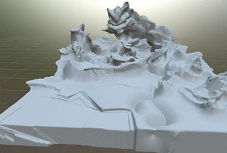
As I'm experimenting I start to see a dragon-like shape emerging from a rock. It's incredibly crude, but I decide to work into it, using the Clay and Extrude tools to sculpt out the body. I like how it connects with the environment; perhaps this dragon is made of rock? A composition is forming...
03. Expand on the concept
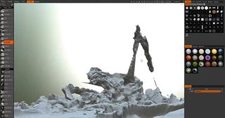
I like this rock dragon concept. He feels big and slow and heavy – perhaps he's been roused by smaller dragons? Already I've gone from a blank slate to something with storytelling potential. I continue to sculpt into the environment, keeping it loose which ensures it'll be easier to manipulate and paint in Photoshop.
04. Light the scene
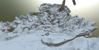
At this stage I'm happy with the overall composition. So now I export the model as an OBJ file and bring it into OctaneRender, my renderer of choice. Here I can easily experiment with lighting to get a feel for the mood of the piece, by playing with sliders relating to time of day and location.
05. Bring it into Photoshop
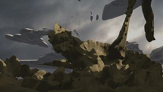
I render out the scene and load it up in Photoshop. The first step is to sketch ideas straight on top of this render. Everything here may change, so this is a chance to expand on the rock dragon concept and see if it'll stick. But first I need to fix the composition and make it flow nicely.
06. Correcting the composition
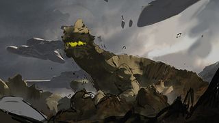
The goal of any illustration is for the viewer's eye to travel around the image and fall on the areas you want them to look at. I adjust the dragon's head and start adding depth to the scene by darkening areas that are close to the camera, splitting the image into sections using atmosphere painted with a soft brush.
07. Exploring the concept
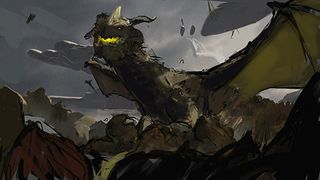
I push the sketch further, adding dark foreground rocks and playing with the idea of painting smaller dragons into the scene. This would give some much-needed movement to the illustration, but the composition will need to change. Right now the rock dragon feels too static. That's okay: the process is to generate ideas, not finished 3D art!
08. Rethinking the composition
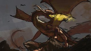
The story is now solidified in my mind: the rock dragon is being attacked by smaller dragons, perhaps of another species, and is in the process of incinerating one with his powerful flaming breath. This requires a more dynamic composition, so I sketch a new idea and track down some good lizard references to help with the anatomy.
09. Posing little dragons
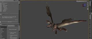
I want the smaller dragons to feel dynamic in the air, and decide to pose them in 3D rather than spending time sketching anatomy. DAZ 3D is a great free piece of software that comes with a dragon model, so I load it up and position the body by dragging limbs into position. Once I'm finished I simply take a screengrab and paste it into Photoshop, ready to be positioned.
10. Design work
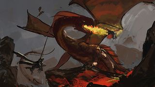
With all the elements in place and a much more exciting composition laid out, I'm ready to start playing with the design of my main dragon. I spend some time browsing references of birds, snakes, lizards and dinosaurs, and experiment with different approaches to the beak and body shape.
11. Exploring the background
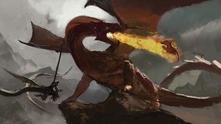
Despite having a solid lighting reference from my 3D render, I'm still unsure of the location of this image and how that will look in the background. Mountainous terrain seems to make sense for the dragon's home. So I search through my photo reference folders to see what might fit, focusing on locations like New Zealand and The Alps.
12. Remember to take a break!
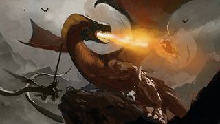
It's always good to step away from your work as often as you feel you need to; returning to a painting after a night usually yields useful discoveries, as you see it again with fresh eyes. In this case I took a few days off and upon continuing noticed some wonky anatomy. The dragon's neck felt too long and the body too insubstantial.
13. Rendering the scene
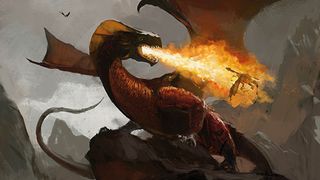
With most of the painting worked out I can now relax and render out some details. I'm referencing continuously during this stage, looking photos of bat wings, flamethrowers, mountains and frilled lizards as I move around the canvas. There's no real order to rendering: I'll do some work on the face and then move somewhere else when I get bored.
14. Adding the final touches

I introduce more small dragons to add to the overall sense of movement in the scene and spend some time adding small details, such as the rendering of the fire and atmospherics. The spiky rocks were a quick experiment at the end, and I think they added a lot to the environment. Another happy accident!
This article was originally published in ImagineFX magazine issue 133.

Thank you for reading 5 articles this month* Join now for unlimited access
Enjoy your first month for just £1 / $1 / €1
*Read 5 free articles per month without a subscription

Join now for unlimited access
Try first month for just £1 / $1 / €1
Get the Creative Bloq Newsletter
Daily design news, reviews, how-tos and more, as picked by the editors.
