How to paint a beastly portrait in Photoshop
Use subtle details to enhance your fantasy character designs. David Gaillet shows you how it's done with his punk rock mutant.
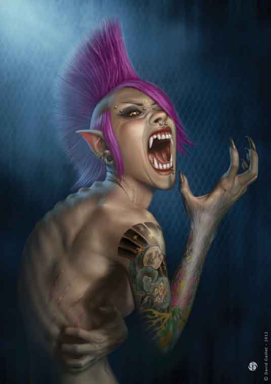
This illustration is a personal work. The idea comes to me just by falling upon an image from the film An American Werewolf in London, which was directed by John Landis and is considered a classic of the genre.
Win clients & work smarter with our FREE ebook: get it now!
I want to represent the transformation of a woman into a werewolf. I'm keen to introduce overtones of the punk movement into the character. This form of raw and spontaneous musical expression associated with nihilism corresponds to the loss of human value when the beast begins to take over my human character.
A young female punk could add some interesting graphical elements, too. Imagine a werewolf with a purple mohican and piercings! My aim is to create a clean portrait: a classical composition with a suggested background.
It's not an action pose because I want to do something intimate, a still image, and place emphasis on her expression and details. Although the details aren't initially visible, they often signal to the viewer what's happening. The challenge is to avoid obvious signs, such as pointed ears, teeth or claws, but still show the werewolf emerging.
01. Find the character
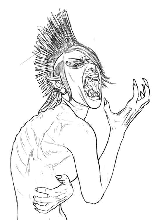
I start by producing sketches of the character's general pose. In this case I quickly come up with something I'm happy with, but it doesn't always work like this! I then search for several references, such as body shapes and wolf hair, that will help me to refine my drawing and guide me to the final image.
02. Establish colours
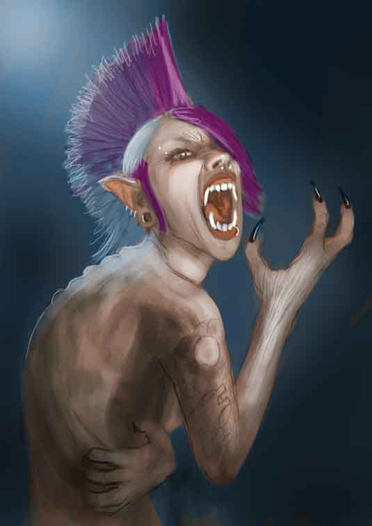
I carry out a rapid colour 'staining' of all the layers, separating the body, hair, eyes, lips and teeth. This step enables me to isolate each item and adjust the colour or levels. It also gives me a chance to think about light sources, shadows, their intensities and directions to direct the viewer's attention.
03. Fine details
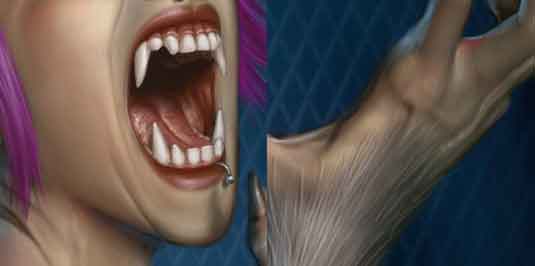
I sometimes, rightly or wrongly, attach more importance to certain details that can't be seen at first glance. For this illustration, especially for this transformation, I feel these small details bring more credibility to the character. I exaggerate certain anatomical parts of the character, such as a larger jaw, elongated hands, more prominent vertebra, a ridge on the base of the nose and the upper lip.
04. Light sources
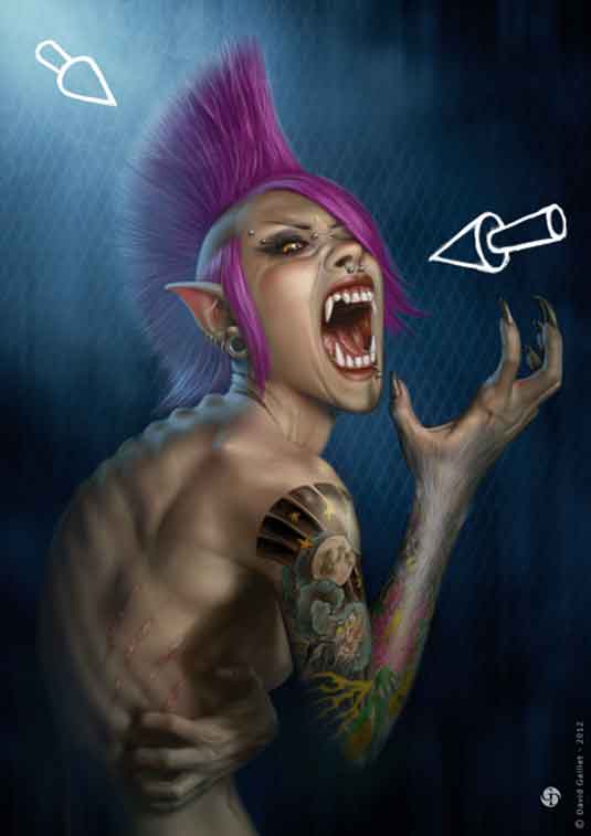
Here I use two light sources. The first is a soft, warm light that comes from the front, enabling me to contrast with the blue background. I use a blue light source coming from behind, possibly from the full moon. The second light will give more intensity and avoid disconnecting the character from the bottom of the painting, which might give the impression of her being suspended in the frame.
05. Tackle the hair
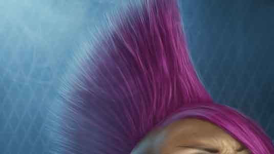
There are several ways of painting hair. I start with the Round brush and reduce the opacity to around 15 per cent to build the movement and volume in the hair. The brightest areas are located on hair that follows a curve. Finally I add detail, taking care not to distort the volume. Sometimes applying too much detail to each strand results in the hair looking uniformly lit, giving it a flat, lifeless appearance.
06. The piercings
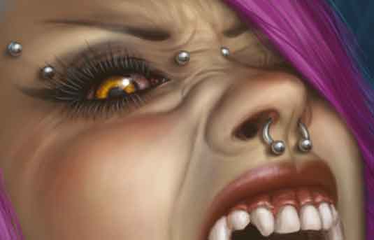
Metal surfaces reflect their surroundings, and therefore what is 'out there'. I don't go into extreme accuracy here, but it is necessary to simplify the reflection so that it suggests ground, the sky, the light source and possibly things close to the metal ball, such as the skin of
the character.
07. Ink work
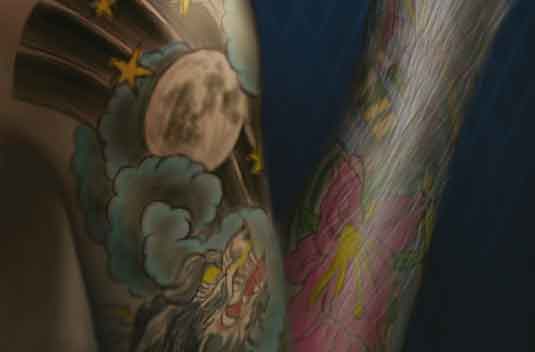
I sketch the tattoo, taking care to observe the volume of the arm and drawing in perspective on the edges. I then starting inking the tattoo. Human skin isn't dull – rather, it's slightly satiny. So I focus on areas where the skin captures more light, such as on the tip of the shoulder. I also lower the opacity of the layer to integrate it with the rest of the image.
08. Final touches
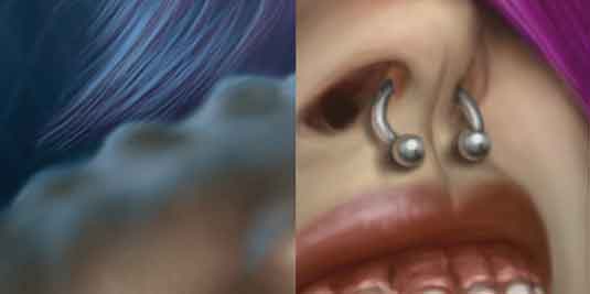
I begin refining each layer using my references. I mainly use the Round brushes with Pressure Opacity and Blur turned on, and a brush to create the skin texture and bumps on the tongue. I use a Density mask to boost or adjust the light in some places, before finally tweaking the piercings, tattoo and scar.
Photoshop custom brush: Grain

Rather than using photo textures, I prefer to work with multiple brushes that enable me to recreate different surfaces, such as rock, vegetation or fabric. For this image I've used this brush to create a grain.
Words: David Gaillet
After eight years of website design, David Gaillet returned to his first passion: drawing. He's now a freelance illustrator who's working in the video games industry while looking to develop his skills.
This article originally appeared in ImagineFX magazine issue 88.
Like this? Read these...
- Paint pinched flesh in 4 steps
- How to become an artist without the help of traditional art school
- 3 top tips for illustrating personality

Thank you for reading 5 articles this month* Join now for unlimited access
Enjoy your first month for just £1 / $1 / €1
*Read 5 free articles per month without a subscription

Join now for unlimited access
Try first month for just £1 / $1 / €1
Get the Creative Bloq Newsletter
Daily design news, reviews, how-tos and more, as picked by the editors.

The Creative Bloq team is made up of a group of art and design enthusiasts, and has changed and evolved since Creative Bloq began back in 2012. The current website team consists of eight full-time members of staff: Editor Georgia Coggan, Deputy Editor Rosie Hilder, Ecommerce Editor Beren Neale, Senior News Editor Daniel Piper, Editor, Digital Art and 3D Ian Dean, Tech Reviews Editor Erlingur Einarsson, Ecommerce Writer Beth Nicholls and Staff Writer Natalie Fear, as well as a roster of freelancers from around the world. The ImagineFX magazine team also pitch in, ensuring that content from leading digital art publication ImagineFX is represented on Creative Bloq.
