How to give your art a sense of motion
Lauren K Cannon talks you through three pro tips for painting multiple figures in motion.
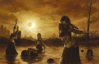
Composing multiple figures is always difficult, but painting them in motion makes the problem even harder. One important thing to watch out for with a moving group is tangents. A tangent is where two edges or lines intersect or touch.
Learn how to paint a ghostly figure in Photoshop
In art, tangents can create visual confusion or disrupt a composition's flow by preventing the edges of two objects from being read clearly. They also happen when a line seems to meld into another object, such as the outline or a mountain peak connecting directly with the angle of a figure's arm. You should always try to avoid tangents – and with multiple figures it becomes especially vital.
In this case we have a group of dancers. Each character needs to have a clean silhouette; their poses should be easily readable. Stagger the placement of the figures, but don't space them evenly apart or put them all on the same plane. Groups look artificial unless you vary their size and placement.
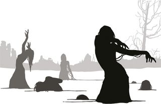
Think about background, mid-ground and foreground, and also remember to create overlapping shapes. Have some figures in the front obscure parts of the figures in the back. This trick is a huge help in creating believable dimensions. To prevent the figures from jumbling together, use value and colour contrast to keep them visually individual.
There's a lot to keep in mind when doing multiple figure compositions, so I suggest making a lot of thumbnail sketches before you commit to anything. Find the best poses and placements for each figure: planning ahead is the best way to avoid the pitfalls of composition.
01. Plan it out
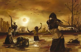
Before committing to any details I plan out the rough gestures of each character. This gives a feel for the composition and helps me address any issues. I lay out my basic colours and values, but that's all. Keeping the figures on a separate layer enables me to move and scale them easily, if necessary.
02. Pick a focal point
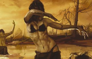
Multiple figure compositions need a focus, so pick one or two characters that need the most attention. I start refining the bodies of the girls, getting their gesture correct. I also focus on the lighting and values. This approach makes it easier to discern how to push the other figures back so the image doesn't become jumbled.
03. Experiment and add depth
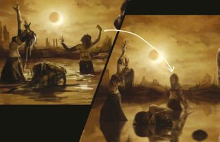
I realise the girl at the back isn't working out. Her pose is awkward and creates ugly tangents with the landscape. So I repaint her, facing the viewer, with her arms down to add variety to the poses. I use layers with low-opacity lighting effects, to create strong atmospheric depth between the figures.
This article originally appeared in ImagineFX.
Like this? Read these...
- How to paint a cultured steampunk tiger
- Free Photoshop brushes every creative must have
- Great examples of doodle art

Thank you for reading 5 articles this month* Join now for unlimited access
Enjoy your first month for just £1 / $1 / €1
*Read 5 free articles per month without a subscription

Join now for unlimited access
Try first month for just £1 / $1 / €1
Get the Creative Bloq Newsletter
Daily design news, reviews, how-tos and more, as picked by the editors.
