How to draw a dynamic team of superheroes
Artist Sara Forlenza reveals her creative process for creating a group dynamic.
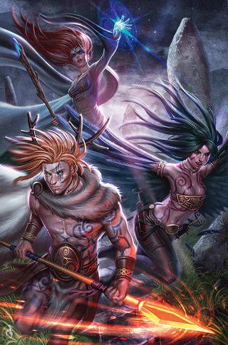
When planning how to draw a well-balanced group image, you should show the various characters in an effective manner, and emphasise their characteristics and dynamic nature. The figures in the foreground will clearly have more prominence, but they can't all be in the foreground. I've found that a useful way to show them is to use a view that's slightly from above, which especially suits a portrait-format image.
One technique to lift the characters from the background and give them a degree of dimensionality is to introduce architectural or natural elements. Note that these elements need to be in keeping with the scene's setting. In my illustration I add a staircase and put in semi-natural objects (some standing stones in the background). I also add tufts of grass and worn rock, before creating a very rough and ready sketch of the characters. I keep my elements on different layers, which enables me to make corrections to the image towards the end of my painting process.
Usually, I'll want to emphasise the importance of the main character and so I would normally place them in the centre of the composition where the viewer's eye will look first. However, in this case I'm keen to create greater dynamism and so I leave that area free. I want the viewer's eye to move from top to bottom, taking in all my characters as they do so.
01. Plot using a grid
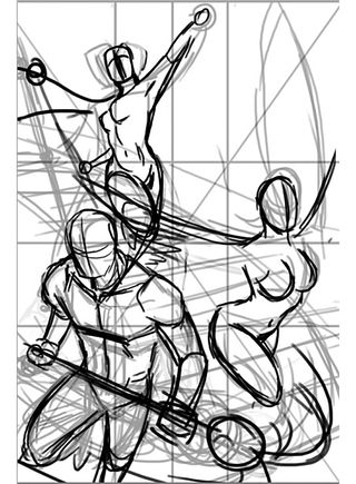
I start the design phase of the image by drawing medians and diagonals, locating the centre of the image. In this case I create a grid, dividing the width and height in three, but other artists might use the Golden Spiral or different kinds of grids – each solution is valid! I sketch the characters in a rough way, so I have an idea of the pose and perspective.
02. Insert some character
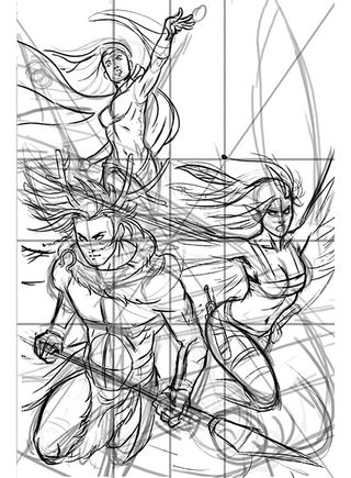
Active characters help to ensure the scene has dynamism. The sorceress casts a spell, the raven-woman spreads her wings, the deer-man charges with a spear. Next, I focus on the anatomy, which is essential to ensure credibility and gives a naturalness to the characters' gestures. Only at the end do I add details such as hair, clothing, weapons and armour.
03. Back it up
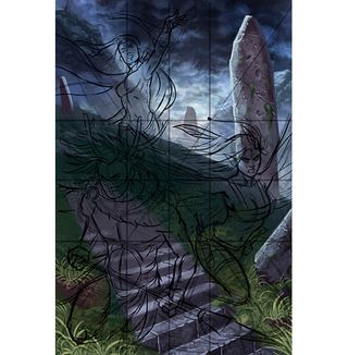
At this point in the creative process I introduce colours. I usually start by painting the background, so I choose the type of lighting and where to place the light sources. In this case, the environment is characterised by a leaden sky, a prairie and some mountains, so I paint a cold, ambient light. I also use a warmer rim light, which introduces visual contrast
04. Add final details
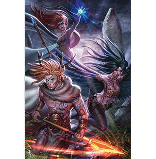
Ambient light doesn't cast sharp shadows, but gives a more defined look so I can show off the characters and their details. I pick desaturated colours to maintain the dark look of the sky, except for the magical light of the spear and the spell of the sorceress. I ensure that my characters are affected by aerial perspective, so I desaturate colours where necessary.
Artist's secret: Layers and layers group
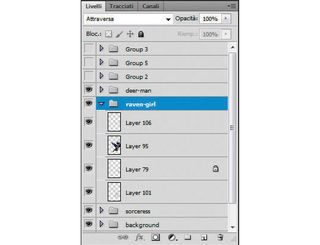
I work on different layers for each character, so I can move them if the image doesn't seem balanced. If I feel that I'm about to be overwhelmed by the number of layers, I create layer group and organise them accordingly.
Words: Sara Forlenza
Sara Forlenza creates art for book covers, cards and RPGs. After many years with traditional techniques, she was introduced to digital art. It was love at first sight.
Liked this? Try these...

Thank you for reading 5 articles this month* Join now for unlimited access
Enjoy your first month for just £1 / $1 / €1
*Read 5 free articles per month without a subscription

Join now for unlimited access
Try first month for just £1 / $1 / €1
Get the Creative Bloq Newsletter
Daily design news, reviews, how-tos and more, as picked by the editors.
The Creative Bloq team is made up of a group of design fans, and has changed and evolved since Creative Bloq began back in 2012. The current website team consists of eight full-time members of staff: Editor Georgia Coggan, Deputy Editor Rosie Hilder, Ecommerce Editor Beren Neale, Senior News Editor Daniel Piper, Editor, Digital Art and 3D Ian Dean, Tech Reviews Editor Erlingur Einarsson and Ecommerce Writer Beth Nicholls and Staff Writer Natalie Fear, as well as a roster of freelancers from around the world. The 3D World and ImagineFX magazine teams also pitch in, ensuring that content from 3D World and ImagineFX is represented on Creative Bloq.
