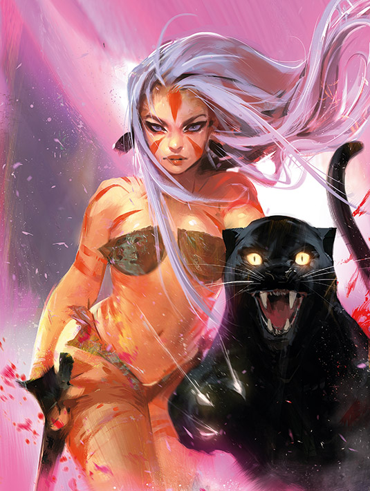
This artwork was a great challenge for me to embark on. My task was to take an old-school classic vintage posters vibe and modernise it for today's audience with my artistic interpretation. One of the main inspirations I leaned towards was Frank Frazetta's art. It was tricky to take his essence, yet still keep my voice.
I'm going to be showing you how to create a great dynamic pin-up in a smart and editable format, while keeping your voice. Many artists and designers today have a problem where either they start an image and jump into it too quickly with a messy workflow, or get so tied up by the process analytically that their voice doesn't show through the piece. Versatility and communication are some of your best assets.
Being able to communicate to the client about what they want, what you want, and how best to represent their product or project, yet still keep the integrity of what you want to say with your creativity are great skills. What I like to do is provide at least three options: two leaning more on what the client wants and one that's more my own.
Doing this will help communicate that you're a team player and that you take direction, as well as showing you're not afraid to jump outside your comfort zone to express your artistic opinion.
I hope this process will help guide you through the steps on how to approach things in an organic and structured way, yet still keeping the fun and energy. Ultimately, I'm really happy with the process and outcome!
01. Create graphic shapes
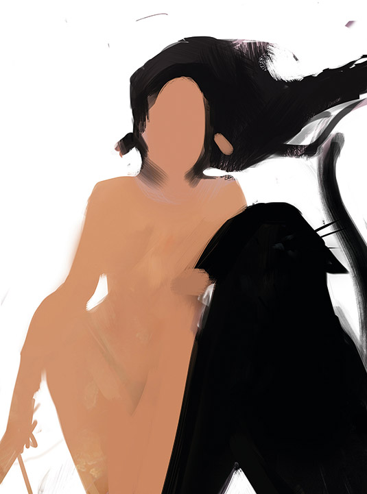
I like to start simple. It's good to establish something clear and impactful. With a strong foundation, the rest of the process should be easier. After a couple of variations of the comp, we land on a barbarian-esque lady and a feline. I want the shapes and colours to be really bold. It's a good general rule to have things on separate layers when working for a client!
02. Work on shading and lighting
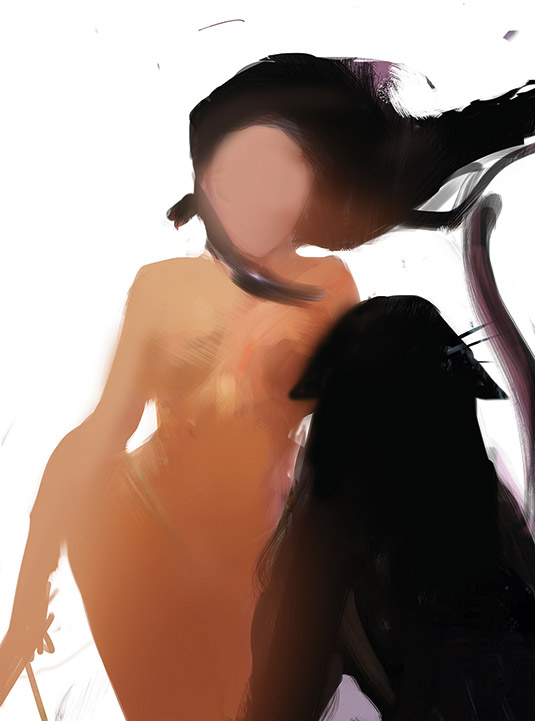
I want to establish my lighting quickly. I like to make concise decisions early, to serve as a foundation when I need to find answers to problems later. I quickly lay some tonal shadows with an airbrush. I put down basic shadows of the anatomy and try to establish a good value read. With the shape on its own layer, I lock the layer and have more freedom to experiment.
03. Refine and design
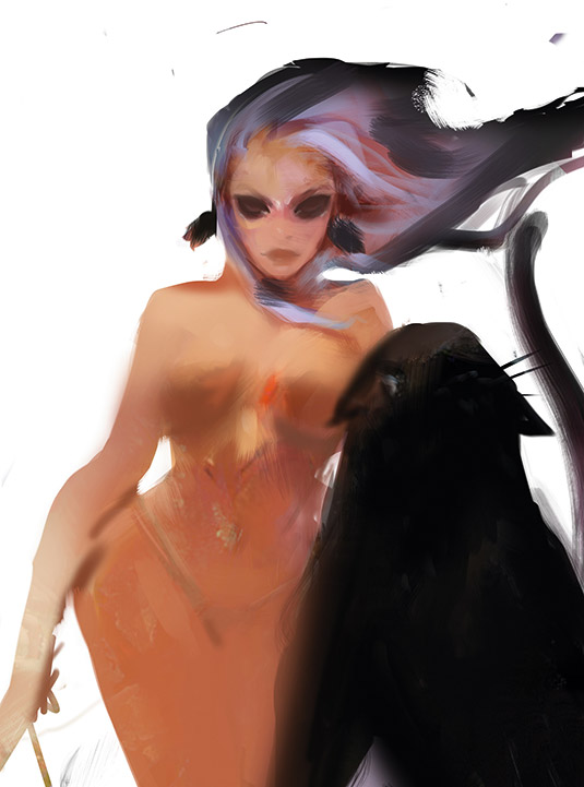
I decide that black hair is too classic looking. I remember I want to use my own voice and create a modern piece. I love having a sort of white/purple hair. I think it's fresh and exciting. As I put it down on the canvas, the results are clear and I'm relieved. I commit to that decision and start to refine and design.
It's good to have your own inspiration up next to you. Your experiences and things you're inspired by translates into the pieces you make, so it's good have some things to draw from.
04. Work on the background
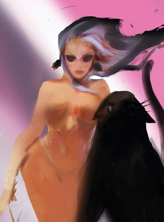
If I work on the character too much it might not fit its surroundings, so I start on the background. Mint Cyan and Salmon Pink are some of my go-to colours that I find appealing. I want to be loose, so I use an airbrush to find a nice, abstract composition for the background. I want the most contrast on the focal point, so I light the bright white light behind her head.
05. Commit to the background
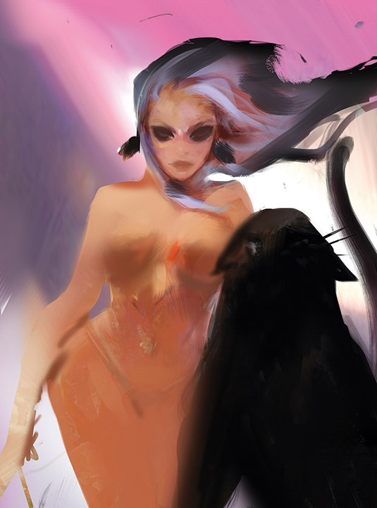
It's great to work loosely, but I need to commit or the stage will go on forever. I try to design all background shapes thinking of the overall impact I'm going for. I want an essence of a moon or sun behind her, cutting through the composition dynamically, fading off into interesting pinks. It's good to always keep in mind your intentions. Here, striking is my key word.
06. Refine further
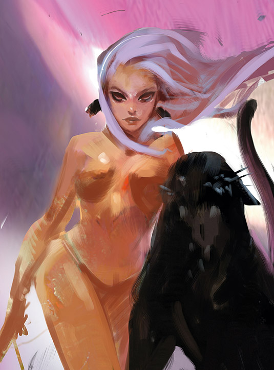
Now I have my elements in order – the background, composition, girl and general shapes – I start to design my characters. I pull from what I know – I work the main placements like her costume and features. I want her to be soft and dramatic, so I give her a heavy cat eye to enhance her attitude. I begin to commit to the white/purple hair.
07. Polish elements
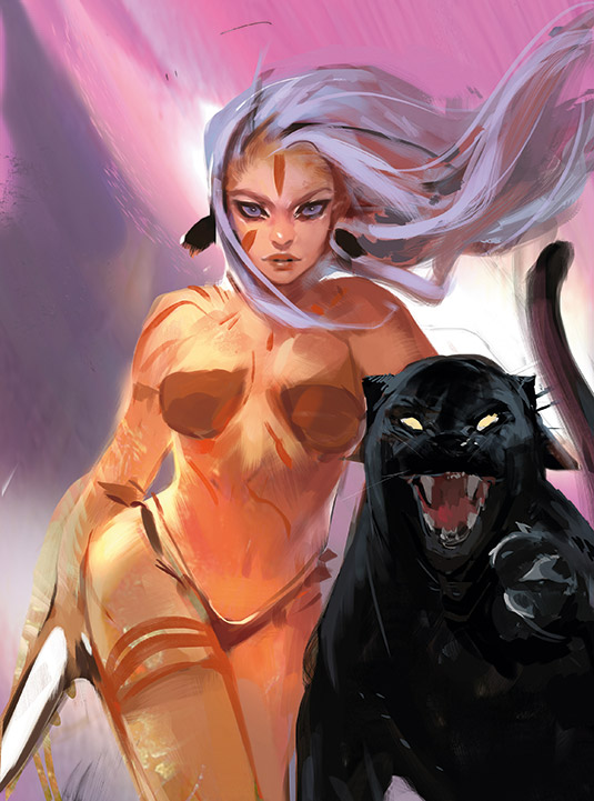
I start to polish, making things clearer and identifiable. I know it's a panther so I look up some reference and start to polish away. The client wanted a knife of some sort, so I implement that. I start to light her a little better so it pops off the page. I'm beginning to see the vision come to life and start to get excited. So I bring in the elements I love most: tattoos!
08. Get feedback
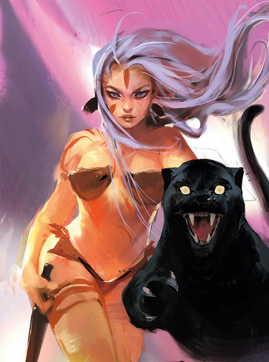
I send my version to the client and receive feedback. I switch the side of the paw, because I thought it was the other paw. I think it's important early on to establish which way left and right are. Because 'the left paw' can mean the panther's left paw or the paw on the left side. I make the eyes smaller, which gives it more attitude, and change the knife. I start to implement the fixes.
09. Use effects and layering
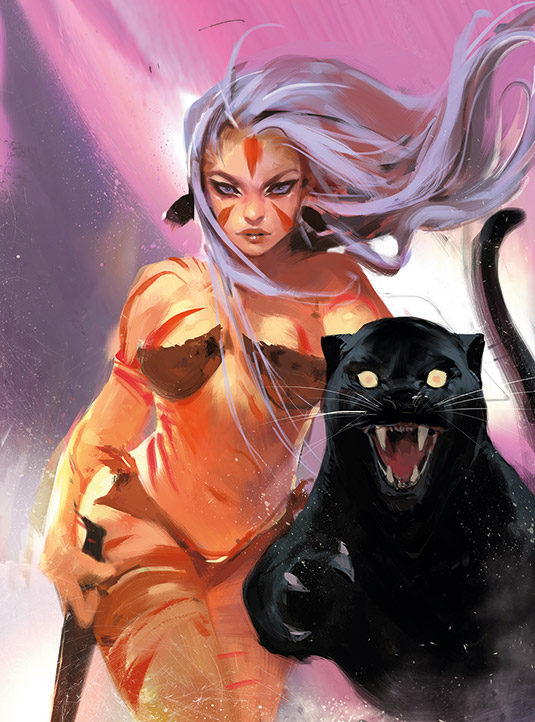
Everything's in order now: the pose, the shapes, the subject and the colours. It's time to add effects and layer some roughness to it. I love the roughness of canvas, so I introduce textured brush strokes throughout. I also add debris, dust and breakage, to give that extra layer of impact. I start to refine and polish things alongside of it. Everything starts to come together.
10. Apply Color Dodge
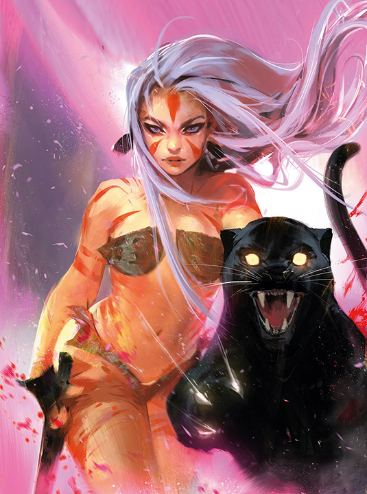
Once I've got the feline's pupils finished, I get to the stage that is the proverbial cherry on the top for all my images! At the near end of my process, around 80-90 per cent in, I like to Color Dodge my paintings. It stimulates a technique close to light. So I brush over my paintings with an airbrush on Color Dodge mode and it instantly pops my painting. I have to be careful not to overdo it. Too much of anything is a bad thing. This is an instant satisfactory step, so please enjoy!
This article was originally published in ImagineFX magazine, the world's leading magazine for digital artists. Subscribe here.
Read more:

Thank you for reading 5 articles this month* Join now for unlimited access
Enjoy your first month for just £1 / $1 / €1
*Read 5 free articles per month without a subscription

Join now for unlimited access
Try first month for just £1 / $1 / €1
Get the Creative Bloq Newsletter
Daily design news, reviews, how-tos and more, as picked by the editors.
