Experiment with type in Flash
Matt Booth reveals how to use Flash to experiment with several different ideas
- Software Flash CS4 or later
- Time needed 1 hour
- Skills-Code with ActionScript (AS3)-Learn how to use bitmap data-Reuse code for prototyping
- Download support files
Using Flash as a graphic tool in the same way that you use Photoshop or Illustrator can help you try out countless unique effects by simply altering a couple of variables. This makes the program much quicker than its Adobe stablemates for the rapid prototyping of ideas for yourself or your clients.
In this tutorial, you’ll learn how to scan a text graphic and use its shape to create unique effects with ActionScript. Once the shape has been stored, we’ll walk through how to replace the text colour with elements of your choice or a creation from the library.
By changing the position, colour, scale and rotation of these new elements, and applying effects such as blurring or a drop shadow, you’ll see how simple it is to produce some stunning effects for use in your design projects. I’ll also cover how to save your designs or refresh them if they aren’t quite what you want.
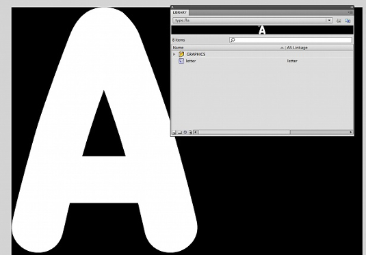
01 Open Flash and create a new Air document measuring 1000px square with a black background. It’s an Air file so we can use Adobe’s PNG encoder to save our designs. Now create a new movie clip, name it ‘letter’ and give it the same AS Linkage name. In this letter movie clip, type a letter in the font of your choice. Then break the letter apart by pressing Ctrl/Cmd+B so that it’s just a shape, and make it 600px high. Make sure the width is scaled proportionally.
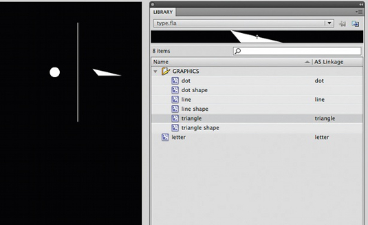
02 Create a library folder called ‘Graphics’. Now create three shapes on the stage – I’ve created a line, dot and triangle. These will be the items from the library that replace the first letter shape. Convert each of these to a movie clip with the names and AS Linkage names of ‘line’, ‘dot’ and ‘triangle’. Next, go into each of these movie clips, select the shapes and convert them to movie clips called ‘line shape’, ‘dot shape’ and ‘triangle shape’. These shapes will be coloured later in the tutorial.

03 The Main class stores the pixels, saving and refreshing before a design is applied. Texture and effects code is imported as separate class files. This texture/effect class is referenced by the _style variable. The pixel positions of the letter are stored in the _positions array. This array is then passed to our texture class to be used how we choose.
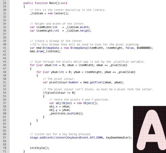
04 First we create an instance of the letter in the library (_libItem). We then create a BitmapData object of this instance. Next we go through each pixel of the BitmapData to get its pixel colour. The gap between each scanned pixel is determined by the _pixelSize class. The smaller the _pixelSize number, the closer together the pixels and the longer it takes to scan the image. In this instance, we’re scanning every tenth pixel across and down.
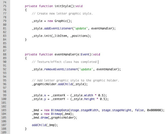
05 Once all the pixel positions are stored, we pass the _positions array to our texture/effect class, adding a listener in too, for when the design’s complete. When the design has finished its task, we create a bitmap version of that design and add it to the _graphicHolder movie clip. This movie clip is cleared of the bitmap when the reset function is called.
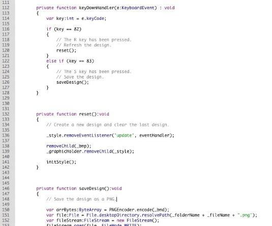
06 All we have left to do in the Main class is add the key press listeners for the reset and save functions. Pressing R on the keyboard (key code 82) calls up the reset function. This removes the bitmap from the _graphicHolder movie clip and calls up the initStyle function again, creating a new design. Pressing the S key (key code 83), calls up the save function. This uses Adobe’s PNG Encoder class to save a PNG version of the design. It uses the folder and file name variables (_folderName and _fileName).
Get the Creative Bloq Newsletter
Daily design news, reviews, how-tos and more, as picked by the editors.

07 The Graphic.as class in this tutorial is our design class. It takes the pixel positions passed to it and uses them to add items from the library. These items can be changed, along with their properties. To start with, we specify what library items we want, along with the colours we’d like to use in our design.
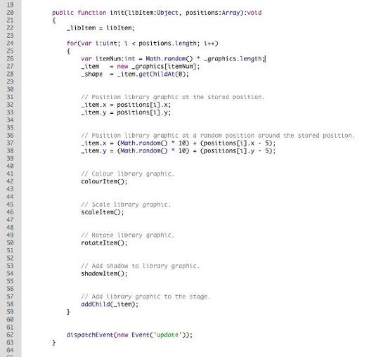
08 The init function takes pixel positions passed to it and adds a library set in the _graphics array to the X and Y position. Or for less order you can place each piece at random. Now we apply colour, scale, rotation and shadow to our library items by calling the appropriate function.
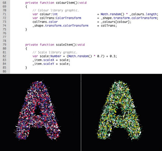
09 The colourItem function takes a random colour from the _colours array and uses it on the library item it’s applied to. The scale function resizes the library item by a random amount. Change these values to suit your design.
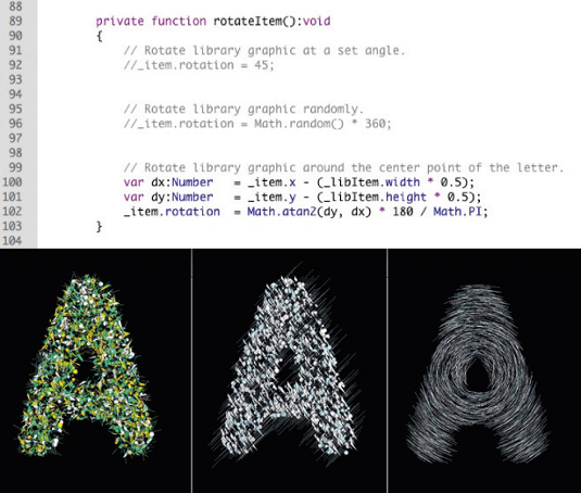
10 The rotateItem function really changes how your design looks. You can rotate the library items to a fixed angle, randomly or around the centre of the letter. You can also rotate around the X, Y and Z – if that’s what your design requires – for a bit more of a 3D feel to your items. Put all of these options into your code and comment out the ones you don’t need now, in case you want them in a different design.
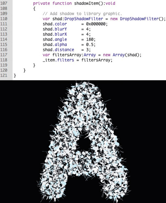
11 If your design needs to be very graphic and flat in appearance but you want a little bit more depth in your design, for example, simply apply a shadow to each library element. Play around with shadow distance and the blur amount for different effects.
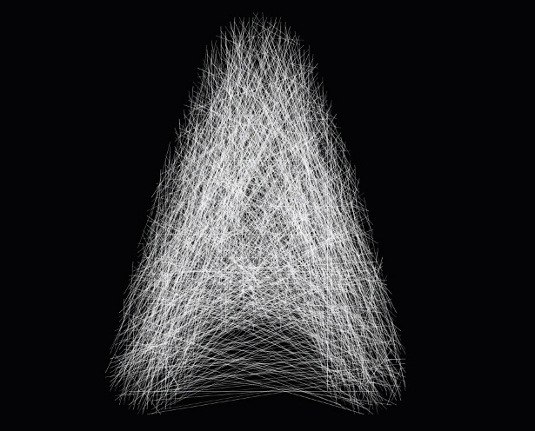
12 Now create your own classes for the different design outputs. Included on your DVD is the Joining.as class to use as an example of what else can be done when you have the shape of the letter stored. This takes those positions and joins them up with a thin white line to create a spider’s web effect. To use this, or any of your own specific classes, just change the reference to them on lines 14 and 79 of the Main.as class.

Matt Booth
A Manchester based freelance designer, Flash developer and long term CA collaborator, Matt H Booth splits his time between commercial projects for clients such as Volvo, Vodafone and Red Bull Presenter, and experimental, graphic-led, self-initiated works.
www.matthbooth.com

Thank you for reading 5 articles this month* Join now for unlimited access
Enjoy your first month for just £1 / $1 / €1
*Read 5 free articles per month without a subscription

Join now for unlimited access
Try first month for just £1 / $1 / €1
The Creative Bloq team is made up of a group of design fans, and has changed and evolved since Creative Bloq began back in 2012. The current website team consists of eight full-time members of staff: Editor Georgia Coggan, Deputy Editor Rosie Hilder, Ecommerce Editor Beren Neale, Senior News Editor Daniel Piper, Editor, Digital Art and 3D Ian Dean, Tech Reviews Editor Erlingur Einarsson, Ecommerce Writer Beth Nicholls and Staff Writer Natalie Fear, as well as a roster of freelancers from around the world. The ImagineFX magazine team also pitch in, ensuring that content from leading digital art publication ImagineFX is represented on Creative Bloq.
