'It needs to feel like magic': The art of creating an unskippable TV title sequence
We talk to Plains of Yonder, the team behind Rings of Power, The White Lotus and more.
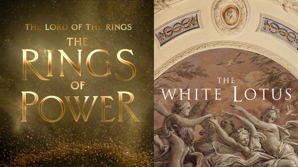
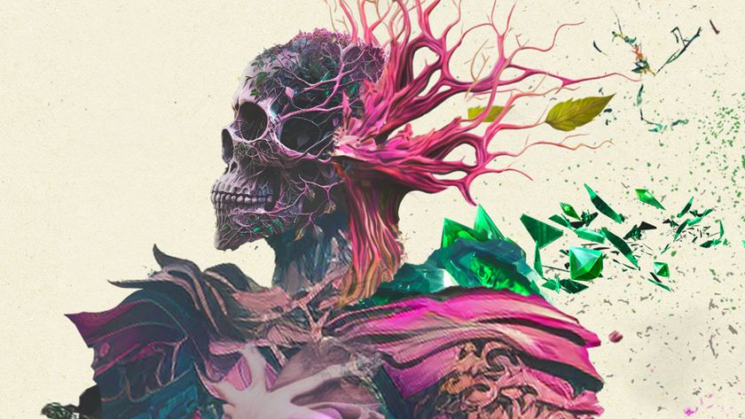
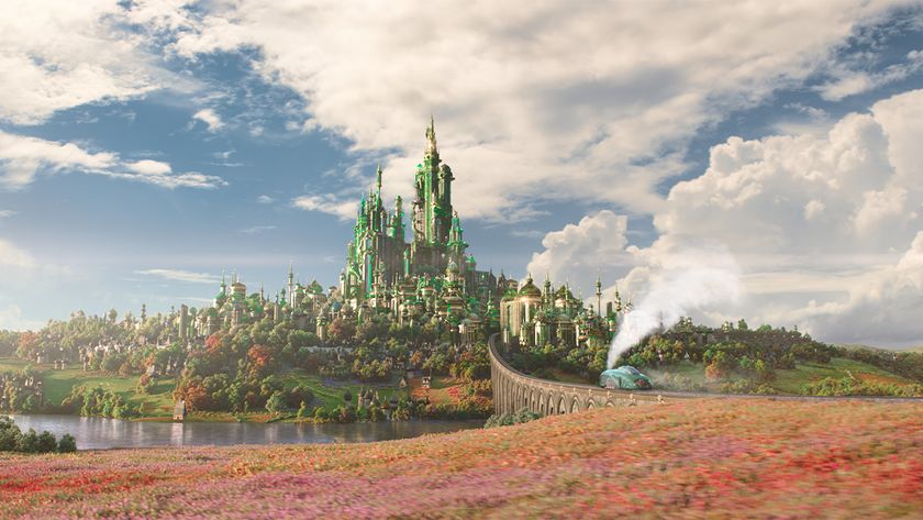
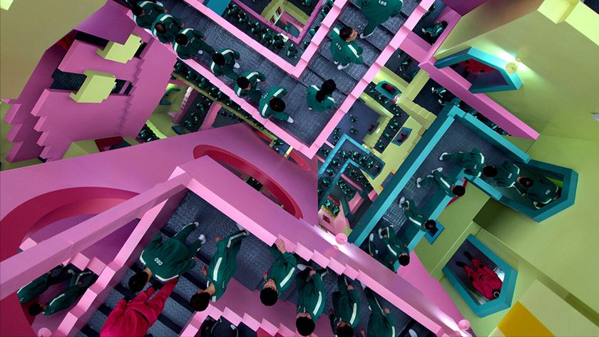
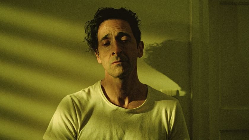
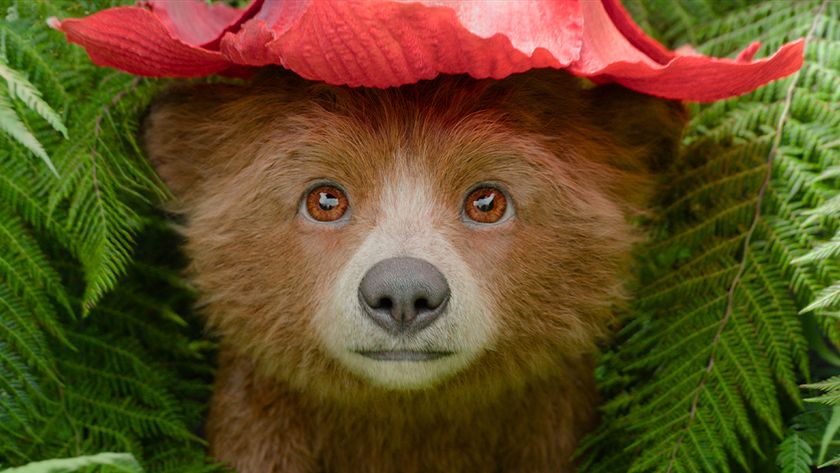
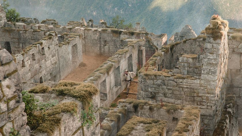
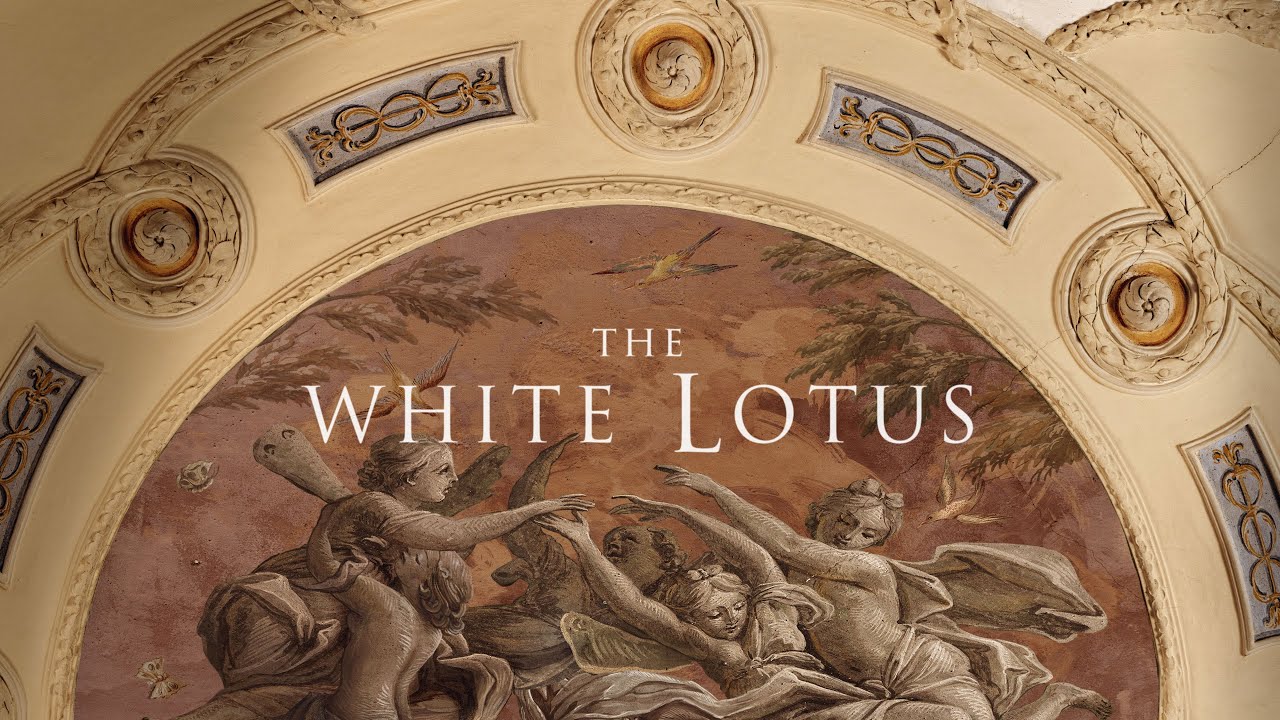
What do Rings of Power, The White Lotus and Time Bandits have in common? As well as being some of the biggest TV shows of the 2020s, they feature stunningly inventive title sequences – all of which were created by small and tight-knit Seattle-based design company Plains of Yonder.
Determined to capture the mood, tone, and feeling of each of its projects, Plains of Yonder takes a different approach to larger LA-based firms, fostering close relationships with show-runners in order to create "high aesthetic designs" that turn key creative themes and Easter eggs from the shows into intricate works of art that have the power, as we saw with the wildly popular opening to The White Lotus, to become cultural phenomenons in their own right.
Hot off the heel's of this summer's launch of the second season of Rings of Power, we caught up with the company's Emmy-nominated directors Mark Bashore and Katrina Crawford to discuss the conception of that show's title sequences, the process of updating an idea for a second season, and some of the more general challenges and opportunities facing title sequence designers today. Check out some of our must-have resources for VFX artists if you're inspired to get creating.
For more behind-the-scenes tidbits from creative projects, take a look at the rest of our How we made series.
Can you explain the concept of 'visualising sound', which is key to the Rings of Power title sequence?
This comes back to season one. The studio approached us to pitch and come up with ideas. And we pitched five different things, but there was a bunch of things we were keeping in mind for all of them, one of which being that, in theory, this could be a 50-hour series. So whatever we did needed to have legs.
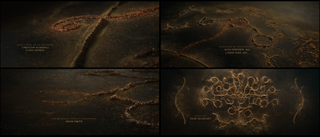
The series is really going back in time, we're seeing how Tolkien's world is created by time and the ebb and flow and shifting of sand, so to speak, of nations and alliances and all these different groups. We came across his creation myth, which is about these Ainur, these angelic beings singing the world into creation. And so that connection between like time shifting sands music actually singing the world into place.
That connection between music and physics brought us into the idea of Cymatics, which is a real world phenomenon. Cymatics is actually the visualization of sound. It's a phenomenon that was first developed in the 1800s and then made very famous by a man named Hans Jenny in the 60s and 70s, where you put sand on a plate, and you apply a vibration to that plate, and according to hertz and resonance, you get a certain symmetrical pattern that forms. And so it it feels like magic, which was also very important. When you're talking about Tolkien, it needs to feel like magic. We did a lot of filming of actual Cymatics, and then worked really hard to emulate that with 3D as well.
The idea for Cymatics came early on. It really stood out to all of us, because it is using a natural phenomenon. It is both magical. It's like very straddling that world of real and magical, seen and unseen. And it's both simple and not. It's millions of grains moving around. It's a boiled down distillation of eons of time, beauty, magic and the formation and destruction of life and societies and lands in this really simple sort of cauldron. It hit the mark as soon as the studio saw it.
How did you approach revisiting the idea for Season 2?
There were some challenges. Of course, you need to evolve from season one. You always want to push the envelope and go further into a concept, but we needed to create a new tone with the exact same music. So that's a little tricky.
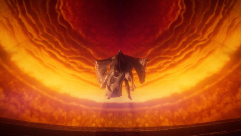
Season 2 it was a much darker season. It's very focused on Sauron and all of this trickery. So we're staying in the world of Cymatics, with the same music, but creating a new tone. And a lot of that was creating new forms of motion. So really diving into this idea of molten, of the making of the Rings, of eruption of volcanoes, this kind of creepy, seductive, insidious, energy integrating into everything slowly flowing out. Ultimately, Sauron's forces are kind of integrated everywhere.
Ultimately, experimentation is the way we work. What we do is a little different than a typical CGI main title or movie or anything that's made in computers, which normally you'd storyboard, build an animatic, and then you'd have, this is the beginning of the shot. We experiment, and we kind of run wild in a lost state trying to capture a mood. For every shot that's in the main title, there's probably, 20 or 30 shots that we built roughly to see if it captures the mood. And that's not an efficient way to build CG work, and it's not how they make movies, but it's how we do it, and it's way more fun and it's more experimental.
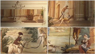
Title sequences are often abstract and expressive, but also have to convey practical information and match up with music. Are these constraints challenging or do they present creative opportunities?
That's a good question, and a good understanding that with titles there is a freedom in them, even though they have strict parameters. I think for us, the idea that they are a bit of a puzzle is attractive.
There are things we always need to do. We need to distill and encapsulate a world. Of course, we're putting titles in. Of course, we're trying to excite people for the show. But there's a lot of tone and psychology that we consider. How can we make you feel? How can we get you in the correct mood, or bring you into this world? So titles are like a little portal.
We also like to stay a little bit tangential to the show, so we don't see our job as replicating the show. But is there another way to distill the world or encapsulate it and bring you in to that match up very well to the actual show? It is a bit of a puzzle, for sure. How do you stay tangential? How do you get the right tone energy pacing? How do you respect your viewer? How do you reward them when in TV, they're watching the opening multiple times?
The titles for The White Lotus became a viral hit. Do you ever get a sense of having a hit on your hands during production?
I think you're surprised when every like, you know, dance club in the world is playing the song. That you can't predict, but as a social satire it hit something for people. So I do think that when you have a show and a main title and music and everything is in real synergy, it can be culturally powerful.
What's the secret to stopping viewers hitting 'Skip intro'?
If we've done our job right, it feels integral to the show. When we think about titles that are super important and critical to us, there's certain shows you have where you would never skip it, because it it gets you excited in a way that if you didn't have it, you would feel incomplete. That's electric.
Also, it's important to remember that every show is essentially skippable. Our kids watch TV and hit forward, like 15 seconds forward, or just move on to a different show, all the time. You're only one push of the remote control away from removing the entire show anyway. So the main titles are no different. If it's good, people will like it. It's just a different world than before streaming, where people were captive and had to watch what you put up, and now they don't have to watch anything. So that makes it more challenging to build something that's original and beautiful and that works with the music in a way that people want to give you their time and reward you with their attention. That's the job. That's our job, and it hopefully rewards doing new stuff and being creative and pushing the envelope.
Get the Creative Bloq Newsletter
Daily design news, reviews, how-tos and more, as picked by the editors.

Thank you for reading 5 articles this month* Join now for unlimited access
Enjoy your first month for just £1 / $1 / €1
*Read 5 free articles per month without a subscription

Join now for unlimited access
Try first month for just £1 / $1 / €1

Daniel John is Design Editor at Creative Bloq. He reports on the worlds of design, branding and lifestyle tech, and has covered several industry events including Milan Design Week, OFFF Barcelona and Adobe Max in Los Angeles.
