"It feels exactly like we wanted it to": the making of Ultraman: Rising
Shannon Tindle and co-director John Aoshima discuss the character design and visual style of the Netflix superhero movie.

You can date Ultraman: Rising as far back as 2001, when the film was first born in the mind of writer and director Shannon Tindle. Pitched to a swathe of studios, the project was eventually picked up by Netflix and released back in June. The development work that had been undertaken over the previous two decades was there for Tindle, his co-director John Aoshima, and their collaborators at ILM Feature Animation to build upon.
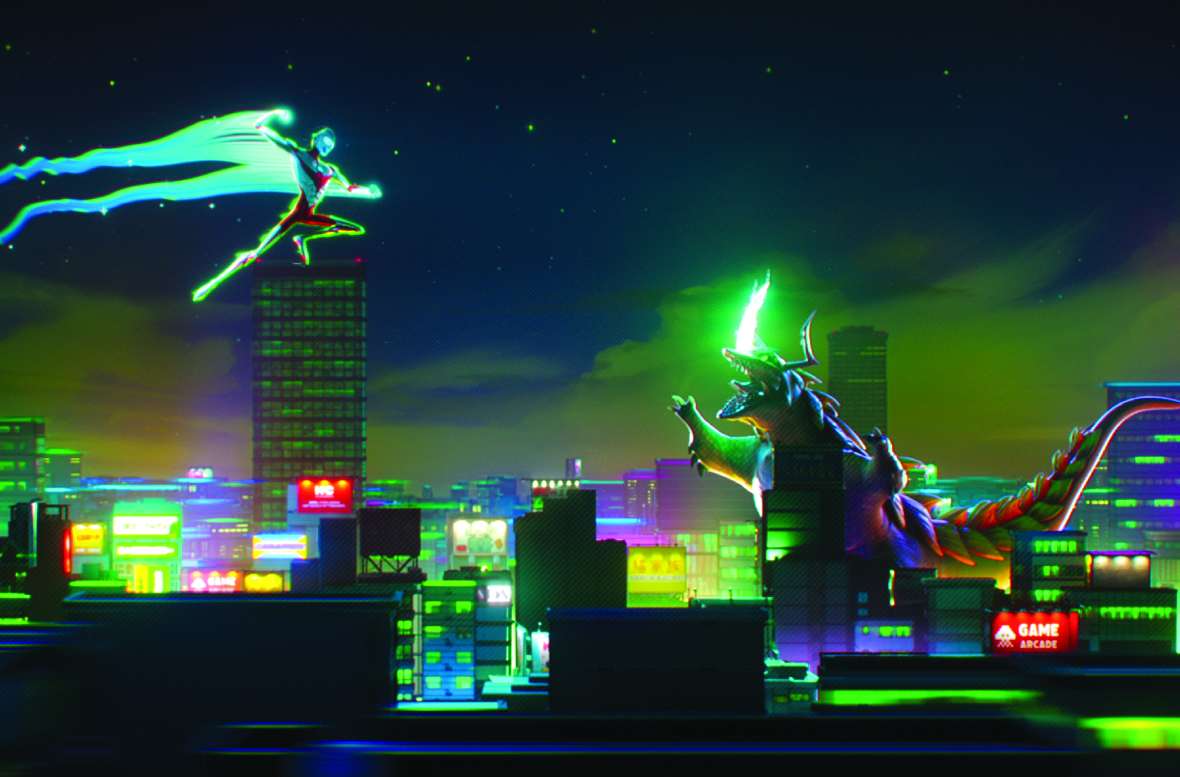
Key to the pleasure of way that it distinctively evokes the 1960s styling of the original series, visual identity and energy of a contemporary movie. The film is appropriately designed in terms of both character design and environments.
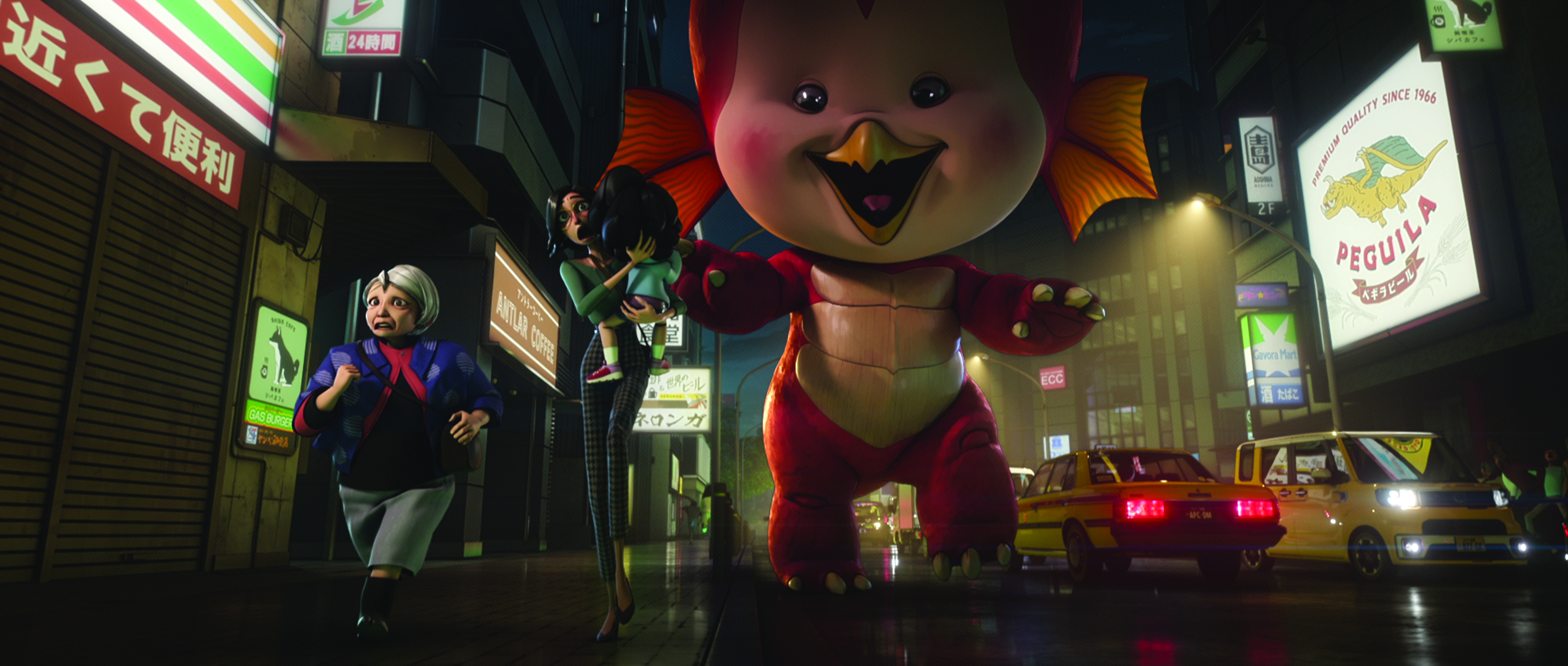
Of the character design in the film, Tindle notes the contribution of character art director Keiko Murayama. “She’s an incredible artist who I’d wanted to work with for a while,” he says. “I’d worked with her back at Disney years ago.” Anime was a key influence for the overarching style of the character design. Tindle adds: “I’d said to Keiko, ‘I love the elegant proportions of Leiji Matsumoto’s characters Captain Harlock and Queen Emeraldas.’”
In turn, this observation led Tindle to note another frame of anime and manga reference for the film’s elegant character design. He explains: “The Evas in Evangelion have longer arms and longer legs. I wanted [lead character] Ken’s body shape in our film to be a bit like that of a swimmer: really broad shoulders, lanky, and of course in very good shape.”
Staying with the detail of human character design, co-director Aoshima explains the nuances of skin tone used in the film. “We had the opportunity to explore the skin tone,” he says. “Nothing comes for free in CG production, so any extra detail is a consideration, and we felt like varied skin tone was the right thing to do. In our early stages of work on skin tone, even for a Japanese character, there’s a specific point of view on class and whatnot, and we really listened to the Japanese and Asian communities within our team to get input on that.
“We were able to find a combination of the right amount of what would work with our budget and production, and I’m really happy we got to go there". That was because of the efforts of our great art department, led by Sunmin Inn and Marcos Mateu-Mestre. Their early exploration and development of the look of our characters, and then having the art department work with ILM Feature Animation and their great team, was an iterative process. It wasn’t a case of ‘this is our design, follow exactly what we’ve here'."
Throughout the movie, there’s evident nuance to the characters’ body language performance, whether in quieter scenes or amid the highly kinetic and visually spectacular action. Aoshima explains: “To touch on the performance, it’s specific; we leaned into the specificity. Because Ken is Japanese-American, he has more of this American mannerism and swagger. Contrast that with Ami in the [second] dinner scene. We provided references and pointed to some shows and Japanese actresses for how Ami should behave, and what her more reserved mannerisms might be. How she handles the items on the table is different to Ken.”
Daily design news, reviews, how-tos and more, as picked by the editors.
Indeed, Tindle echoes his co-director’s observation. “One of my favourite scenes for animation in the whole film is when Ken and Ami are having their second meal,” he says. “That was animated in Singapore, and when she begins to dig a little more deeply into who Ken is, and we know he loves his food because he’s talked about how much he loves it, he pushes it away and sits back. It’s a real subtle thing but he’s not looking at her.”
Staying with Ken’s creation for a moment more, it’s worth noting that one of the ways character can be economically expressed in animation is through the design of the hair. Tindle observes: “A lot of times CG hair can move way too much. Ken’s hair specifically was based on a young Toshiro Mifune [Japanese actor and producer]. He’s a good-looking dude.”
Of the dynamic between Tindle, Aoshima and the team at ILM Feature Animation, the former says: “Stefan Drury [ILM executive VFX producer] and Hayden Jones [ILM VFX supervisor] have become really good friends to me and were both with us on Lost Ollie, too.
Stefan would say, ‘Well, we can do anything. Do you have the money for it? Do you have the time for it?’ “I’ve seen too many times where you’ll have artists or directors, especially working in animation, insist it has to look exactly like that image they’ve painted. They can make it look like that image from one angle, but as soon as you move the camera – because we wanted to have a dynamic camera – what I kept saying to the art department was that they are our collaborators and not a vendor.
“They were our partner studio, and we wanted to treat them, even though they were spread across London, Vancouver and Singapore, as if they were under the same roof. When you have that, you’re not just saying, ‘Copy this thing that I did,’ you’re saying, ‘You have some of the best artists in the world, let’s come up with the best look together and be surprised by what we find.’
“When you look at the final film, I don’t know that anybody would say, ‘That looks exactly like we thought it would look’, but it feels exactly like we wanted it to. That’s because of that team environment, and of being so collaborative throughout the process.”
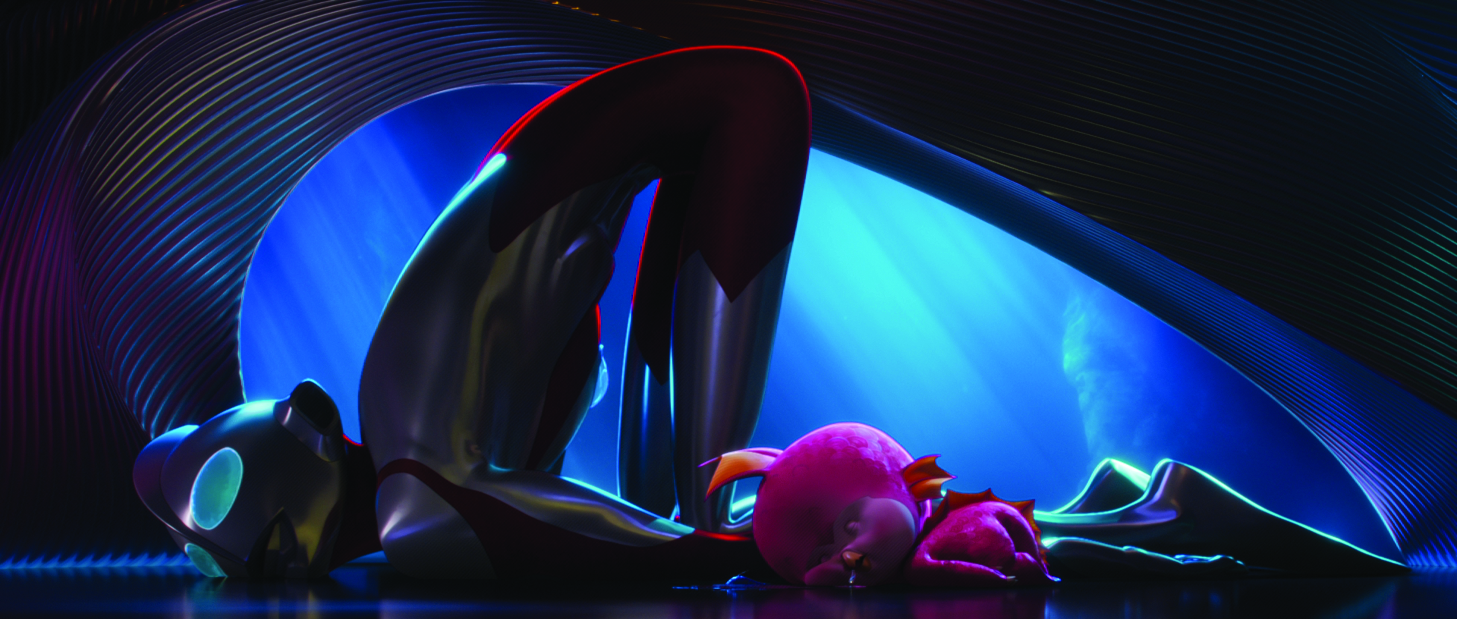
Key to the environment work undertaken for the movie was the concept and realisation of Ken’s hideaway. “The thing that’s special about animation is that anybody who is going to direct an animated fi lm is usually a visual artist,” Tindle says. “It’s where you come from, drawing is how you communicate, so we tend to see things in that way.
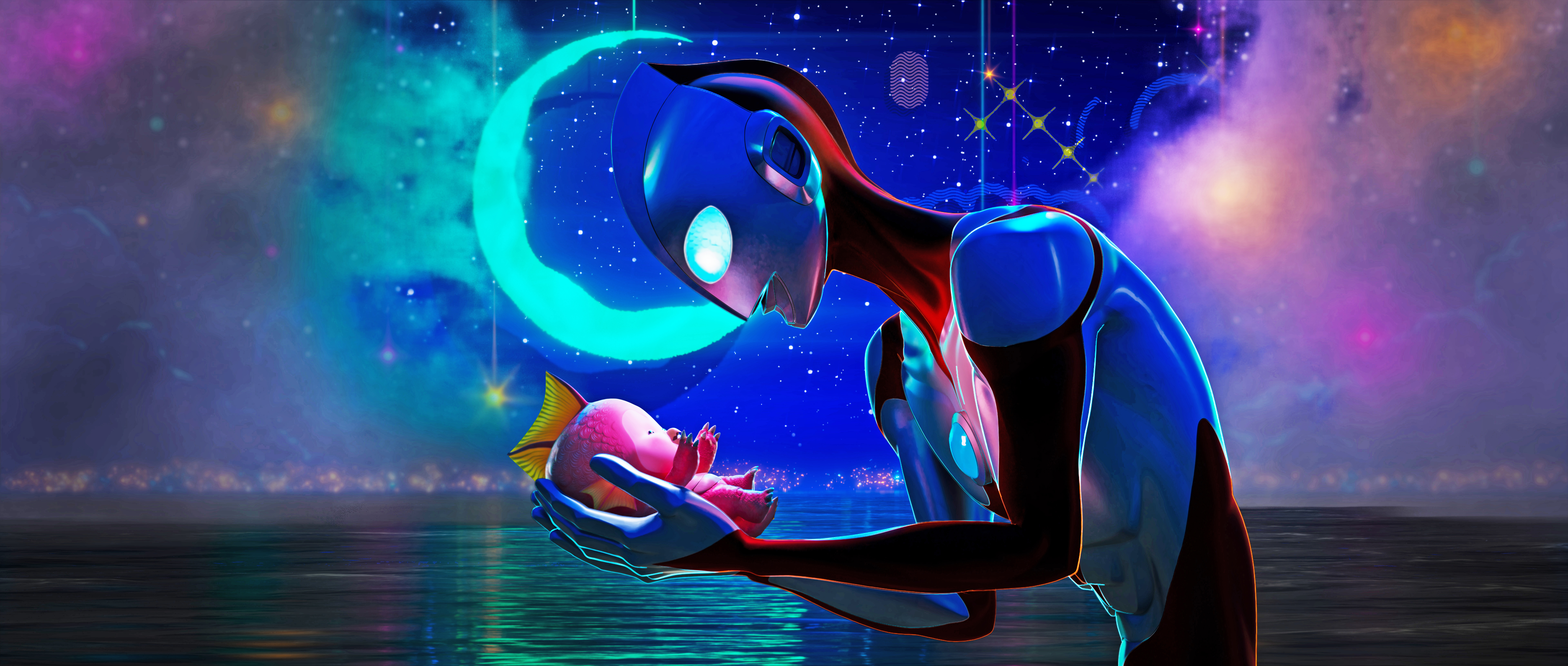
“We had all the rectilinear shapes in the city, which is what you see when you’re in Tokyo, and so we wanted to contrast that in Ken’s man cave; I wanted it to feel like a womb, like it’s comforting. But you can also make it feel alien, which speaks to Ultraman’s roots without talking about it.
“Marcos did a beautiful design of these elegant curves. We were looking at the work of Eero Saarinen, who’s one of my favourite architects. Look at the TWA terminal that he designed at JFK [airport] and the St Louis Gateway Arch. I just love how Saarinen designs that fl ow of space and Marcos was able to build on that, and when you get deeper into Ken’s actual man cave, you have these warm woods and panelling. I love seeing that. You’ll also see that in Frank Gehry’s spaces in the way he curves wood.”
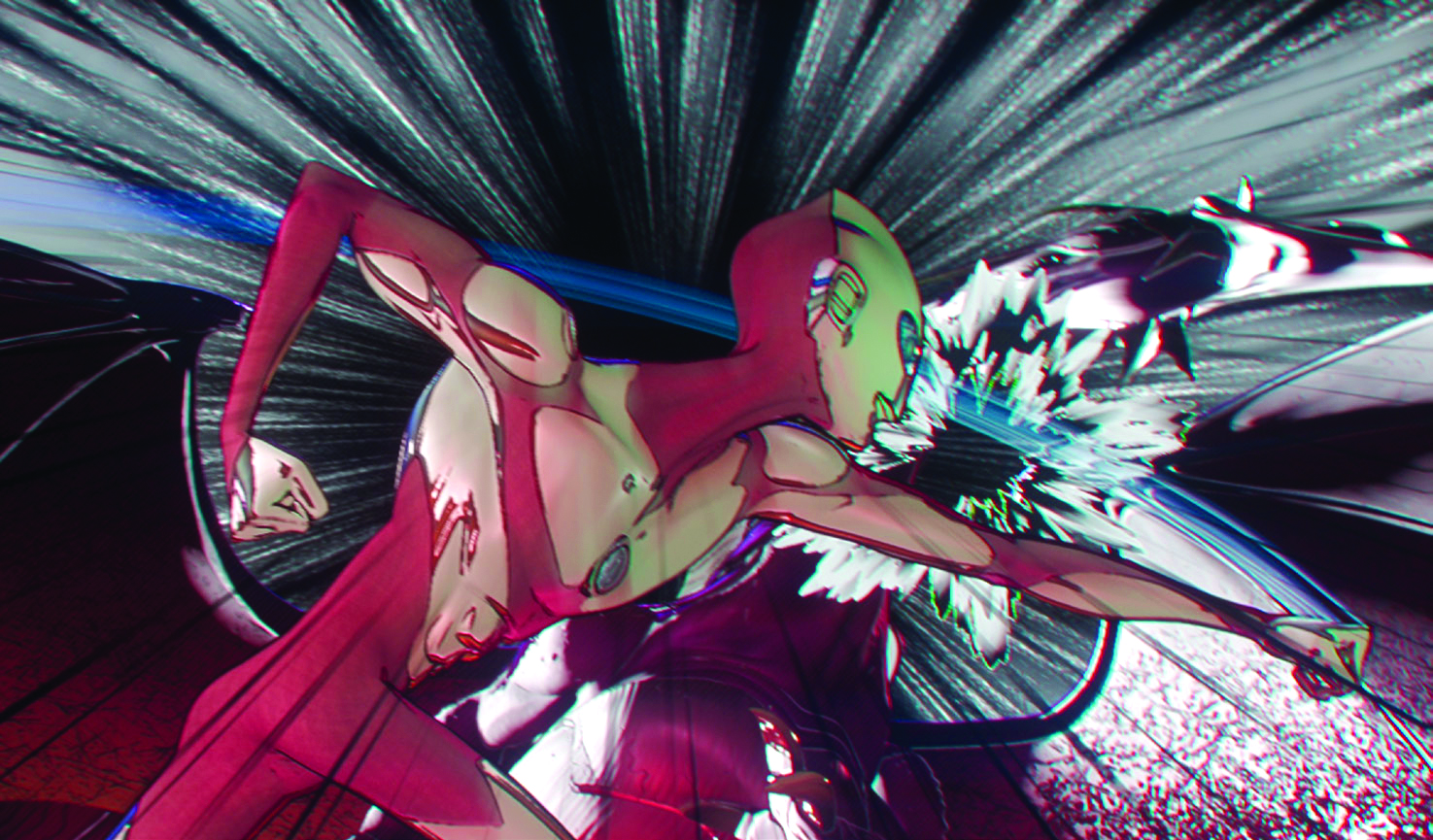
Critical to the Ultraman: Rising aesthetic is where anime meets what can be rightly described as a classic American animation style. Tindle recalls: “There was a notion at one point of, ‘Do we go twos and threes?’ Threes is something you almost never see in American animation, but you see it in anime a lot, so do we go that route? We did early tests that looked like that, and there was even some dissent from other animators that thought the only way a stylised look could work would be if we did it on twos and threes, but I didn’t want to do it like that.

“By the time we were going back and forth, we were at the point of no return and went all ones for it. Luckily, the audience doesn’t care about any of that. What they care about is authentic performance based on reality, and I think that’s what the best of classical Disney animation does. But also, if you look at a Studio Ghibli film, they really study people and how they move.”
Bringing our conversation to a conclusion, Tindle circles back to the emotional resonance of the movie’s character and environment work. “There was a vulnerability in the process because we encouraged our team to share their experiences,” he says. “John shared his experience of moving from Japan to Los Angeles, and my daughter is the inspiration for the design of Emi and how she behaves. There were a few times when we were launching animation and I’d be sharing very personal stories of loss – it’s the same thing we did with ILM on Lost Ollie – and we would get emotional in those meetings. I think you have to making this kind of movie.”
This content originally appeared in 3D World magazine, the world's leading CG art magazine. 3D World is on sale in the UK, Europe, United States, Canada, Australia and more. Limited numbers of 3D World print editions are available for delivery from our online store (the shipping costs are included in all prices). Subscribe to 3D World at Magazines Direct.

Thank you for reading 5 articles this month* Join now for unlimited access
Enjoy your first month for just £1 / $1 / €1
*Read 5 free articles per month without a subscription

Join now for unlimited access
Try first month for just £1 / $1 / €1

James has written about movies and popular culture since 2001. His books include Blue Eyed Cool: Paul Newman, Bodies in Heroic Motion: The Cinema of James Cameron, The Virgin Film Guide: Animated Films and The Year of the Geek. In addition to his books, James has written for magazines including 3D World and Imagine FX.
