Colourist Alec Pieper on movie design's most 'invisible' art.
When people ask me what part of a project I worked on and I respond with “I did the colour”, they usually think it’s cool, but are left confused as to what that means. If I show them the before-and-after of a colour grading project, they can get a better sense of what I do. Colour grading is like an “invisible” art form and a job I didn’t even know existed until after film school, when I learned how this craft refines the emotional and visual tones of a film project. By manipulating contrasts, saturation, and colour palettes, the colourist can help visually transmit the intended mood and emotion, enhancing the viewer’s experience.
Audiences sometimes assume the colour of something was shot right out of the camera, when in reality it may have taken a colourist days or weeks to achieve a visual look. With colour, there’s a bit of a misconception that it's last-minute movie magic when in reality colour grading is the final 20% of getting a movie or content piece to its final product. The foundation of colouring lies in making adjustments to the choices made during production: the design, the lighting—whether natural or artificial—the camera used, and much more. All of these elements provide a colourist with something dynamic to work with - a not-so-blank slate to use as a starting point. (For a general introduction to the technique, take a look at our guide to colour grading.)
Hot locations are often warm-toned, and cold ones cool-toned (Image credit: Diamond View)
The Responsibility of Colour
A colourist’s primary role is to fortify the director and DP’s vision. Directors often work out the creative for entertainment projects or campaigns with reference images and clips, and use those as a guide to help colourists understand how they want to bring their vision to life. Sometimes though, relying on past materials can perpetuate trends that are at best overdone, or at worst, potentially harmful.
Latest Videos From Creative Bloq
One such colouring technique that has recently come under fire is the sepia filter, which is used in films to denote warm climates… or foreign countries. This is problematic only when colour is used to perpetuate stereotypes or lend untrue connotations to the places and peoples depicted. When a colourist is asked to implement a colour grade in a project that they feel raises a red flag in these areas, they can potentially advocate for a change of direction. However, if the director is adamant about its use, this can be the final ruling. Fortunately, I’ve never personally been put in this situation, but navigating creative disagreements is generally part of the colourist's process.
An example of warm tone (Image credit: Diamond View)
The sepia filter trend sometimes used to depict underprivileged settings likely began when filmmakers discovered you could switch colour palettes without switching shooting locations, saving time and critical budget dollars. For example, a film or show could be shot in Los Angeles, but colour grade changes may indicate to the audience that the setting is miles, countries, or worlds away. Sometimes directors choose warm vs. cool tones, not to be confused with the “sepia filter”, to portray a new climate. Hot locations would then be warm-toned whereas cold ones would be cool-toned. That said, even the latter could be considered overdone. Films like Sicario and shows like “Shogun” and “The Sympathizer “ avoid either of these pitfalls by maintaining a more authentic, “true to life” approach to colour, avoiding overused filters. They refused to portray their settings based on viewer assumptions about those locations; rather, they considered the mood of the story they wanted to tell and let colour theory guide the way.
Changing the script
Meaningful change in colour grading often starts long before the actual production begins. To break a cycle of stereotypes, DPs, directors, and production teams need to re-evaluate and adjust their approaches during pre-production. Engaging colourists early in the process can provide valuable insights on how to evoke the desired emotional impact without relying on clichéd colour schemes.
Last year, I worked on a project with Diamond View for the Tampa Bay Buccaneers, where we opened with a film-like contrast and bold colours--most importantly, their signature team shade of red--to showcase the city of Tampa. Such techniques are essential when aiming to captivate an audience and capture what they most want to see. These are sports fans, already enveloped in a high-octane viewing environment watching their favourite team. The last thing we need is to show them something muted and desaturated. This intentional use of rich saturation transformed the visual experience from standard reality to a hyper-real state, amplifying the kinetic energy of the sports campaign.
Get the Creative Bloq Newsletter
Daily design news, reviews, how-tos and more, as picked by the editors.
"This intentional use of rich saturation transformed the visual experience from standard reality to a hyper-real state, amplifying the kinetic energy of the sports campaign" (Image credit: Diamond View)
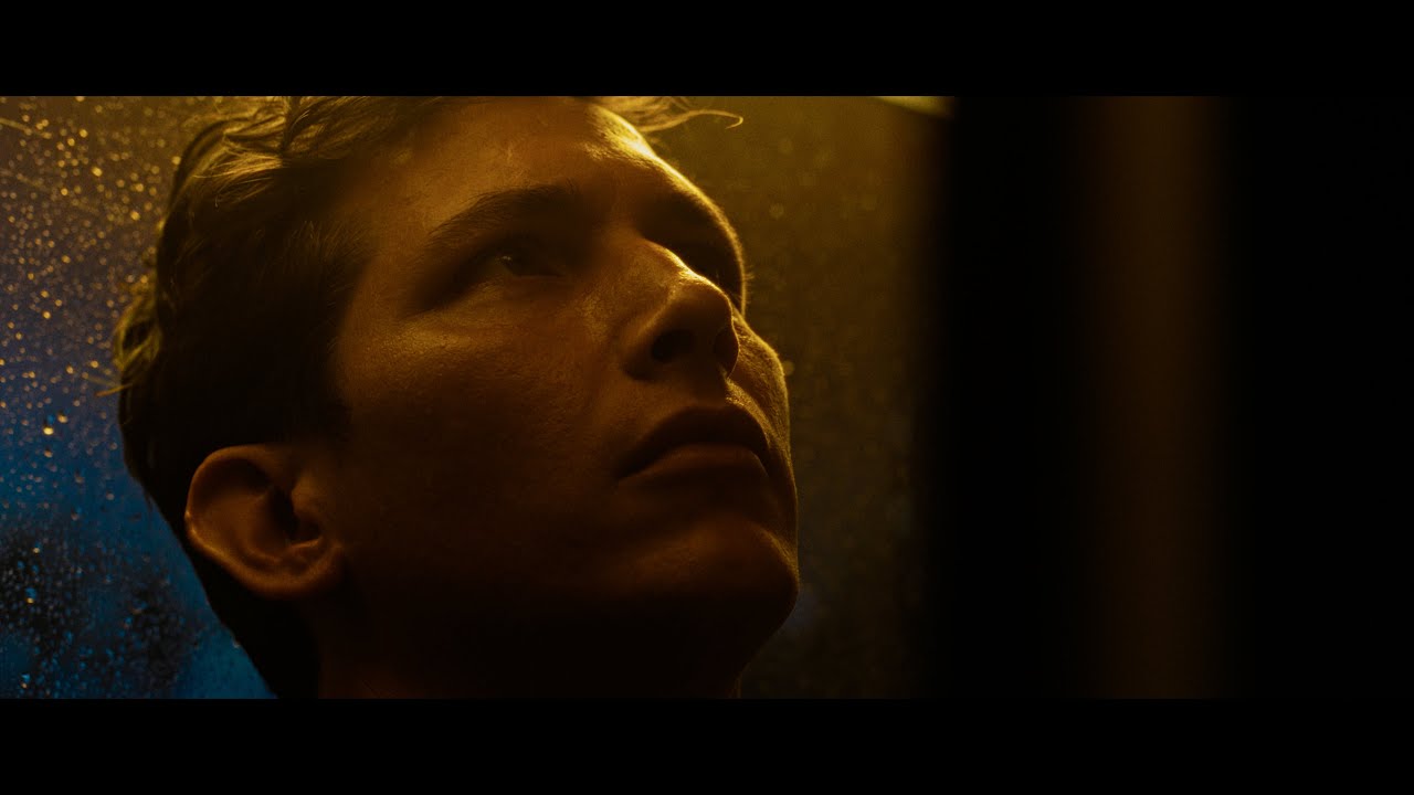
Another project that sticks out to me is the music video for Some Blues by Blake Daniels. This song touches on a pretty heavy personal matter, and we wanted to capture that emotion. The video opens in colour and Blake is lit with warm practical sources leaning into the moody aesthetic of the song. As we came into the chorus, the director wanted to have it hit a little harder with the audience, so we suddenly switched to black and white while images of destruction play behind Blake. To heighten the emotion at the climax of the song, we used sharpening in specific frequencies to draw more contrast in the textures of his face while still in black and white. This sort of emphasised the toll he took in the story of the song.
"To heighten the emotion at the climax of the song, we used sharpening in specific frequencies to draw more contrast in the textures of his face while still in black and white" (Image credit: Diamond View)
When approaching colour grading, one should also consider the overall style of a project, not just its tone and mood. The chosen colour palette should then be an integral part of the set design from the outset. For instance, if you aim for a pastel aesthetic reminiscent of Wes Anderson’s films, those colours need to be incorporated into the set design well before shooting begins. This proactive planning is essential, as effective colour grading isn’t about relying on a magical transformation in post-production, but rather about aligning your vision with a thoughtfully designed visual strategy from the start. If you shoot with high contrast lighting with pingy highlights and deep shadows, or through a LUT that doesn’t align with the vision, you can run into problems in colour where you only have so much room to push the image before you find where it breaks.
Colour done right is an invaluable asset to video projects--even if the general public doesn’t bat an eye at a job well done. Colour done wrong, however, has a huge impact on the finished product of a work. Colour grading does bear some responsibility for how the finished product will look and be perceived and interpreted by the audience. Production and post can work together to ensure the reality--or alternate reality--that is represented is true to their story and style, and not based on assumptions and dated portrayals of under-represented places.
Thank you for reading 5 articles this month* Join now for unlimited access