Squid Game was a surprise hit when it first appeared on Netflix back in 2021, and now it's repeating that success with a second season. It's as tense and macabre as ever, but beyond the dark story and horrifically violent games, the striking visual design of the Korean series provides a surprising lesson in branding.
While plot twists and strong characters clearly contribute much to the series' popularity, it's the clever use of visual communication that has helped make it an iconic hit. Below, I'll look at three key aspects of branding in Squid Game and what they can reach (also see our roundup of iconic brands and why they work).
The success of the Squid Game branding
A post shared by McDonald's Australia (@mcdonaldsau)
A photo posted by on
Plenty of brands have taken advantage of the popularity of Squid Game for their own campaigns, from McDonald's Squid Game Meals in Australia (see above) to a Just Eat collaboration in the UK. The sinister and dystopian theme of the series is perhaps lost on them. But Squid Game's own branding is a lesson in creating a coherent identity. Let's delve into the visual communication used in the series.
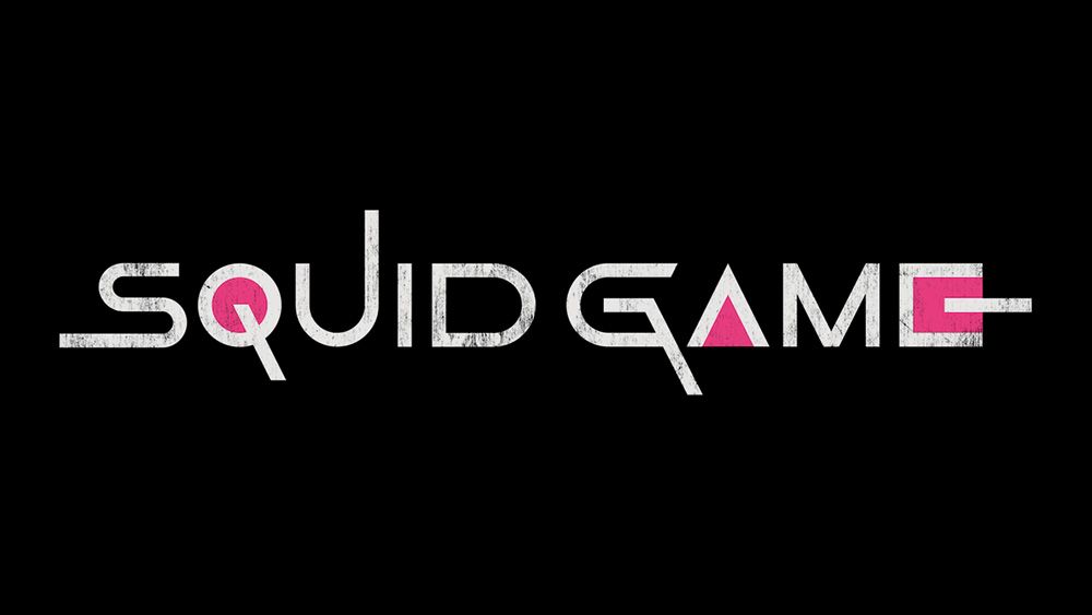
The Squid Game logo


Whether in the original Korean or the many international translations, the Squid Game logo stands out as something different and unique. The angular letterforms and geometric shapes feel playful but also a little futuristic and a little cryptic, hinting at the theme of the series.
Elongated forms reflect the labyrinthine nature of the game world, and the geometric shapes in pink/magenta represent the icons that identify the game in the series while also connecting the logo to the colour palette in the onscreen world.
The original Korean logo is particularly clever: the circle, triangle and square icons form part of the letterforms, allowing the name of the series to be abbreviated to ojing-eo geim" (OJM or 'ㅇㅈㅁ'). But in every language, the logotype is distinct from anything else on TV, showing how much meaning and recognition can be achieved with a bespoke typeface.
Squid Game icons


Speaking of icons, the circle, square and triangle are a constant throughout the series. The shapes come from the real South Korean children's game from which the series takes its name, and they appear everywhere, from the card that prospective contestants receive inviting them to participate in the macabre game show to set decor.
Get the Creative Bloq Newsletter
Daily design news, reviews, how-tos and more, as picked by the editors.
They also serve to identify the rank of the workers that herd contestants between games: circles for the lower ranking workers, triangles for the armed soldiers and squares for the managers. The creators were inspired by worker ants and employed these simple symbols as a way to depersonalise the workers while still communicating their different roles.
The symbols are so effective because they're familiar to everyone, even children, and yet their familiarity doesn't make them any less distinct, showing that a unique brand identity can be built from the simplest and most mundane elements. And there's three of them, subscribing to the rule of three, 'omne trium perfectum', which suggests that trios make a greater impact and have more sticking power (see our pick of the best 3-letter logos).
The Squid Game colour palette

Squid Game also masters the art of colour in branding, and here to it shows us the power of simplicity. Clear colour choices were made for the uniforms and sets, with a predominance of pink and teal, colours we might associate with children's games.
Guards wear pink, a colour often associated with childhood, femininity and glamour but here appropriated to convey danger. In contrast, the contestants' uniforms are teal. The same colours appear in the sets and corridors in the game backed up by supporting hues (some think Squid Game's set design was inspired by a Spanish housing estate – as well as the Dutch artist Maurits Cornelis Escher).
Pink and teal are complementary colours, sitting on opposite sides of the colour wheel (see our guide to colour theory). The contrast not only sets apart the 'good' and 'bad' in the series but also creates a bold vibrant identity that fits a brand inspired by childhood games.
What is the Squid Game font?
The Squid Game logo uses a bespoke typeface that was designed for the Netflix series with variations on its letterforms for different languages. Several type designers have attempted to recreate the look and feel of the typeface. These include Darrell Flood's Game of Squids font (available for free at Dafont.com).
Other type options that have some resemblance to the Squid Game font include The Shape of Things and Mandatory Plaything from Chequered Ink.
What is Squid Game?
Squid Game is a Korean survival thriller created by Hwang Dong-hyuk and broadcast on Netflix. The plot involves a secret contest where players facing financial hardship compete in a series of lethal versions of traditional children's games for the chance to win ₩45.6 billion (US$39.86 million). The games are organised for the entertainment of wealthy viewers and include the squid game of the title.
For more series to watch, see our pick of the best TV VFX in 2024.

Thank you for reading 5 articles this month* Join now for unlimited access
Enjoy your first month for just £1 / $1 / €1
*Read 5 free articles per month without a subscription

Join now for unlimited access
Try first month for just £1 / $1 / €1
Joe is a regular freelance journalist and editor at Creative Bloq. He writes news, features and buying guides and keeps track of the best equipment and software for creatives, from video editing programs to monitors and accessories. A veteran news writer and photographer, he now works as a project manager at the London and Buenos Aires-based design, production and branding agency Hermana Creatives. There he manages a team of designers, photographers and video editors who specialise in producing visual content and design assets for the hospitality sector. He also dances Argentine tango.
