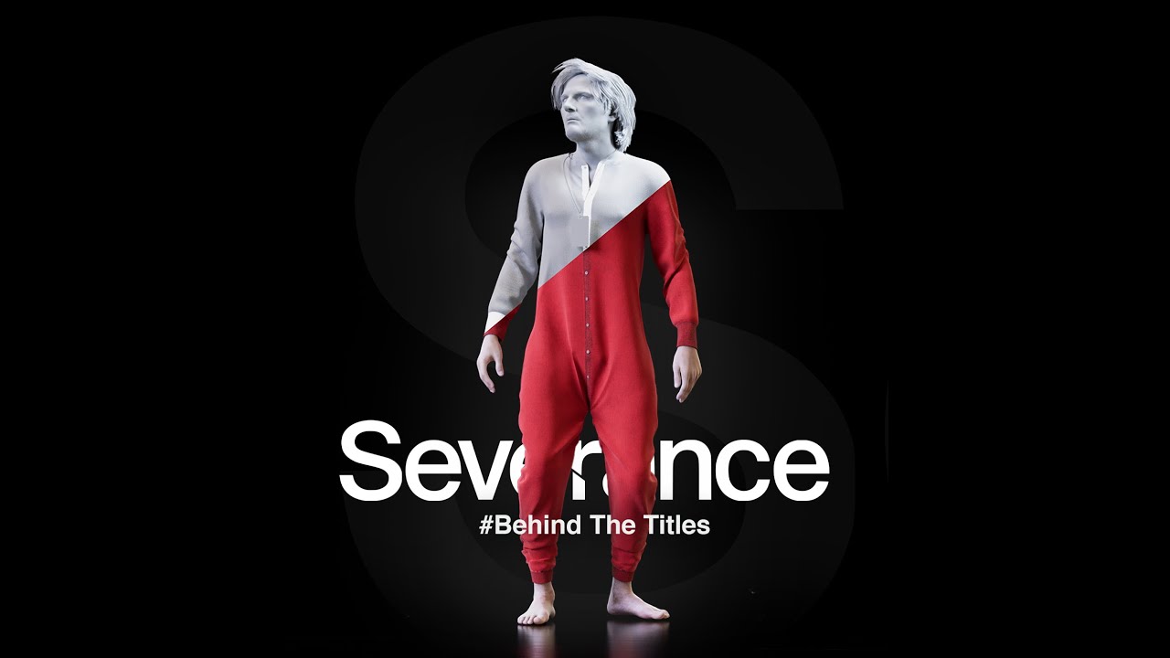
But Severance's aesthetics stand out from the moment each episode begins. It's one of those few series you can stream and never want to skip the opening credits, so I was intrigued to come across a behind-the-scenes video offering a glimpse of how the Severance title sequence was made.
Severance Season 2 - Intro Title Sequence / BEHIND THE TITLES / MAKING OF - YouTube
The Severance title sequences for both seasons were made by the Berlin-based artist Oliver Latta, AKA Extraweg, who specialises in surreal 3D animation.
Latest Videos From Creative Bloq
In Season 2, the sequence is darker (see the full sequence below), going deeper into the subconscious mind of Mark, the series' hero. It's a sequence that rewards repeat watching, revealing new details and Easter eggs each time. And more elements start to make sense or take on new meaning as the series progresses.
The animation reflects the series' themes of fractured identity, duality, isolation and the idea that reality could just be a construct. It's a dreamlike journey into Mark's mind, from 'brain babies' to Mark emerging from his own head.
Severance — Opening Title Sequence: Season 2 | Apple TV+ - YouTube
To create the animation, Oliver used motion capture (mocap) and then worked in Houdini and Cinema 4D (see our pick of the best animation software). What I hadn't imagined was that he would have captured the mocap footage in his own living room.
The setting makes the process look so casual and easy, although Oliver says it was much more complicated that how the behind-the-scenes footage makes it look, with a lot of hand animation and corrections involved.
Get the Creative Bloq Newsletter
Daily design news, reviews, how-tos and more, as picked by the editors.
Wondering what to watch next? See our piece on What is The Eternaut? the epic sci-fi comic coming to Netflix this month.
Joe is a regular freelance journalist and editor at Creative Bloq. He writes news, features and buying guides and keeps track of the best equipment and software for creatives, from video editing programs to monitors and accessories. A veteran news writer and photographer, he now works as a project manager at the London and Buenos Aires-based design, production and branding agency Hermana Creatives. There he manages a team of designers, photographers and video editors who specialise in producing visual content and design assets for the hospitality sector. He also dances Argentine tango.
You must confirm your public display name before commenting
Please logout and then login again, you will then be prompted to enter your display name.