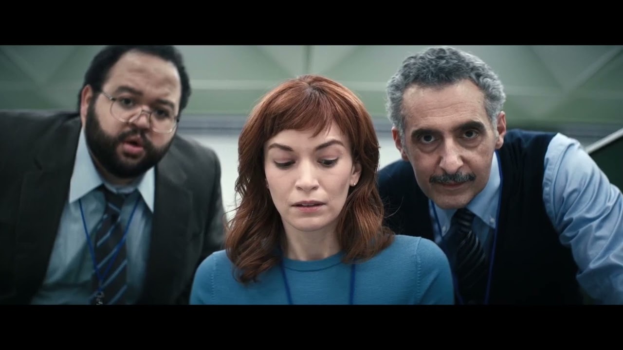
If there were an Emmy for prop design, Severance would have to win it. With the finale just days away, Severance Season 2 has cemented the Apple TV production's reputation as one of the most visually arresting series in recent years. The production design, lighting and blocking all contribute to making Dan Erickson and Ben Stiller's dark sci-fi office comedy look so perfect, but it's the prop design that does a lot of the lifting.
The props in Severance are essential to the depiction of Lumon Industries, the fictional company where the 'severed' employees work. They play a vital role in making the seemingly contradictory retro-futurist vacuum of the corporation feel coherent and believable, and they've become so iconic that we've seen fans remaking Severance props with the dedication of Kier protégés.
In tribute, here we explore five examples of how Severance props helped create the series' universe (also see our roundup of packaging design inspiration and our interview with Apple TV+ graphic designer Gina Alessi.
01. Lumon incentives in Severance
To define Severance's look, production designer Jeremy Hindle took inspiration from the mid-century quest for the 'perfect workplace'. He's mentioned Eero Saarinen and Kevin Roche's modernist John Deere Headquarters in Illinois as an influence, and the series finally used the same architects' Bell Labs building as the Lumon headquarters.
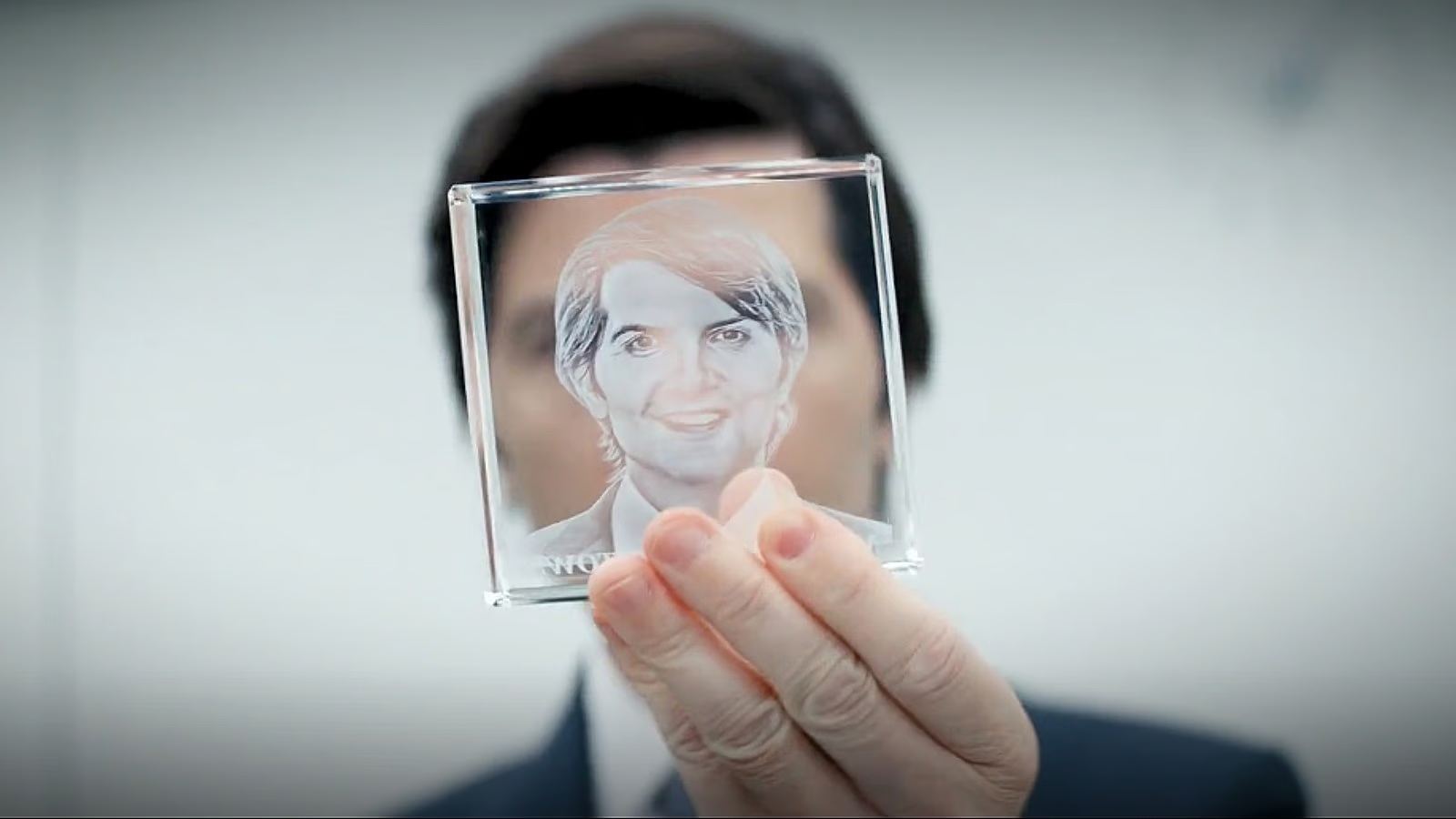
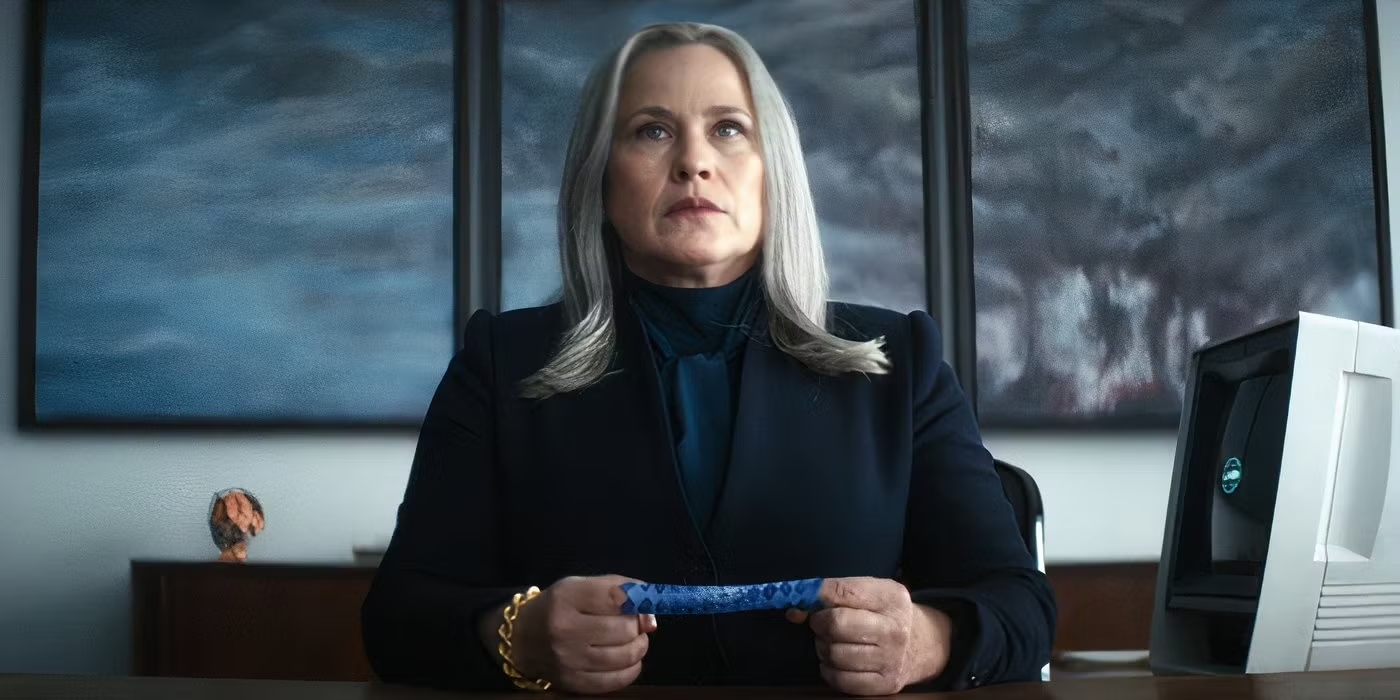
That vision of the ideal modern workplace extends to the interiors and the smallest details: the perfect paperclip, the perfect pen, and Innies receive absurd incentives, from finger traps to carved watermelons and glass cubes with their own portraits. Since the omnipresent Lumon manufactures everything, prop designers wanted to make every item unique and branded, so even the infantilising incentives use a Lumon powder blue palette, adding to the sterile feel of the offices.
02. Lumon Industries WoeMeter
@make3co ♬ Main Titles - Theodore Shapiro
Many props were created by prop master Cat Miller and her team, but some jobs were contracted out. The Lumon WoeMeter, which appears in Season 2, was created by Make3 in less than six weeks based on concept renders from the production designers. It's typical of the often anachronistic tech at Lumon, which seems to have developed at a pace of its own, and it was made fully functional so actors could use it convincingly.
Make3 began by 3D modelling the machine's components before before parametrically designing the entire machine. The main body was then milled from aluminum and side caps were made from solid titanium. The designers say they took the knobs from an early '90s Nagra tape recorder and added meters powered by stepper motors and a series of LED displays controlled by an ESP-32 microcontroller on a custom-designed circuit board.
Get the Creative Bloq Newsletter
Daily design news, reviews, how-tos and more, as picked by the editors.
03. The MDR terminals
Severance set director Andrew Baseman has said that the team realised early on that they couldn't use real-world brands that viewers would recognise (hence why Severance escapes the blatant product placement of other Apple TV shows like Ted Lasso). This extends to the MDR terminals, which reinforce the retro-futurist aesthetic. Contradictory design features – a cathode-ray tube but also a touchscreen, a trackball for input – add to the enigma of what the data refiners are anyway doing.
The terminals looks like toys more than high-tech computers by today's standard, but they look like they must have been inspired by the 1977 Data General 6053, also known as the Dasher D2. Note that the Lumon keyboards have no escape key – a little Easter egg like that shows how much attention was dedicated to Severance's prop design, even making meta references to the series' themes.
A Data General "Dasher" 6053 computer terminal -- liiks like it provided inspiration for Severance prop makers from r/SeveranceAppleTVPlus
04. Lumon minicassette Recorder
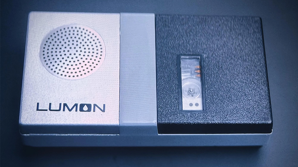
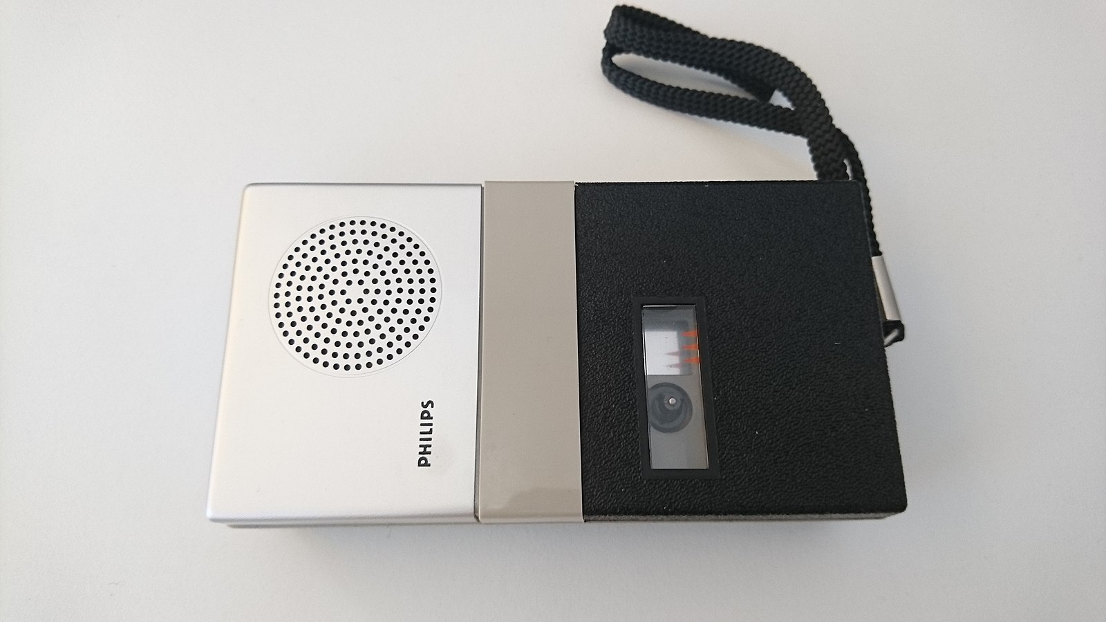
While everything in the Severed workspace is Lumon made, not all of the Severance props were created from scratch. That perfect-looking Lumon minicasette player? It appears to be a Philips LFH0085 from the later 1960s with the Philips logo removed and the Lumon logo added. It seems part of it may have been repainted. It you want your own, there are plenty on ebay. Prop master Cat Miller also tracked down genuine vintage erasers, which were stamped with the Lumon logo.
05. The Kier paintings
A post shared by Danny Aviles (@dannyillustration)
A photo posted by on
One aspect of Severance's design seems out of place with the rest of the visual style: the strange paintings celebrating Lumon's founder Kier Eagan. Most of the pieces are pastiches of real-world works from different eras and styles, from Renaissance-era biblical imagery to Goya in the portrayal of an attack on MDR by Optics and Design and David Friedrich’s Wanderer Above the Sea of Fog in 'Kier Invites You to Drink of His Water'.
Digital artist Hugh Sicotte planned how each painting would look based on references in the script, and the actor Marc Geller was hired to pose as Kier in different positions. The artist Danny Aviles, who also worked on storyboards for Severance, shared his iterations for the painting 'Kier Pardons his Betrayers' in the Instagram post above.
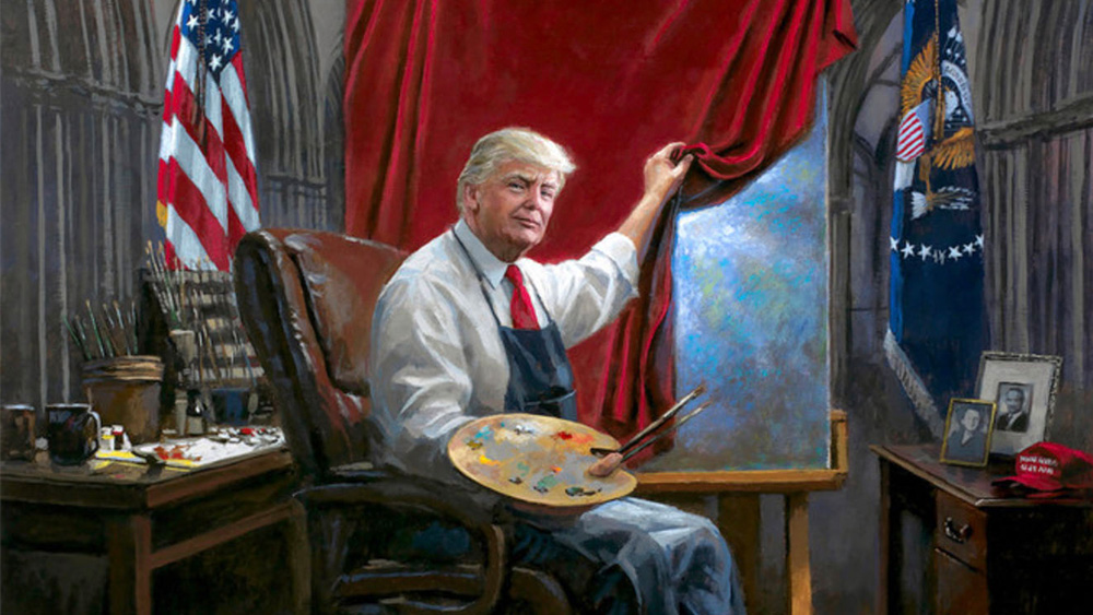
The paintings add a comical grossness to Lumon's corporate propaganda. They might seem too absurd and exaggerated to be believable, but their kitschness and heavy-handed allegories feel very familiar next to the artist Jon McNaughton's portraits of US president Donald Trump.
The last episode of Severance Season 2 will be released on Apple TV late Thursday / early Friday (20 / 21 March) depending on where you're located and will have a longer runtime of around 1 hour and 15 minutes. Also see our article about the Lumon logo for more on the visual design of the series.

Thank you for reading 5 articles this month* Join now for unlimited access
Enjoy your first month for just £1 / $1 / €1
*Read 5 free articles per month without a subscription

Join now for unlimited access
Try first month for just £1 / $1 / €1

Joe is a regular freelance journalist and editor at Creative Bloq. He writes news, features and buying guides and keeps track of the best equipment and software for creatives, from video editing programs to monitors and accessories. A veteran news writer and photographer, he now works as a project manager at the London and Buenos Aires-based design, production and branding agency Hermana Creatives. There he manages a team of designers, photographers and video editors who specialise in producing visual content and design assets for the hospitality sector. He also dances Argentine tango.
You must confirm your public display name before commenting
Please logout and then login again, you will then be prompted to enter your display name.
