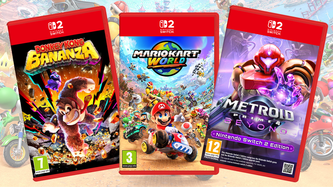
While the art itself for the new Nintendo Switch 2 game boxes is beautiful, with Donkey Kong Bananza looking particularly striking, many Nintendo fans have taken to Reddit and social media with one gripe – the large red slab across the top of the game boxes and centred logo is a problem.
Given the controversy around Switch 2 game prices, this feels like a minor issue, but it's the kind of design 'fail' that many die hard fans pick up on and can't overlook.
While the new and exclusive Switch 2 games feel more unique and balanced, the real issue fans are having is with the upgrade editions – the Metroid Prime 4: Beyond box art in particular is irritating fans, with many bemoaning the red slab, combined with the disclaimed text as off-putting, preferring the simplicity of the Switch box, which has a small logo in the corner.
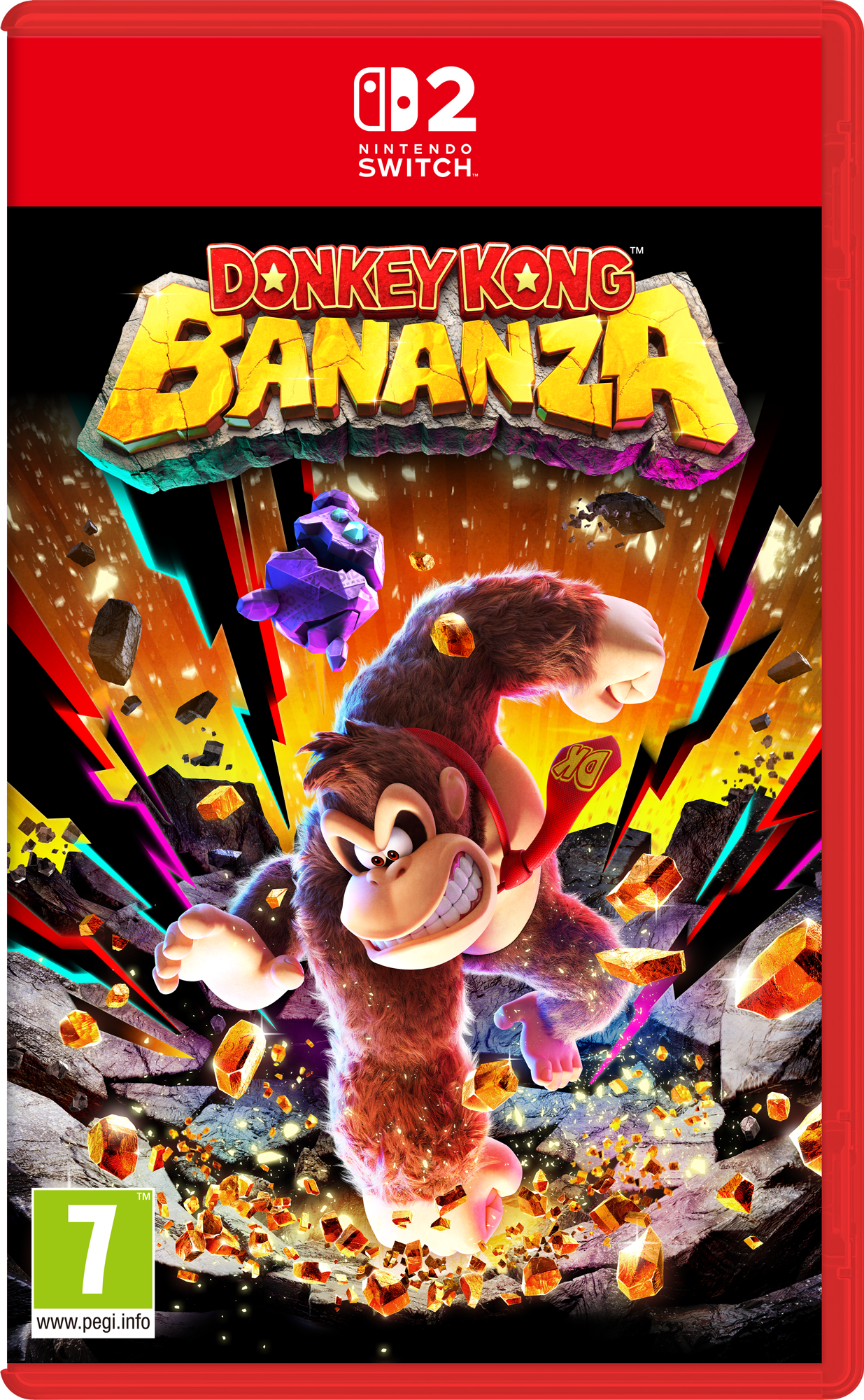
"I feel like that and the red box is overkill," wrote resplendentcentcent on Reddit, adding: "Red box with an obvious logo containing the 2 in the corner would be much preferred. It's a shame after I felt like the Switch 1 box design was perfect."
Some fans have even joined the dots that suggest the new Switch 2 box art is bringing back the centred logo design of the old Wii U packaging – a console that was a notorious failure for Nintendo.
snk50 wrote on Reddit: "It is but it's very obvious they're trying to differentiate between switch 1 and 2. Don't want to go the wii u route lol."
SonicHokage added: "Funny the wii u logo was in the middle too, are we about to witness another console fail (sarcasm)."
Get the Creative Bloq Newsletter
Daily design news, reviews, how-tos and more, as picked by the editors.
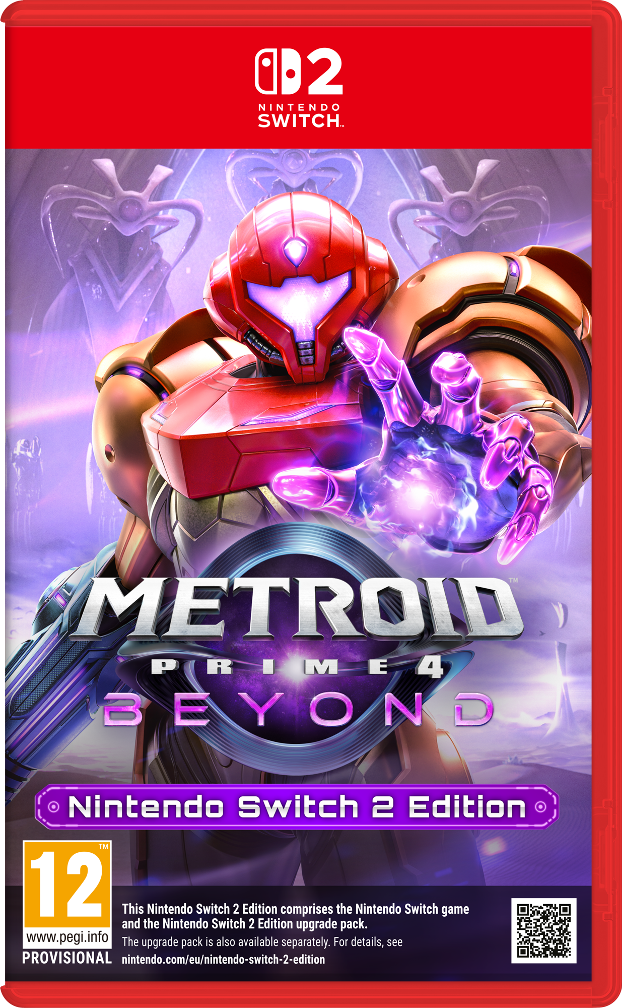
I can personally see the point many of these fans are expressing, particularly as the art itself is beautifully rendered and Nintendo has a history of creating impactful illustrations.
To mask and hide this artwork, for new games like Mario Kart World, but particularly Switch 2 Editions of classics like Kirby and the Forgotten Land and Legend of Zelda: Breath of the Wild, feels wrong. The art is hidden behind a slab of red, with a small logo and then caked-over with the kind of disclaimer text usually reserved for the rear of a box.
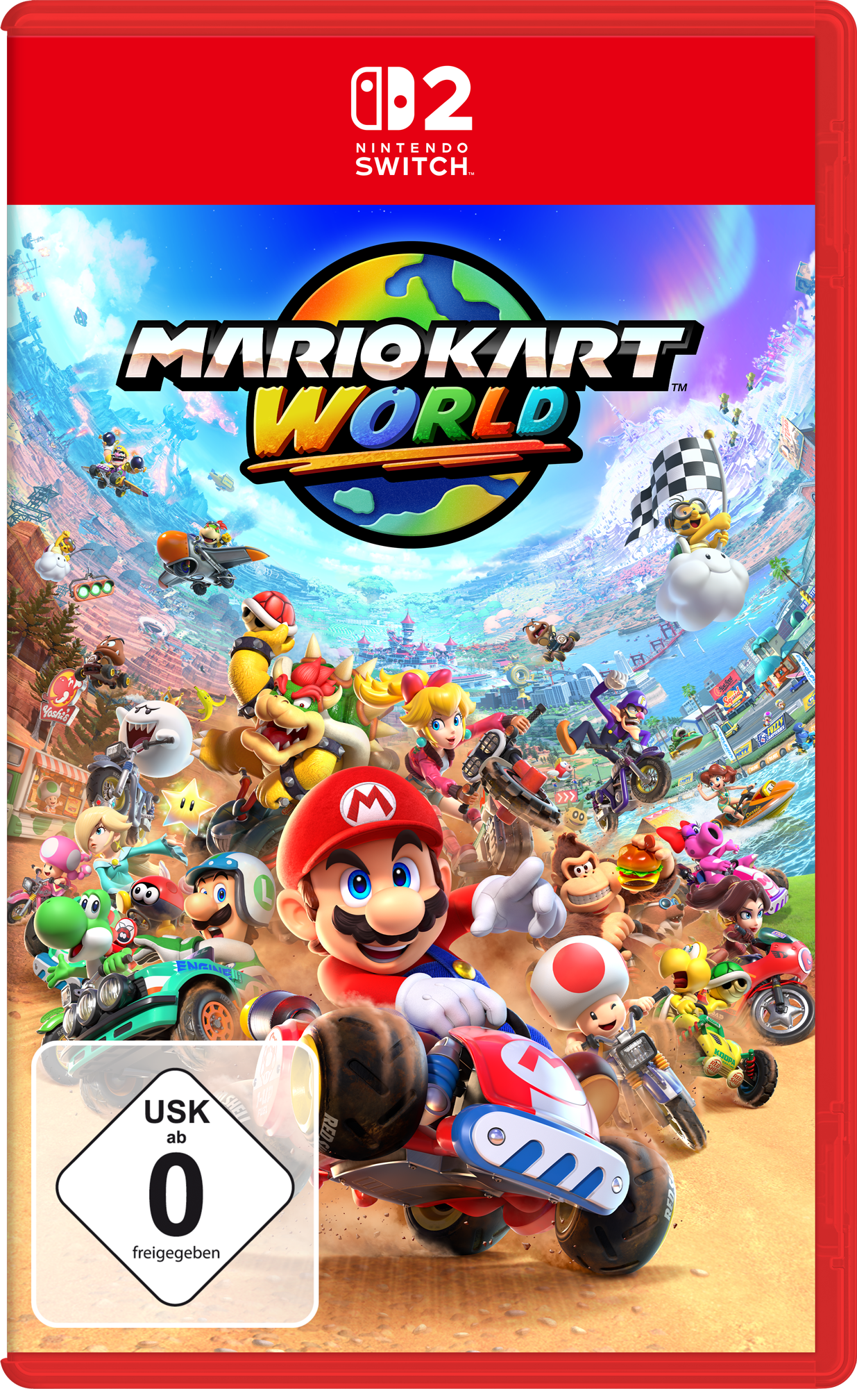
If you're not put off by the prices and the box art, read our explainer on how to pre-order a Switch 2. And for a more positive take, read the five epic Nintendo Switch 2 surprises that have fans talking.

Thank you for reading 5 articles this month* Join now for unlimited access
Enjoy your first month for just £1 / $1 / €1
*Read 5 free articles per month without a subscription

Join now for unlimited access
Try first month for just £1 / $1 / €1

Ian Dean is Editor, Digital Arts & 3D at Creative Bloq, and the former editor of many leading magazines. These titles included ImagineFX, 3D World and video game titles Play and Official PlayStation Magazine. Ian launched Xbox magazine X360 and edited PlayStation World. For Creative Bloq, Ian combines his experiences to bring the latest news on digital art, VFX and video games and tech, and in his spare time he doodles in Procreate, ArtRage, and Rebelle while finding time to play Xbox and PS5.
You must confirm your public display name before commenting
Please logout and then login again, you will then be prompted to enter your display name.
