Film colourist Máté Ternyik reveals how the Oscar-nominated movie built its unique aesthetic.
Few films in recent memory have captured the imagination quite like Brady Corbet’s ambitious, visually arresting saga, The Brutalist. A testament to the tight-knit collaboration between director Brady Corbet, cinematographer Lol Crawley, and colourist Máté Ternyik, the film tells the story of a visionary architect who flees war in Europe to rebuild his life in America.
From the earliest camera tests, Máté played a central role in refining the film’s aesthetic, working closely with Crawley and Corbet to shape a look that evokes grandeur, texture and the passage of time. (Catch up the film's inspiration in our list of the 10 iconic examples of brutalist architecture and read our 'What is colour grading' explainer to understand Máté's work.)
Nominated for ten Academy Awards, including Best Picture, Máté explores his work in the DI (Digital Intermediate) suite with us, discussing his creative synergy with Corbet and Crawley and the challenges of working with VistaVision and 70mm aesthetics alongside the evolving role of the colourist in ambitious cinematic storytelling.
Below Máté tells us how the team designed the film's aesthetic to play on the graceful yet surreal and menacing feel of brutalist architecture.
(Image credit: Universal)
“I was initially brought on board as the dailies colourist. However, from my first session with Lol and Brady, working through their camera test footage in preproduction, there was a mutual feeling that we all spoke the same language and shared a sense of aesthetics. On day three of production, they asked me to stay on as colourist for the whole project and finish the film.
"After seeing the first few days’ rushes, it was immediately apparent that this film would be something very special. Adrian Brody was an irresistible presence on the screen, and there was a sense of scale and grandeur about every shot unlike anything seen in movies these days."
Setting the visual language
(Image credit: Universal)
"Lol and Brady often came into the studio after wrapping to screen and grade the previous day’s rushes. After they had asked me to stay on to do the final DI, these sessions became even more involved, and we did a lot of great work even during the shoot, finding looks and solutions that, in many cases, made it into the final grade of the film.
Get the Creative Bloq Newsletter
Daily design news, reviews, how-tos and more, as picked by the editors.
"This is distinctly different from how many projects get graded, where the footage is shot and edited, and only then does the colourist truly get involved. In those instances, many decisions might have already been taken that may have been different if the colourist had been involved earlier.
"In our case, it meant that Brady and Lol could go to set on day six, knowing that what they did on day four worked out exactly as they hoped, or perhaps with an idea from me about how to change a subtle thing to achieve even better results. This was instrumental in affording them a sense of reassurance and confidence, allowing them to make bold and strong choices on set."
Drawing inspiration
(Image credit: Universal)
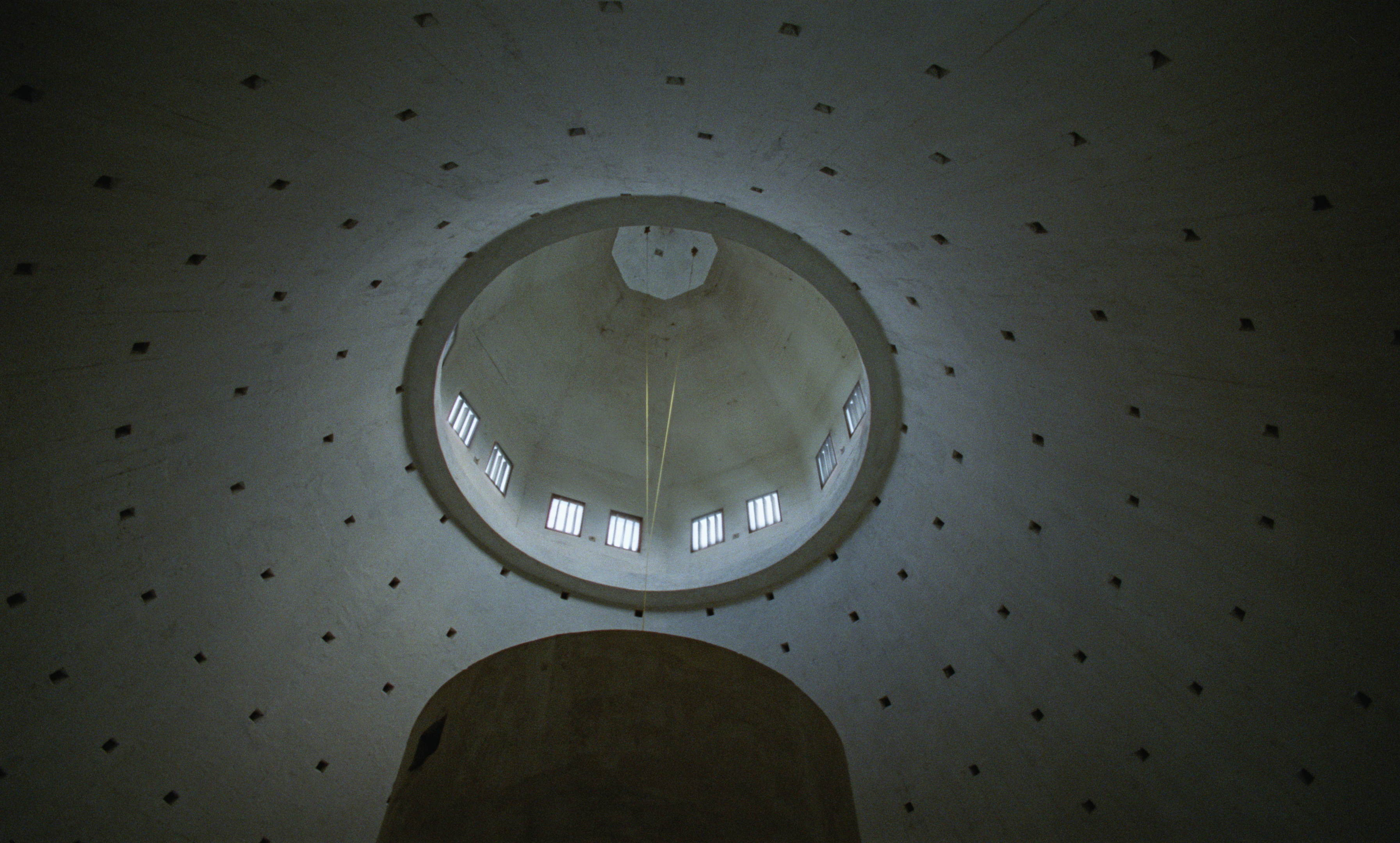
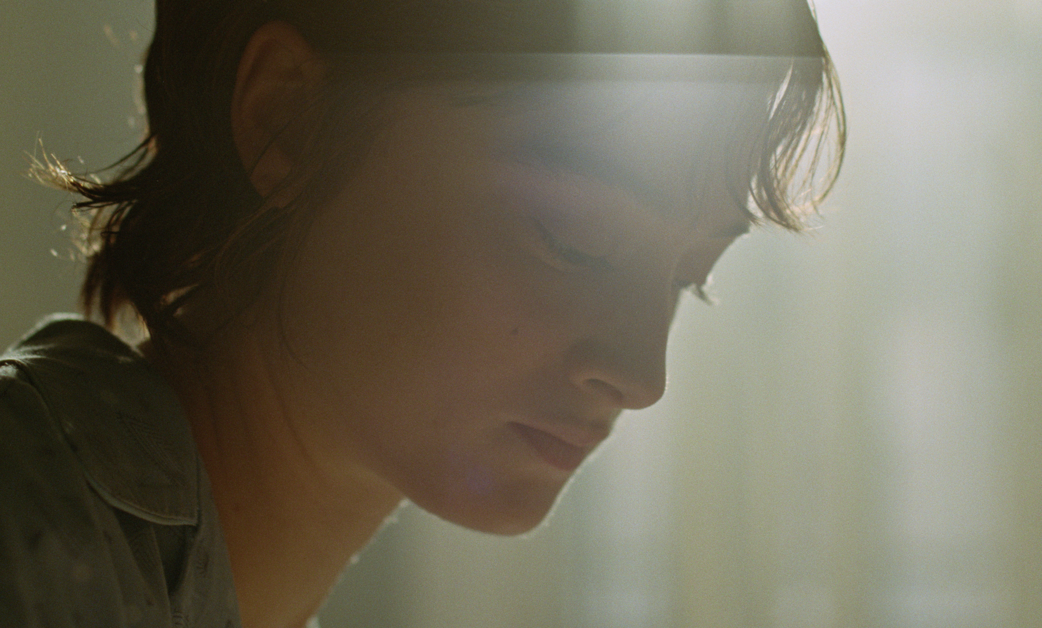
"Brady and Lol referred to movies, photographs, and paintings when discussing how they wanted me to approach the grade. As the film is a celebration of art, architecture, and creation, references from various media helped define the right visual cues.
"Once we started working together in the suite, we developed a great dynamic. They initially gave me a lot of freedom to explore the footage, offering quick and consistent feedback. Over time, this process became more efficient, and they generously allowed me to experiment, incorporating ideas into the final look."
Image 1 of 3
(Image credit: Universal)
(Image credit: Universal)
(Image credit: Universal)
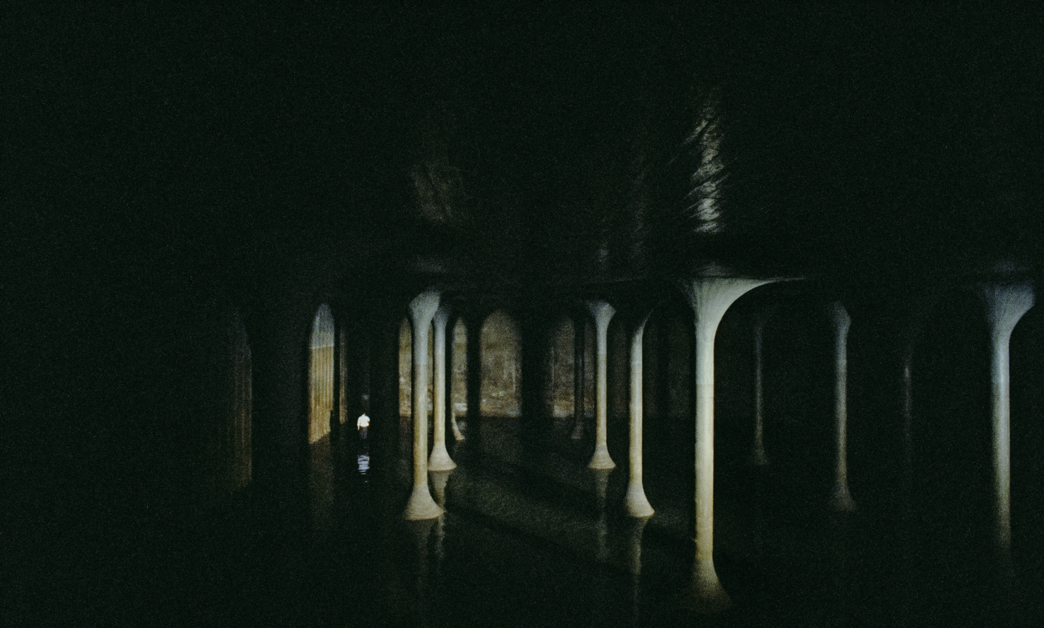
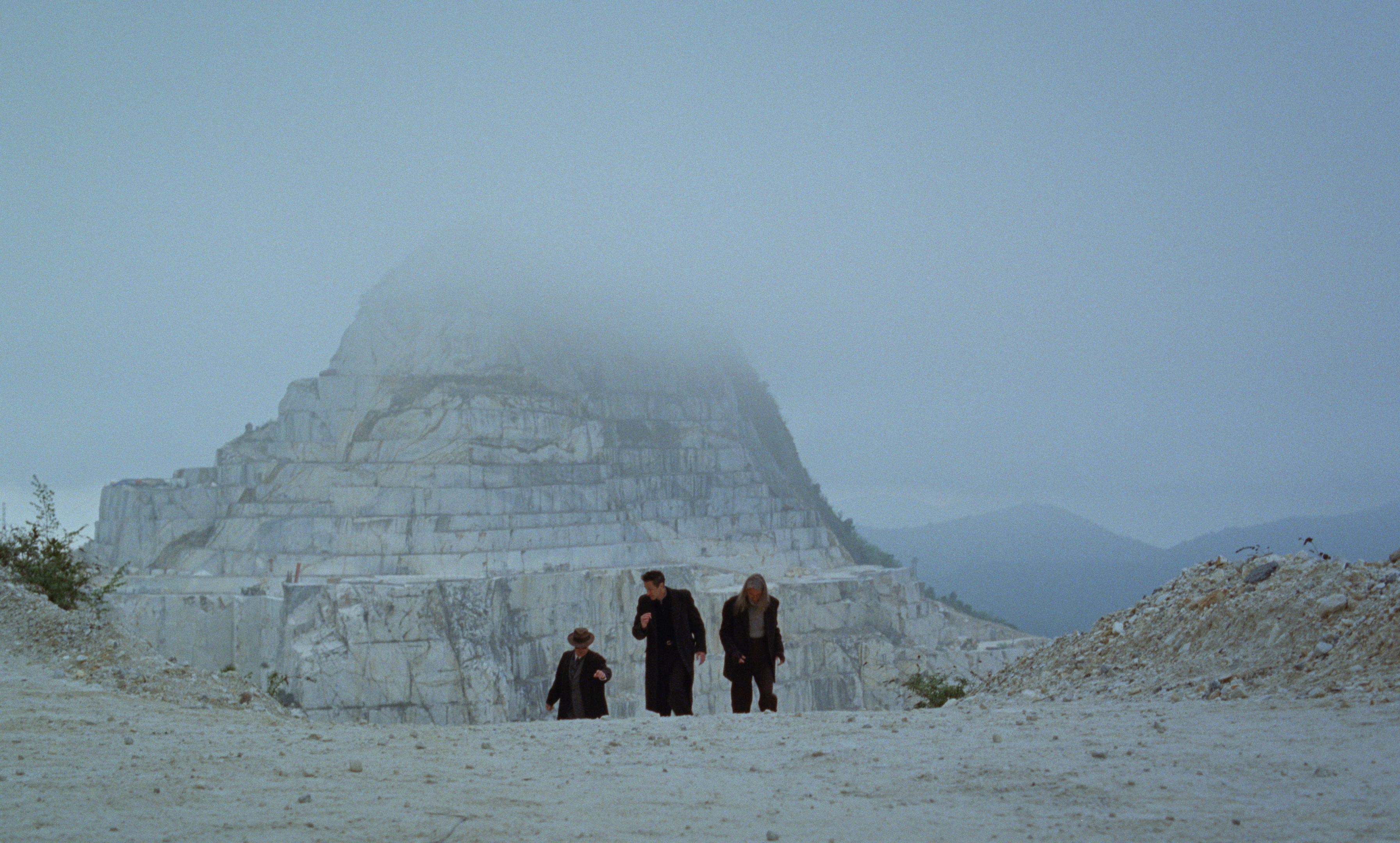
"One key example of how this process worked is the dusk scene where Guy Pearce’s character brings his dinner party to a hilltop. The grade was informed by the opening shot, where lanterns glow in fading twilight. After some experimentation, I found an approach that created an ethereal look, which we loved and carried through the rest of the scene.
"One day, while working alone, I experimented further and found a way to redistribute low end values from the blue channel into the others, recovering far more shadow detail. When Brady and Lol saw it, they loved it, and that’s how it made it into the film. This back and forth rhythm of solo experimentation followed by collaboration became our workflow.
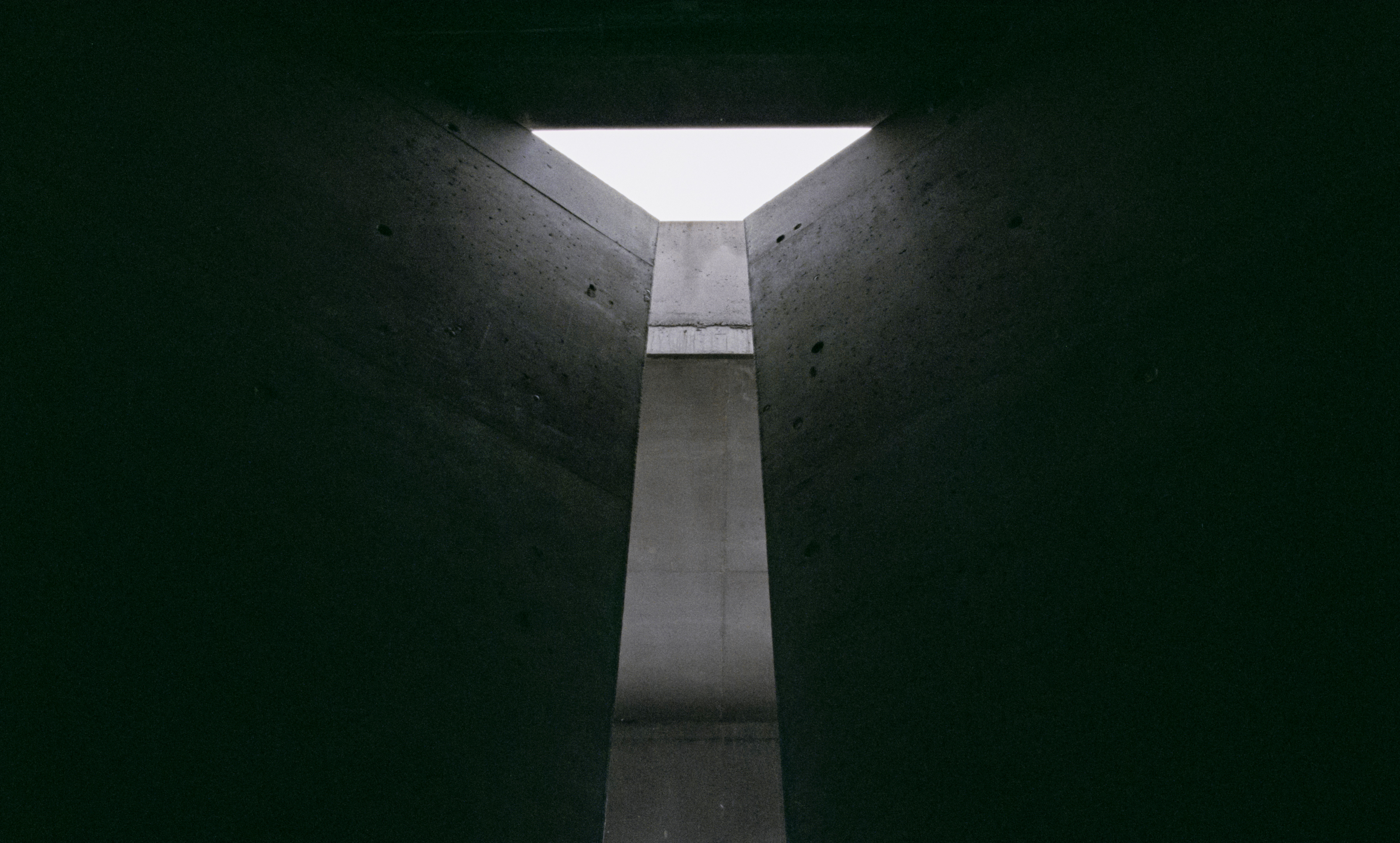
"Texture and atmosphere were central to the visual language. During camera tests, we worked on balancing exposure, lighting, negative processing, and grain texture. Lol and Brady wanted prominent grain and responded to the ‘beat up’ quality it brought to the images."
Achieving balance
(Image credit: Universal)
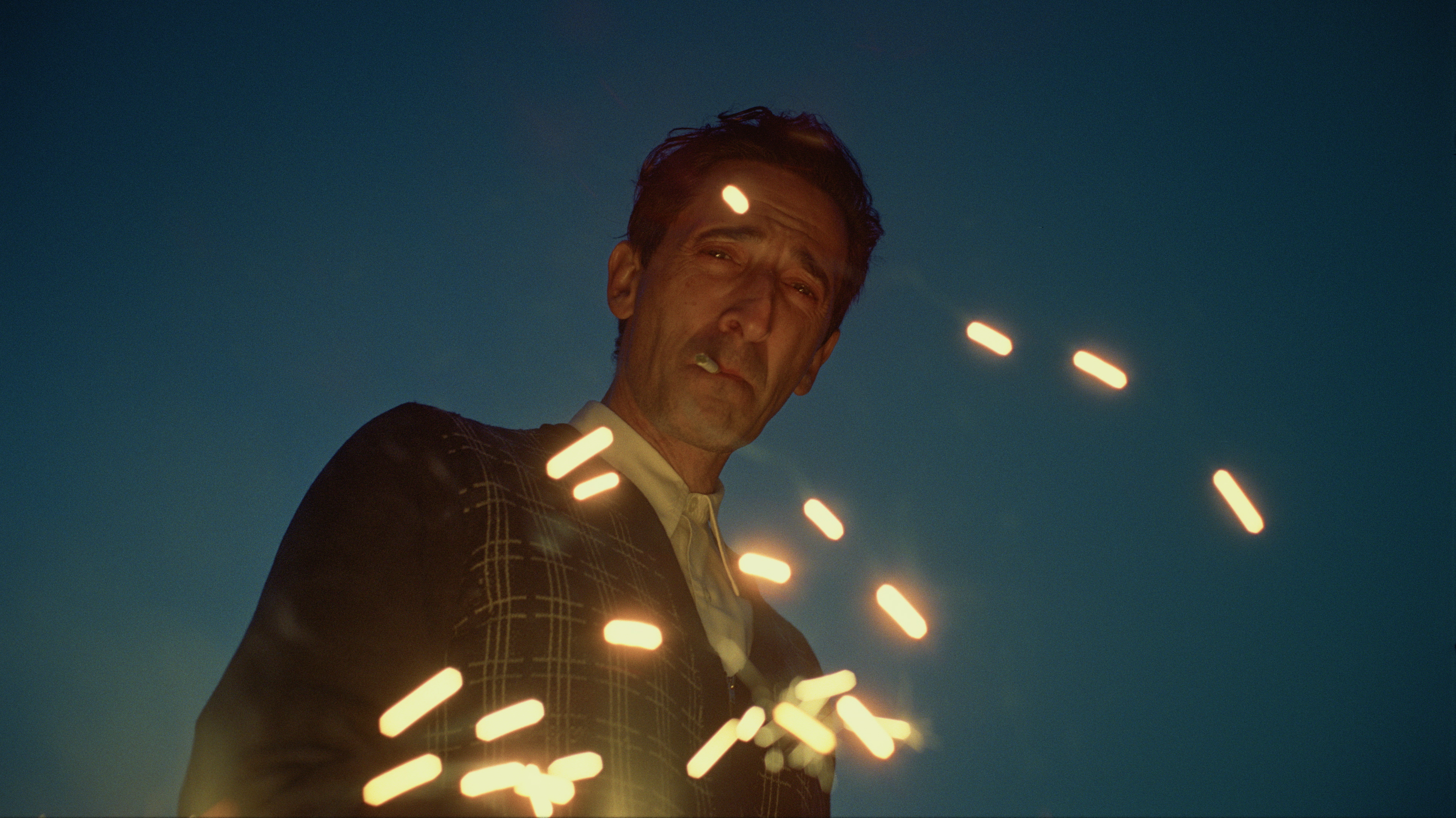
"Shooting in VistaVision and presenting in 70mm gave the film a unique sense of scale. Our goal was to maintain and accentuate this grandeur, subtly shaping the light on landscapes and guiding the eye to key elements without disrupting the integrity of the frames.
"One specific challenge was the flicker caused by the rare, older VistaVision cameras. We had to carefully remove it where distracting, and in some cases, add flicker to 3perf 35mm shots back in during the post process to ensure visual consistency.
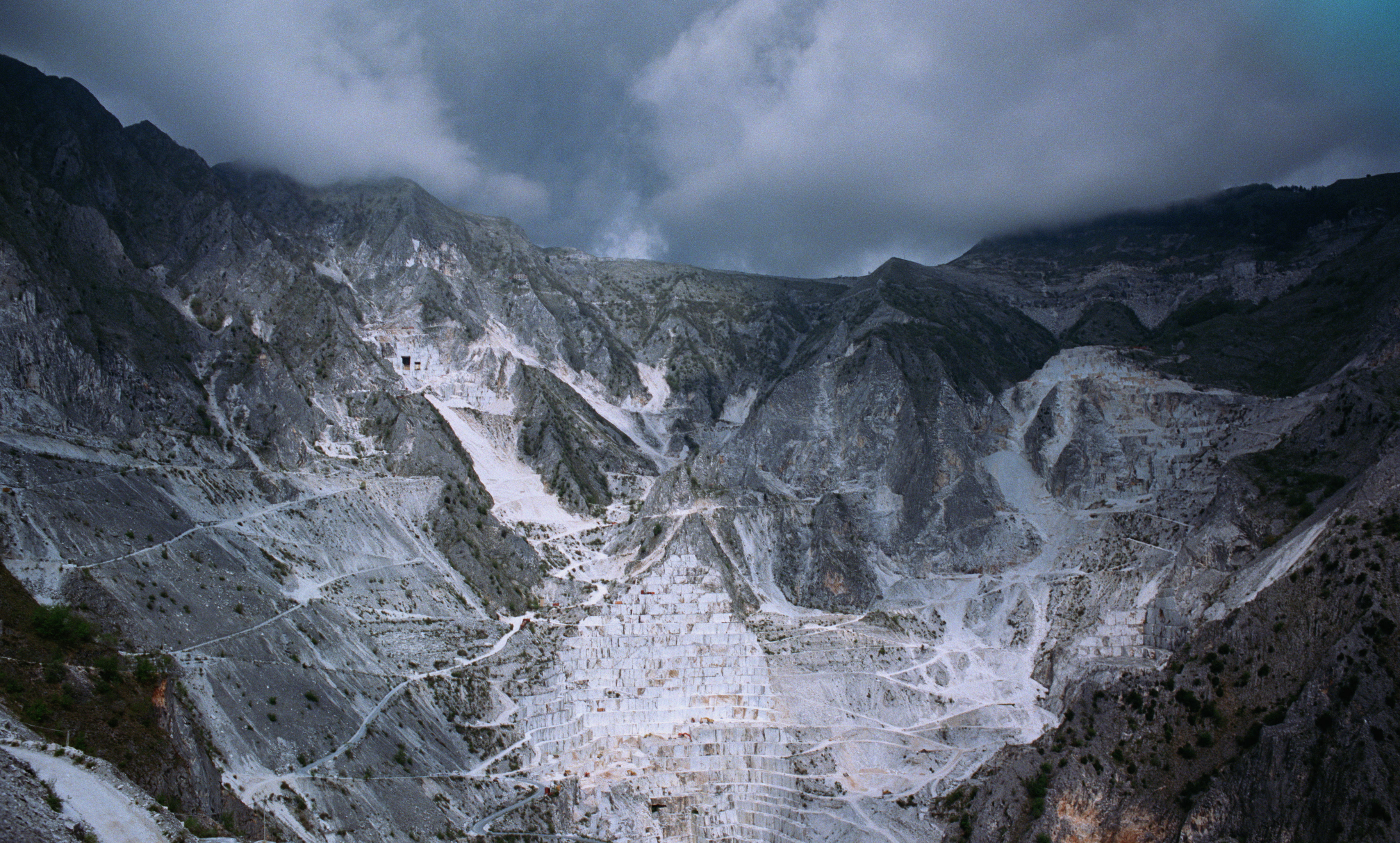
"Visiting the backlot and on location sets was invaluable. Studying textures, lighting and architecture first hand helped us push the grade further. This level of involvement, though uncommon, proved to be an artistic advantage, reinforcing that more immersion during production allows for greater creative freedom in post."
Image 1 of 3
(Image credit: Universal)
(Image credit: Universal)
(Image credit: Universal)
"DaVinci Resolve Studio was an essential tool for this project, used through the dailies colour and final DI grade. It’s various denoising tools, used in several different ways, sometimes globally and sometimes on individual channels, have been great at reducing grain where needed. I also used the Channel Mixer extensively to clear colors in the shadows in a more pleasing way. We also used the integrated grain feature to add grain where needed and to match other shots within a scene.
"Although not a feature per se, the system's stability was a great asset during the project. Both Lol and Brady noted that after finishing their previous films on other platforms, it was apparent to them that Resolve was very stable, with very few interruptions to our work."
Image 1 of 3
(Image credit: Universal)
(Image credit: Universal)
(Image credit: Universal)
"Lol and Brady would attend late night sessions throughout the shoot where we developed many of the film’s visual language elements. By the time the final grade began, we had a well established communication style and a clear goal.
They were present for most of the final grading sessions, ensuring that our vision remained consistent. This wasn’t about discovery, much of that had already happened during the shoot, but about refining and pushing our artistic and technical limits to achieve the agreed upon results."
Ian Dean is Editor, Digital Arts & 3D at Creative Bloq, and the former editor of many leading magazines. These titles included ImagineFX, 3D World and video game titles Play and Official PlayStation Magazine. Ian launched Xbox magazine X360 and edited PlayStation World. For Creative Bloq, Ian combines his experiences to bring the latest news on digital art, VFX and video games and tech, and in his spare time he doodles in Procreate, ArtRage, and Rebelle while finding time to play Xbox and PS5.
You must confirm your public display name before commenting
Please logout and then login again, you will then be prompted to enter your display name.