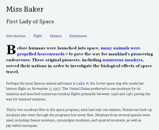
Discover the power of CSS3 selectors
Rich Clark explains how to keep your markup slim and target elements in the DOM without resorting to extra presentational markup or JavaScript by using CSS3 selectors. Thus we can truly separate our content and presentation from one another
- Knowledge needed: Beginner to intermediate HTML and CSS
- Requires: Text editor, browser
- Project time: 3 hours
- Download source files
This article first appeared in issue 216 of .net magazine - the world's best-selling magazine for web designers and developers.
To style an element with CSS, we need to be able to target it. Enter CSS selectors, which enable us to target elements at a more granular level without adding presentational markup or attributes.
This means your markup can be super slim, semantic and flexible. There isn’t space to cover all the CSS3 selectors here so we’ll concentrate on attribute and substring selectors followed by structural and negation pseudo-classes.
With a range of selectors available, it can be difficult to know which type of selector to use. As the new CSS3 selectors are introduced, we’ll provide real-world use cases for them to use in your projects right away.
Attribute and substring selectors
CSS3 has extended the list of attribute selectors we can use by adding three new substring selectors to our toolkit. This means we can now target a rule and apply CSS styling to an element based on part of an attribute’s value. We’ll briefly describe each below.
“Starts with” substring selector
The caret (^) operator, when related to the substring selector, means “starts with”. For example, this could be used to target all external links in our content by adding a small icon indicating an external link. In the following example, we’ll add a background image and padding to all links that start with http:// by using the ^ “starts with” attribute substring selector as below:
- a[href^="http://"] {
- background:url(img/external.png) 100% 50% no-repeat;
- padding-right:15px;
- }
That’s great but occasionally there will be internal links that begin with http://. In that case you don’t want the icon to appear. We can work around this exception by adding another rule beneath our initial one (they have the same specificity) to nullify the properties set for external links. The ^ operator is retained because the link(s) may be going to various pages within the site.
Get the Creative Bloq Newsletter
Daily design news, reviews, how-tos and more, as picked by the editors.
- a[href^="http://"] {
- background:url(img/external.png) 100% 50% no-repeat;
- padding-right:15px;
- }
- a[href^="http://mysite.com"], a[href^="http://www.mysite.com"] {
- background:none;
- padding-right:0;
- }
Another use case for the ^ operator might be to target links starting with the
mailto: string and add an icon such as a mail icon:
- a[href^="mailto:"] {
- background:url(img/email.png) 100% 50% no-repeat;
- padding-right:15px;
- }

“Ends with” substring selector
We’ve dealt with “starts with”, now we’ll look at “ends with”. The operator for this is the dollar symbol, $.
The syntax is exactly the same as the “starts with” syntax and common use cases include adding icons to represent different files types for document downloads or to indicate different feed types. To indicate that a link goes to a PDF document, we can use:
- a[href$=".pdf"] {
- background:url(img/pdf.png) 100% 50% no-repeat;
- padding-right:18px;
- }
This method can be used to target any file type, such as .doc, .jpg, .atom or .xml.

"Contains" substring selector
The final substring selector uses the star or asterisk (*) operator, which stands for “contains”. This is powerful when we wish to target elements that have more than one class applied. It can also be used to target specific domains within an anchor. We’ll use it in the following example to highlight those anchors linking to a person’s Twitter account:
- a[href*="twitter"] {
- background:url(img/twitter.png) 100% 50% no-repeat;
- padding-right:20px;
- }
The same effect could have been achieved using the ^ operator and the value http://twitter.com, but using the (*) operator helps us save a few bytes. The real power of the * substring selector, however, comes when we need to style one of the Twitter links differently based on its Twitter handle (eg http://twitter.com/chrisdavidmills). To clarify, all the links contain twitter as in the above example, but only one contains chrisdavidmills:
- a[href*="chrisdavidmills"] {
- background:url(img/twitter.png) 100% 50% no-repeat;
- padding-right:20px;
- color:#ff0;
- }
We could also use the * operator to apply different styling to links pointing to the pages of people we've indicated as friends, family members and others using the XFN microformat, selected via their rel attribute values. For example, to indicate that Chris Mills is our friend, our markup would be:
- <a href="http://twitter.com/chrisdavidmills" rel="met friend">Chris Mills</a>
Because there are two values for the rel attribute, it becomes difficult to target using the ^ or $ operator, so * (contains) becomes an option, as does the CSS 2.1 tilde (~), which targets a whitespace-separated list of words, one of which equals the value. Here we’ll use the new CSS3 substring selector *:
- a[rel*="friend"] {
- background:url(img/friend.png) 100% 50% no-repeat;
- padding-right:20px;
- }
This causes a problem though: our Twitter icon for Chris has been overwritten by the XFN icon, because both the style rules have the same specificity and the a[rel*="friend"] {...} rule appears further down our style sheet. We can get around this by adding some additional padding to our friend rule and using multiple background images to add both icons placed in different positions:
- a[rel*="friend"] {
- background:
- url(img/friend.png) 100% 50% no-repeat,
- url(img/twitter.png) 85% 50% no-repeat;
- padding-right:40px;
- }
Structural pseudo-classes
Structural pseudo-classes let us style elements and parts of elements that are in the DOM but can’t be targeted with other selectors. They keep your markup clean and efficient, replacing the addition of extraneous classes in your markup, either those in the source code or those added dynamically using JavaScript.
:last-child
This is for targeting the last child of another element. We can use it to remove the border from the last item in a list, for example:
- nav li:last-child {
- border-right:0;
- }
The :first-child pseudo-class was introduced in CSS 2.1 and works in the same
way as :last-child except it targets the first matched child of another element.
:nth-child
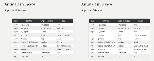
The :nth-child pseudo-class lets us target one or more specific children of a given parent element. It can take the form of a number (integer), keywords (odd or even) or a calculation (expression). It can come in handy when you want to style data tables or complex lists (see issue 216, page 78). We’ll start by showing the keyword value even to add a background colour to create a zebra-striping effect on alternate table rows to improve readability that might traditionally be achieved server-side, using JavaScript or by adding classes to your markup:
- tr:nth-child(even) td {
- background-color:#eee;
- }
We could achieve the same effect as the previous example using the expression ‘2n’ or ‘2n+0’, which means “style every second row”:
- tr:nth-child(2n) td {
- background-color:#eee;
- }
If we wanted to reverse the row colouring and have the background colour applied to the odd rows, we could use either the odd keyword or the expression ‘2n+1’, which means ‘every second row starting from the first’. The examples below have exactly the same effect:
- tr:nth-child(odd) td {
- background-color:#eee;
- }
- tr:nth-child(2n+1) td {
- background-color:#eee;
- }
Following so far? Good. Using expressions similar to those we’ve seen before, let’s assume we want to target every fourth line of the table. Simply use:
- tr:nth-child(4n) td {
- background-color:#eee;
- }
How about every fourth item starting from the second row?
- tr:nth-child(4n+2) td {
- background-color:#eee;
- }
We can see a pattern emerging. Now let’s deal with that smart kid in class who wants to count backwards. Imagine we want to style the first five rows in the table. This is achieved using a negative value for ‘n’:
- tr:nth-child(-n+5) td {
- background-color:#eee;
- }

:nth-last-child
The :nth-last-child pseudo-class is essentially the same as :nth-child but it starts counting from the last element. Using the same expression as the previous example we can highlight the last five rows in the table:
- tr:nth-last-child(-n+5) td {
- background-color:#eee;
- }
Also just like :nth-child, :nth-last-child accepts the ‘odd’ and ‘even’ arguments and doesn’t have to use a negative value for ‘n’.
:only-child
We have one more ‘child’ pseudo-class to look at. :only-child works by targeting any elements when they are the only child of its parent. This might come in useful if we have a dynamically generated list that only contains only one item, in which case the margins should be decreased:
- ul li:only-child {
- margin-bottom:2em;
- }
:first-of-type
The ‘type’ pseudo-classes tend to work in the same way as the ‘child’ classes, the key difference being that the ‘type’ pseudo-class only targets those elements that are the same as the element the selector is applied to. They’re useful when we can’t guarantee there won’t be any other child elements in place. Eg, if an hr is placed between each paragraph, by using :first-of-type, we can ensure we target only the paragraphs. Consider an intro paragraph contained within a section (<section id="introduction">). Using :first-of-type, we can style the first paragraph within the section, like so:
- #introduction p:first-of-type {
- font-size:18px;
- font-weight:bold;
- }
For some extra coolness, we can combine :first-of-type with the ::first-letter pseudo-element from CSS 1 (yes, 1) to style the first letter of the first paragraph in the introduction. Note that CSS3 introduced a new double-colon (::) syntax for pseudo-elements to distinguish between them and pseudo-classes such as :hover. We’ve used the double-colon syntax in the example below although using it for client work can be a bad idea because of backwards compatibility:
- #introduction p:first-of-type::first-letter {
- font-size:60px;
- float:left; width:auto;
- height:50px;
- line-height:1;
- margin-right:5px;
- }
:last-of-type
Using :last-of-type, we can achieve the same effect as :last-child. To remove the right-hand border from the last menu item, we can use:
- nav li:last-of-type {
- border-right:0;
- }
:nth-of-type
:nth-of-type works in the same way as :nth-child and uses the same
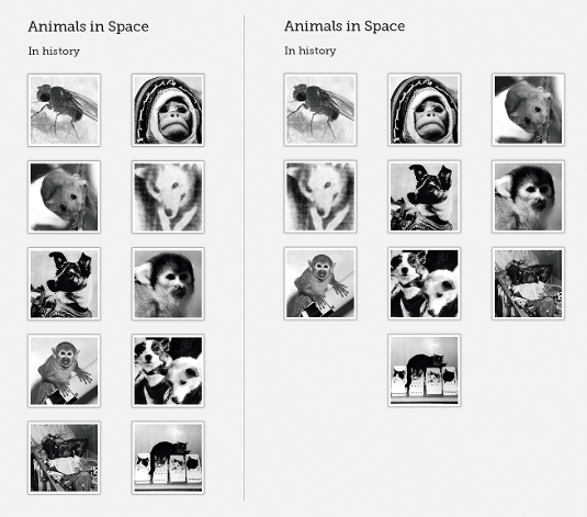
syntax. However, it can be more useful than :nth-child should there be elements in between those being targeted. The following example has a section with a heading, followed by a list containing images of animals in space:
- <section id="animals">
- <h1>Animals in Space</h1>
- <ul>
- <li><img src="img/fly.png" alt="Fruit Flies" /></li>
- <li><img src="img/albert.png" alt="Albert II" /></li>
- <li><img src="img/mouse.png" alt="Mouse" /></li>
- <li><img src="img/tsygan.png" alt="Tsygan" /></li> <li><img src="img/laika.png" alt="Laika" /></li>
- [...]
- </ul>
- </section>
Now we’ll remove the bullet points created by the list, declare a width, float each of the list and add some margins:
- #animals ul {
- list-style-type:none;
- width:670px;
- }
- #animals li {
- float:left;
- width:200px;
- text-align:center;
- margin-right:35px;
- margin-bottom:35px;
- }
Imagine the margins have caused the third list item to drop onto a new row but our design dictates there should be three images per row. This provides the perfect use case for :nth-of-type to target every third list item (3n) and remove the right-hand margin to ensure they don’t drop onto a new line:
- #animals li:nth-of-type(3n) {
- margin-right:0;
- }
As with :nth-child, we can also use expressions (2n+1) or keywords (odd or even) to target certain elements. :nth-of-type can also be used to target the first item in a group using the expression li:nth-of-type(1) {...}, which has the same effect as using :first-of-type.

:nth-last-of-type
Using :nth-last-of-type(1) {...} is the same as using :last-of-type but, combined with expressions, it lets us count backwards starting from the last item, like :nth-last-child. Using our nth-of-type example, we’ll move the last lonely animal from our list of 10 to the centre by adding a large left margin:
- #animals li:nth-last-of-type(1) {
- margin-left:235px;
- }
:only-of-type
:only-of-type targets elements whose parent elements have no other children of the same type. Imagine we have an article that can contain several images but if only one image is included, we may want it to be full width. This is where :only-of-type comes into its own:
- article img:only-of-type {
- width:100%;
- }
:empty
:empty can be an extremely useful pseudo-class. It represents an element with no content. Assume we’ve got a dynamically generated aside in our page: we use :empty to hide it if it has no content.
- aside:empty {
- display:none;
- }
Before we start jumping for joy, a word of warning: if a browser finds a single character, or even whitespace, the element will be rendered because it no longer correctly matches the :empty selector. It’s fine to add HTML comments to the markup, but ensure there’s no whitespace.
:not()
In many ways the negation pseudo-class :not() works in reverse to other selectors because it enables us to target elements that don’t match the selector’s argument. Strange, we know, but it’s very practical. A prime example would to be style all form inputs that are not submit buttons:
- input:not([type="submit"]) {
- width:250px;
- border:1px solid #333;
- }
This saves us from having to add an extraneous class to a submit button simply for styling purposes. Or looking from the other way, it saves having to add a class to every other input. That markup is looking leaner already, right?
We can also use the negation pseudo-class during testing to catch those things that validation won’t. For example, let’s say we want to see all abbreviations that don’t have a title attribute specified. Just use:
- abbr:not([title]) {
- outline:2px dotted red;
- }
The same technique can be used to highlight images that don’t have an alt attribute specified:
img:not([alt]) {
   outline:2px dotted red;
}
This is a technique Eric Meyer uses in his diagnostic CSS (meyerweb.com/eric/ tools/css/diagnostics/). Add the diagnostic file when testing to catch all these errors, fix them and remove the file when you’re ready to deploy to the site.
Browser support
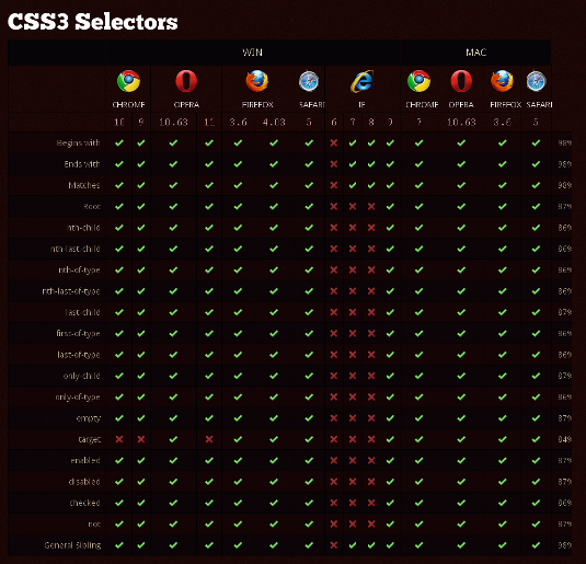
So how does this all work in browsers in the real world? Well, CSS3 selectors are fully supported in IE9+, Firefox 3.5+, Chrome 4+, Safari 4+, and Opera 10+ (with three minor exceptions). Support in IE6, IE7 & and IE8 is virtually non-existent (IE7 & and IE8 support the general sibling combinator and all the attribute selectors), but we can get around this by polyfilling with native JavaScript or a jQuery library.

One useful polyfill we can use is Selectivzr by Keith Clark. Alternatively, if we decide that some of these sprinkles are only added as enhancements and aren’t crucial for the site’s functionality, then it’s fine for them not to show in less capable browsers. The choice is yours.

One caveat with IE before v9 is that, when it’s grouping selectors and comes across a selector it doesn’t understand, it ignores the whole rule. So if we have:
- ul li:nth-child(3n), ul li.last {
- margin-right: 0;
- }
IE will not recognise the rule. Consequently, we’ll need to split them into their own rules, like so:
- ul li:nth-child(3n) {
- margin-right: 0;
- }
- ul li.last {
- margin-right: 0;
- }
Summary
We’ve learned that by using powerful CSS3 selectors, we don’t need to add unnecessary classes and IDs to our markup, ensuring we can truly separate our content and presentation from one another. We’ve seen how to target the first, last, odd or even items in a group. We’ve also learned how to target groups of elements using expressions and those on their own.
We’ve seen how to use negative pseudo-classes to help with testing and diagnostics. But there are many more CSS3 selectors we haven’t had time to cover. These include UI element states pseudo-classes, the general sibling combinator, :target (which deserves an article of its own), the new double-colon syntax of ::before and ::after and many more.
Check out the Selectors Level 3 W3C Proposed Recommendation, which can be found at www.w3.org/TR/css3-selectors.

Thank you for reading 5 articles this month* Join now for unlimited access
Enjoy your first month for just £1 / $1 / €1
*Read 5 free articles per month without a subscription

Join now for unlimited access
Try first month for just £1 / $1 / €1

The Creative Bloq team is made up of a group of art and design enthusiasts, and has changed and evolved since Creative Bloq began back in 2012. The current website team consists of eight full-time members of staff: Editor Georgia Coggan, Deputy Editor Rosie Hilder, Ecommerce Editor Beren Neale, Senior News Editor Daniel Piper, Editor, Digital Art and 3D Ian Dean, Tech Reviews Editor Erlingur Einarsson, Ecommerce Writer Beth Nicholls and Staff Writer Natalie Fear, as well as a roster of freelancers from around the world. The ImagineFX magazine team also pitch in, ensuring that content from leading digital art publication ImagineFX is represented on Creative Bloq.
