Wizards of the Coast artist paints a woman warrior the Applibot way
Will Murai's break down of a Legend of the Cryptids bad ass.
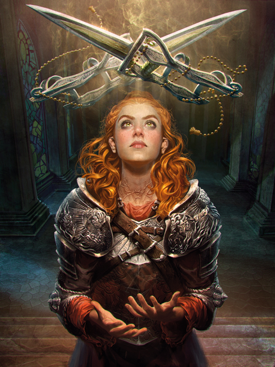
Demon stopper Oliveira is a character created for the mobile card game Legend of the Cryptids, developed by the Japanese publisher Applibot.
She is the warrior who prevents demons and monsters coming up to the surface of Earth. In her backstory, Oliveira spent time in Hell and was rescued by a sacred warrior who also taught her how to fight.
In this painting I'm depicting a scene where she is receiving the magic katars from her master. They will help her battle against monsters, as she tries to stop them rising from the depths of the Underworld.
As well as telling this particular story in the illustration, I came up with the idea that she should have scars over her body as a vestige of the time she was in the hands of the demons.
Every scar, besides being a physical mark, is a little story in its own right. I wondered if this type of attention to detail and character depth could attract players' curiosity about her and lead them to identify a little bit more with her.
Character design
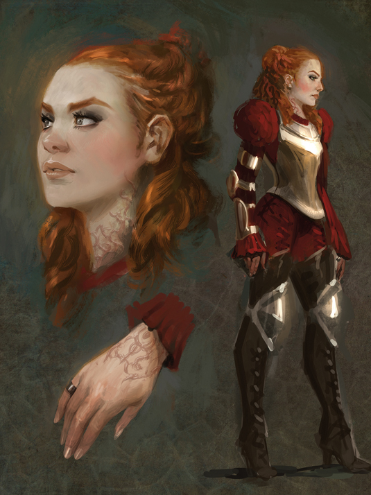
Before getting into the illustration itself, I like to start laying out the character design. It's easier to balance the importance of the visual elements if you already know how the composition will take shape. This means you can be sure that an important feature won't be too subtle in the final image.
Composition
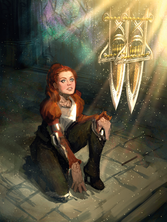
I sketch two versions. But in this one I realise the camera angle isn't dramatic enough and the scars would be tiny. A front shot will feature direct light and one-point perspective, which are good for emphasising a character. Sometimes classic solutions are better than dynamism.
Character details
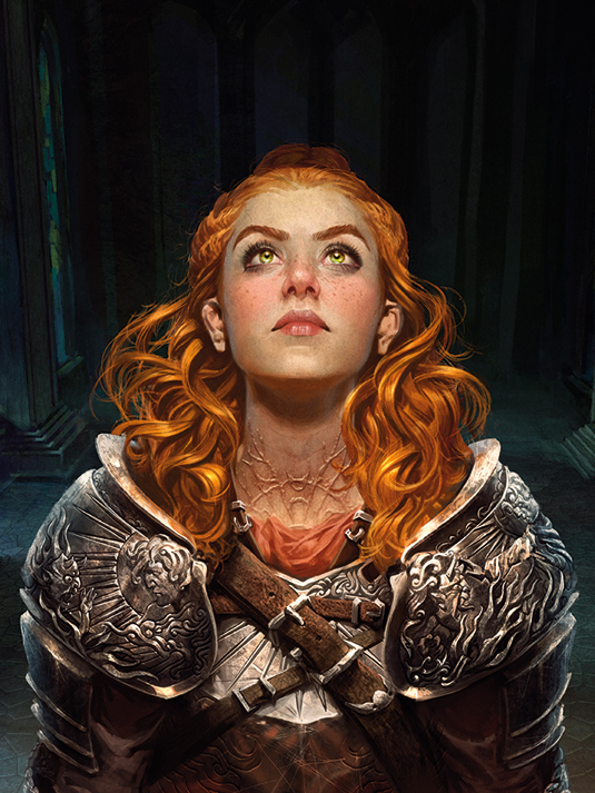
I start detailing with large brushes, gradually picking smaller ones – I find this makes it easier to keep track of the overall look and feel. There aren't many secrets here: set your brushes to smaller sizes and patiently render ornaments, freckles, hair and drapery. The deeper the detailing, the richer the piece.
Darks and lights balance
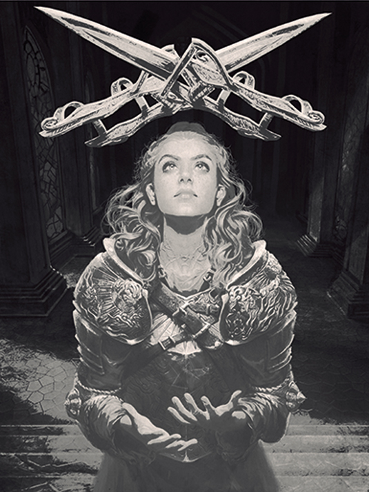
When designing an illustration that will be used on cards, be it printed or digital, you must always consider shapes and contrast. The proper balance between darks and lights gives the elements enhanced readability. Overlapping highly illuminated elements over light surfaces will make them disappear at smaller sizes.
A well-worn armour design
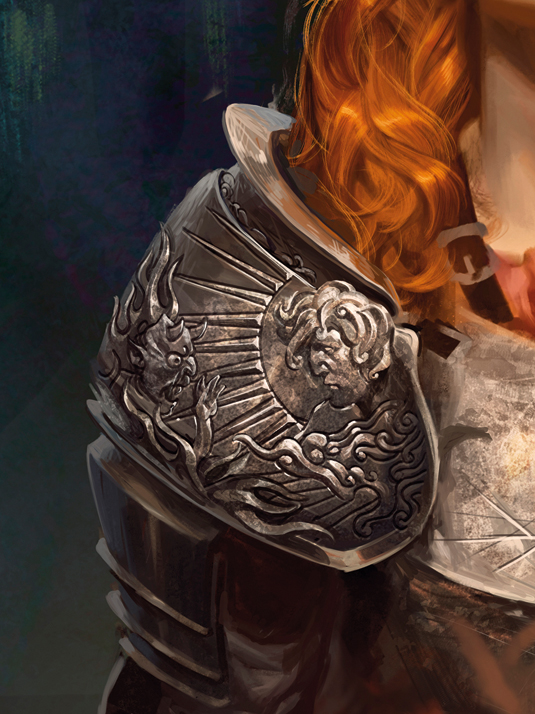
To achieve a realistic metal texture, I use a custom brush in a layer set to Overlay mode above the painting. Another layer, set to Color Dodge mode, provides the specular treatment. Some random dirt textures enhance the armoured look.
Colour structure
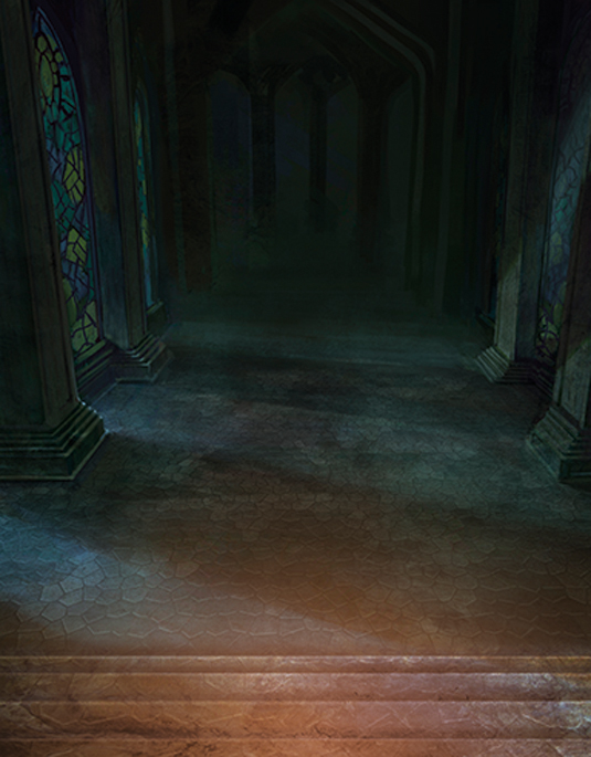
The briefing was that Oliveira should be red-headed. To highlight this, I give the background a wash of green tones, the complementary colour to red. In fact, this decision ended up guiding the whole colour structure. The painting has colder hues in the background and warmer hues in the foreground.
Photoshop brushes
Simple Round Brush

Used from the composition sketch to the most intricate detail.
Acrylics on Canvas

Great to give a traditional acrylic texture and to smooth out the overly harsh pixel feel. It can be tweaked to be used in many different ways.
Words: Will Murai
Will Murai is a freelance illustrator and concept artist. He has worked for clients such as Wizards of the Coast and Applibot, and is passionate about fantasy art, sci-fi movies and games.
This article originally appeared in ImagineFX magazine issue 106.
Like this? Read these!
- The simple secrets of painting sun-drenched hair
- How to draw faces without reference
- How to create an atmospheric nightmare using Photoshop

Thank you for reading 5 articles this month* Join now for unlimited access
Enjoy your first month for just £1 / $1 / €1
*Read 5 free articles per month without a subscription

Join now for unlimited access
Try first month for just £1 / $1 / €1
Get the Creative Bloq Newsletter
Daily design news, reviews, how-tos and more, as picked by the editors.

The Creative Bloq team is made up of a group of art and design enthusiasts, and has changed and evolved since Creative Bloq began back in 2012. The current website team consists of eight full-time members of staff: Editor Georgia Coggan, Deputy Editor Rosie Hilder, Ecommerce Editor Beren Neale, Senior News Editor Daniel Piper, Editor, Digital Art and 3D Ian Dean, Tech Reviews Editor Erlingur Einarsson, Ecommerce Writer Beth Nicholls and Staff Writer Natalie Fear, as well as a roster of freelancers from around the world. The ImagineFX magazine team also pitch in, ensuring that content from leading digital art publication ImagineFX is represented on Creative Bloq.
