Use symbolism to give your art bite
The ever-popular vampire genre receives an injection of fresh blood from illustrator Liam Peters.
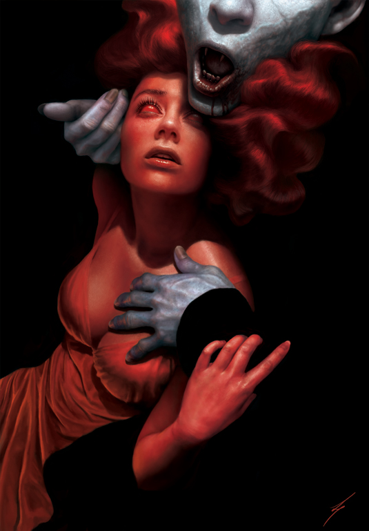
Although I've always wanted to paint a vampire piece, given the saturation of vampires in the media there's a real need to try and set myself apart.
While taking inspiration from my favourite vampire movie, Bram Stoker's Dracula, my overarching aim is to create something contemporary in composition and concept without being too far removed from my usual style.
Win clients & work smarter with our FREE ebook: get it now!
I start thinking of a vampire's lust for human blood as an addiction as much as it is a physical need. Through this I start designing a red woman who's symbolic of this bloody vice.
What develops is an image of a vampire embracing this woman and her, in turn, gently holding his arm, urging him to keep going. I try to push the composition a little more with the use of black encompassing the woman and shaping the flow of visual interest.
This dark space prevalent in the image is not only a part of the vampire himself, but also symbolic of the empty hole within him that can never be filled.
This insatiable lust for blood gives way to the title, The Great White.
01. Initial concept
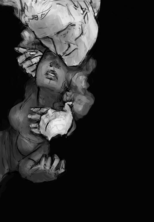
Originally, I imagine the woman as a human rather than a symbol and have the vampire's darkness forcing her against the side of the picture, to emphasise the futility of her situation.
However, I want to push the meaning a bit more and make things a little less literal. Furthermore, it wasn't obvious that this figure was a vampire.
02. Misplaced attention
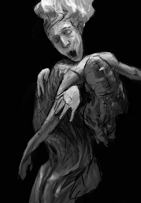
In this particular sketch the woman is more symbolic, but is too submissive with no real power – just like an addiction should have. The vampire seems too detached and showing his entire face may bring too much attention to him as a character, and deviate from the main concept of blood lust and addiction.
03. Figure alterations
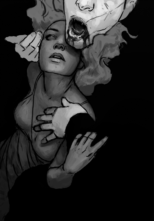
Using the first sketch, I angle the vampire's head backwards to show his fangs and also give his mouth a euphoric expression.
Limiting the view of his head not only leaves something for the viewer's imagination, but also keeps the focus on the concept rather than character backstory. Further adjustments to the woman also leave her looking less fearful.
04. Ensure your skin looks realistic
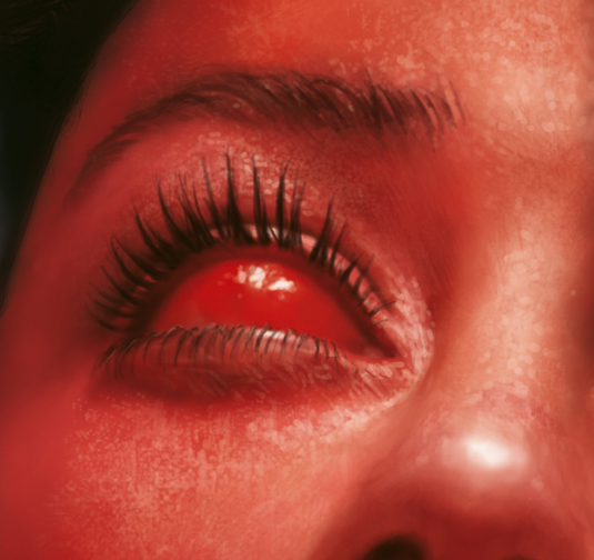
For skin I use a speckled brush. I use a soft-edged brush to first lay down skin tones and then the speckled brush to lay down the pits and highlights of pores.
Finally, I add a few brush strokes by hand to further refine some of the surfaces and highlights to the contours of the skin.
05. Animal parallels
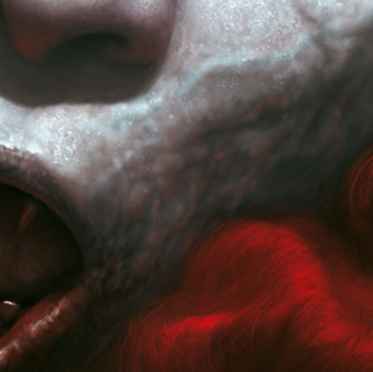
Like those on a great white shark, I add some scarring on the face and around the mouth to give the idea of pain in the service of hunger. I also depict some pulsing veins running down the face towards the fangs.
06. Approach the hair in stages
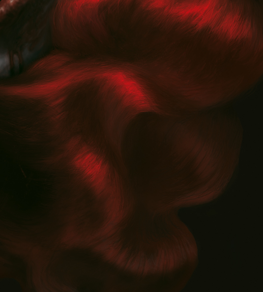
When painting the hair, I first use a basic Soft brush to establish the general shape and colour.
Then, by adjusting the Angle Jitter and Spacing of one of the skin brushes, I can lay down some hair detail followed by a few thin strokes by hand with a basic Hard brush.
07. Predator and prey
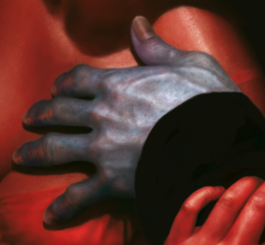
I want a lot of contrast between the vampire and his prey. So I create some Overlay and Multiply layers to provide cool-coloured discoloration in his hands and face.
I use blues and greens for the veins, purples for the fingertips and slight yellows for the nails and knuckle joints.
Note on brushes
Custom brush: Skin Brush1

Used at different opacities, this is a great brush to depict pores,
blotches and the skin's surface in general.
Skin Brush2

By reducing Spacing and Angle Jitter, this brush can also be used for hair. Sergey Kolesov created both of these brushes.
Words: Liam Peters
Originally hailing from Australia, Liam Peters is currently self-employed producing a range of digital illustrations from his home just outside of Dallas, Texas. This article originally appeared in ImagineFX issue 108.
Like this? Read these!
- The B-movie art that's so bad it's good
- Make 3D prints using your own photos for free
- The art book that gives artists a piece of the pie

Thank you for reading 5 articles this month* Join now for unlimited access
Enjoy your first month for just £1 / $1 / €1
*Read 5 free articles per month without a subscription

Join now for unlimited access
Try first month for just £1 / $1 / €1
Get the Creative Bloq Newsletter
Daily design news, reviews, how-tos and more, as picked by the editors.

The Creative Bloq team is made up of a group of design fans, and has changed and evolved since Creative Bloq began back in 2012. The current website team consists of eight full-time members of staff: Editor Georgia Coggan, Deputy Editor Rosie Hilder, Ecommerce Editor Beren Neale, Senior News Editor Daniel Piper, Editor, Digital Art and 3D Ian Dean, Tech Reviews Editor Erlingur Einarsson, Ecommerce Writer Beth Nicholls and Staff Writer Natalie Fear, as well as a roster of freelancers from around the world. The ImagineFX magazine team also pitch in, ensuring that content from leading digital art publication ImagineFX is represented on Creative Bloq.
