Is this is the ugliest face in the world?
This is what a pro artist paints when asked to create the ugliest face on earth.
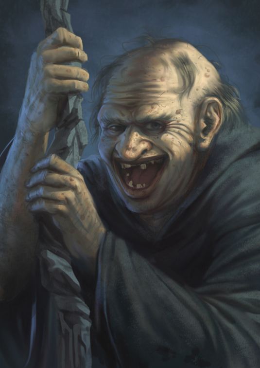
Before we start, I'd like to point out that the entire concept of ugliness is a very subjective thing. I recently read an article on the 'ugliest celebrities' and I was practically throwing my fruit snacks at the laptop screen (Gary Oldman? Really?).
If there are people who think those actors are ugly, then there's no sense in stressing out over any objective idea of unattractiveness!
That said, I love a lot of the old EC Comics horror issues. When I try and picture ugliness they are the first thing that comes to mind, so I'll be using that as my inspiration here.
Trying to get to the root of what 'ugliness' is can be an interesting mental exercise in itself. It's much like trying to figure out what it means to be 'pretty' or 'handsome'
For one thing, many aspects of what modern Western culture regards as ugly are natural aspects of the aging process. Exaggerating wrinkles, cataracts, hair loss, liver spots, lost teeth and almost anything indicative of decay is also something we as a culture associate with ugliness.
01. Birth of the uncool
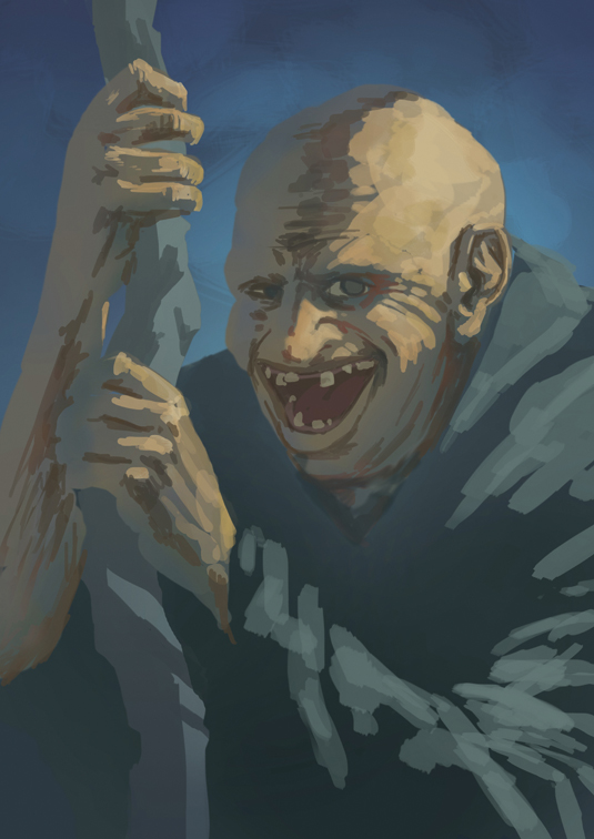
When putting down your initial colours and values, don’t worry about keeping things tight. Painting beauty demands every feature be placed just right, so the less you’re striving for beauty the less you should worry about clean lines and symmetry.
In fact, making all of the features smooth and symmetrical is something you should actively avoid.
02. Blank face
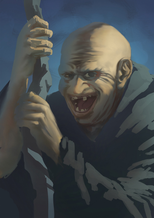
High-key art tends to feel soft and light because of its lack of contrast, so adopt the inverse of that idea to create more uncomfortable images.
You don’t need to cover everything in shadow, though, because that can also soften a lot of edges. Quick jumps from light to dark add tension to an area, so don’t be shy when aging a face. Dark lines mean deep wrinkles.
03. Face off
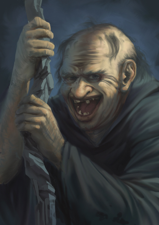
Signs of decay are an easy way to make people look creepier.
Drawing an uncomfortable posture, removing teeth, exaggerating the ears and nose, spotty patches of hair (not to mention hair growing in strange places), and pretty much anything rotting, will enhance the effect.
Avoid giving your character anything that implies a personal cleanliness routine.
04. Stinky bum
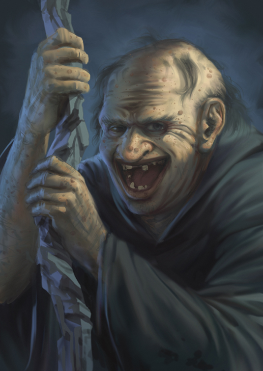
Again, the idea is to make the character appear as unhygienic as possible. If it looks like they’ve showered any time soon, make them a little more repulsive with some appropriate textures.
You can make some areas of the skin slippery and slimy, have some mucus running out of a few orifices, or add lots of pores and bumps to the skin. Have fun with those icky details!
Words: Tony Foti
Tony Foti is a US freelance illustrator who contributes to D&D and Fantasy Flight Games' Star Wars and The Lord of the Rings lines. This article originally appeared in ImagineFX magazine issue 107.
Like this? Read these:
- Free Photoshop actions to create stunning effects
- Illustrator tutorials: amazing ideas to try today!
- Great examples of doodle art

Thank you for reading 5 articles this month* Join now for unlimited access
Enjoy your first month for just £1 / $1 / €1
*Read 5 free articles per month without a subscription

Join now for unlimited access
Try first month for just £1 / $1 / €1
Get the Creative Bloq Newsletter
Daily design news, reviews, how-tos and more, as picked by the editors.

The Creative Bloq team is made up of a group of art and design enthusiasts, and has changed and evolved since Creative Bloq began back in 2012. The current website team consists of eight full-time members of staff: Editor Georgia Coggan, Deputy Editor Rosie Hilder, Ecommerce Editor Beren Neale, Senior News Editor Daniel Piper, Editor, Digital Art and 3D Ian Dean, Tech Reviews Editor Erlingur Einarsson, Ecommerce Writer Beth Nicholls and Staff Writer Natalie Fear, as well as a roster of freelancers from around the world. The ImagineFX magazine team also pitch in, ensuring that content from leading digital art publication ImagineFX is represented on Creative Bloq.
